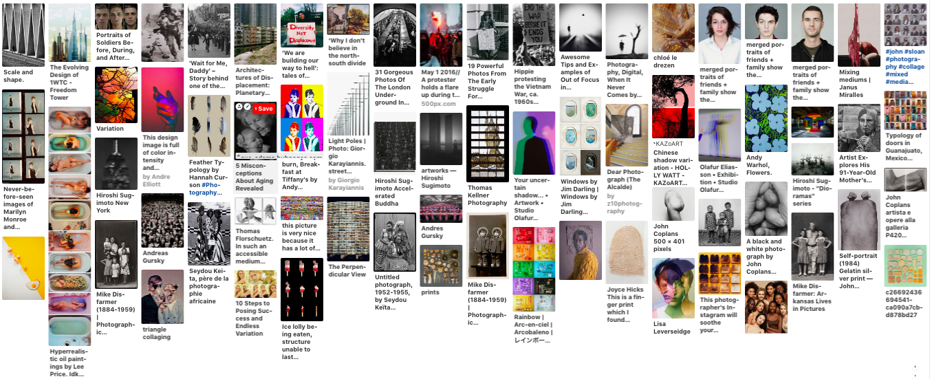
Pintrest Board Inspiration
https://www.pinterest.co.uk/safithegoldfish/variation-and-similarity/
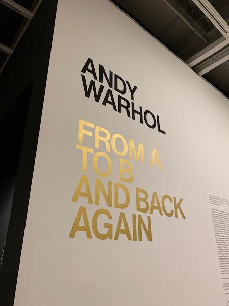
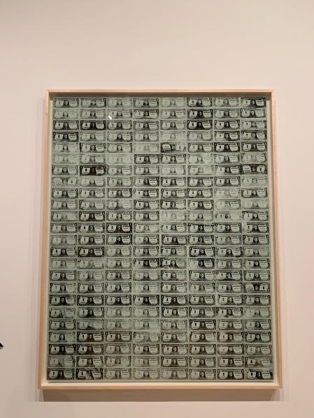
Andy Warhol- From A to B and Back Again
|
|
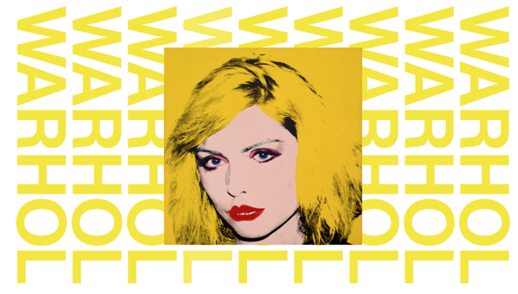
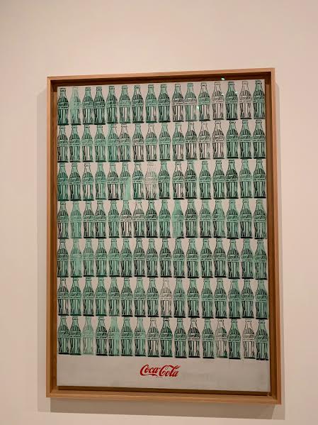
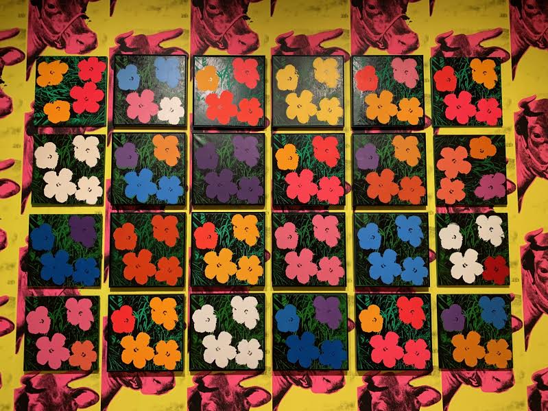
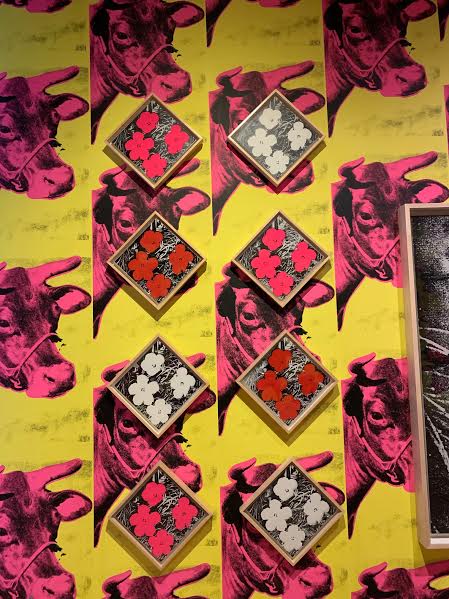
Silk Screen Printing- Repetition With Variety
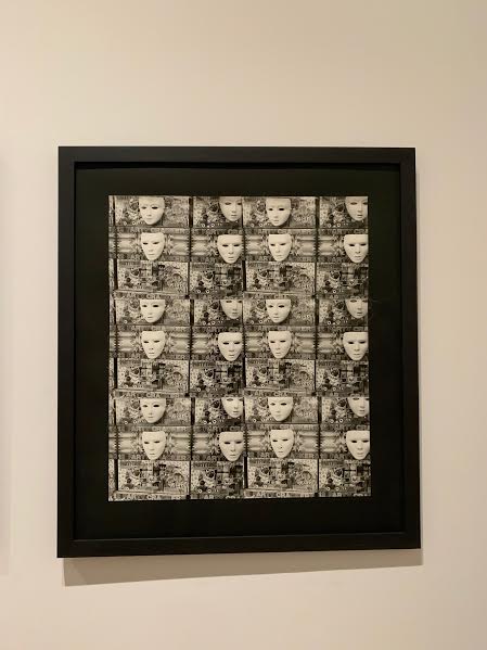
Using subtle surface variations, different colour combinations and varying pressure Warhol created the effect of variation and similarities between the repetition of the same objects. This style could also be seen as a form of typology whereby it is the same thing repeated but in a different way each time and it is also formulated similarly to that of typology images (in a grid formation). Inspiration from this idea could be carried into photography by developing the same image (from film) in slightly varying ways, this could achieved by using different filters or changing exposure time and light intensity. In addition it could be replicated by putting slightly varied filters or effect on digital images in photoshop.
Using subtle surface variations, different colour combinations and varying pressure Warhol created the effect of variation and similarities between the repetition of the same objects. This style could also be seen as a form of typology whereby it is the same thing repeated but in a different way each time and it is also formulated similarly to that of typology images (in a grid formation). Inspiration from this idea could be carried into photography by developing the same image (from film) in slightly varying ways, this could achieved by using different filters or changing exposure time and light intensity. In addition it could be replicated by putting slightly varied filters or effect on digital images in photoshop.
|
|
|
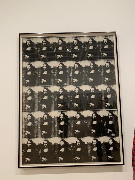
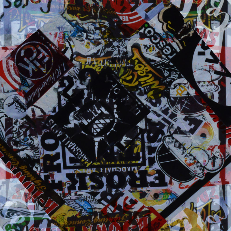
Silk Screen Printing Using Photographs - Repetition With Variety
This image is an example of how the variation in printing techniques onto the linen has varied the outcome of each individual thing however in this case it is a photograph. I really like the aesthetic os this image and I think that it was one of my favourite pieces of work in the exhibit. I would really like to draw inspiration from the printing technique combined with the look of the repetition.
This image is an example of how the variation in printing techniques onto the linen has varied the outcome of each individual thing however in this case it is a photograph. I really like the aesthetic os this image and I think that it was one of my favourite pieces of work in the exhibit. I would really like to draw inspiration from the printing technique combined with the look of the repetition.
|
|
|
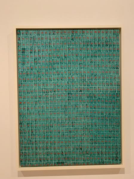
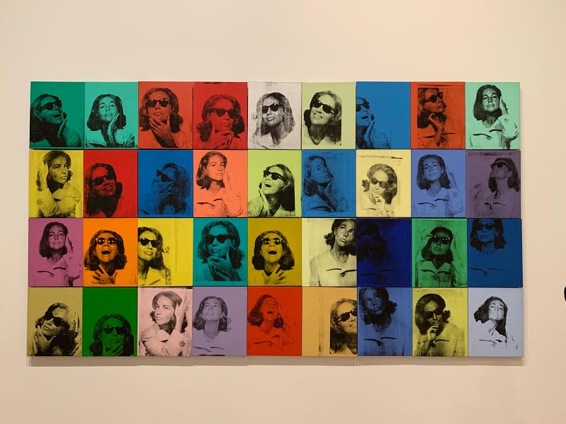
Variation in Colours
In these examples we see the same image repeated however the only variation is in the colours of the images. This idea could be replicated in photography by inverting the colours of an image in photoshop without changing the fundamentals of the image. This could also be done in the dark room by adding different coloured inks to the same image developed from film. 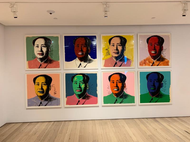
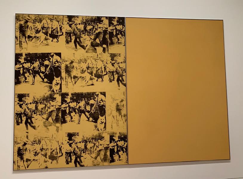
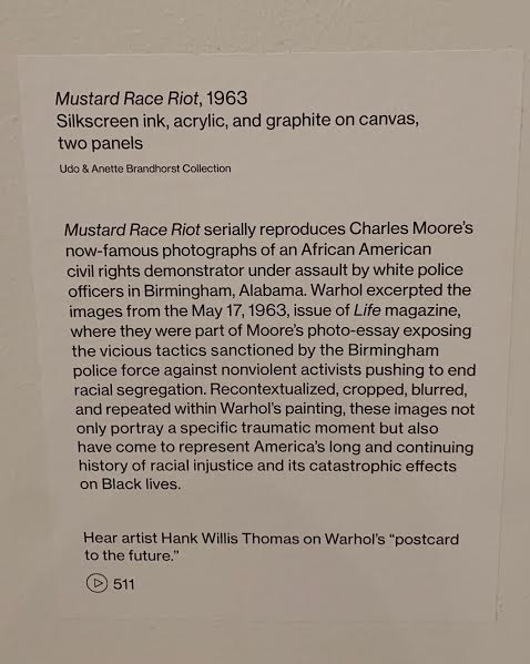
Selections from Mao Tse-Tung, 1972
|
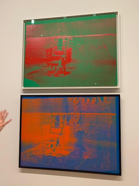
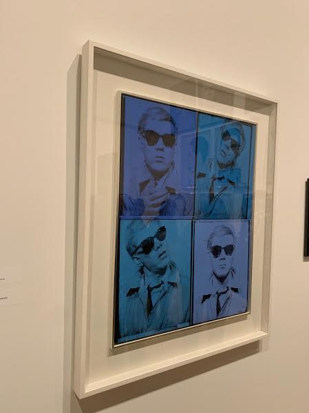
(top) Big Electric Chair, 1967-68/
(bottom) Big Electric Chair, 1967
|
|
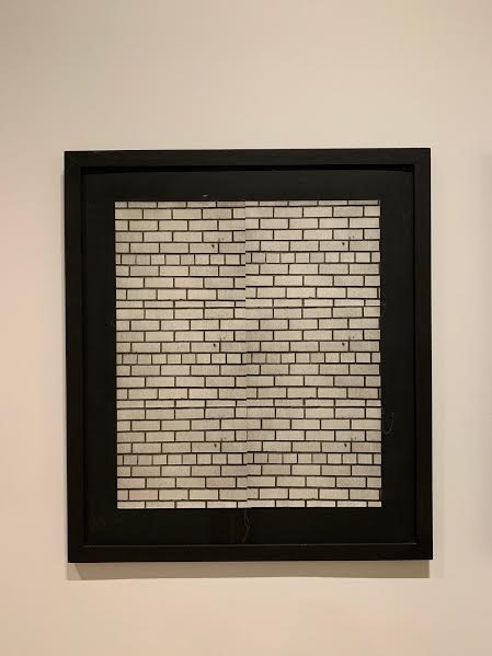
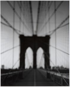
same image repeated to create one whole image
upon first glance you you might think these are just ordinary images of a brick wall or of a crowd but they are actually just the same image readapted (in the case of image 1) or the repeated images of an object from varying angles (in the cases of 2 and 3. these images already show a clear use of photographic technique. image 1 is a silkscreen print on linen, the technique used in most of Warhol's popart images of repeated objects. it is developed from a united press newswire photo from april 1955. it is not clear in the image on the left but this whole image consists of 6 blocks where the same image is repeated in a grid formations. this is technique is effective with images of crowds and other scenes without clear formation because upon first glance you dont immediately see that it is 6 combined images. the form used in images 1 and 2 is slightly different however does link clearly to the image of the crowd. they are all photographs as opposed to painting like the majority of the works in this exhibit. however the images displayed below are both gelatin silver prints. they also depict a variety of images in a grid formation, however each image is of the same object but from different angles. this variation in perception is more apparent in image 2 and by using the technique of something patterned like a wall it creates as similar effect to that of the crowd image. |
1
|
2
|
3
|
using mixed/ alternative mediums
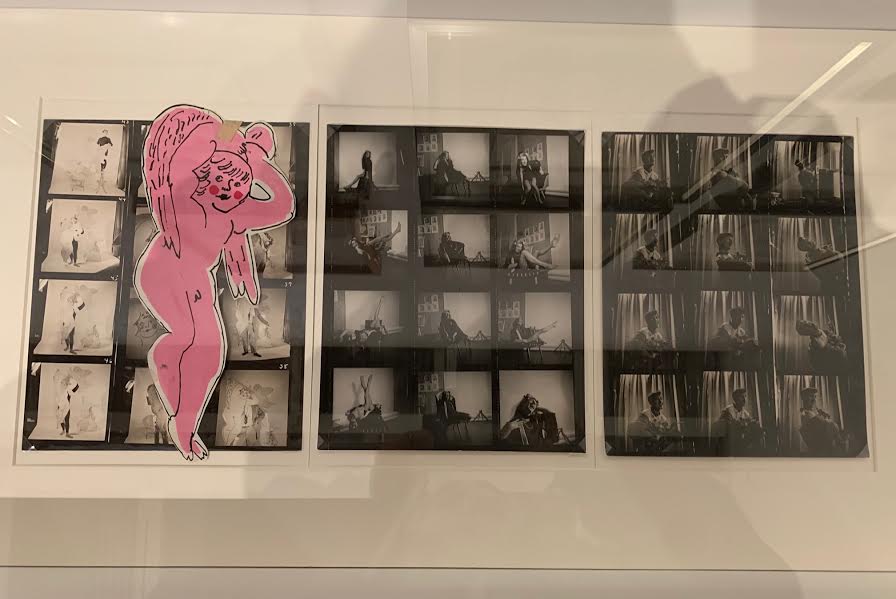
in photo 1 we see series of examples where people are being photographed in different positions and from different angles in the form of a contact sheet. this shows clear variation and similarity between the photos taken by displaying them as one singular and cohesive image. in the exhibition these were accompanied by drawing that had been inspired by the photographs, you can see these in image 2. they were displayed in a grid formation similar to the look of a contact sheet. this has inspired me to think about how a contact sheet could be an interesting way to display typology or to convey clear similarity and variation between images that are different but still part of the same shoot and have lots of similarity.
furthermore the combination of art and photography could inspire the idea of using variation of mediums in my project, there were clear examples of mixed medium work throughout the exhibit
1
|
2
|
using mixed/ alternative mediums (continued)
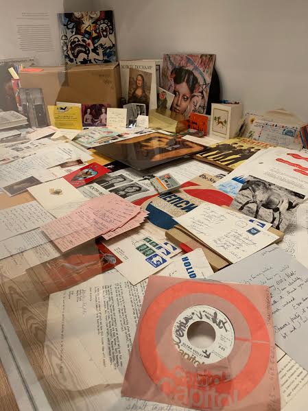
here was a time capsule which contained images, posters, record and other material which together were collated to form a final piece. this is a good example of where alternative and mixed mediums are used
|
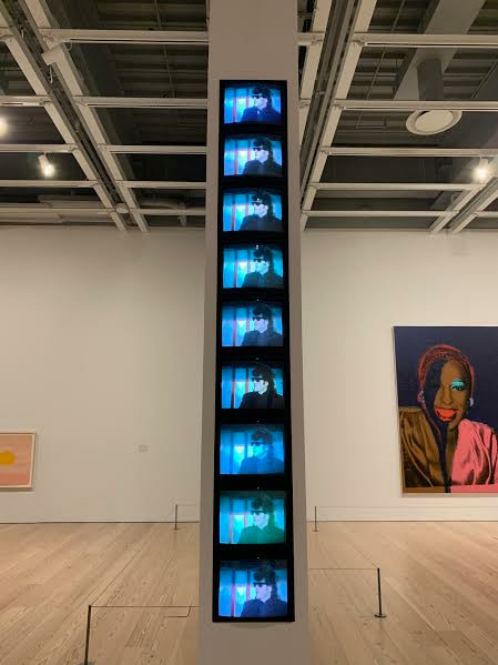
in this part of the exhibit there was in instillation of TVs in the wall which displayed the same interview. i have experimented with video before in previous projects but i think that this is an intriguing way to display it especially when considering that repetition is a good way to covey variation and similarity.
|
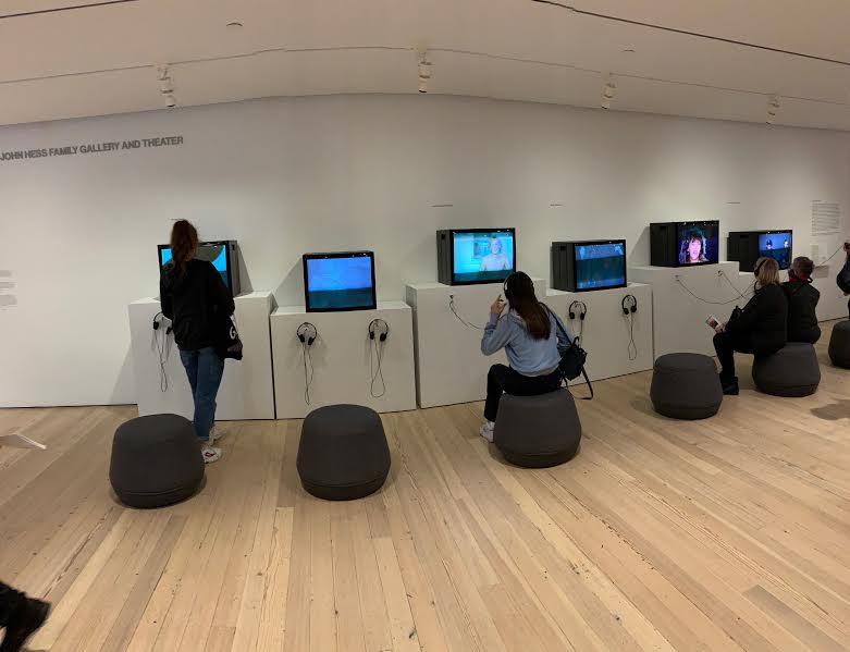
this image is just another example of where video and TVs were used however this adds the interactive element of the headphones and seats
|
|
portrait typology
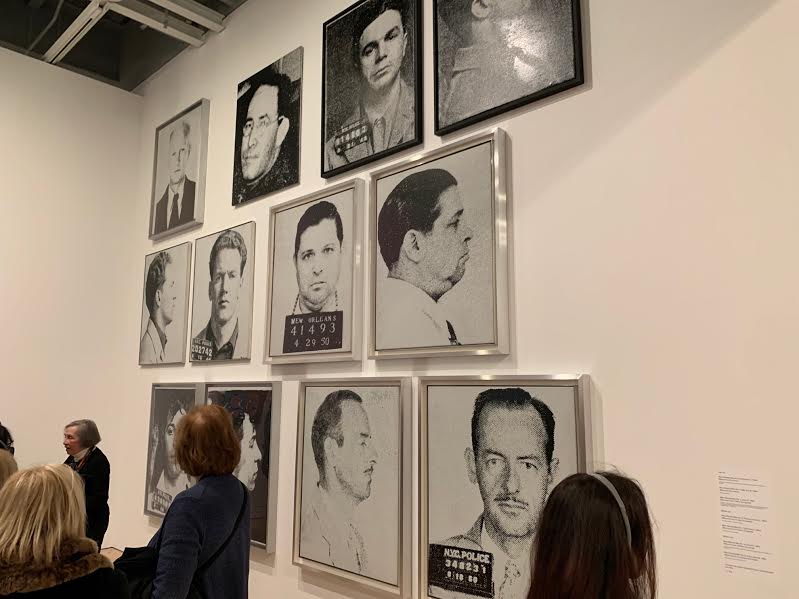
on the right you can see clear and simple typology where images of men are displayed, the link between them is that they have all been on 'the most wanted list'. this is a simplistic form of typology and and sub groups amongst people is something i think i will explore when attempting typology myself. below we can see two examples of where the is a variety of portraits displayed that are different but have clear similarities so they is variation and similarities. in addition the addition of colour adds an interesting aesthetic and emphasises the variation in the images. |
|
|
|
Variety in colour - similarity in image
This effect where variety is shown in colour as opposed to image as well as having it in a pattered formation is something i really loved the aesthetic of. this technique could be achieved by printing an image onto associate and placing it on a variety of coloured card or like i had previously discussed, developing an image in the dark room and adjusting the colours with ink
This effect where variety is shown in colour as opposed to image as well as having it in a pattered formation is something i really loved the aesthetic of. this technique could be achieved by printing an image onto associate and placing it on a variety of coloured card or like i had previously discussed, developing an image in the dark room and adjusting the colours with ink
|
|
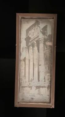
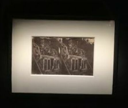
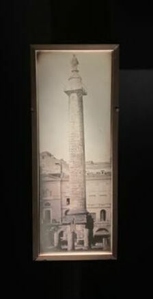
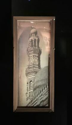
The daguerreotypes of Girault de Prangey-
MONUMENTAL JOURNEY
Joseph-Philibert Girault de Prangey (1804–1892) was a french artist, architectural historian, archaeologist, and pioneer photographer. Girault de Prangey was keenly interested in the architecture of the Middle East and in 1842 he embarked on a three-year photographic excursion throughout the Eastern Mediterranean, and he returned to France with more than one thousand daguerreotypes—an unparalleled feat in the history of photography. He used daguerrotypes, a very early photographic method, each is a unique image on a silvered copper plate. His daguerreotypes are the earliest surviving photographs of Greece, Palestine, Egypt, Syria and Turkey, this is probably due to the fact that the daguerrotype was only invented 3 years before his journey. IN this exhibition approximately 120 photographs that he created in Greece, Egypt, Syria, Turkey and the Levant are on display. I have shown just a few of these below.
I think in this exhibition we can see a clear theme, Mediterranean architecture. this broad focal point which allows us to draw similarities between the countries while still seeing the places for their own individual nuances.
I think in this exhibition we can see a clear theme, Mediterranean architecture. this broad focal point which allows us to draw similarities between the countries while still seeing the places for their own individual nuances.
FRANCE
|
|
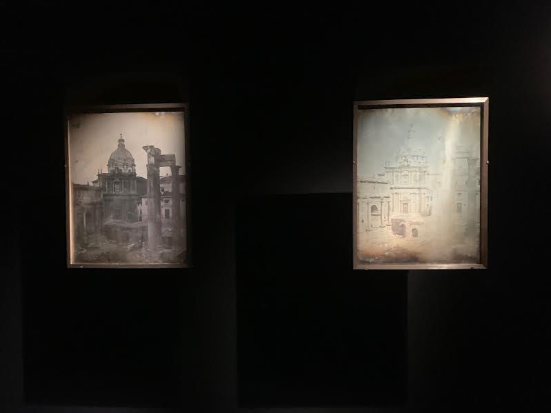
ITALY
The images 2 below (on the left) are ones which I found particularly interesting, this is because these are the same scene from the same time photographed at different exposures. This has caused them to look like 2 completely different times of day. I think this is a very good example of how you can manipulate photographic techniques to create variation.
|
|
GREECE
|
|
LOWER EGYPT
|
|
|
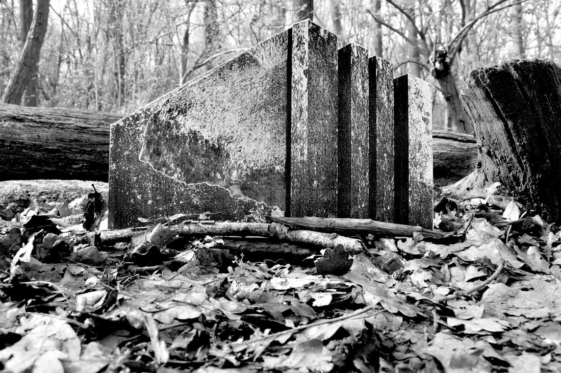
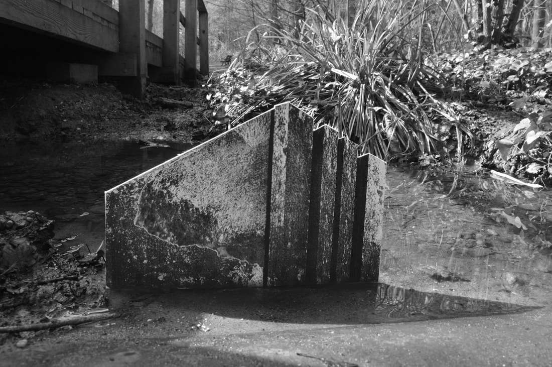
Set Task- Typology
Artist- Ed Ruscha
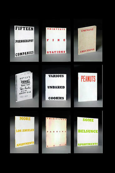
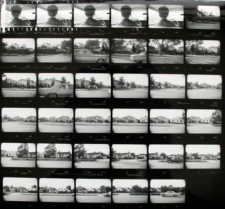
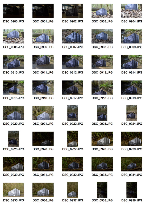
Ed Ruscha is famous for his paintings and prints but is also known for his series of photographic books based on typologies. Some of this work includes 'Every Building On The Sunset Strip', 'Twentsix Gasoline Stations', 'Some Los Angeles Apartments' and 'Thirtyfour Parking Lots'. His work is commonly described as 'deadpan' and 'mundane' however, ironically when asked what inspires his work he said "I am interested in what is interesting." One of his most compelling works in my opinion is "Every Building on the Sunset Strip," which is a 27 foot panorama compiled from images of the 1 and half miles between the south to the north sides of Los Angeles' Sunset Boulevard. These continuous road shots are something I find very interesting to looks at. The way he displays his typology work is something that is unique and interesting. unlike other typology photographers he doesn't lay out dozens of images of the same object side by side however he is known to do this on a smaller scale, maybe with only 4 image (as shown below in 'rooftops', or he might display them as a panorama, as a contact sheet, or as a book (as seen on the left).
This unique showcasing of work is something that I want to bring into my attempt at typology, I think that its a unique way to display typology work and there is a large significance in how you display work which is not always something that give importance to or acknowledge, I aim to be more mindful of this in the future.
This unique showcasing of work is something that I want to bring into my attempt at typology, I think that its a unique way to display typology work and there is a large significance in how you display work which is not always something that give importance to or acknowledge, I aim to be more mindful of this in the future.
A STEET IN LA- View from a car
|
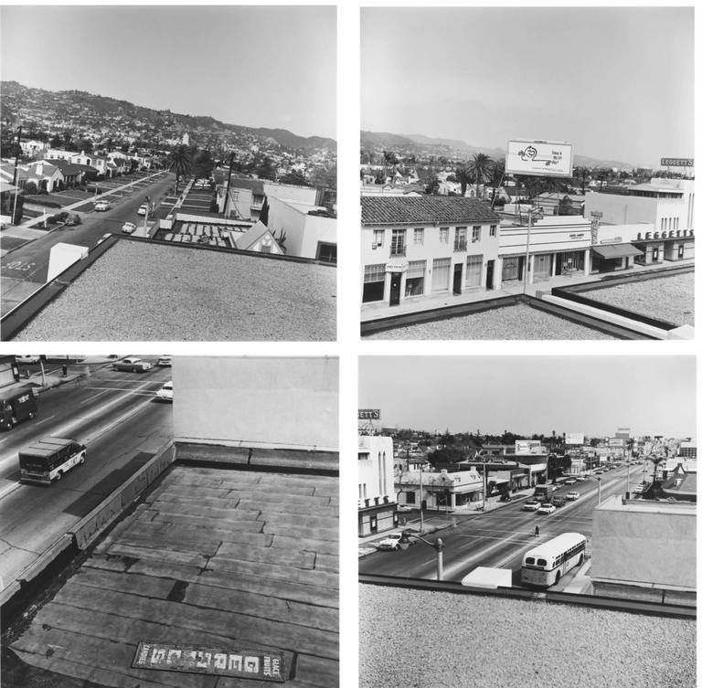
ROOFTOPS
|
My Work
For the typology task I wanted to experiment with lots of varied layout and presentations, Ed Ruscha does this in his work and doesn't restrict himself to one layout or style. Below you can see my multiple responses to this task.
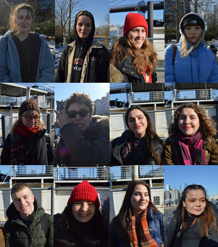
GRID
This grid layout is commonly seen in typology photography. As you can see I used portraits of people, I think the response shows good variation however the framing of the images draws them together and makes the images appear similar.
This grid layout is commonly seen in typology photography. As you can see I used portraits of people, I think the response shows good variation however the framing of the images draws them together and makes the images appear similar.
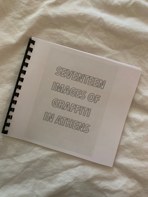
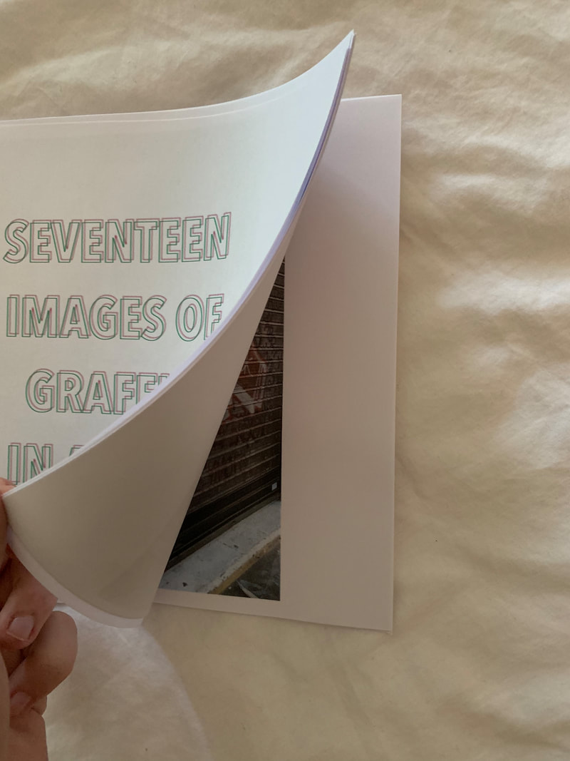
BOOK
My second response came in a more unique layout that I had only seen from Ruscha and this was the book layouts. When I went to Athens the streets were plastered with graffiti and not only did I think the documentation of this highly political propaganda would be interesting but I also felt that it suited the book form better than other images I had taken. I felt this way because I believe that the images stand well on their own and have their own message as a singular image but are also interesting when compiled into a collection. These images are made cohesive by their layout and by the subject they show but are all unique.
Below you can see the final book and what that looked like but below that you can see the images that featured in the book.
|
|
PANOS
These are my responses to the pano layouts, here I did 2 different kinds, 1 where I have actually compiled the images into the pano and another where I have put them into a contact sheet layout which more closely remobilise the "sweet in LA' piece by Ruscha. Both are taken in Athens.
These are my responses to the pano layouts, here I did 2 different kinds, 1 where I have actually compiled the images into the pano and another where I have put them into a contact sheet layout which more closely remobilise the "sweet in LA' piece by Ruscha. Both are taken in Athens.
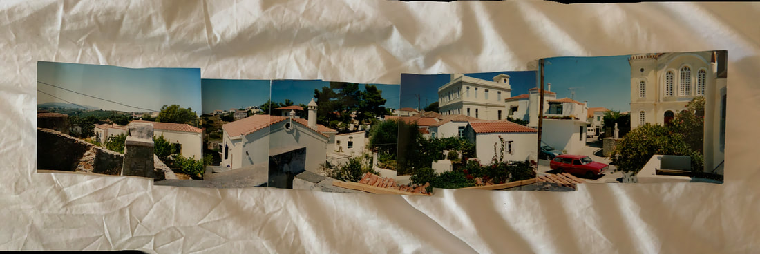
I think all the responses worked well and came out how imagined them. I really like the images used in the contact sheet pano and I also like the idea behind the graffiti book. If I were to take one of these responses forward and develop it I would probably choose the book or the continuous pano because they were the responses that I most enjoyed creating but also I think conceptually the book could be taken in quite and interesting direction. However I'm not sure of far you could take it and how much you could change such a structure idea and for that reason I think the compiled pano would be the one that would be best for me to develop. having said this the other 2 responses were good in their own ways, the first being the more traditional and common layout which I feels shows typology the most blatantly and the last one being good in that you could make an actual contact sheet and perhaps experiment with film as well.
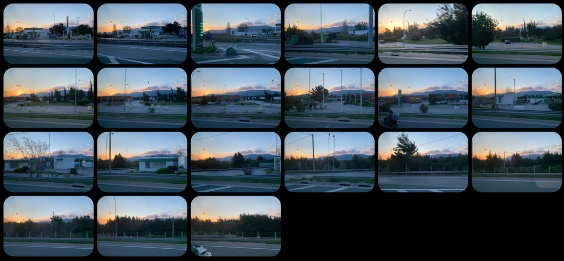
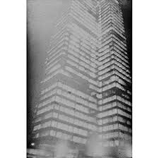
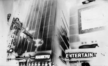
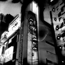
Set Task- A varied view of the city
Artist- Anthony Cairns
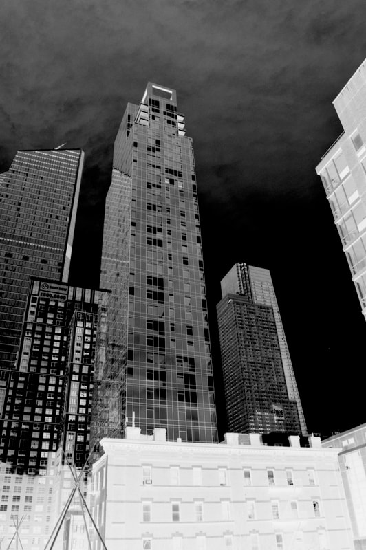
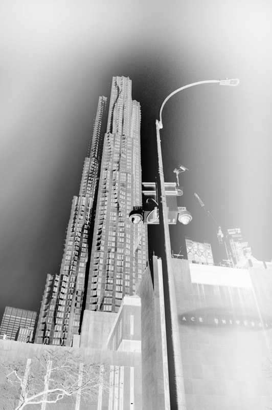
Born in London, Anthony Cairns is traditionally trained photographer whose work is centred around the city at night. Having photographed in LA, London, Japan and New York he's now created an extensive collection of images of cities at night using alternative methods of photography and presentation. He shoots almost exclusively on black and white film, he prints all his own work, often experimenting with forgotten or discarded methods. Cairns recently exhibited at the Tate Modern in London where in one part of the exhibit he had used old tablets to capture the image and then took it apart while the image was on the screen, subsequently freezing the images on the screen and showcasing the actual tablets in plastic casing. This interest in alternative methods bring in that ideas of using a variation of methods and materials to emphasise in my project the topic of variation. In addition to this the coherent theme throughout his work is 'cities at night', he subsequently captures the similarities and differences of cities around the world and makes them coherent using an overarching and recognisable aesthetic.
|
|
|
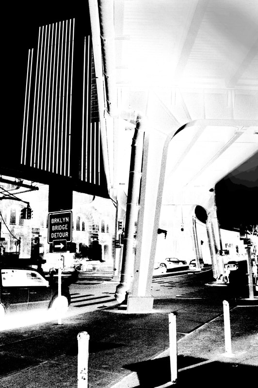
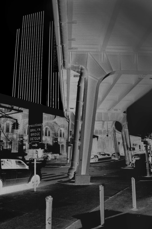
My Work
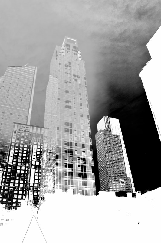
Unlike Anthony Cairns I used my digital camera to capture these images and then created the final product in Photoshop instead of using film and alternative processes like Cairns does in his work. Also the images I took were from the daytime whereas all of his work has a focus on the cities at night. However having said this I think that my work does show a similar aesthetic to Cairn's.
|
|
|
|
|
|
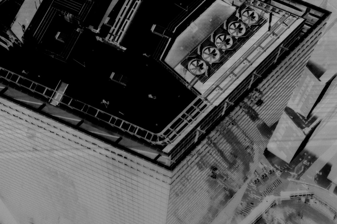
Overall I am happy with the final product and I think I have achieved the desired aesthetic despite using different techniques to the artist I took inspiration from. In addition to create this I used the inverting tool in photoshop and I think this links in with the idea of variation because your showcasing a different variation of an image but similarity because fundamentally your looking at the same picture. Following on from this idea if I were to develop this work I could use other effect in photoshop to try and achieve a physical representation of this idea of variation, perhaps then drawing on my work in typology and displaying them together so the viewer can really get a sense of the varied effects put on the image. In addition if I were to develop this task further I would maybe experiment with images in the dark room, an advantage of this I think is by using film and developing the images in the darkroom it is easier to create more emphasised yet natural looking juxtaposition and contrast within the individual images.
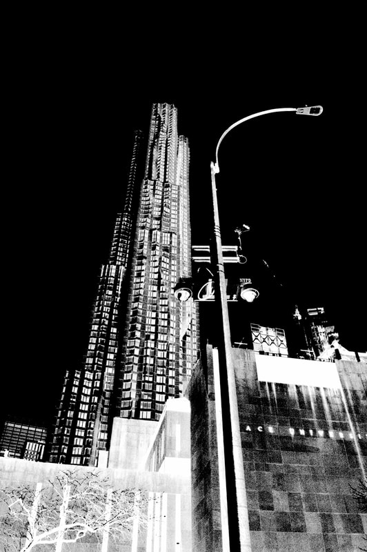
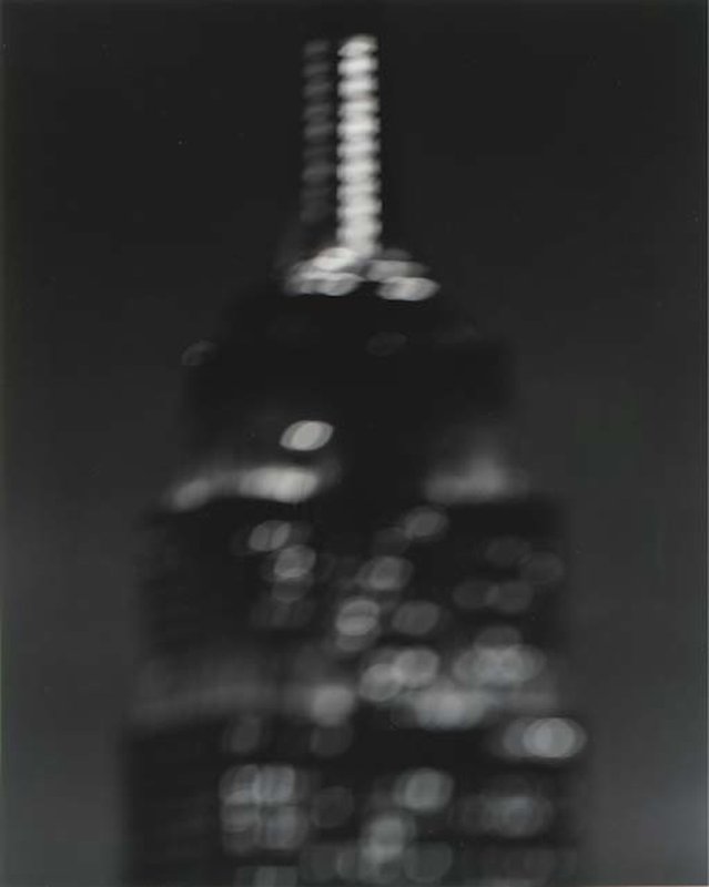
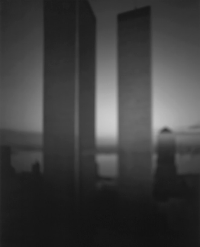
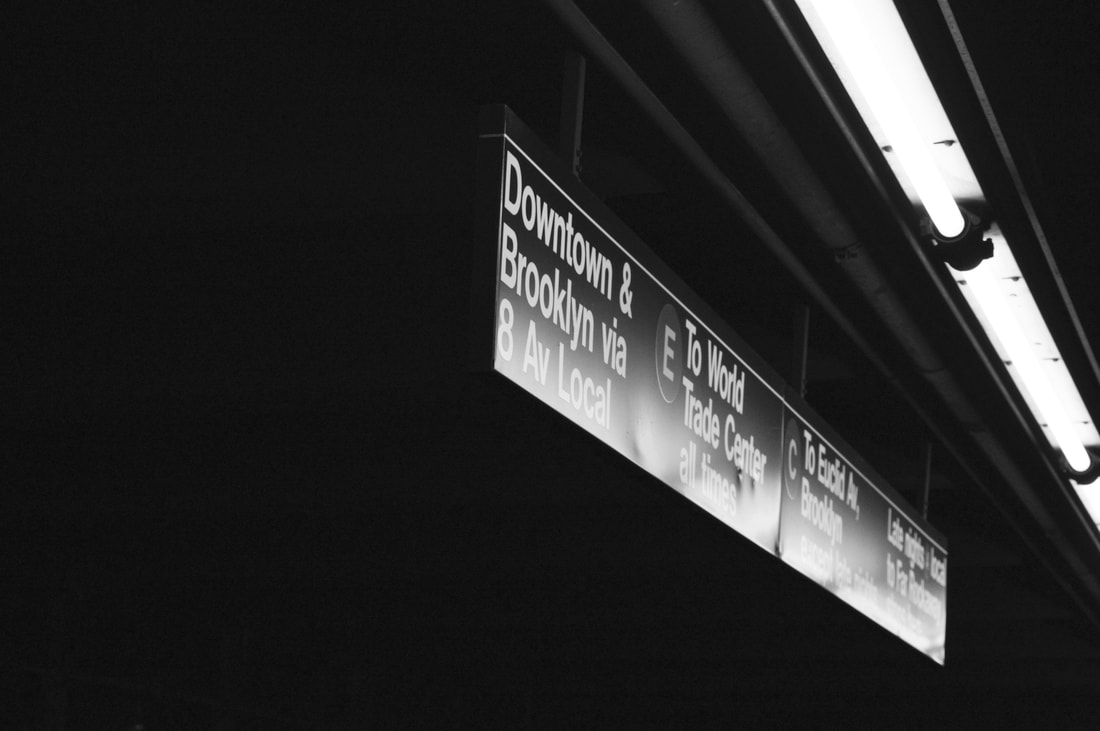
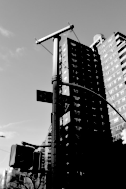
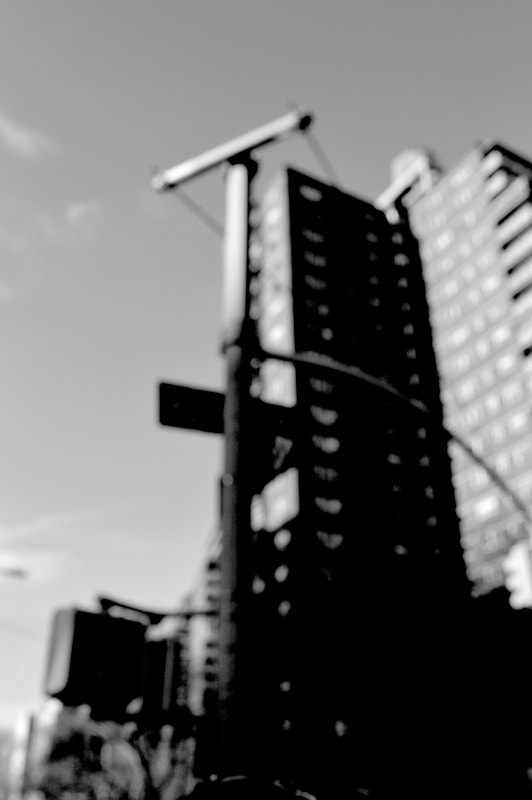
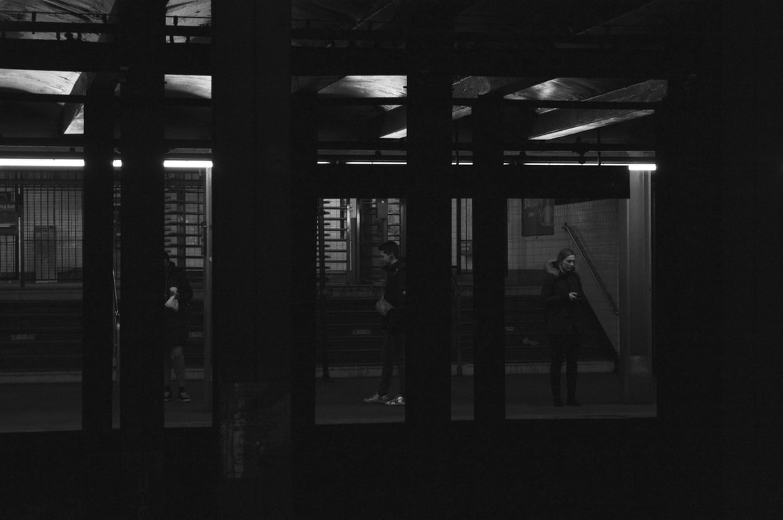
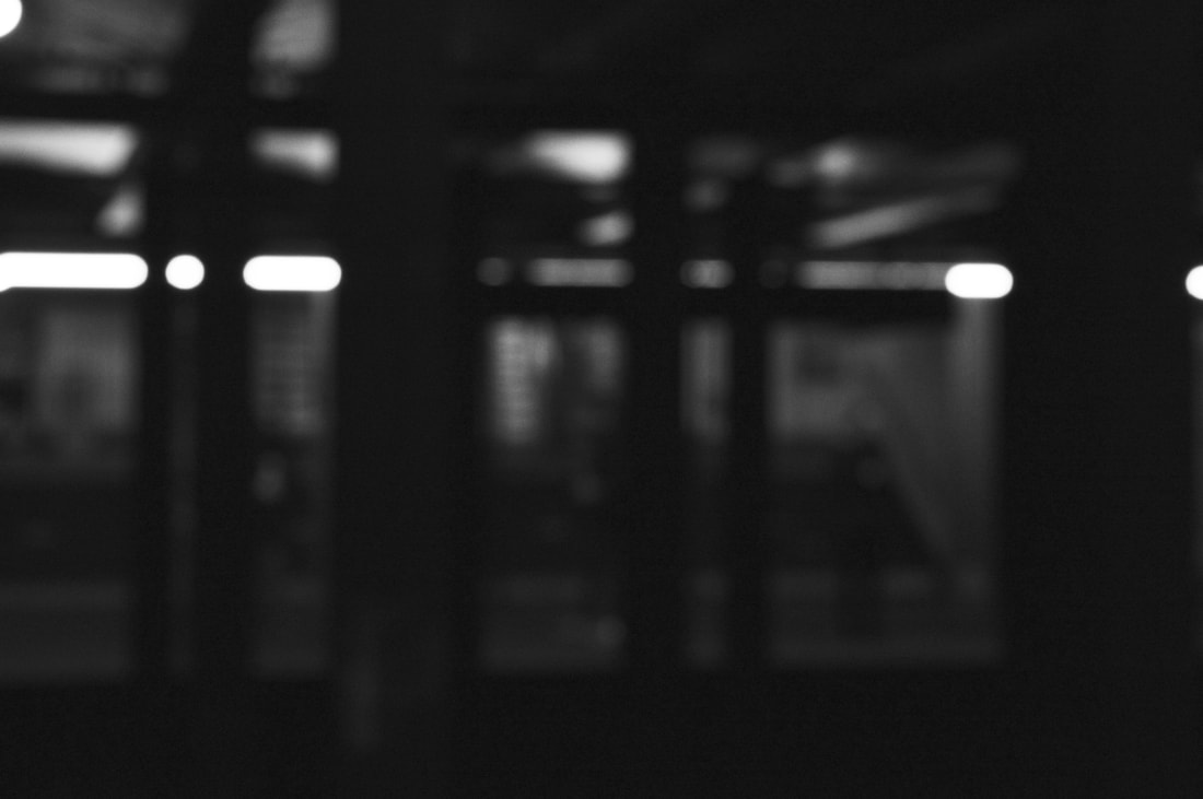
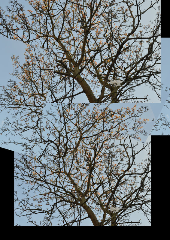
Set Task- Variation in focus
Hiroshi Sugimoto
This task is inspired by Hiroshi Sugimoto's project titled architecture. The imagesin this project were taken between 1997-98. In an attempt to document architecture in the age of modernism a concept which for him was the style of stripping away decoration but one which also represented the spread of democracy and the innovation of the Machine Age swept aside the ostentation that before that had been a signifier of power and wealth, he felt due to this style this was no longer true. Through this project Sugimoto says "I discovered that superlative architecture survives the onslaught of blurred photography. Thus I began erosion-testing architecture for durability, completely melting away many of the buildings in the process." This idea embodies one of the main aims for this title which is to take things and vary your perception of them or even vary the object itself. In Sugimotos case he uses blur photography and this is what i have attempted in my response below.
|
|
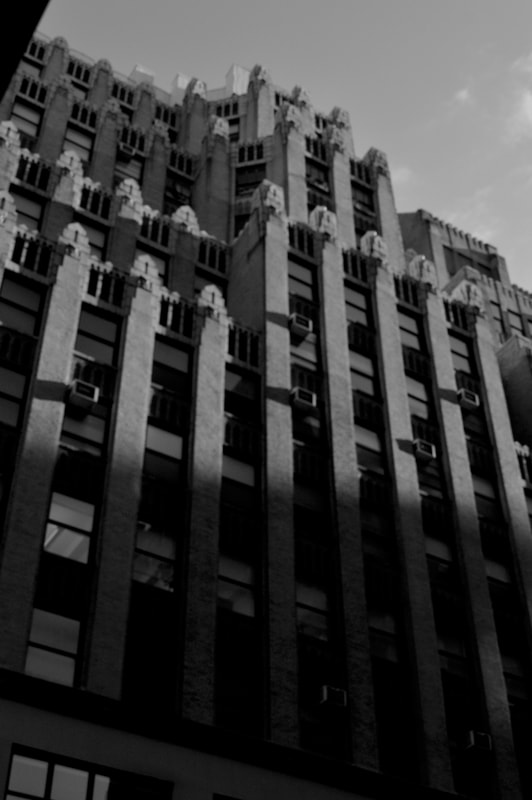
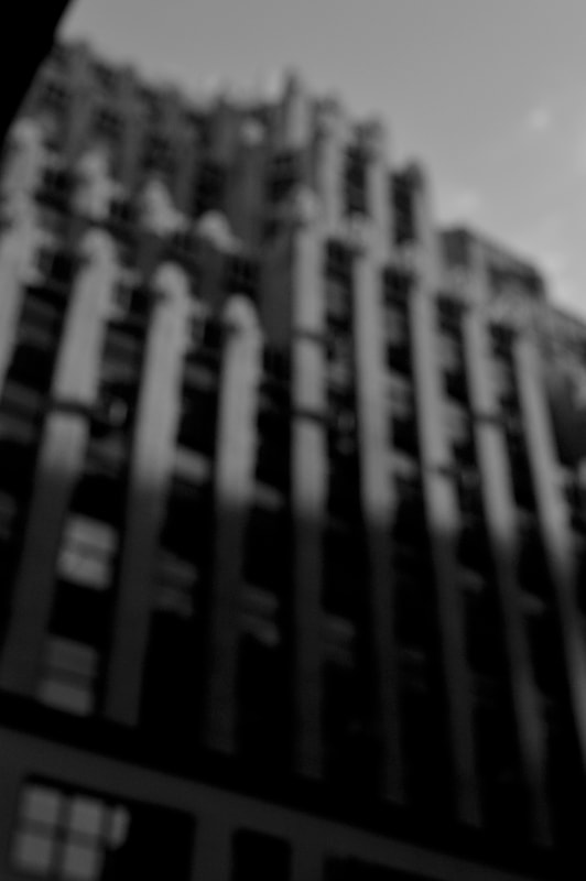
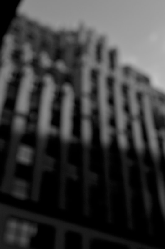
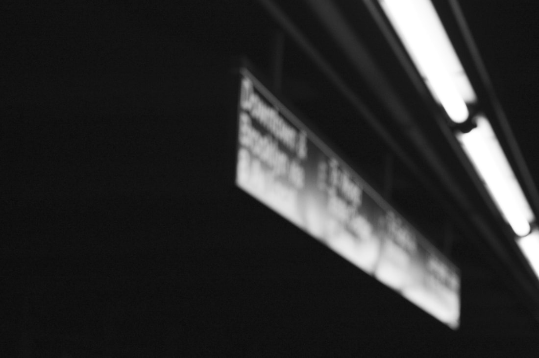
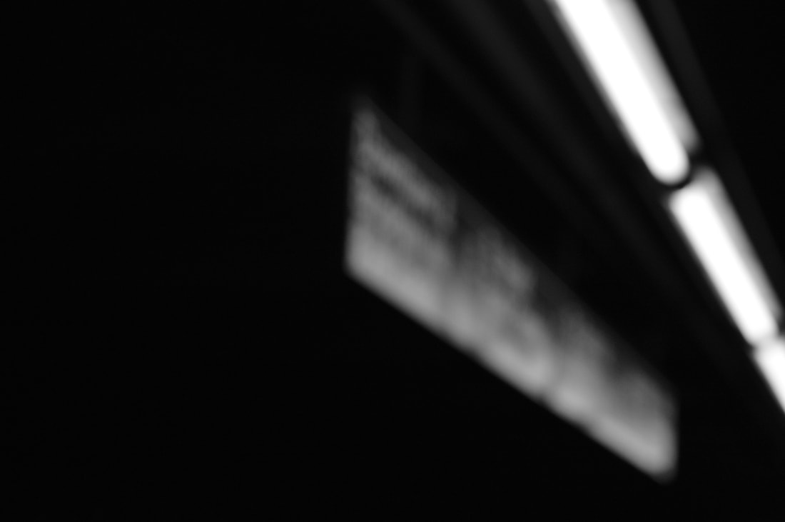
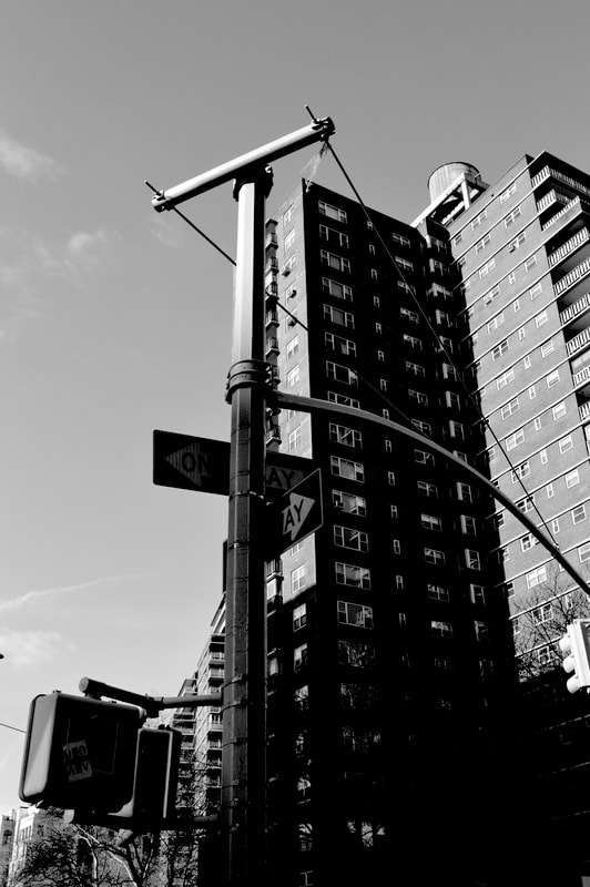
VARIED FOCUS IN CAMERA
This first response was taken on a digital camera. Originally the variation in blur was just as a way of experimenting with different levels and intensity of blur however I showcased them as a set on my website because I believe that it emphasises to the audience the variation and similarity in the work, however I do think the blurred images can stand alone as their own unique pieces when taken out of the set of 3. I tried to vary what I took pictures of and stray away from just architecture, in an attempt to find what I felt best worked with this effect and what I most enjoyed photographing.
|
|
|
|
|
|
|
|
|
|
|
|
I think this development was successful in showing a varied perception of what would usually be and image in focus. If I were to take this strand further and develop it I would follow the theme of the last set of images taken in the subway, I really like the way the dark aesthetic bodes well for the aim of making the image abstract. in the hopes of stripping away the image and melting away the scenery I think the most blurred image in the subway best achieves this look. Also an idea for development could be experimenting with the same style and technique but using coloured images.
VARIED FOCUS IN PHOTOSHOP
In this development I attempted to achieve the aesthetic of Sugamoto's work but in photoshop. The process was simple and only involved converting the image to black and white and then blurring it using the 'box blur' button.

|
|
|
|
I think that the development was successful however i preferred the look of the first development and if i were to take this forward I would stick with creating the aesthetic in camera as opposed to doing it in photoshop. the reason i don't like the second development as much is because i think it looks more pixelated and not as abstract as i would have liked it to be, which is something i think the first development achieved well.
Artist and Me
Hiroshi Sugimoto's
|
|
Don McCullin- Tate Britian
|
|
|
|
my analysis of the exhibit
|
photos from the exhibit that i have not discussed below
|
EARLY LIFE
Don McCullin grew up in North London, in Finsbury Park. Having grown up in this rough area McCullin remembers experiencing poverty, bigotry and violence from a young age, this coupled with his the loss of his father at 14 made his childhood a very difficult time for him. This could be why in his later work he is not afraid of capturing difficult or upsetting scenes.
Don McCullin grew up in North London, in Finsbury Park. Having grown up in this rough area McCullin remembers experiencing poverty, bigotry and violence from a young age, this coupled with his the loss of his father at 14 made his childhood a very difficult time for him. This could be why in his later work he is not afraid of capturing difficult or upsetting scenes.
|
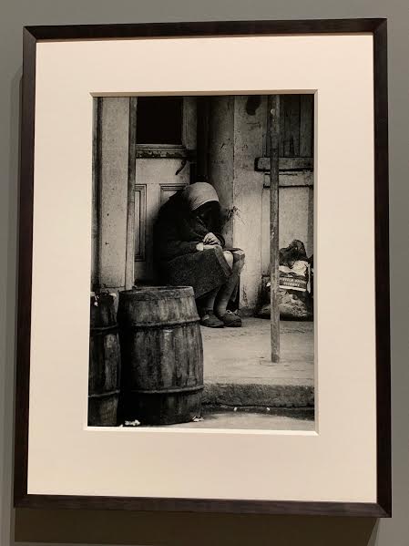
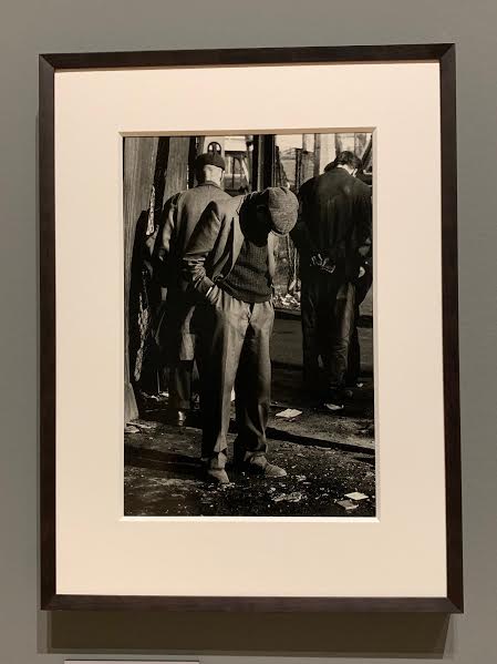
Gangs
Much of the his early work is taken in his local area. These scenes included images of a north London gangs known as 'The Guv'nors' ,the neighbourhood was still in partial ruins from being bombed in the war and this image below shoes the boys standing in the shell of a bombed house in their Sunday suits. In McCullin's work he seems to want to show conflict within groups, show what makes us different and having been surrounded by tension and conflict within his own community he had a unique perceptive on it. Lots of his work sheds light on the variations between us but later in his career it seems as though he wants to bridge that gap by showing what make us people, showing things we all share while still documenting us in our small sub-groups. In the exhibition we are told a story about the gang on gang on police conflict which sadly resulted in the stabbing of a policeman. This incident occurred a few months after this image on the left was taken and after the story broke he took this image to the Observer and they wanted him to do more, thus beginning his professional photography career. |
BERLIN
McCullin travelled to Berlin in 1961 to photograph the building of the Berlin wall. after the second world was Europe had become a divided continent with with capitalist countries in the west and communist countries in the east. this was due to significant economic disparities as well as restrictions on individual freedoms. like most of McCullin's work this documentation of conflict is what emphasises the variation between groups and views. in addition to documenting the political conflict he also captured the uneasy coexistence of military occupation in everyday life, these tensions are particularly apparent in some images and we can see a direct visual representation of the variation of lives people were leading and how they were forced to coexist.
The people
here we see examples of how military presence fits in with everyday narrative. there is clear juxtaposition created in both of the images shown below by showing both groups of people coexisting and how that dynamic appears unnatural.
|
|
The wall
The wall is representative a physical separation between people. the composition of the images, standing on one side looking into the other make the wall appear meek and underwhelming. to see people simply standing on the other side looking in overpowers the physical separation of the wall and reinforces the idea of unifying quitclaim of humanity and common ground between the opposing sides.
The wall is representative a physical separation between people. the composition of the images, standing on one side looking into the other make the wall appear meek and underwhelming. to see people simply standing on the other side looking in overpowers the physical separation of the wall and reinforces the idea of unifying quitclaim of humanity and common ground between the opposing sides.
|
|
|
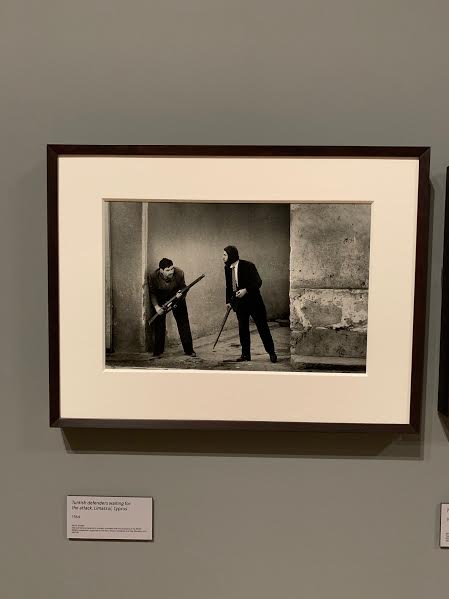
CYPRUS
In 1964 the observer magazine sent McCullin to Cyprus to cover the ongoing violence on the island known as the Cypriot civil. There was a long history of both Greek and Turkish rule over the island which resulted in warfare between the 2 groups. The images he would go on to take would be some of the first of the conflict. The People This image on the right is very symbolic of conflict as it shows how violence and fighting becomes a common scene on the streets and becomes the normalised in a daily narrative. in addition it shows a variation and juxtaposition to the more formal warfare we see now, we don't see scenes of normal citizens fighting in the street in European and western countries anymore. |
|
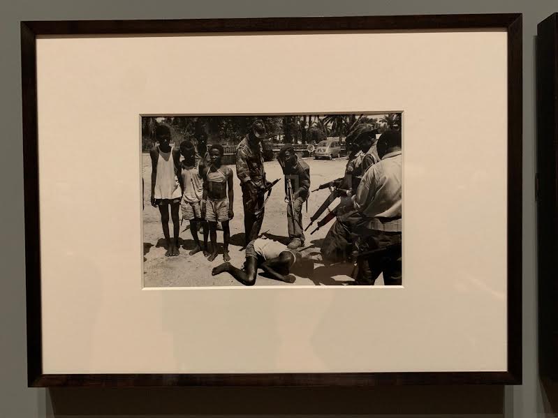
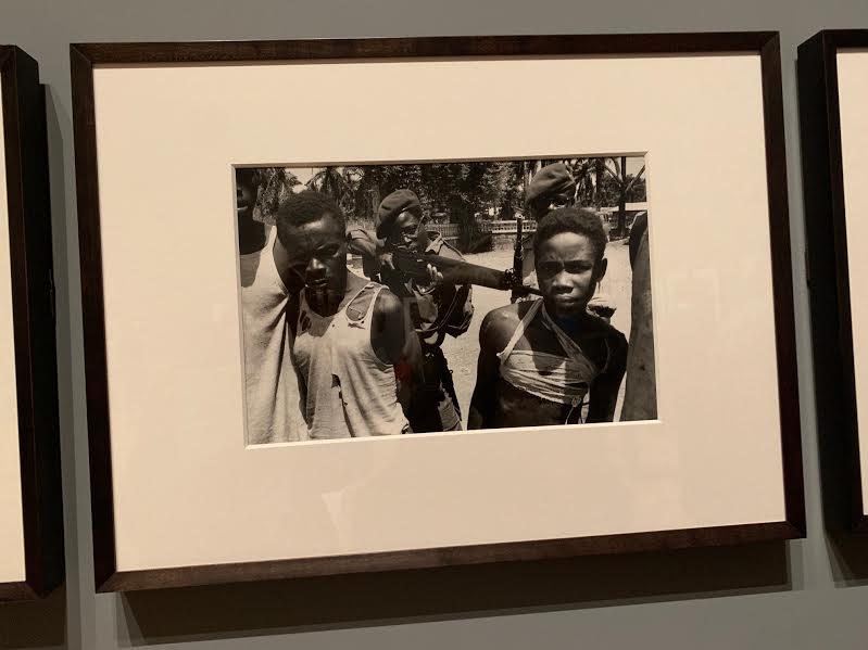
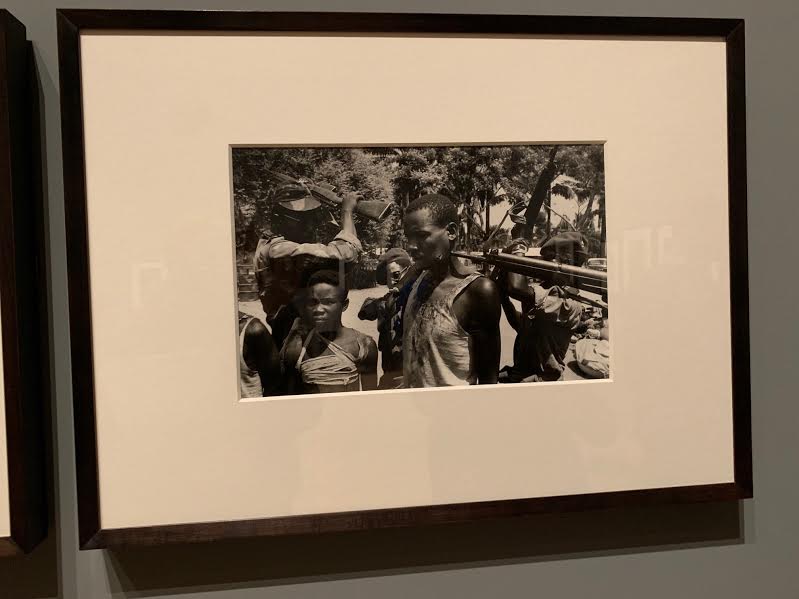
CONGO
in 1964 don also travelled to the Republic of Congo, now the Democratic Republic of Congo. He was tasked with documenting the rebellion that followed the murder of the countries first prime minister. The assassination took place during a period of unrest following independence from Belgium colonial rule in 1960, it was believed that because of this the US and Belgium had a role to play in the assassination.
The people VS. The people
The country had fallen under 4 separate governments in this time. He said 'the fighting I encountered was vicious, and on the whole, evil men prevailed'. We can see this conflict unfolding in these images of Congolese soldiers tormenting their prisoners before execution. In a country where a nation becomes so separate and violent towards each other you don't have to look far to see the variation in political affiliation within the country and the tensions felt due to this variation.
|
|
|
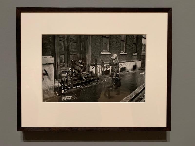
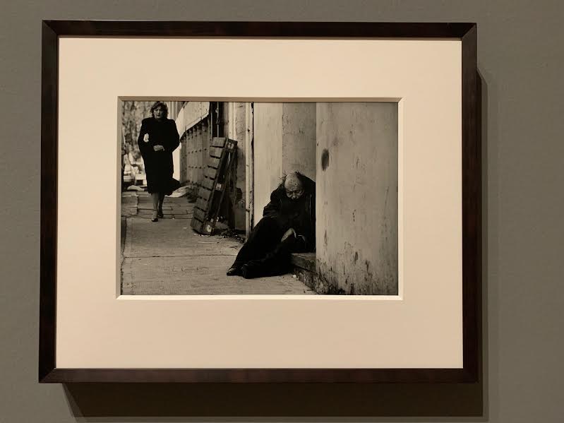
THE EAST END
From the late 1960s to the early 1980s, McCullin photographed communities of men and women living on the streets of Aldgate and Whitechapel in east London. He began photographing people who he felt had been left on the street following the closure of psychiatric institutions. McCullin said 'there are social wars that are worthwhile. I don't want people to think photography is only necessary through the tragedy of war', unlike other project he didn't approach this one with an objective lens he wanted to shed light of the issues that capitalism had caused and fight for the rights of people who he didn't feel had the opportunity for their voices to be heard.
Gentrification and economic disparity
Located on the edges of the wealthy financial centre of the city, the east end is completely unrecognisable now after extensive gentrification. He lamented the fact that capitalism works against people at the bottom of the social ladder who are unable to fight against its powers. In these 2 images i believe McCullin is trying to the show the beginnings of the gentrification in this area and the disregard for the people at the bottom of the social hierarchy. these images depict physical and visual representation of thew disparity of wealth in these inner city areas.
|
|
Physical similarities
After a lifetime of showing the differences between people around the world McCullin seems to stray from this when photographing in England. In the documentary which McCullin made to accompany the exhibition he discussed how now in his later work he is fascinated with what make people British, He want to explore why we are different and the sub-groups of Britain but ultimately he wants to explore what its means to be British and what quintessentially British Britain looks likes. Especially in a country which has felt the powerful effects of globalisation I think this is such a interesting complex question, what does it mean to be British? However despite this being conversation sparked by his later work I think we can clearly see this curiosity coming through in his earlier works as well. Even when he was only starting out you can see having been surrounded by the influx of migrants into places like Finsbury Park has inspired him to capture what this new a diverse Britain looked like and how this would change what it was to British and to identify as British. So overall we can see how his photography of Britain aims to join people and show the similarities between them, even if it is as simple way as body language. the images below are a clear example of this.
After a lifetime of showing the differences between people around the world McCullin seems to stray from this when photographing in England. In the documentary which McCullin made to accompany the exhibition he discussed how now in his later work he is fascinated with what make people British, He want to explore why we are different and the sub-groups of Britain but ultimately he wants to explore what its means to be British and what quintessentially British Britain looks likes. Especially in a country which has felt the powerful effects of globalisation I think this is such a interesting complex question, what does it mean to be British? However despite this being conversation sparked by his later work I think we can clearly see this curiosity coming through in his earlier works as well. Even when he was only starting out you can see having been surrounded by the influx of migrants into places like Finsbury Park has inspired him to capture what this new a diverse Britain looked like and how this would change what it was to British and to identify as British. So overall we can see how his photography of Britain aims to join people and show the similarities between them, even if it is as simple way as body language. the images below are a clear example of this.
|
|
|
NORTHERN IRELAND
In 1971 The Sunday times sent Don on one of many trips to northern Ireland to document the political unrest. his images were published as part of a photo-story entitled 'war on the home front'. in the 1960s civil rights campaigns to end the discrimination against the small catholic community of northern Ireland resulted in accusations of police brutality. subsequent violence and rioting broke out between republican parliamentarians such as the IRA, unionist parliamentarians such as the UVF and British state security forces.
Street warfare
the conflict was mostly fought on the streets with violence often flaring up in residential areas where segregated catholic and protestant communities met. more that 3,500 were killed and more that 50,00 were injured, most of whom were civilians. Again similarly to the images taken in McCullins early careen in Berlin we see how political street warfare fits in within the daily narrative. not only do the images below show a juxtaposition between the people and the fighters but also a juxtaposition between the events that were occurring and normality, allowing McCullin to capture unique scenes where people are acting without thought and without a sense of what is normal.
|
|
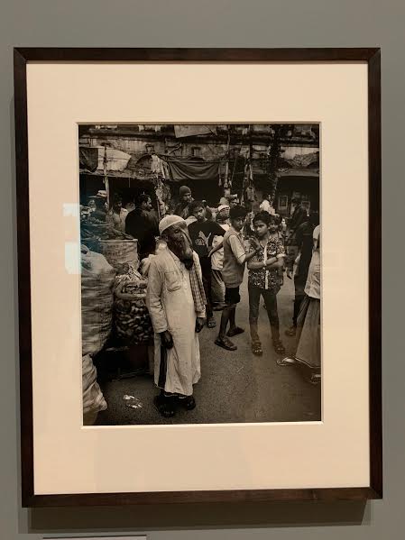
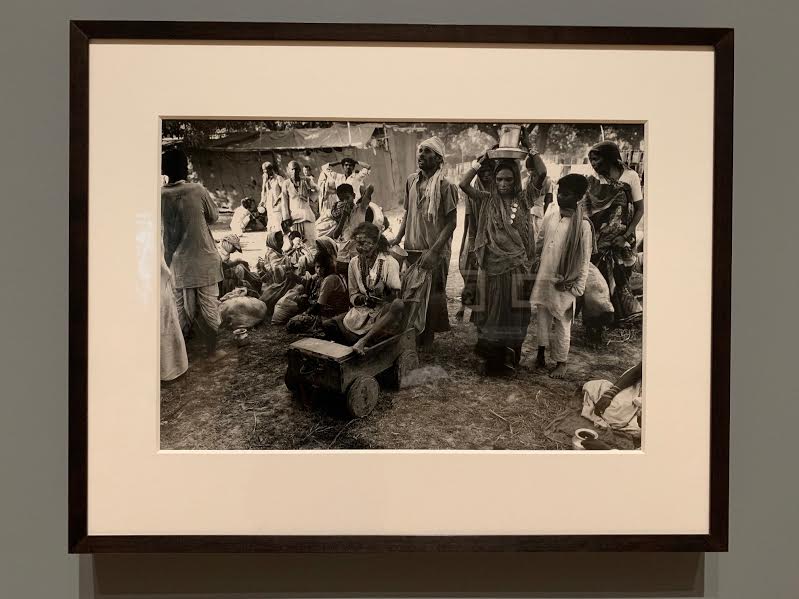
INDIA
Disabilities
A small but noticeable part of McCullins imagery from India is the focus on people with disabilities that he encountered there. These images stood out to me as part of the topic of variation because the composition emphasises the separation between the disabled person and the people around them. It seems as though McCullin has unintentionally captured a moment where the people have separated and distanced themselves from the subject. This places further emphasis of the idea of variation between different people and how this variation can effect our social interaction and who we associate ourselves with, this is idea that is heavily discussed in the documentary that McCuillin made to accompany the exhibit.
|
|
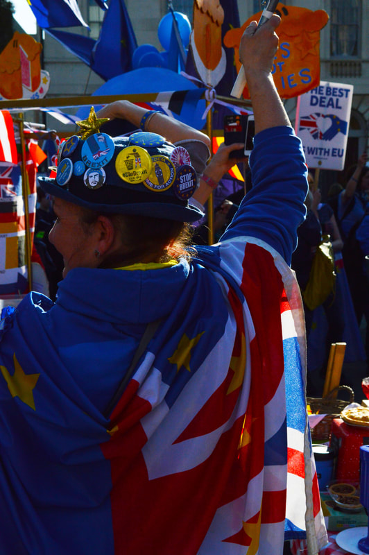
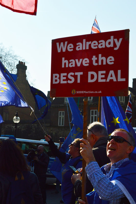
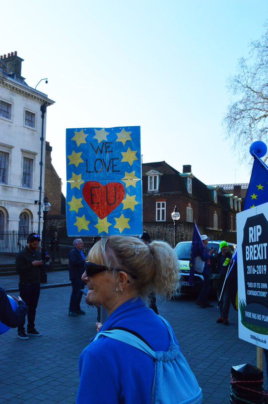
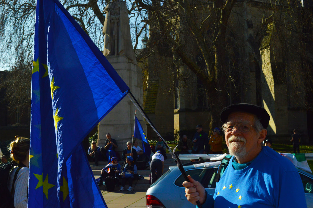
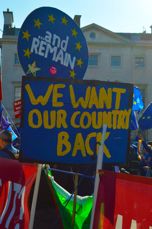
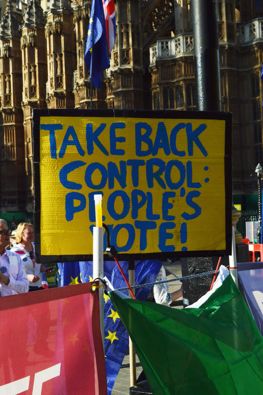
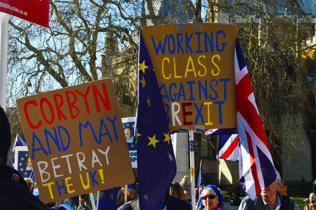
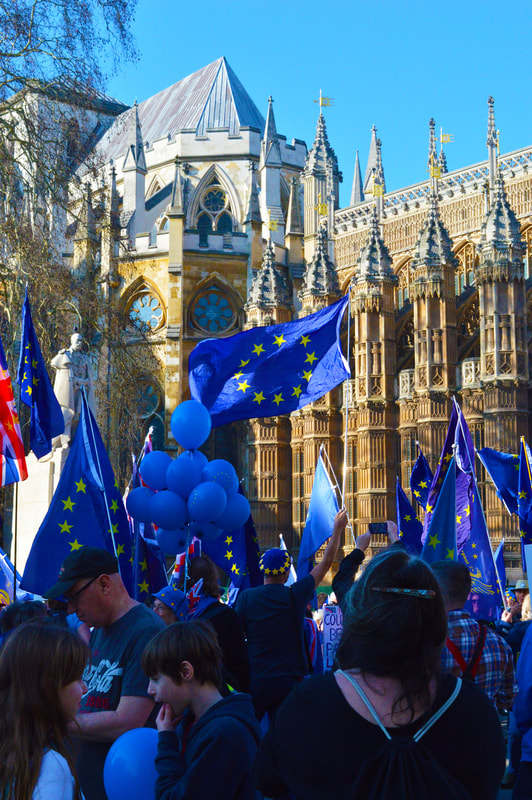
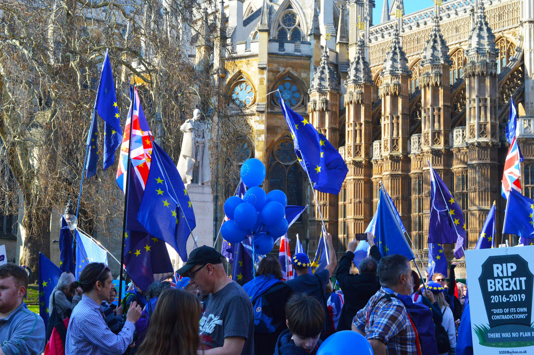
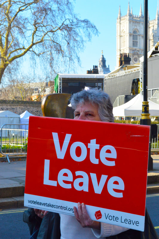
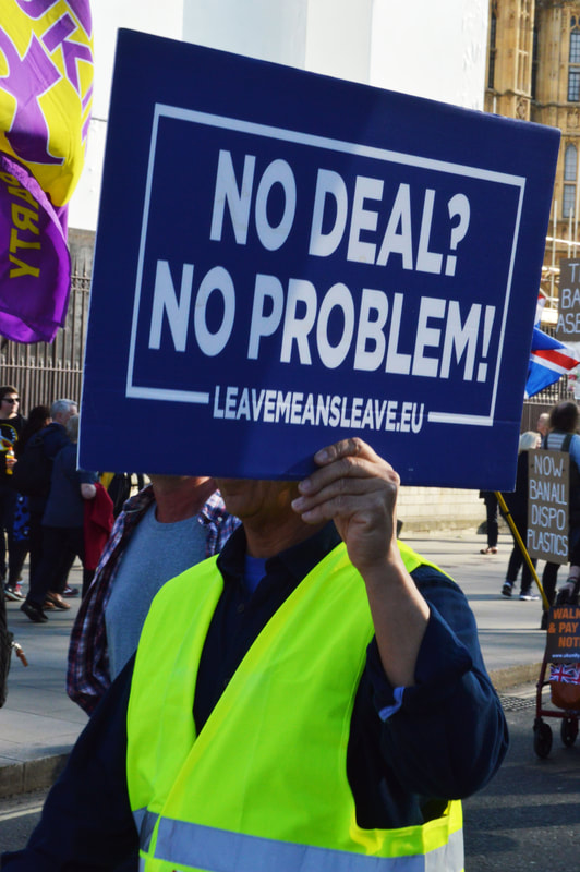
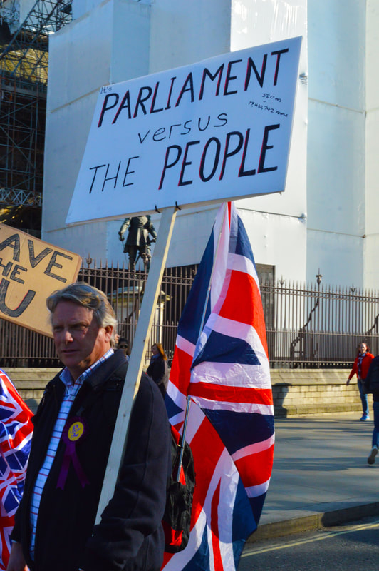
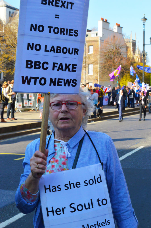
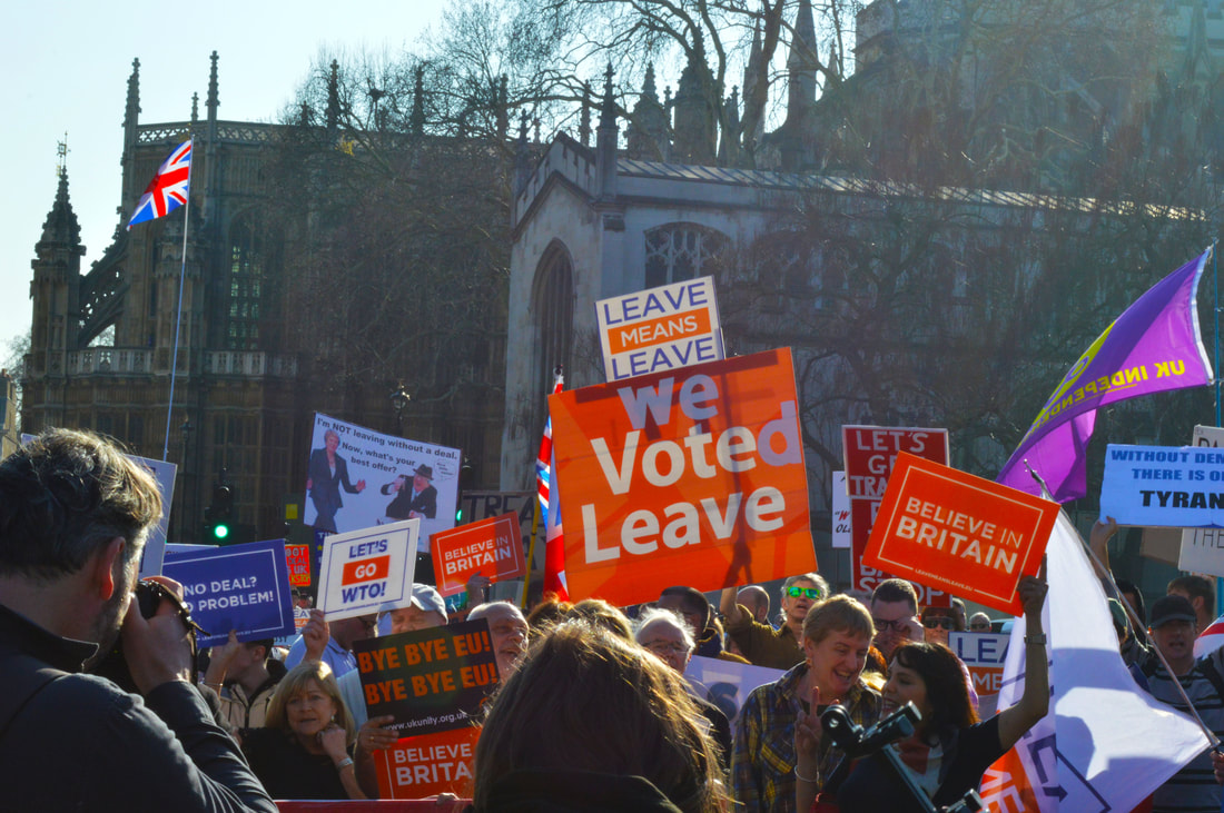
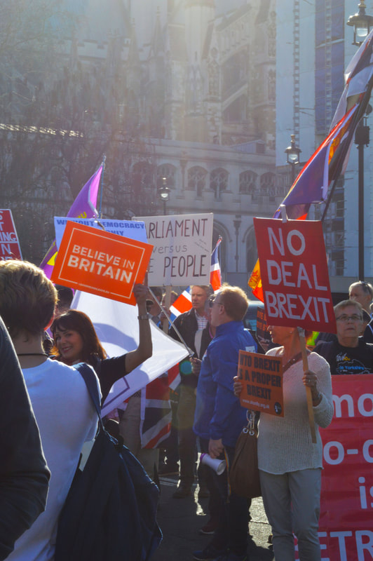
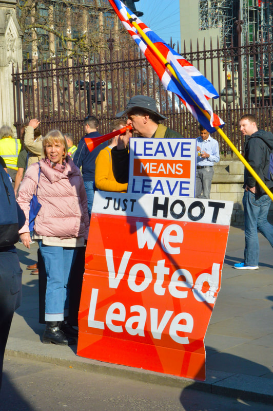
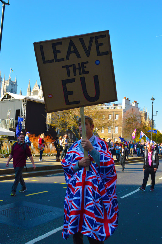
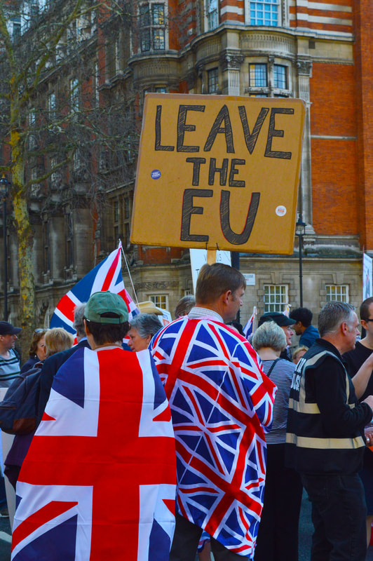
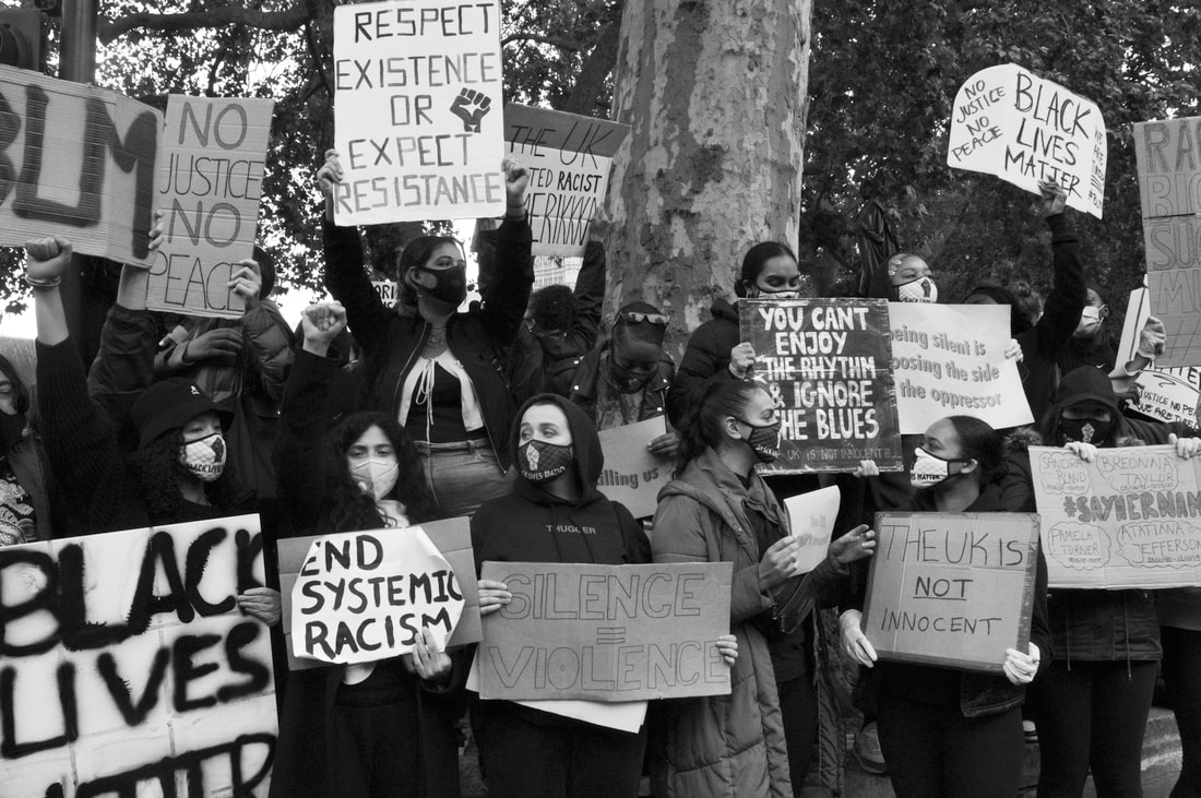
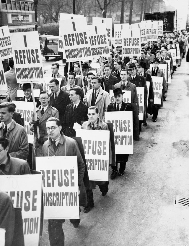
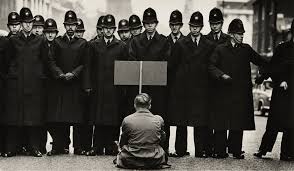
Variation in Political Views- Leave/ Remain Protest
For this task I photographed a protest happening in parliament square. However there were 2 very clear opposing sides who weren't engaging with each other but were clearly opposing and trying to spread their own individual propaganda. There was a pro brexit side and a pro remain side. There were clearly different atmospheres surrounding both groups and i think that this is evident in the imagery.
REMAIN
|
|
|
|
|
|
|
LEAVE
|
|
|
|
|
|
|
|
These images were taken directly after looking at the work of Don McCullin and with that in mind I tried to be a non biased documenter and shed light on both sides equally, I think I was successful in doing this and as a result of it I also showed variation in views to a good quality as well. All in all I think that this development was successful and with politics being one of my other a level subject I think this idea and the concept behind it would be something interesting to explore for my own personal interest but also as I feel it really embodies the title of the exam and what we are aiming to capture.
Similarities Between Locations
Artists- Páraic Mc Gloughlin and Kevin McGloughlin
This is work created by two brother which aims to show the similarities in landscape using gifs. they compile images of different landscapes but images that depict the same landforms and form these into patterns or sequences. this link well to the topic title because it is an exhibition of variation and similarity, this format showcases this very successfully.
|
|
|
|
|
Arena from Páraic Mc Gloughlin on Vimeo. |
Páraic Mc Gloughlin
|
|
Kevin McGloughlin
|
My Work
The first 3 gif were inspired more by the arena video by Peter McGloughlin, they depict more common landscapes and man made structures such as roads and stadiums. The 4th give is heavily inspired by the Talos video Kevin McGloughlin, this one looks at more abstract and natural landforms. This is what I aimed to look at in the 4th gif, trying to gather images of the most diverse landscapes that I could find from all over the world.
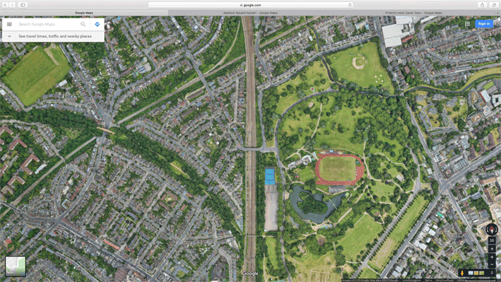
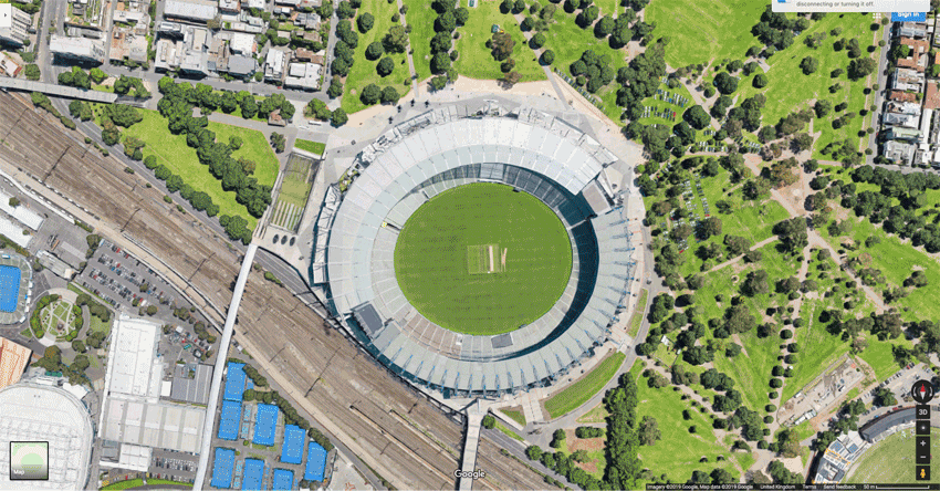
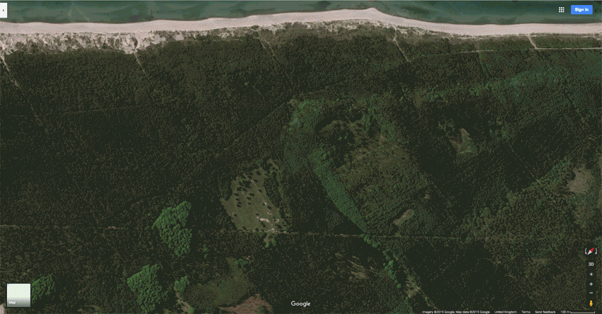
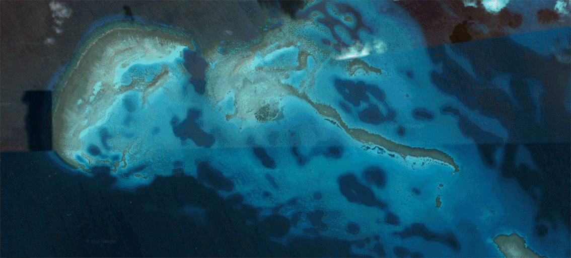
This task was successful in showing variation and similarity simultaneously, it has a lot of potential to develop further, i could experiment with colour and shape as opposed to building and man made structures.
Variation in layout and parts
Artist- Noémie Goudal
The work is inspired by Noemie Goudal her work aims to change the perspective or narrative of a landscapes by placing a material within a landscape and changing it using just one simple thing. The artist questions the potential of the image as a whole reconstructing its layers and possibilities of extensions through landscape instillations. For this particular series she travelled mainly to France, England and Germany where she photographed fragments of buildings which she then printed on paper an mounted them on cardboard. All her images are made physically in the actual landscape, the constructions are not edited into the image, they are placed there. The building at 2D and the shadows are a result of photographing building in the same light that she photographs the landscapes in. She edits her images to black and white to achieve the archival image effect that he wants to portray with her work, he feels as though black and white images lend itself better to this aesthetic. There is also an underlying theme in the her work whereby she aim to create a juxtaposition between the man made and the natural world, this shows variation but by combining them it shows similarity and brings the 2 aspects to appear as one. She is very interested in the ideas of man made vs nature and this leads her to looking at geomorphic architecture, architecture that is built within nature of built of observe nature, gouda takes a lot of inspiration fro these buildings in her work.
|
|
|
My Work
|
In goudal's work she talks about how nature inspires man made creations and in her work she presents this idea by taking large images of the natural world and placing them in man made landscapes, as a result of this we can directly see the inspiration we take from and correlation between nature and the man made. In my work I presented this idea slightly differently by creating the man made object from nature, the building I constructed in photoshop was originally images of rocks which i then cut and pasted to create the building. By doing this I hope to create a similar effect, to show how we get inspiration for our creations from nature. In addition I think it also shows the versatility and varying uses of the rock, and makes us look at building materials from an alternative perspective, when we look at buildings we may not always see them for what they're made of but in these images that is what it tries to embody it is blatant instead of subtle, again hopefully this reminding the audience of that connections between man and nature.
|
|
|
|
|
|
|
|
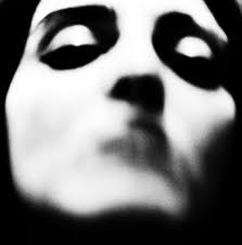
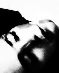
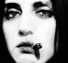
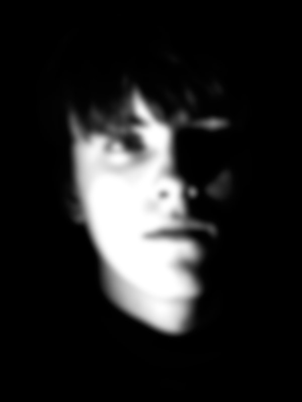
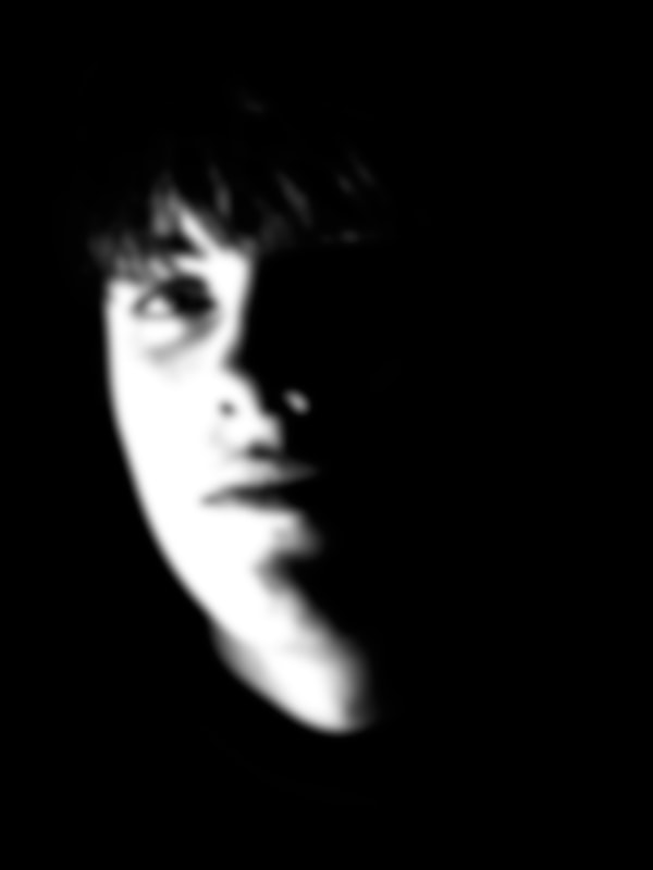
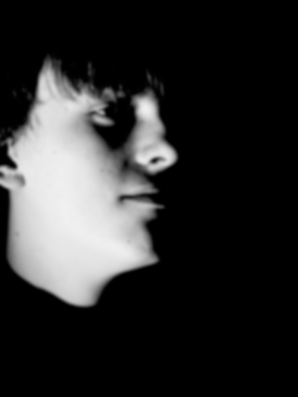
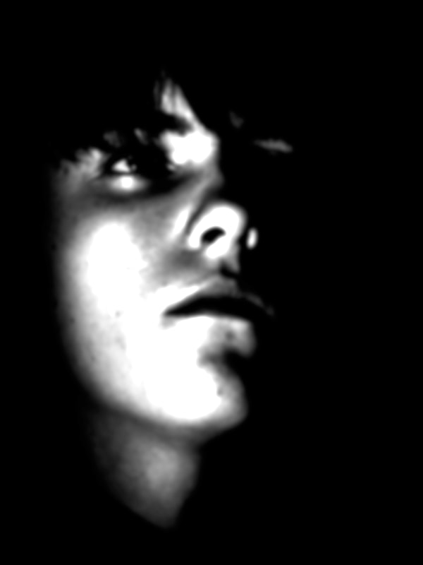
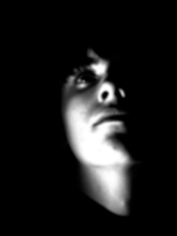
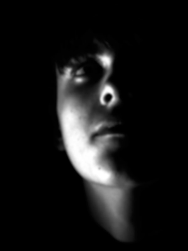
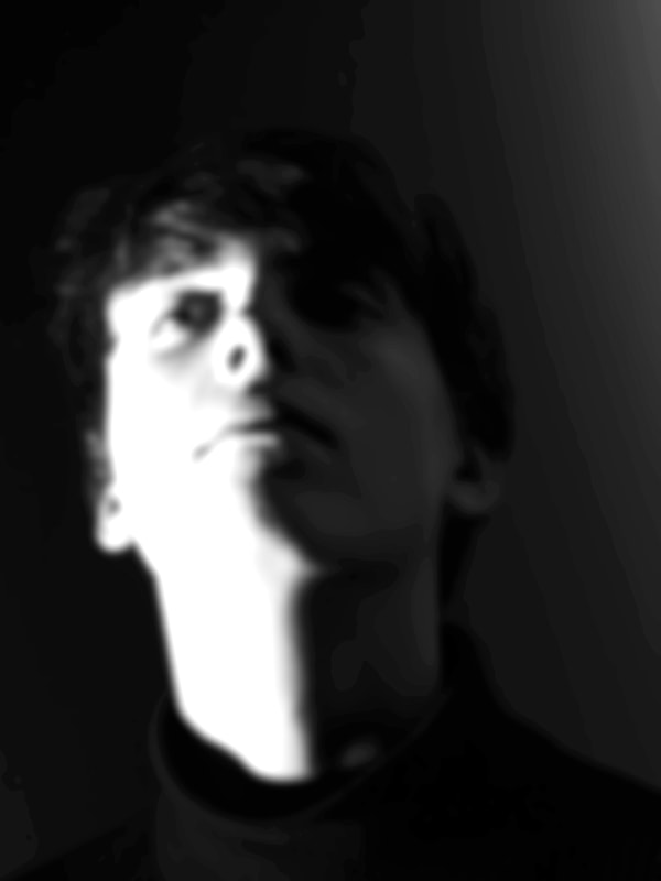
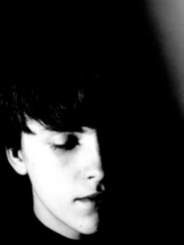
Shadow and Light Portrait Variation
Artist- Valerie Kabis
Kabis is interested in looking at light shadow and darkness to create alternative portraiture by using light she creates alternative and unique shapes within the genre of portraiture. in some images she takes it as far as making the image almost abstract or unrecognisable as a face.
|
|
|
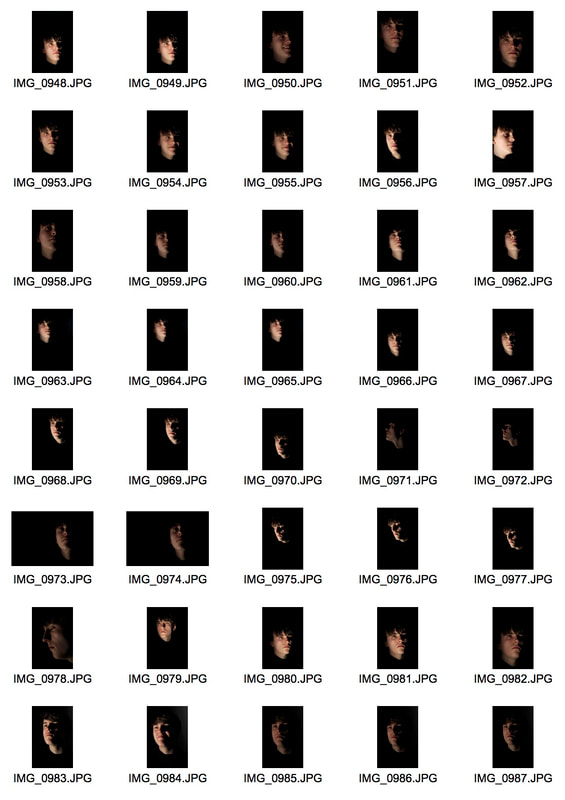
My Work
In my work I also played with light and shadows to create this silhouette effect as well as effect used when staging the image I also used photoshop to intensify the shadows and light and more closely achieve the effect that I desired. I photographed my subject in a dark room with a black backdrop and a single spotlight on him. the angle of the light effected the shape of the visible parts of the face, changing the angle of the light and the direction he was facing meant that the shapes in the image appeared different subsequently showing a variation in perception of the face and the subject. This task also exhibits a variation from mainstream portraiture using its alternative and unique aesthetic but is still similar in that it still falls under the category of portraiture.
|
|
|
|
|
|
|
|
|
|
I think the techniques i used in the this tasks were successful in achieving the desires aesthetic. if we ere to develop this maybe I would experiment with inverting the images instead of doing low light and high contrast. I could also play around with different colour combinations not just keeping the images in black and white.
STRAND 1-
COLOUR TYPOLOGY
For this strand I want to take inspiration from a video I came across (I have linked this above) to explore the idea of creating variation in photoshop like what we did out variation in layout task but also take inspiration from out variation in focus task where we look at landscapes through an alternative lens, from a new perspectives. For me a kaleidoscope embodies that perfectly, you're looking through a vision altering lens and this is an effect I want to artificially replicate in photoshop using images of the new york landscape. There is no particular artist that inspired this work, only the knowledge of the technique and seeing the end result of the image in the video.
Even though the video was self explanatory I didn't follow it exactly and the techniques that worked for one image didn't necessarily work for all of them. I've explained this in the step by step process, I have shown my own personal process below and have specified where I have strayed from the original instructions.
|
|
|
|
STRAND 2-
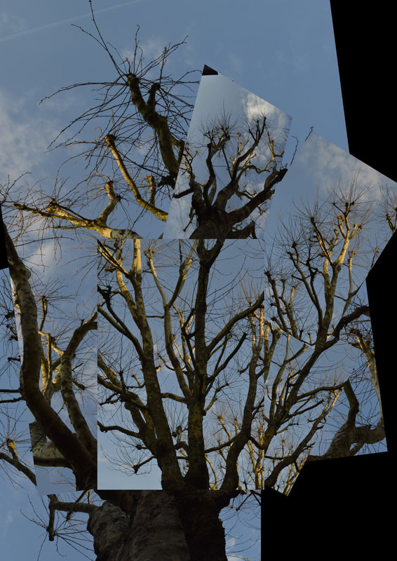
VARIATION AND CONTINUATION IN PARTS
In this strand I want to de composed images of trees to create a new images. This idea is inspired by Noemie Goudal and her work with variation of parts and layouts. The subject I will focus on is trees because they are versatile and free flowing, so easy to reconstruct. Not only does this concept explore ideas around variation in layout it also brings forwards some more interesting ideas of man made nature and the implications of that, in a more complexed form this is genetic modification, something that is very controversial and a current social dispute for many people. Having listened to Noemie Goudal talk about her work specifically around nature and how this is meant to convey more complex social issues this has really inspired me to try and make my work more multi dimensional. Not only in this stand but in all my work, I think aiming to address some more hidden and deeper messages in my work is what will help me progress as a photographer and what will make my work more interesting.
|
|
STRAND 3-
SIMILARITIES IN VIEWS/ UNITY
Artist- Don McCullin
The decade of the 1960s was a period of significant social change. It was known as 'the Swinging Sixties', it was a time when social laws were liberalised. After a long gruelling war people no longer wanted to approach conflict with violent and fatal approach. Britain wasn’t directly involved in the Vietnam War, however British musicians such as John Lennon still brought it to the attentions of British people through protests against the conflict. Young people were finally given a voice and the freedom to do what they wanted. People began to challenge and question authority, something that would have been unheard of a decade ago. McCullin captured this tumultuous time and shows clear variation and disparity between the the people and authority. while still showing unity and similarity within the opposing sides, unity being emphasised by the joint goal of peace.
|
|
|
My Work
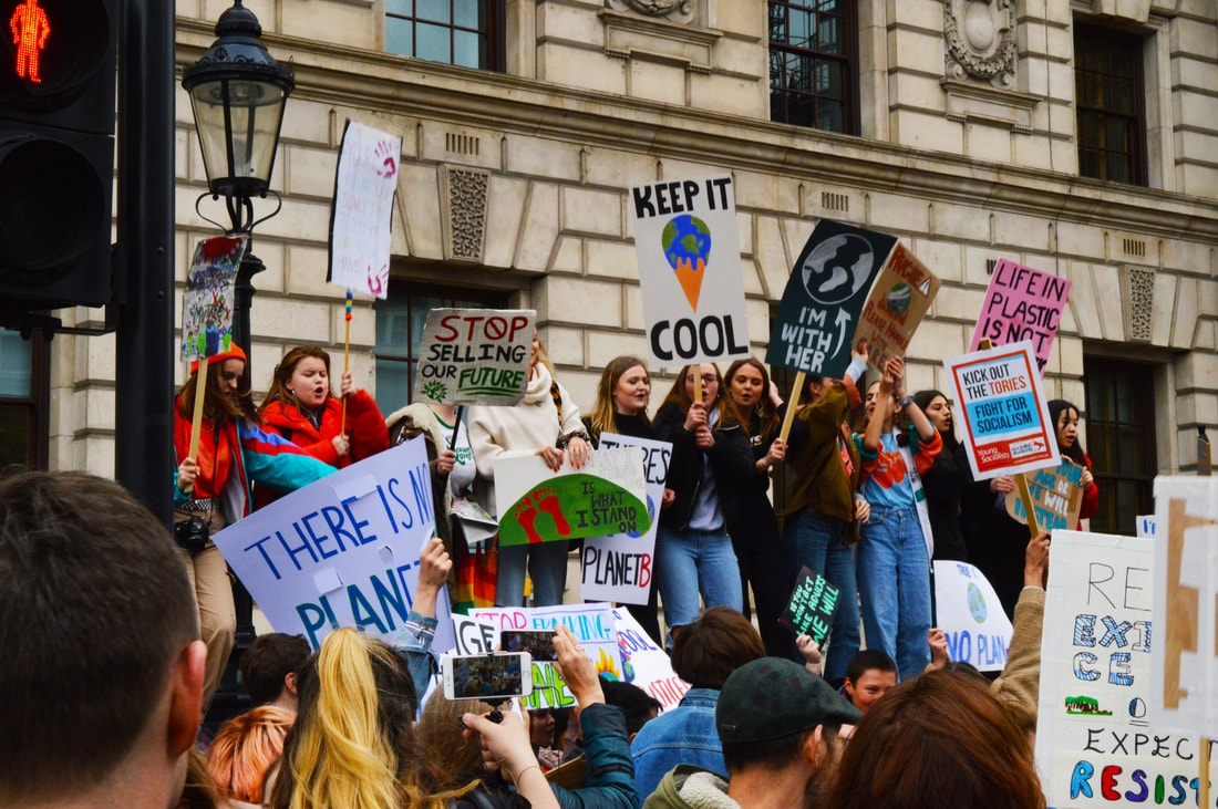
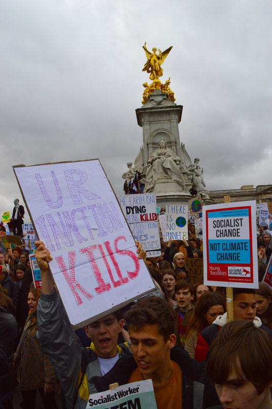
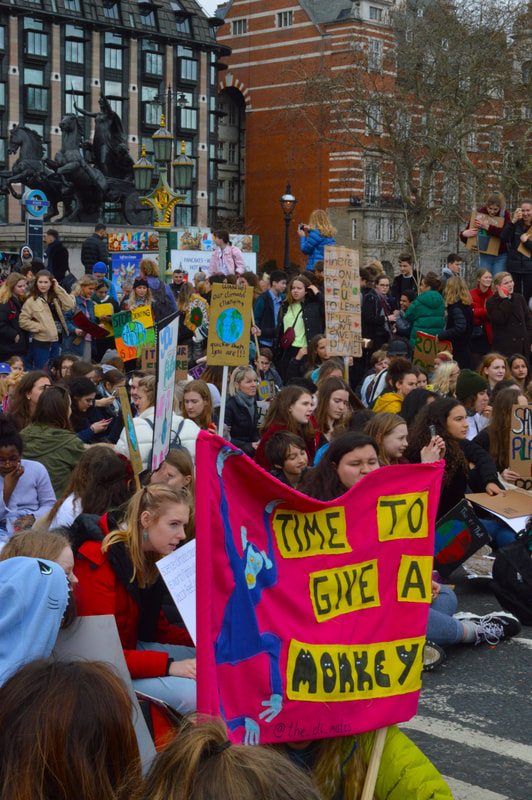
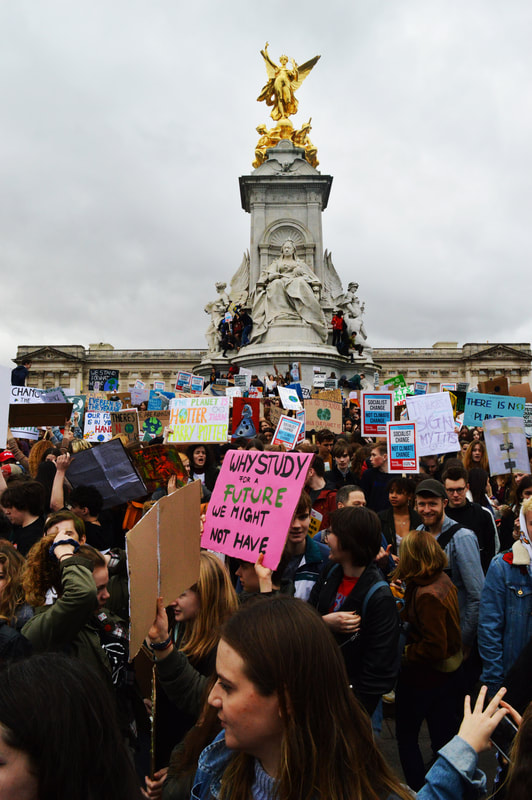
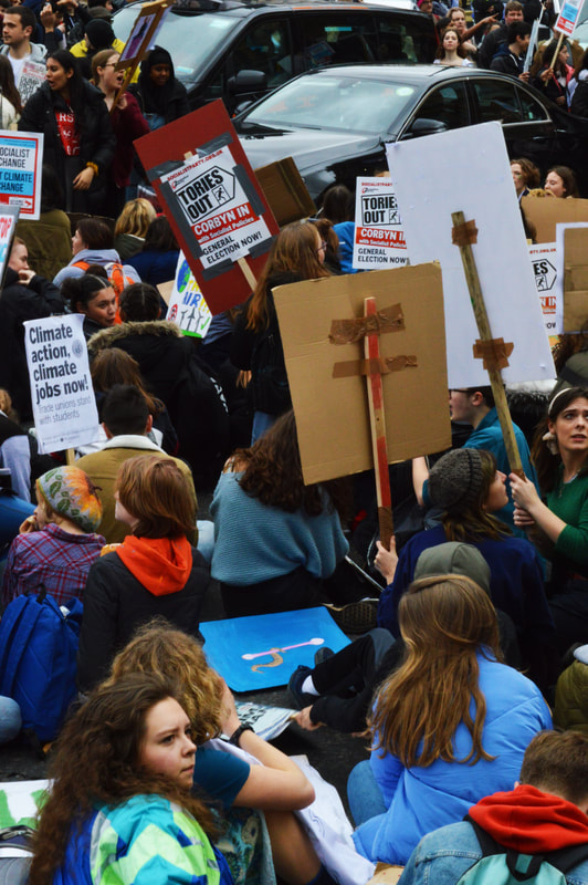
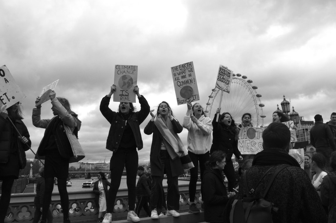
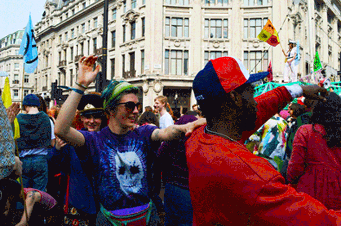
In this development I set out to photograph the Friday school strikes for climate action. After my previous strand I was really looking to explore more social issues in my work and this seemed like the perfect thing to go to. I have always been interested in documentary photography and photo journalism. I really try to navigate lots of my work into that direction because that is what inspires me the most. However after recently going to the Don McCullin exhibition a lot of what I had heard him say and seen embodied in his work was fresh in mind. This involved things like being an unbiased documenter, photographing both sides, and for me that enabled me to show variation but also exploring this idea of unity and what bring us together, which was good for me in showing similarity.
|
|
|
|
|
|
|
|
|
|
I really loved the outcome of these images, I thought that they were successful in conveying the atmosphere of the protest. I felt like being young myself gave me a unique insight, ofter photo documenters and journalists attribute some of their success to being able to relate to their subjects which is definitely something I could do in this case, not only that but also climate change being subject I am actively caring about so I also felt this passion worked in my favour. It quickly became apparent to me that this was the strand I wanted to take forward, before I had even gotten the images home, it was the one that worked best with my skill set, embodied both sides of the exam brief, explored social controversy and the strand the I could see the most potential in. The friday strikes meant that I knew I could have a continual schedule for photographing and I knew there would be a consistent turn out, not only that but I am also an active member of extinction rebellion and I knew that their week of protests was coming up shortly, this seemed like the perfect opportunity to photograph the subjects. I like this strand and I think it came out how I imagined however as fast pace as the protest was going I was thinking equally quickly about what my images were missing while there. I then thought about Don McCullin's work and the black an white aspect which I felt was very impactful I also felt like the images I had taken were good but they weren't personal enough, the images that I see documentary photographers take are always more intimate, not so much of the big crowds and more of the individuals who make up those crowds, so from the on i used my camera to capture strictly individuals and edited them to black and white in photoshop. i explain the thinking behind my next development in the writing below.
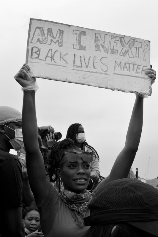
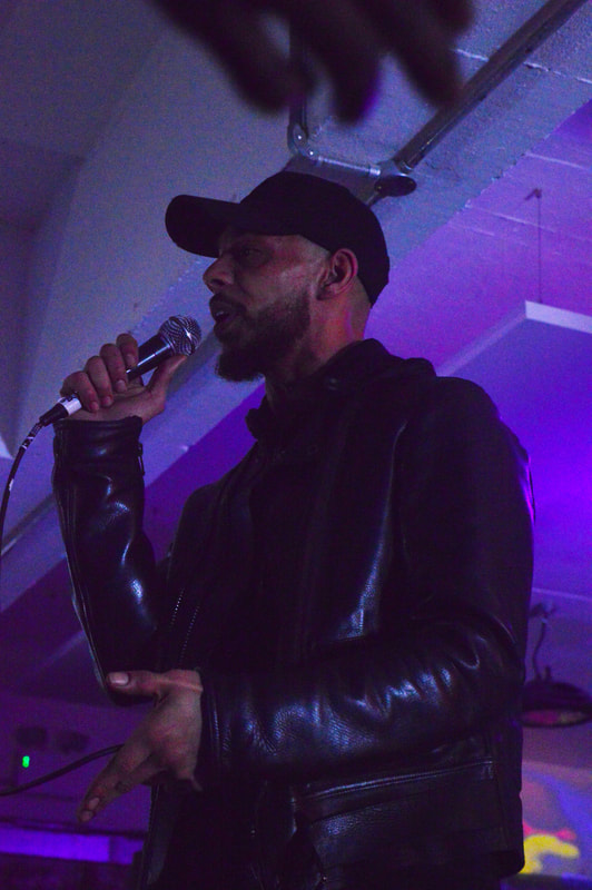
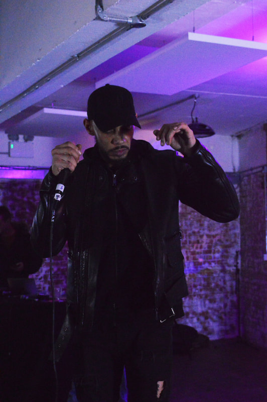
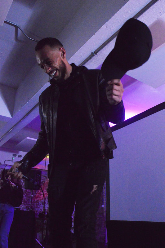
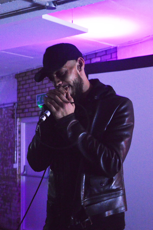
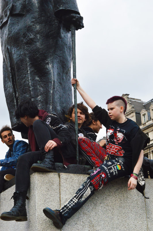
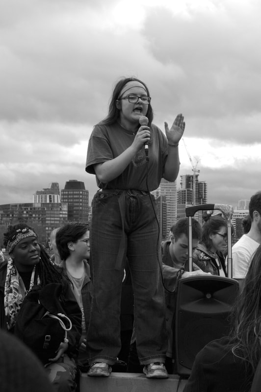
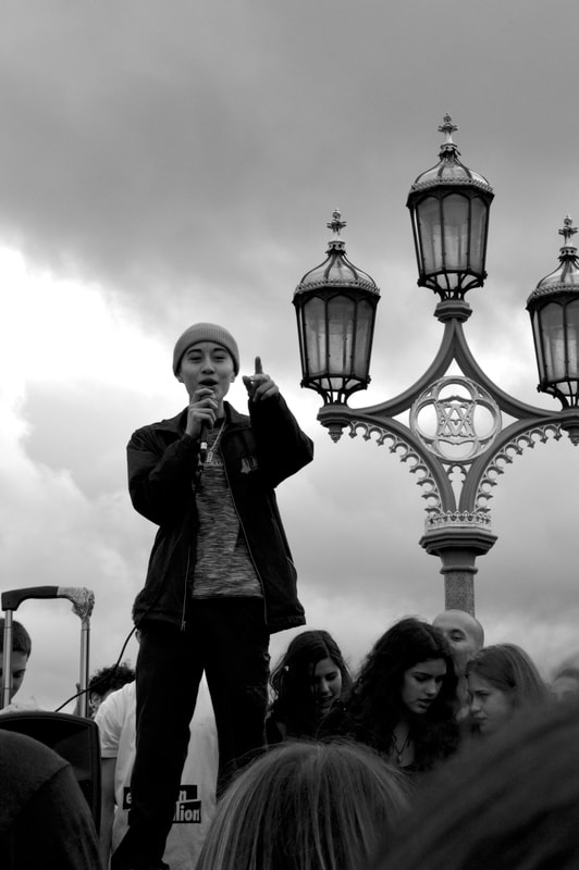
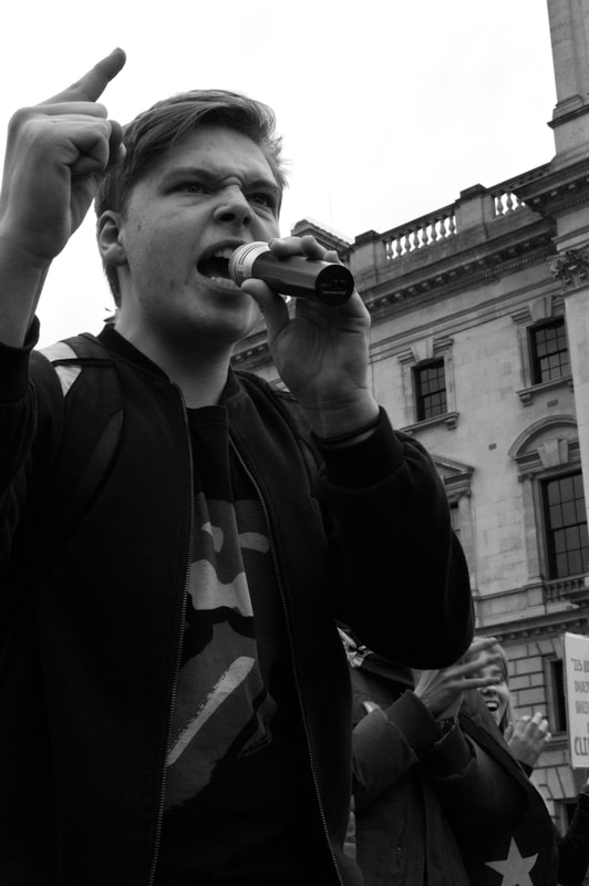
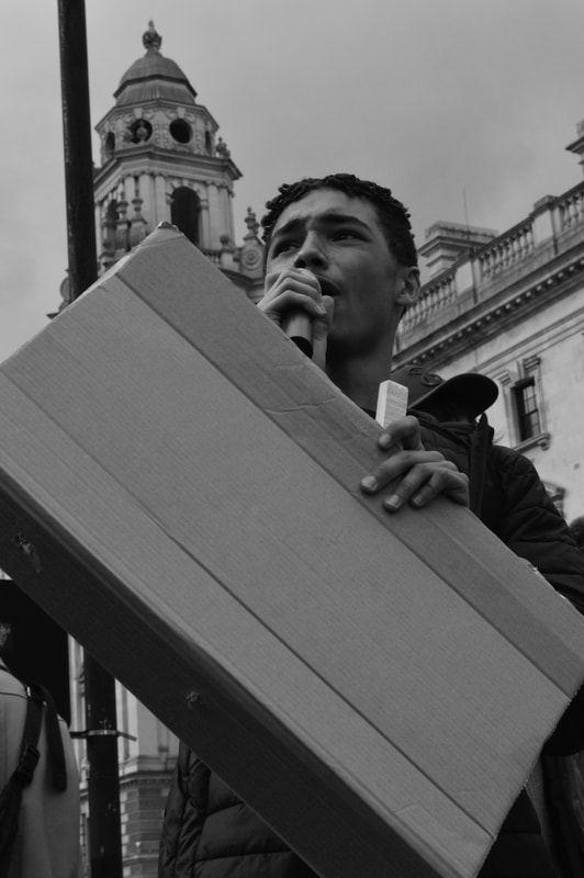
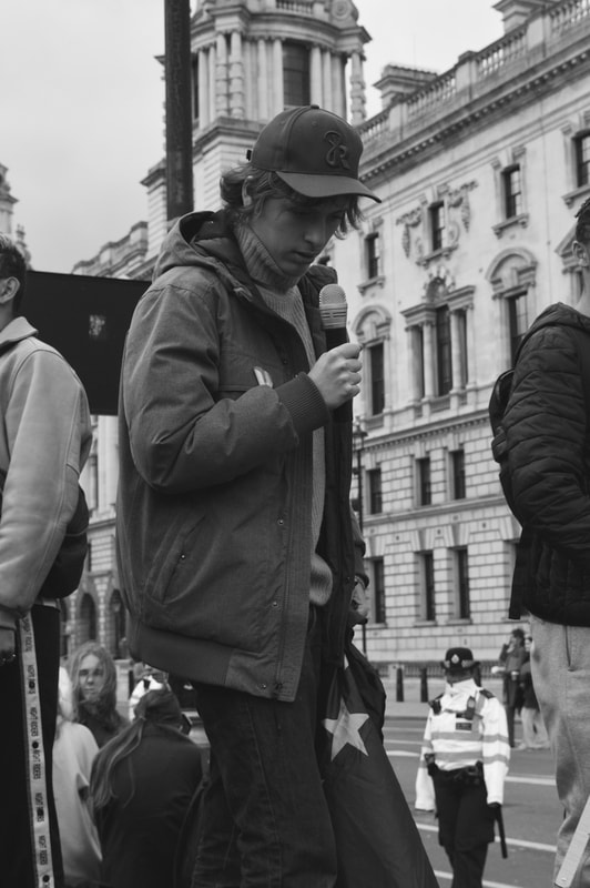
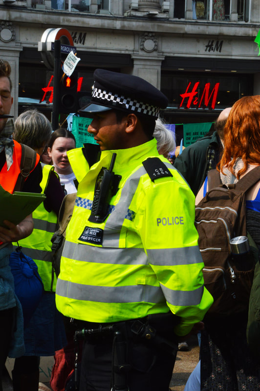
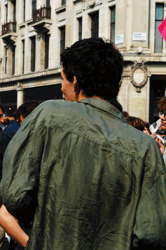
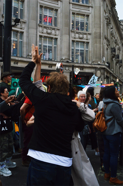
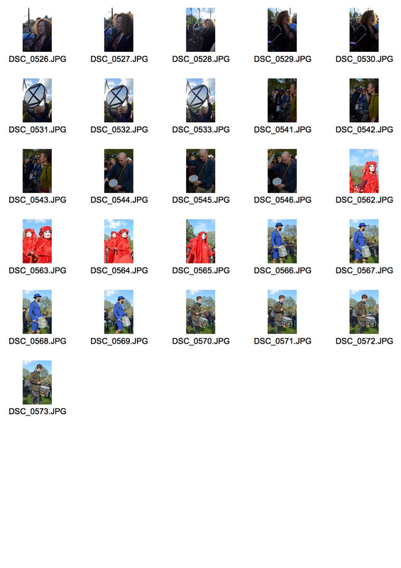
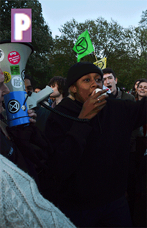
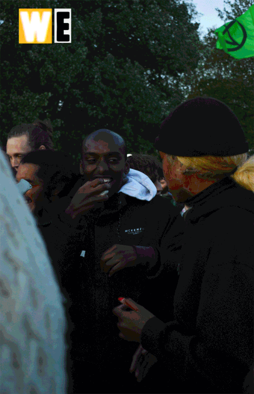
DEVELOPMENT 1- INDIVIDUALS
This strand was somewhat calculated but did not have great planning behind it, I knew I always intended to make them black and white because I wanted to more closely match the aesthetic of Don McCullins work and I felt at the time that there was something more impactful about the black and white imagery. I also knew I wanted to focus on individuals, so I tried to sought out interesting people in the crowd who were isolated enough for me to capture them on their own. Most of these images were taken in parliament square where lost of speaches were taking place, this was the perfect set up for me to capture my desired images.
|
|
|
|
|
|
|
|
Focusing mainly on the people who actually wanted to get up and speak meant that I was photographing the most passionate amongst the crowd which is something I think translates clearly in these images, you can tell by the expressions on their faces and their emotive body language. I think this is the thing that made this development successful however after getting home and editing the images into black and white they lost something. The protest was colourful and vibrant and I think the colour images conveyed this and the atmosphere more effectively. So for this reason in my next strand I will go back to colour while still focusing on individuals and see how that transpires. It was also apparent to me that I had not yet photographed the opposing side, however to be honest it wasn't really clear on who/ what that was, was it the police? To me they seemed like a harmless proportion that weren't really going against the protest. I suppose some people were aiming their anger to the government but they weren't represented in this informal scenery, I guess you could say they we're faceless or anonymous especially seeing as this is a multi party issue. There was also hate directed towards capitalism and that is more of a non physical concept with physical manifestations so that felt hard to capture also. Don McCullin's work had really made me think about the opposing side and with the extinction rebellion week of protest being my next event I wasn't sure what to expect so in the next strand I definitely want to bare in mind the idea of opposition but don't think i'll I know how to capture this or what I will capture this until I get there.
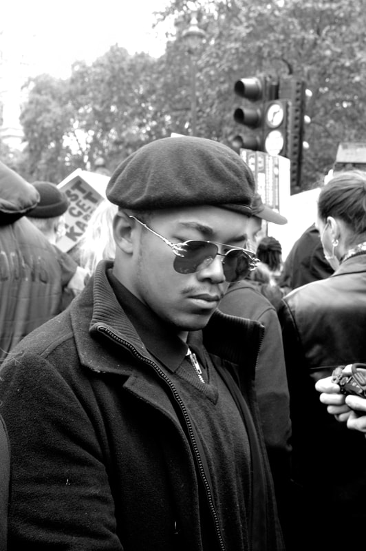
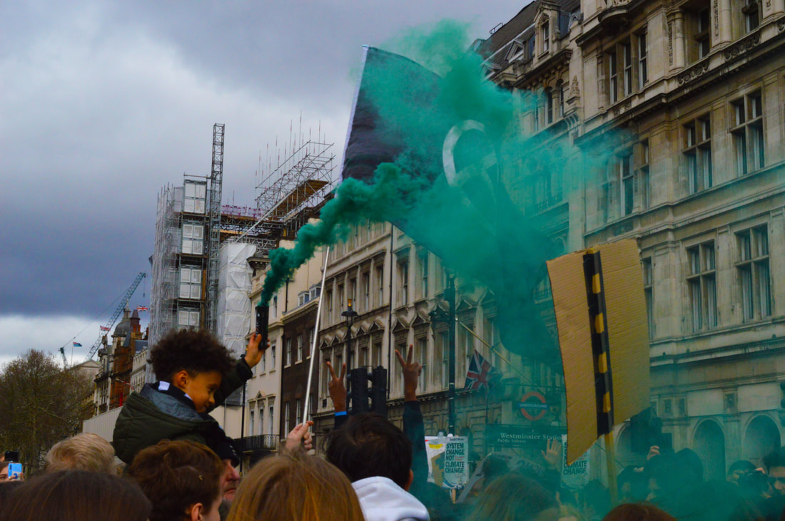
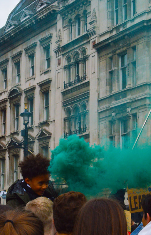
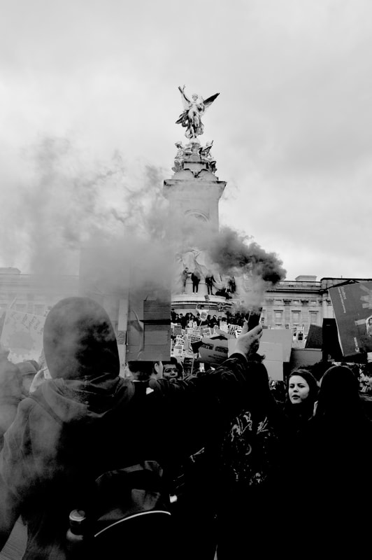
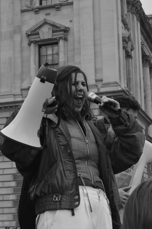
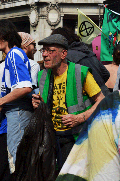
DEVELOPMENT 2- INDIVDUALS IN COLOUR
In this development I will photograph individuals on the second day of the extinction rebellion protest, on the extension rebellion social media they have been posting lots of updates from oxford circus and that seems to be the main point of action so I will head there and try to explore some of the other areas that they have taken over, specifically marble arch and waterloo bridge. I aim to capture individuals in colour but also the opposition.
|
|
|
|
|
|
|
|
|
|
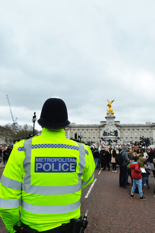
I think the colour development is definitely and improvement on the back and white one and I am still happy with aesthetic of the images, I think they depict a wider variety of people which we didn't see at the youth march, obviously because it as dominated by young people. I think that the extinction rebellion protest better showed a diverse variety of people coming together to unite and fight for the same cause. There was also a much clearer police presence here I think mainly because they could arrest more people, because more of them were adults and we were causing much greater disruption than that of the Friday protests. That day the police had been heavily criticised on the news about their lack of control over the situations and their method of arrest, it was clear they are going to re strategise and it was said that on the Thursday they were going to a attempt to completely take back control of the oxford circus area. It seemed clear to me that this is what I would photograph for my next development and this would help me become less biased and hopefully show both sides of the fight.
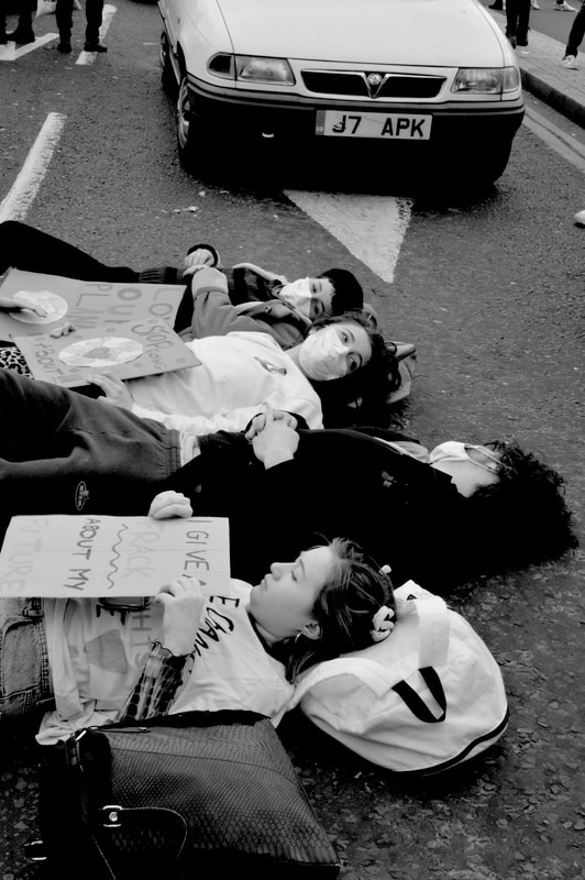
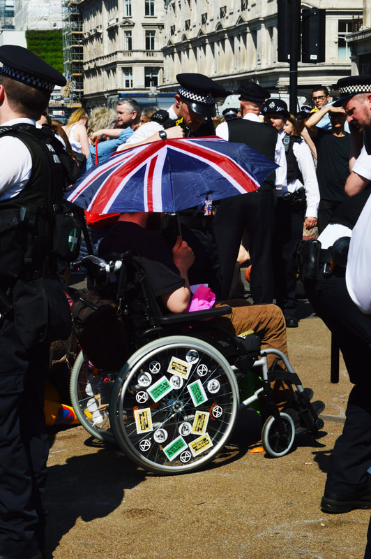
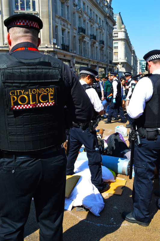
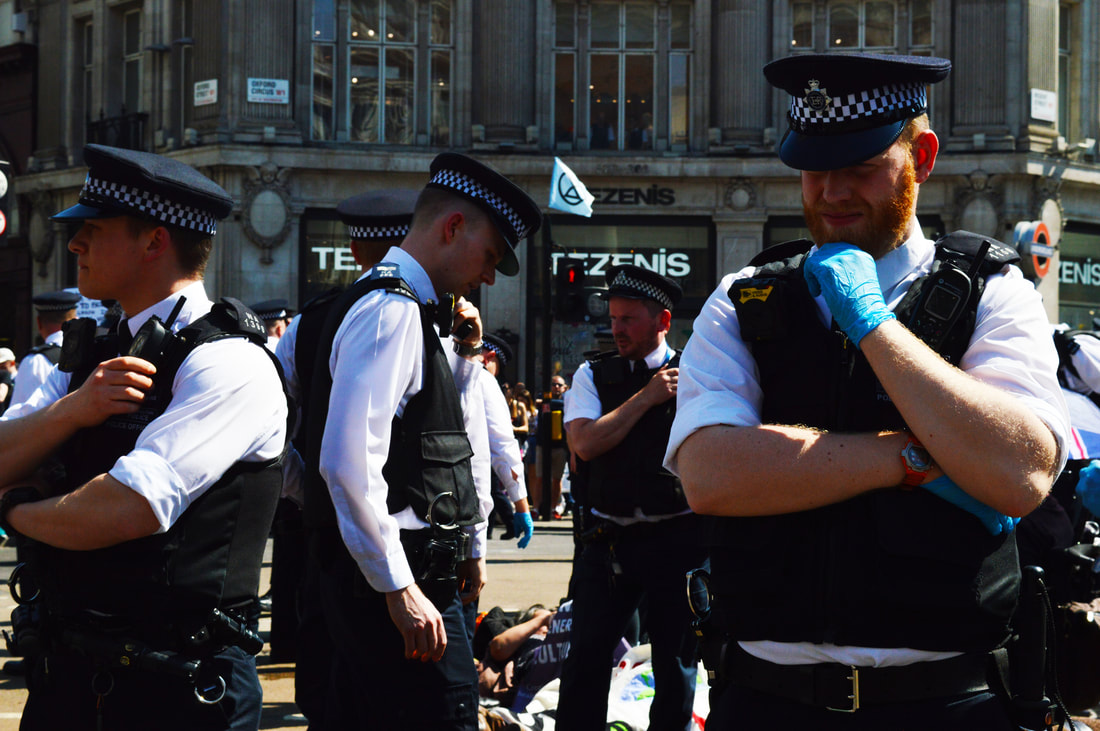
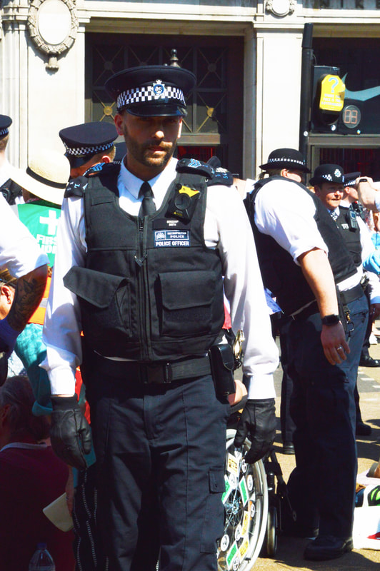
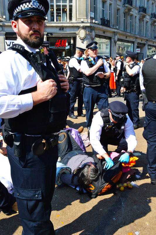
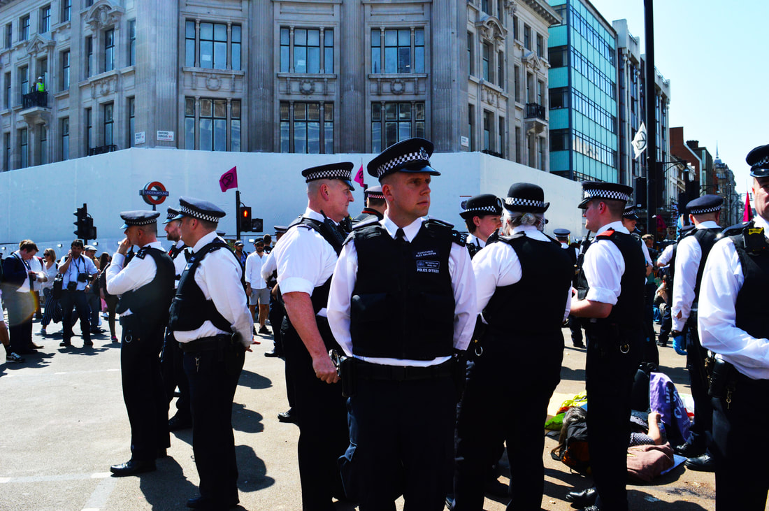
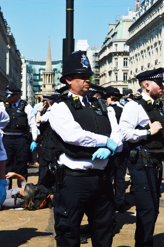
DEVELOPMENT 3- OPPOSITION, POLICE
In this development I am hoping to focus solely on the police presence at the protest today (Thursday). The news was filled with images of the officers strategically separating and dispersing the crowds, it was clear there was a crowd of passive supporters and a crowed of people willing to be arrested, these were the ones refusing to move. Even on the news it almost seemed as though the united front that I had experienced during all the protests was suddenly being broken up I was hoping in this strand to also capture that aspect of the opposition as well as the police themselves.
|

|
|
|
|
|
|
|
|
|
I have tried to keep the editing of the coloured images relatively similar, making them high contrast, bright, high vibrancy and slightly over saturated. In this case I think that this works especially well the black and white uniforms of the police really works well under these effects, and really stands out. In real life the police definitely stood out in the scenario, there were more than I had seen on any other day and I think this is made very clear in the images, although I went with the intention of photographing them it was hard not to, they were asserting themselves and surrounding the crowd. It wasn't hard to break through the first line of police, and get close to the action that as happening in the centre of the junction, this is where most of the people were willingly being arrested and you can see this in the images and in the background. They were also arresting people on the outside as well. After being in the middle for sometime a few policeman that I had interacted with the days before engaged in conversation with me, it was clear they were willing to arrest anybody who was not willing to move for them. However it seemed to me as one protestor left another one would come and i don't think that their new plan was at all effective and I definitely wasn't in fear of bing arrested despite going against all the instruction that had given to me and being threatened multiple times. This made clear to me that even though the police were the obvious opposition to the protests on the streets they weren't opposing the issue and they weren't the enemy here, they almost represented something bigger, which seemed to be the government. The conclusion I have come to is that there is really an opposition we were almost fighting ourselves and for that reason despite the fact there were people fighting back against us the idea of capturing the true opposition would be near impossible. The opposition did just simply seem to be climate change as a whole and all that that involved. So for that reason I decided to go back to focusing on the unity of the solidarity of the protest. After thinking about what the colour aspects of the images actually bought to it I started thinking about how I could really convey the vibe of the protest to people without them being there, because it was so lively and busy the obvious thing did seem to be movement and I was greatly inspired by all the dancing and music that was being played at the big pink boat in oxford circus. I knew this would carry on after the failed attempt by the police to regain control so the next day I went back to try and capture this aspect of the protest.
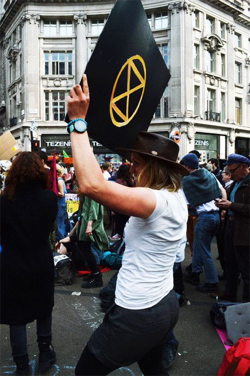
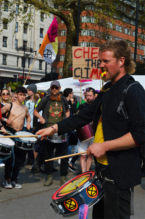
DEVELOPMENT 4- MOVEMENT GIFS
To embody and represent the movement and vibrancy of the protest it seemed obvious to me that I will use gifs. This is what I plan to do in my next development.
|
|
|
|

|
|
|
|
I definitely feel like capturing the movement bought the image to life for obvious reasons and I like the effect of this but I wasn't sure that this was an effective way to convey the message of the protest. I felt that my other work was more emotive and the message behind the images were clearer. In this development this was lost. I was interested in the idea of subtitling images and was very familiar with the work of Jim Goldberg and other artists who had text to their work. This seemed to be almost like subtitling an image which bought in than element of movement but while still keeping with the message, I decided to explore this idea further and work it into my next development, I explain the thought process behind this in more depth below.
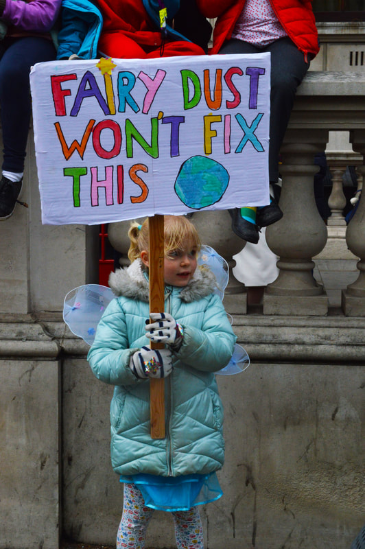
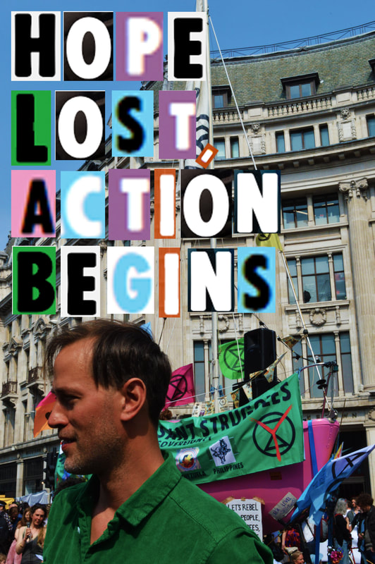
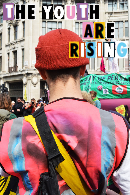
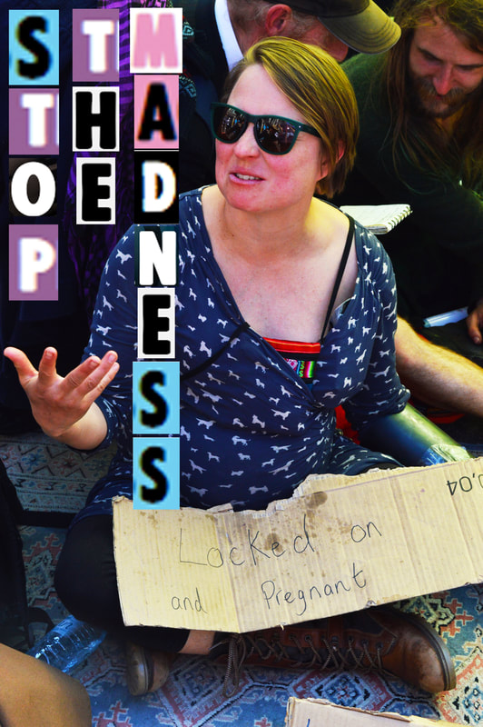
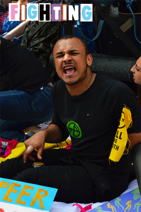
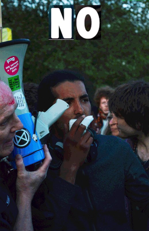
DEVELOPMENT 5- SUBTITLED IMAGES
In this strand I will add text to the images I take at the protest, I plan on taking pictures of individuals because I think in my previous developments they have been the ones that have been the most emotive and impactful. I will take direct quotes from things I see on signs and hear people chanting singing or saying so that I can add this relevant text to the images.
|
|
|
|
|
|
|
|
This development was very successful, I think I achieved all the things that I didn't quite capture or do in the other developments. I like the aesthetic and the font that I used was taken from the extinction rebellion website, that is the font they use on most of their propaganda so it was quite fitting and the colourful letters went well with the colourful imagery. However that the words shown were somewhat disjointed from the what the person was actually saying because I didn't necessarily match the 2 thing together I just put on what I felt would look best. I then thought of the idea of combining my 2 previous development by adding tougher gifs of people talking and singing and chanting with the words of what they were actually saying around them.
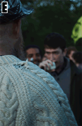
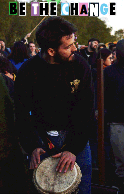
DEVELOPMENT 6- SUBTITLED GIFS
Like I said in this development I plan to take gifs of people talking and dancing around at the closing ceremony and edit he with text. This was the result, I will show the process below:
|
This was more of an experiment gif, I wanted to see how they would look and if thecae would even work. I did but this one moved around too much which was definitely an issue that I saw in the others because I didn't use a tripod to take them. So before I begun any of the steps that I show above iI ensured that all the images were straight and in line before I started.
|
|
|
|
|
|
|
|
The gifs were successful, the final product came out the way i imagined and I think that they conveyed the message that I had missed in previous developments. however I still want to create a piece which really embodied and translated my experience with extinction rebellion in the week that they protested.
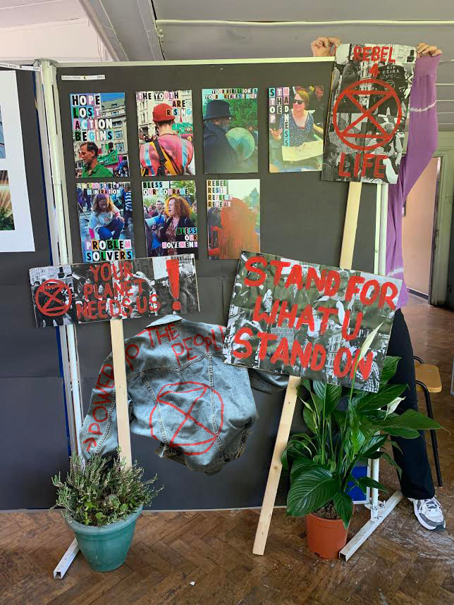
Final piece-The Installation
For this development I aimed to create an emersive experience which I felt translated and embodied the week I spent with extinction rebellion, I wanted to shed light on the individuals that made up the movement and the people that were fighting so passionately for such and important cause. I began to pull inspiration from images that I had taken at the protest which I felt could inspire this small replica of the events. These are the images that i used:
|
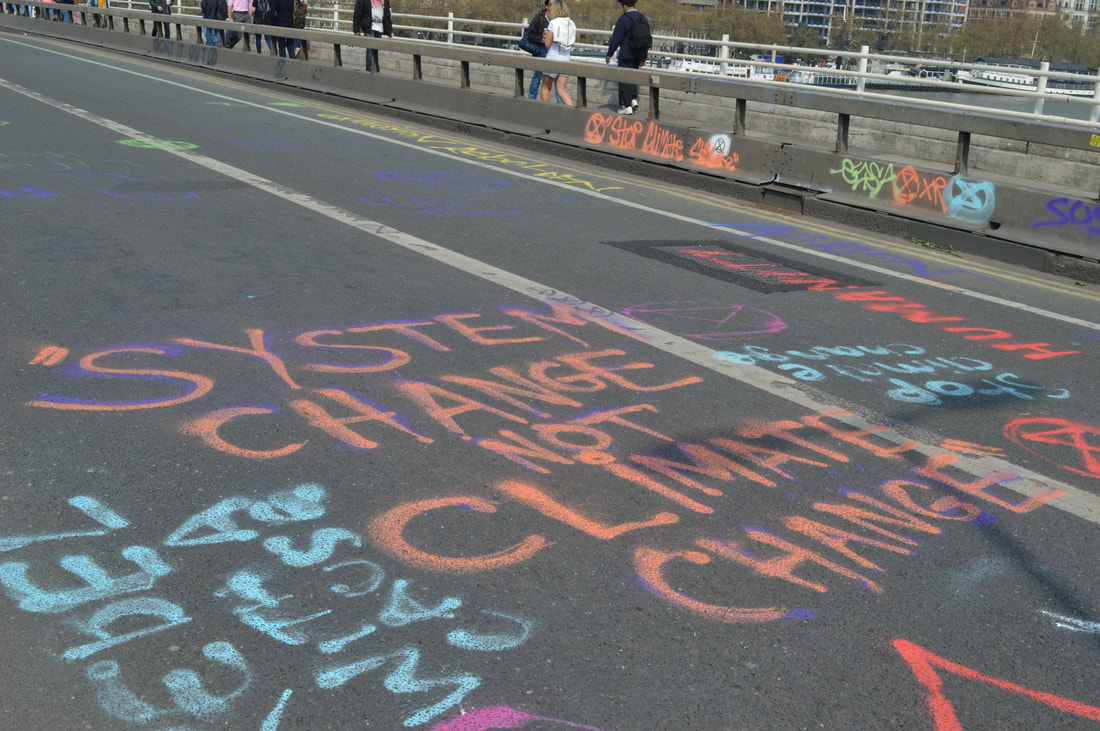
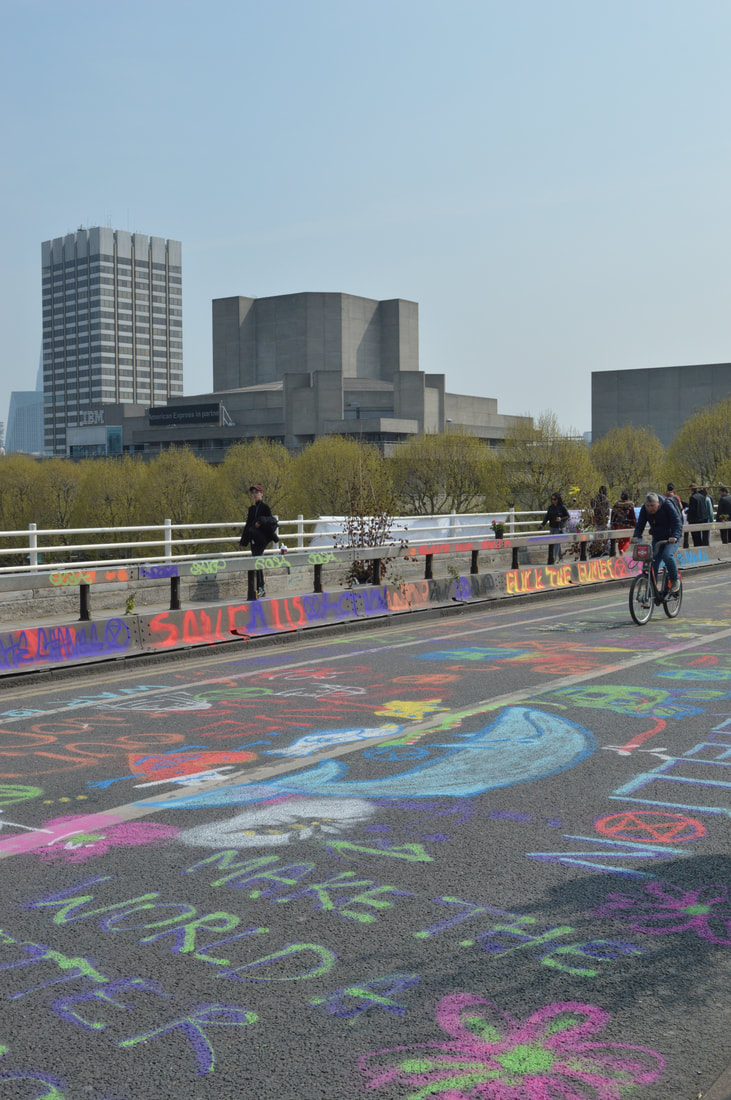
Every location that xr had taken over was made obvious by the lining of streets with graffiti and artwork, the street were being used as canvases. This graffiti style is something I want to use in the installation, perhaps using it as a background for the images and work that I mount.
|
|
|
|
|
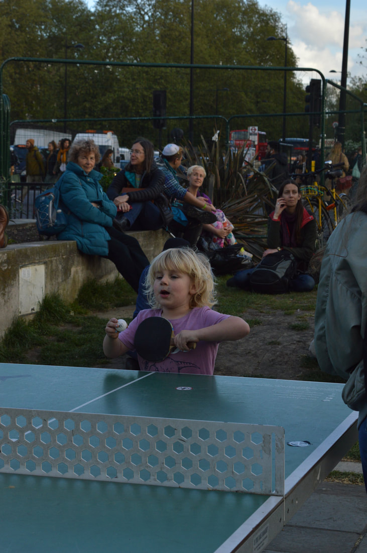
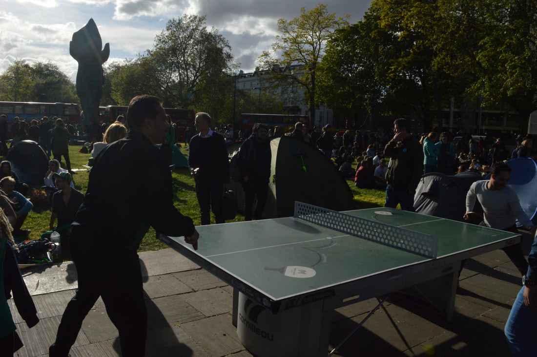
There was such a strong sense of community and Marble Arch especially embodied this idea of love, joint experience, family, and mainly this idea os unity which is something I have always aimed to show with this work. I'm not sure how to replicate the actual atmosphere of togetherness but I hope that by putting chairs and places to sit within the installation this would encourage people to sit and talk to one another and hopefully they will be a small snippet of this idea of community and socialisation.
|

|
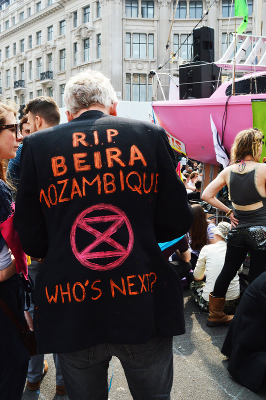
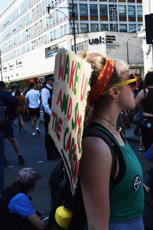
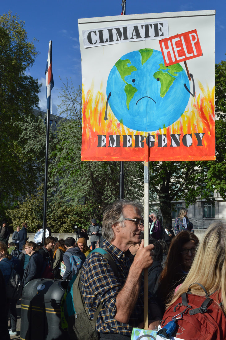
Lots of people had decorated their own clothes and used their body a canvas for their beliefs, it was almost like everybody was wearing a uniform but each person as wearing something unique, i feel like this is a really important element to bring into the display as it is something that really stood out for me and again this idea of wearing a uniform is something which is also a big symbol of unity. In addition the signs were very important, they were very creative and imaginative and what really stood out to me (especially when having individuals in mind) was the people behind the posters and placards. behind each strong message was a person that wrote it, for this reason I really wanted to combine the images of the individuals with some form of a sign or placard.
|
|
|
|
In addition to all of these things the sound was very important to me, there was unique sound of the protest, there was singing and chanting and debate a discussion. At the closing ceremony in Hyde park corner there were poems read, song sang, drums played and speeches given, I recorded some sound from this incase I wanted ti use it later on, it seemed fitting to have this playing in the installation. This is what inspired the video that I have put below, I converted the gifs into videos and played the sound over them. This will be the centre of the installation as the gifs are my main final piece.
|
|
As a practice to see how all the components would look combined together I created this, I didn't include the video because as I said it just practice but this is what I hope the installation will come to together to look like, another thing I hope to include in the final on is a graffiti background which replaces the black one which you see in the image.
|
|
