Colour Portraits
ARTIST- Ryan Lowry, for VOGUE
|
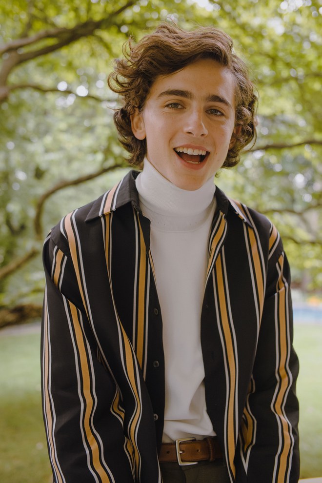
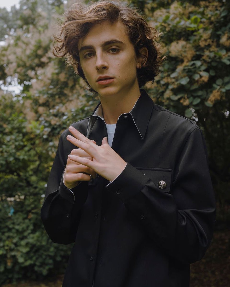
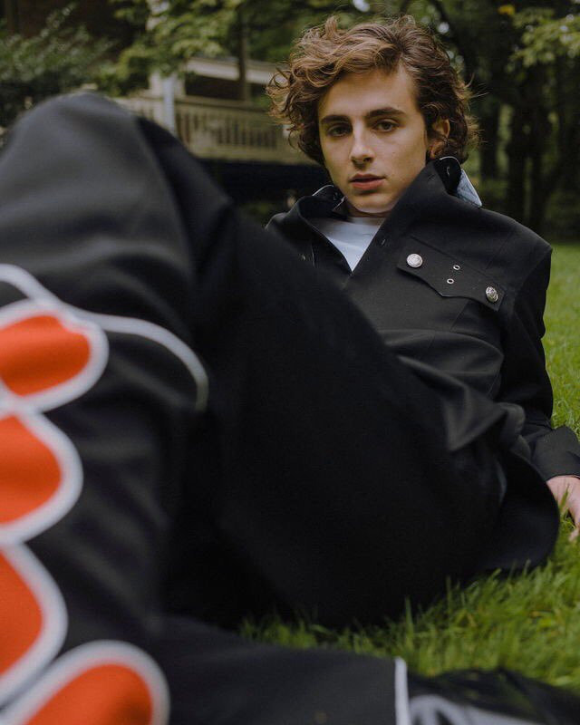
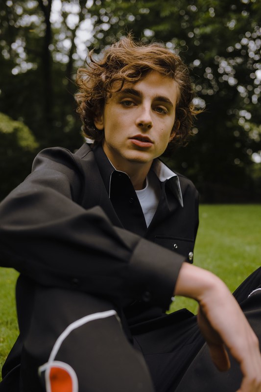
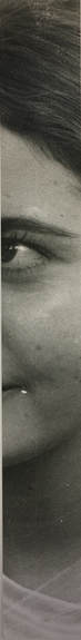
These images are taken from an article in vogue which was discussing the achievements of the actor (the model) Timothee Chalamet. I think that the images were a good example of a photographer trying to capture somebody in a very natural and relaxed way which allows the viewer to gain an alternative perspective on them to the one they might get from studio portraits of more editorial work, This is one of the things I find desirable about documentary photography style. Obviously these are not documentary photographs but I think that the elements that they share with the documentary style is something I find compelling and are the thing that inspires me to explore new avenues of documenting youth as opposed to just candid expose work. I also think that because my topic of youth is broad and i'm not planning on photographing the more shocking and vulgar aspect of youth eg. drug taking (I won't be ruling out the possibility of exploring this theme but for now I think I will be taking it in a more lighthearted direction), I think that trying to capture youth in this way is something I will be carrying through lots of my future developments; trying to focus on the people and what the image can say about them as opposed to trying to capture where they are or what they're doing.
I thought that the composition of the images were really interesting and the trees gave the images an aesthetic that I wanted to incorporate into my first development, they really add to the natural and relaxed vibe of the images. I think that the model looking into the camera adds an element of intimacy to the photos and the proximity of the photographer to his subject adds to this as well, overall this all feeds into the purpose of trying to allow the audience to get a sense of the person being photographed which I believe is another key aim of any documentary photography. |
|
|
|
MY WORK
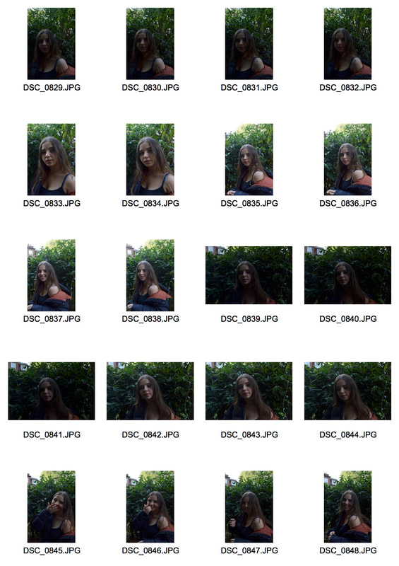
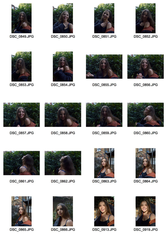
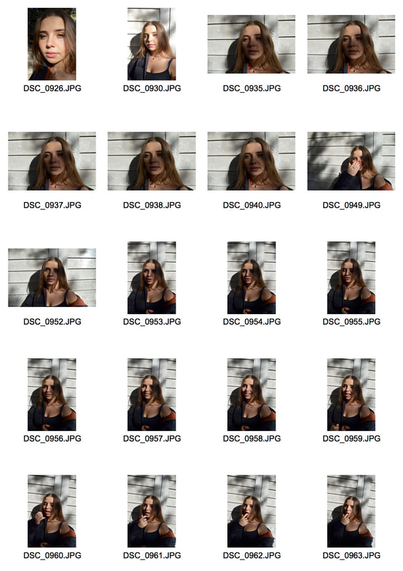
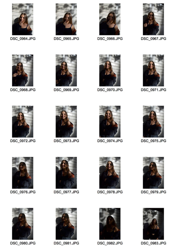
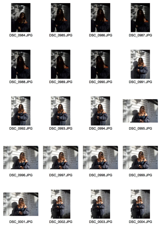
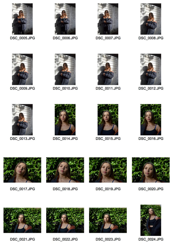
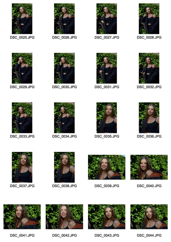
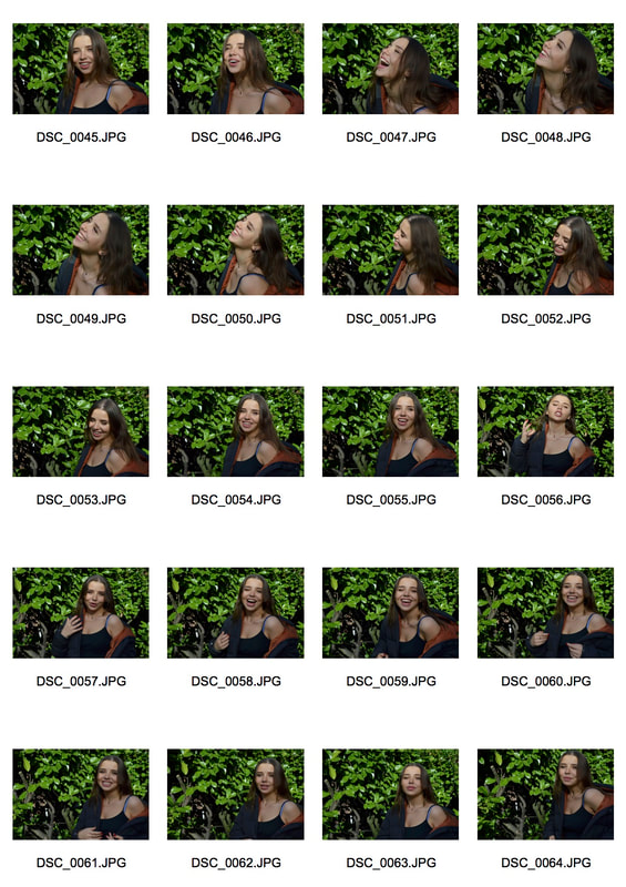
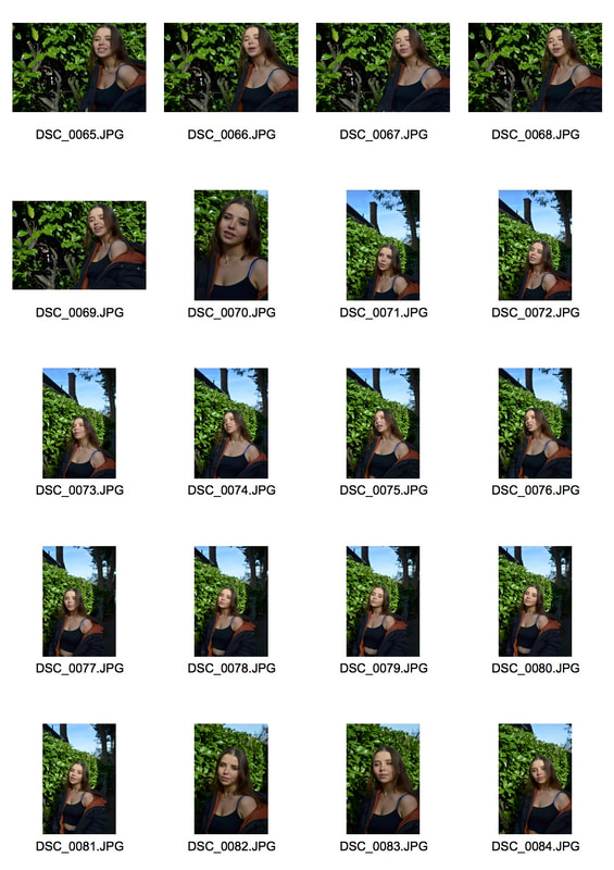
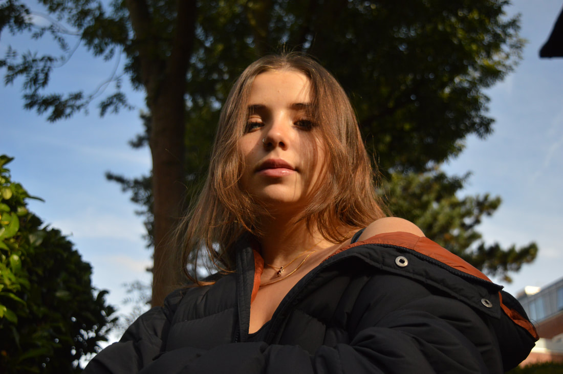
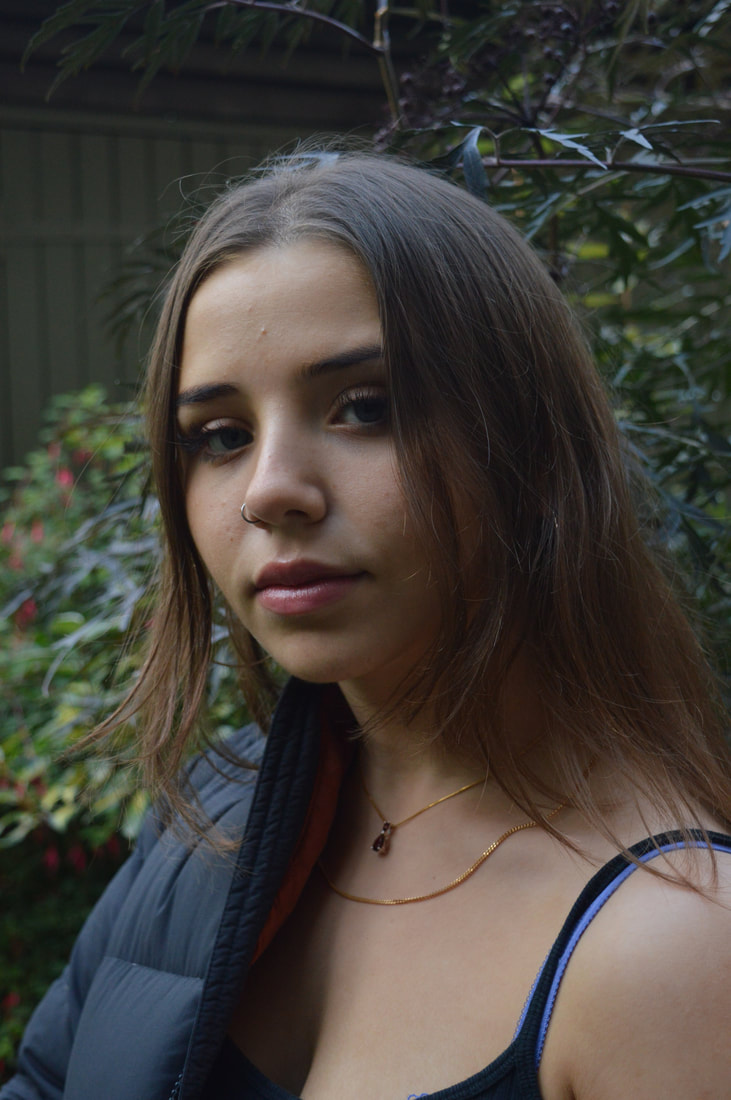
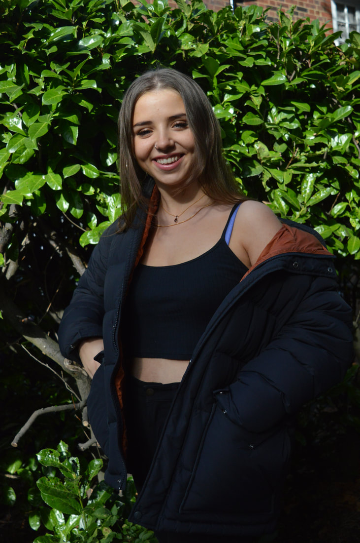
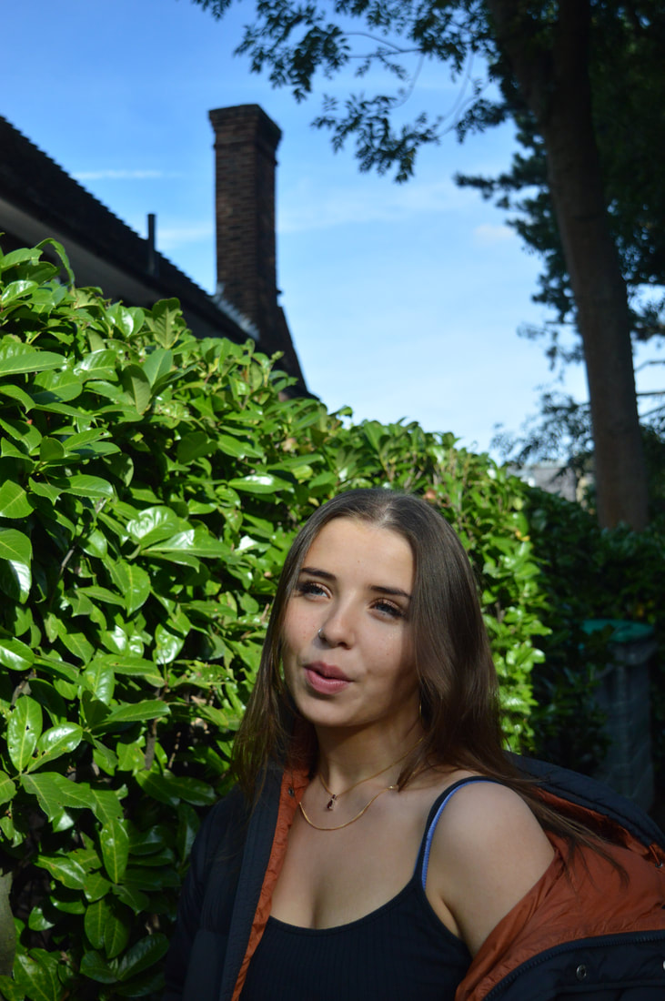
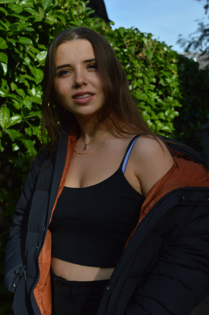
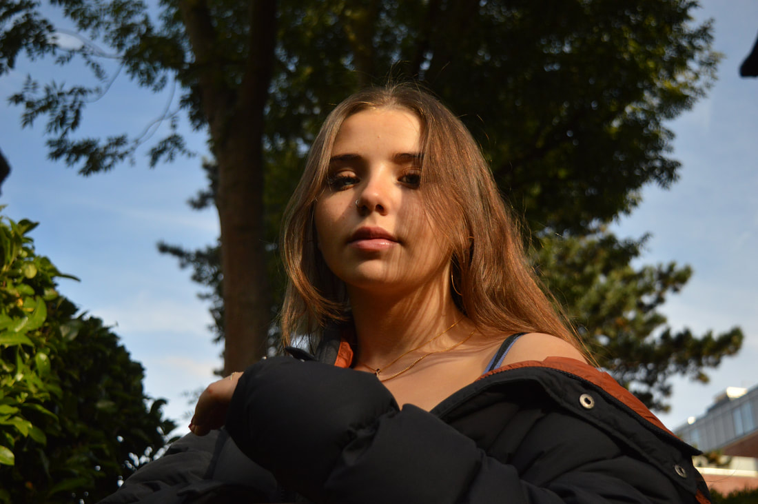
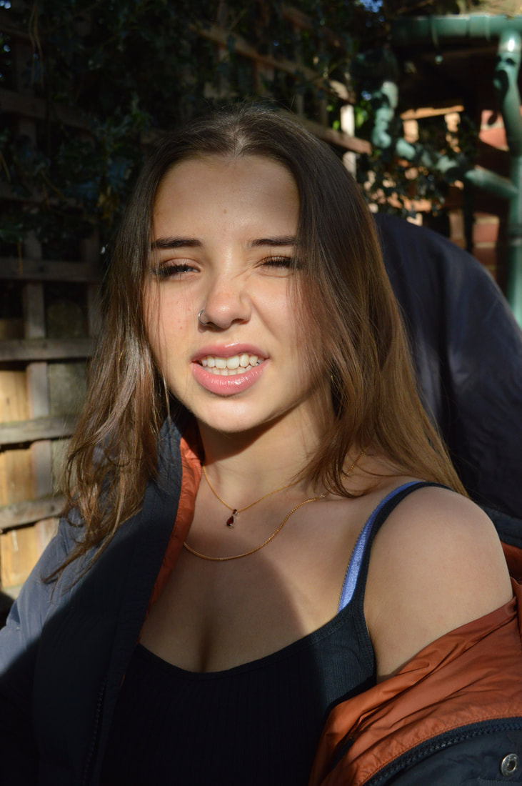
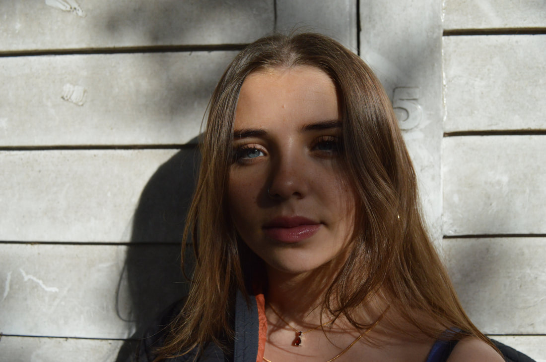
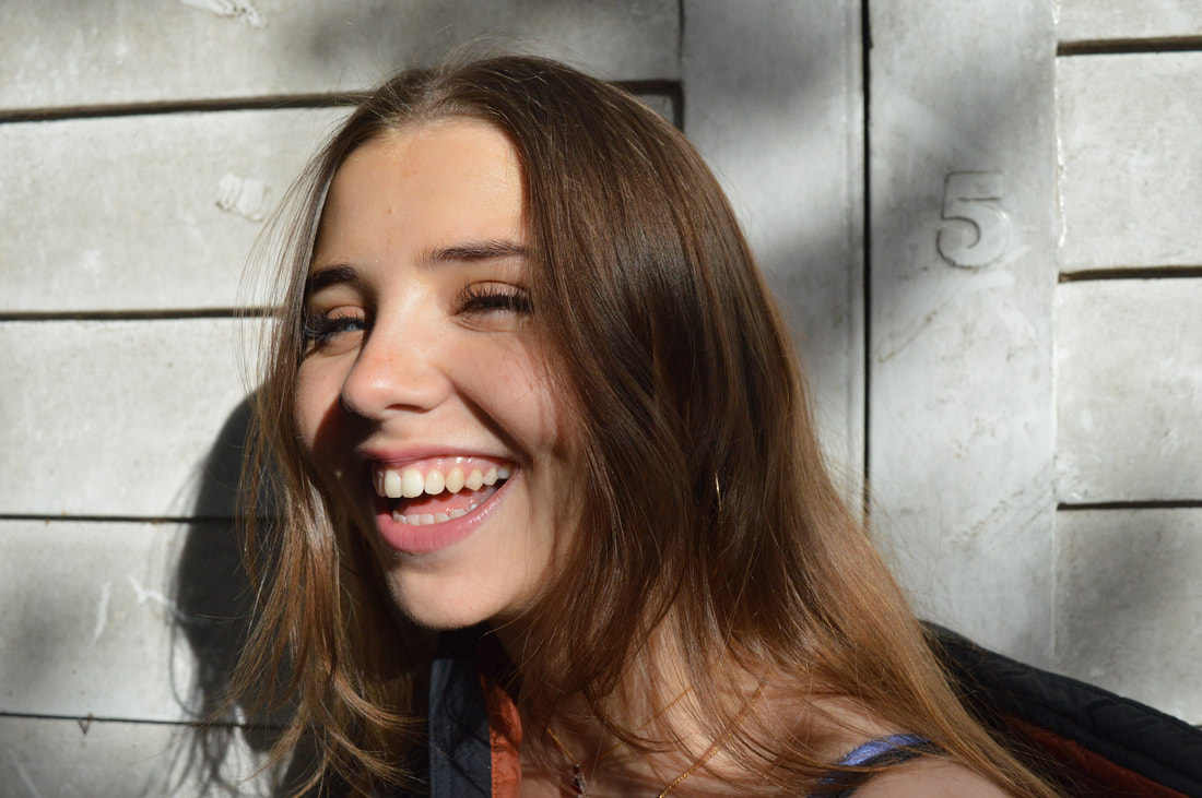
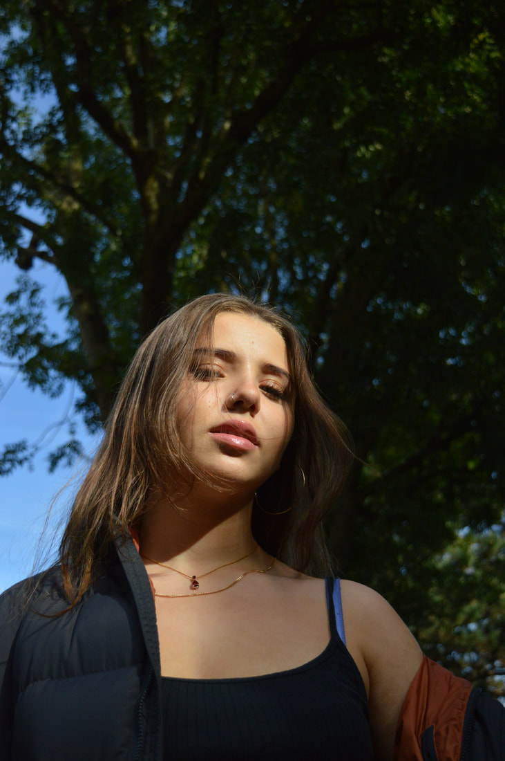
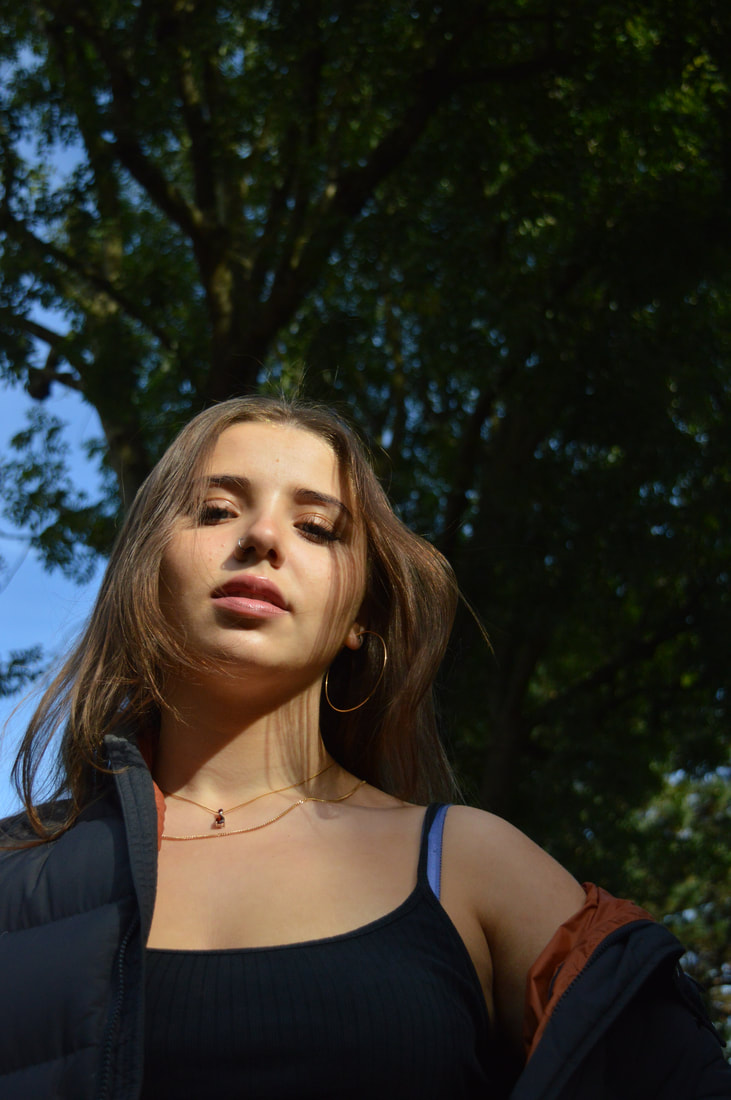
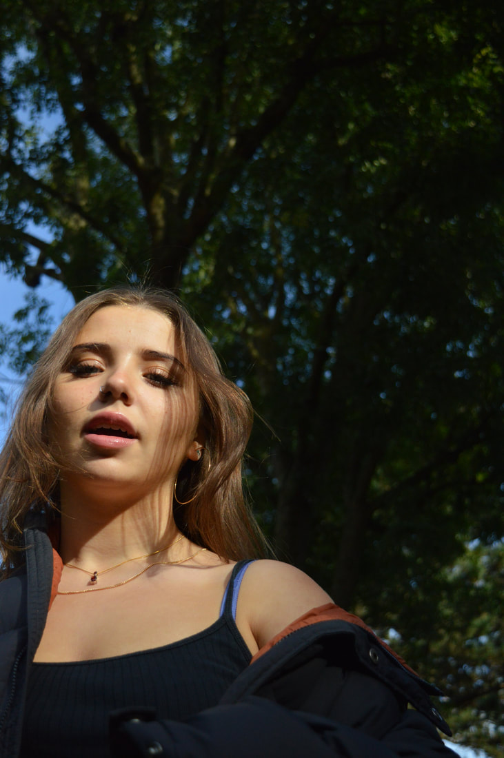
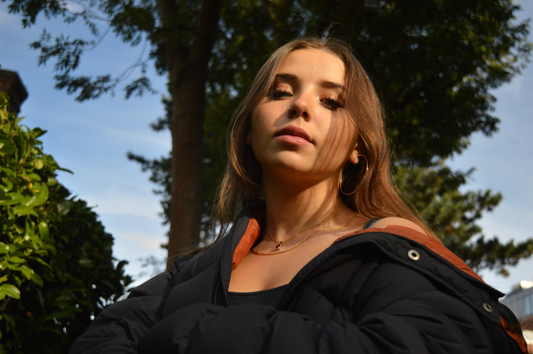
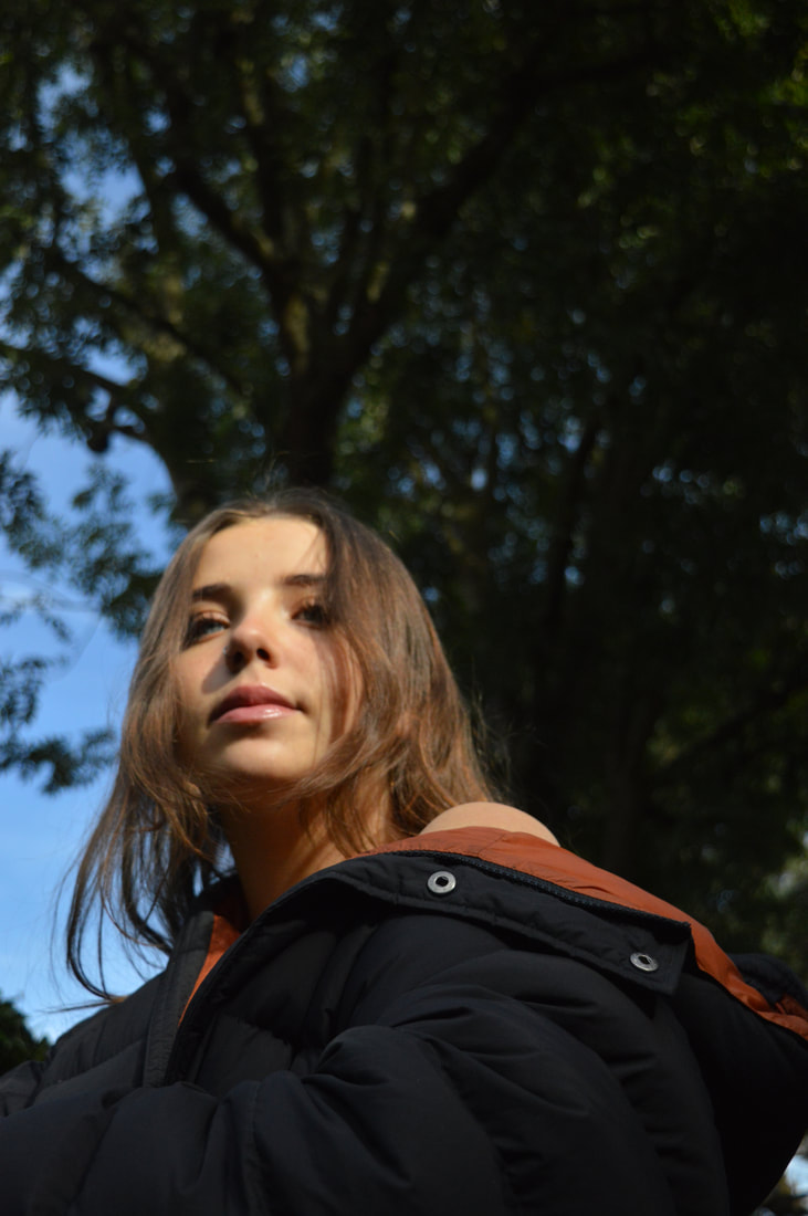
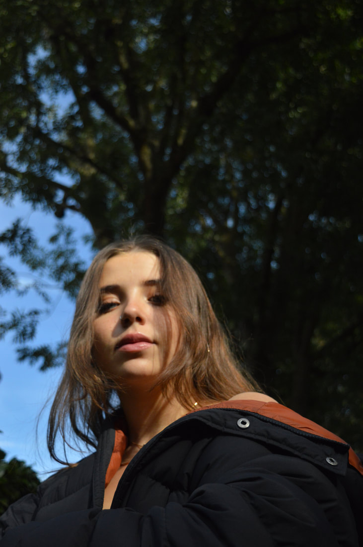
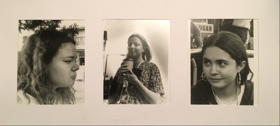
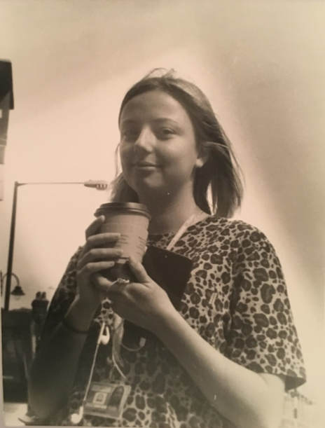
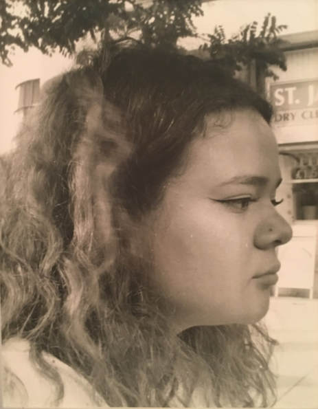
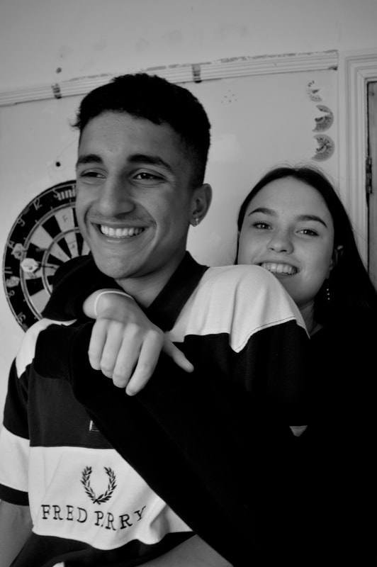
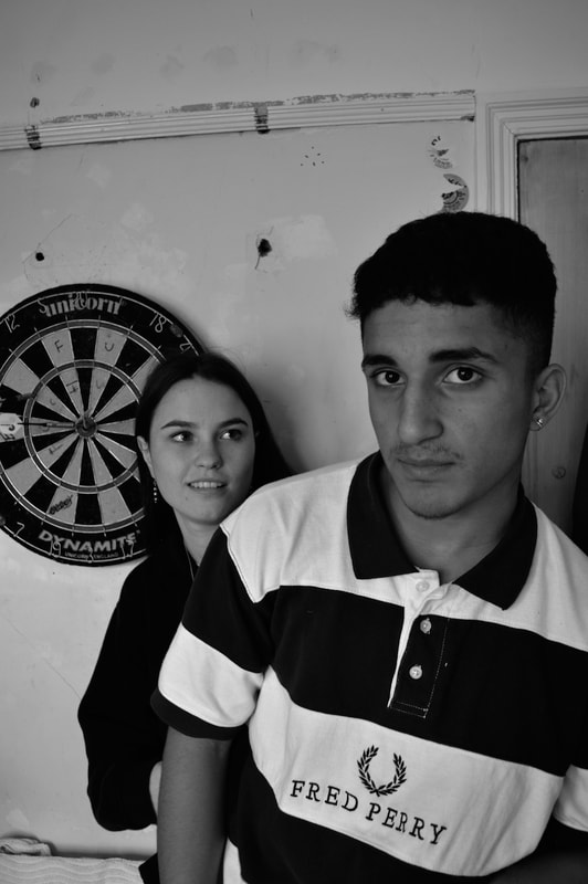
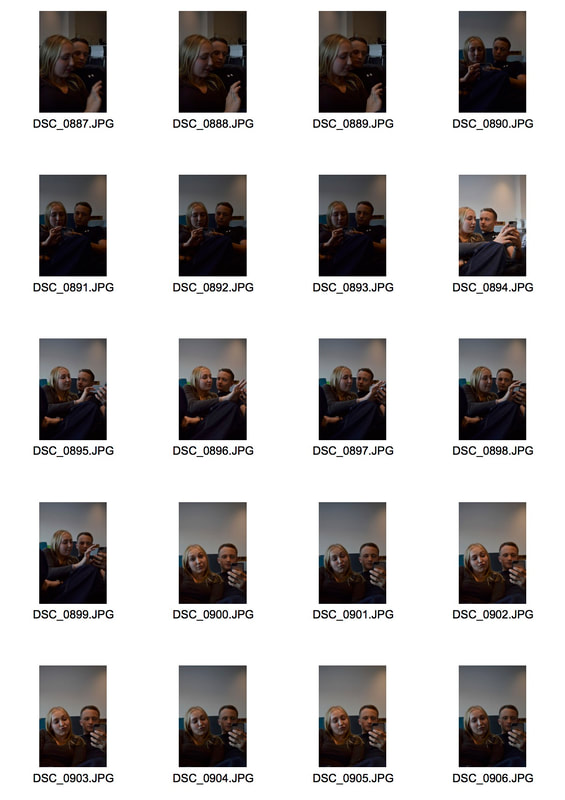
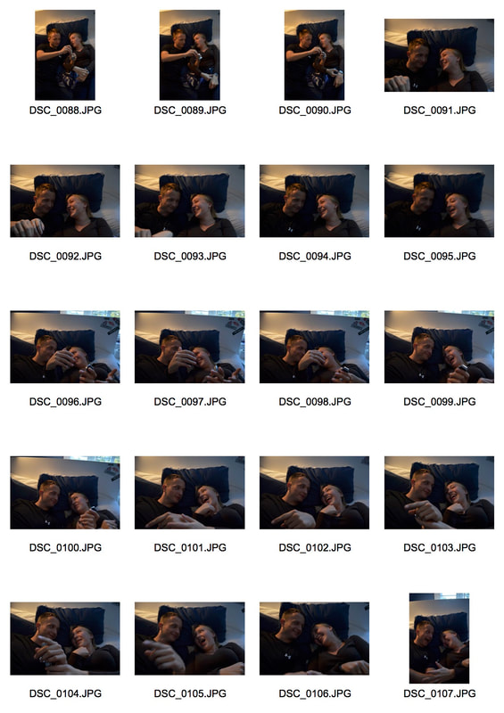
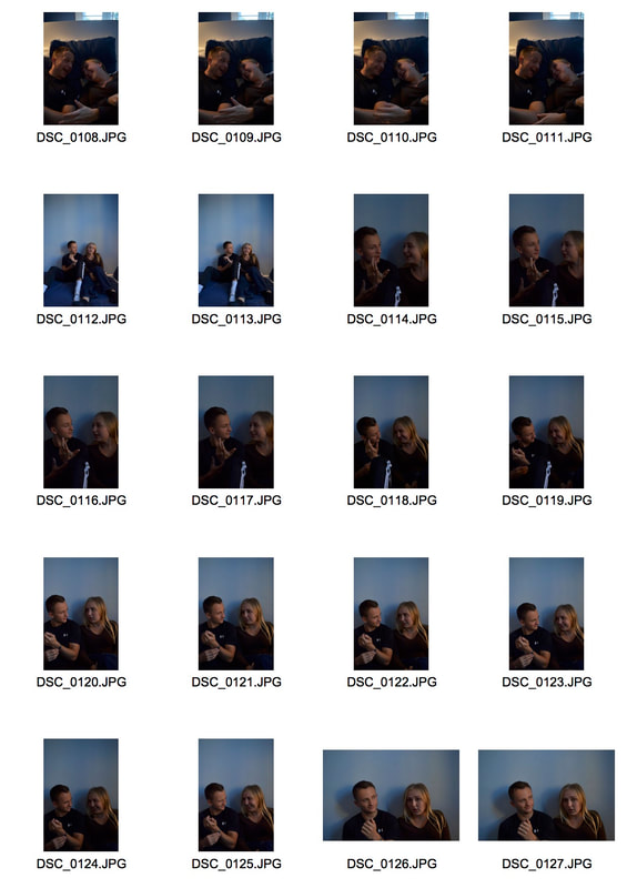
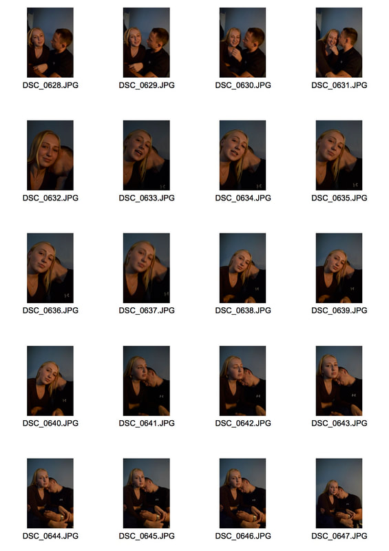
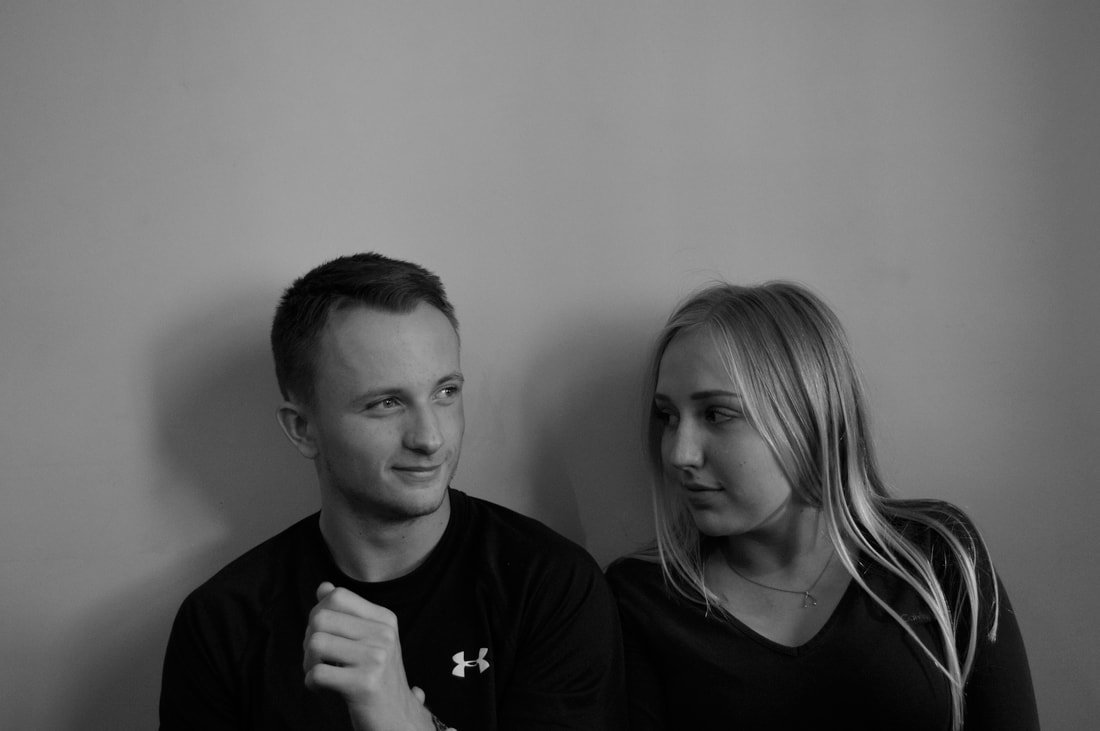
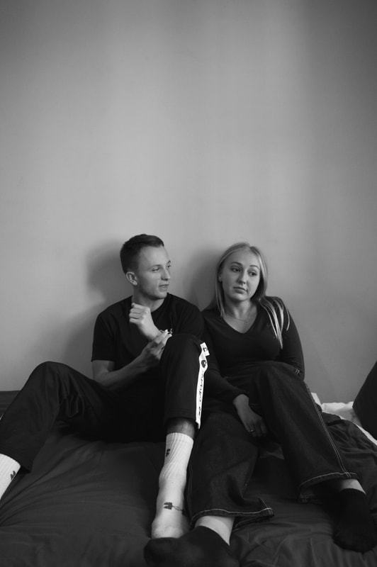
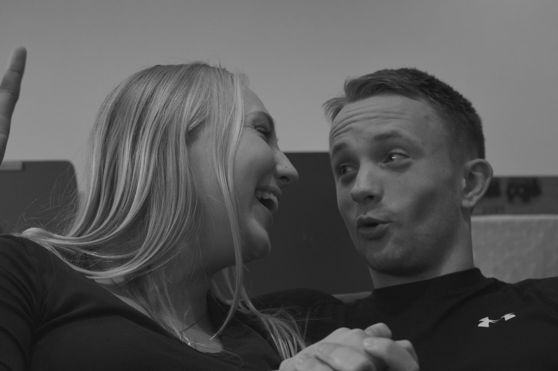
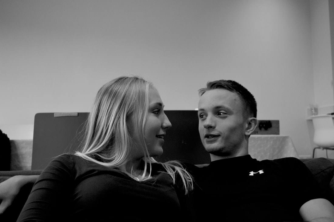
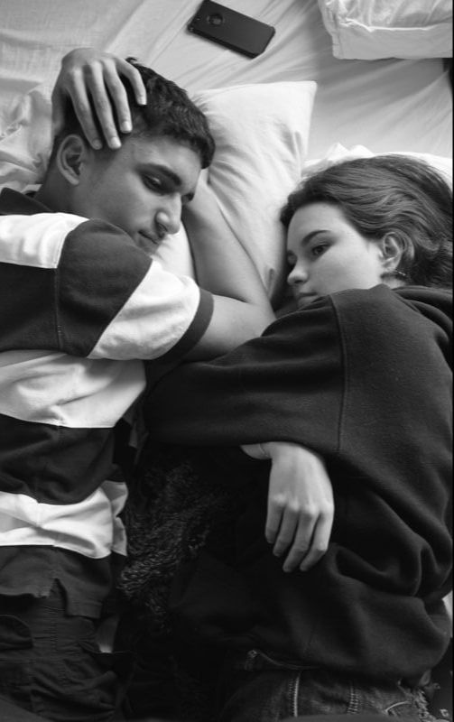
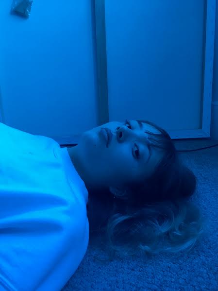
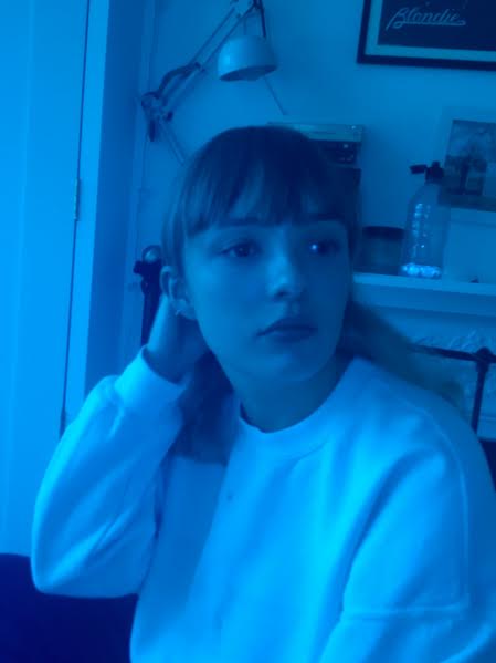
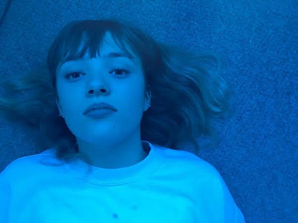
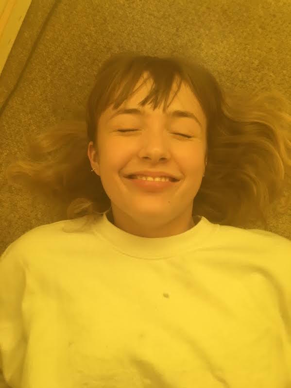
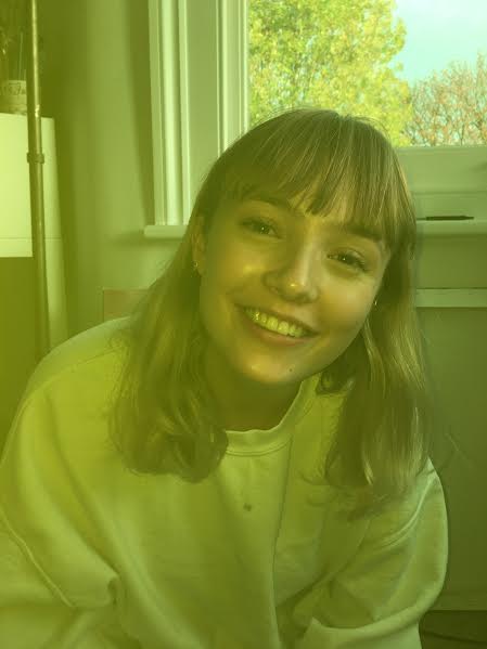
when taking these images i tried to give the model the least direction possible, i wanted her to be as natural and even though the images were somewhat posed i wanted them to present as candidly and possible. this is why while taking the pictures i was trying to have a conversation with her or in some cases i was just getting her to talk to me about random things. in the majority of the pictures i took the subject is looking directly into that camera which similarly to the work of Ryan Lowry because it adds to intimacy of the work. the emotion on Thalia's (the model) face in most of the pictures is somewhat of a non emotion, she doesn't look happy but she doesn't look angry or sad either, she just looks normal and relaxed. In other images I've caught her at a moment where she is laughing or where she is mid sentence which is why i think we get to see more of her personality in the images especially. in future developments i think the images which show more evident emotion are the ones i prefer so trying to get the model to react naturally and in a candid way is something i will try to achieve.
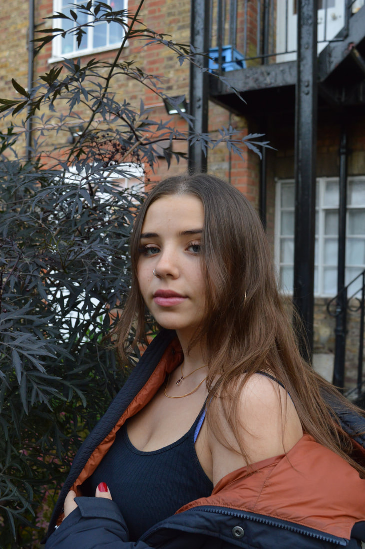
most of the images with the exception of the 2nd and 3rd images were taken using a fast shutter speed and low f-stop (wide aperture). the fast shutter speed meant that even though the sun was shining directly onto her and was coming from behind the camera, the images weren't over exposed and the natural light could add to the image rather than inhibit them. the wide aperture meant that the foreground was more in focus than the background, this made Thalia (the model) the main focus of the images. however in the images where she is standing very close to the backdrop they are in equal focus. furthermore the 2nd and 3rd images were taken using different settings because they were taken in a shaded area so needed a slower shutter speed in order to allow more light into the lens, although the f-stop stayed low for these images as well.
most of the images with the exception of the 2nd and 3rd images were taken using a fast shutter speed and low f-stop (wide aperture). the fast shutter speed meant that even though the sun was shining directly onto her and was coming from behind the camera, the images weren't over exposed and the natural light could add to the image rather than inhibit them. the wide aperture meant that the foreground was more in focus than the background, this made Thalia (the model) the main focus of the images. however in the images where she is standing very close to the backdrop they are in equal focus. furthermore the 2nd and 3rd images were taken using different settings because they were taken in a shaded area so needed a slower shutter speed in order to allow more light into the lens, although the f-stop stayed low for these images as well.
|
|
|
|
|
|
|
|
|
|
|
|
|
|
|
|
|
|
|
|
|
|
|
|
Black and White Film Portraits
ARTIST- Mary Ellen Mark
Mary Ellen Mark is a photographer who has been in every project that i have done on documentary photography, the power point, the leaflet and curatorship task. her photography is griping and her portraiture of youth is what inspired me to explore this topic. The portraits displayed below were taken for an article about life on the streets as a child, so, naturally they are documentary photographs. i believe the aim of any photographer is to spark an emotional reaction in their audience and for Mary Ellen Mark i think she is trying to spark pity or sadness maybe, i think this way through her compelling photography she can raise awareness for this issue. she wants us to consider how the children in her images might feel or what they might be going through which will counter effect the way people behave towards or view them. i believe this is in hopes of showing the negative effects of the "greed is good" mindset of the 80s and show how fostering a capitalist economic system can detrimentally effect the most vulnerable in society.
she creates truthful and honest images in the hopes of showing that even in 'America's most liveable city' there is still a street kid epidemic and in turn trying the emphasise how bad it must be in worse off states and cities in the US. this is shown through portraits of the kids she is documenting. she takes intense and intimate images of the young people, she makes sure that they are the focus of the pictures and the backgrounds are blurred. in most of the images the subject is looking straight into the camera which gives the images their intensity especially when combined with the authentic and raw emotion presented on their faces. furthermore the setting of some of her other images present the children in disturbing situations this creates a juxtaposition where by you see a young and innocent person in a mature situation, these scenes are something most people wont have witnessed in their lives which is why Mark's work is so introspective and compelling. this streetwise project allows people to see the darker side effects of the american government in the 80s.
i love the aesthetic of the images and i think that black and white imagery is something i want to explore in my own portraiture, it emphasises the focus on the subject and creates less distractions in the image. furthermore i would also like to develop my film camera skills and explore that as i am used to using digital cameras. i believe that using film is also symbolic of the candidness of Mark's photographs and is a medium that goes hand in hand with documentary photography and is commonly used my the photographers that i am look at.
|
|
|
MY WORK
|
moving on from my previous development i used a black and white film camera to create these photos. i drew inspiration from Mary Ellen Mark and i think that this is evident in the images displayed below. as you can see i took about 12 usable images on the whole role and these are displayed as a contact sheet on the right.
This was my first time using film i think that the process was lengthy and at some points tricky but it allowed me to appreciate the end result more. in addition it helped me further develop my photography skill which i can use when taking photos on digital camera regarding knowing what aperture and exposure to use. As you can see lots of the images needed to be exposed at different times under the enlarger and that why i had to make multiple contact sheets to form one whole one. i chose 3 images which i felt were the most candid and most in the style of Mark's work which i had tried to keep in mind as a point of inspiration when taking these images. i think that with practice i could definitely master the technique of taking pictures on film however to proceed with the project i don't think ill be using it because of how time consuming it is and because i don't think its the medium i should use when i want to create the best work possible. in the future when i have gotten better i would be open to using it to create more substantial bodies of work. |
|
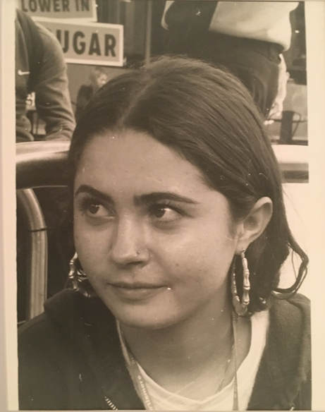
Here are the 3 images that I chose. they each needed to be exposed for a variation of times so on the side I have shown where I have made the test strip and then the testers that I did. as i explained before, developing the film is a lengthy process and this is one of the reasons why. the first image of Kate was the quickest one that i did because i exposed the whole image for the same amount of time however developing the others were more complicated. i have explained mt process further below.
Kate
|
|
|
|
Eva
|

|
when developing this image of Eva i used the same process of using a test strip to determine how long i should expose the images for. however this showed that none of times i tried developed the whole the image the way i wanted it to, in other words one time wouldn't work for one part of the image like it would for another. this is why i had to expose the whole paper for ... second and then cover the parts i was satisfied with, in this case her body and face, and then expose the rest for another .... seconds.
|
Ella
|
by coincidence as i developed the pictures it became progressively more complicated to get the look i wanted. using the same technique as i had used on the image of Eva, i exposed this image at three different exposures. i exposed the face and hair for... and the the tree area for.... and then the right hand side background for....
in retrospect the small area behind her head could of been exposed for slightly longer because its very bright and underdeveloped, however in Mark's work the focus is never on the background of the image so this does draw more focus onto the subject of the image. |
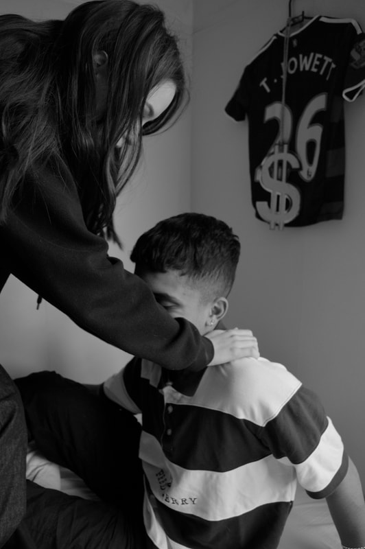
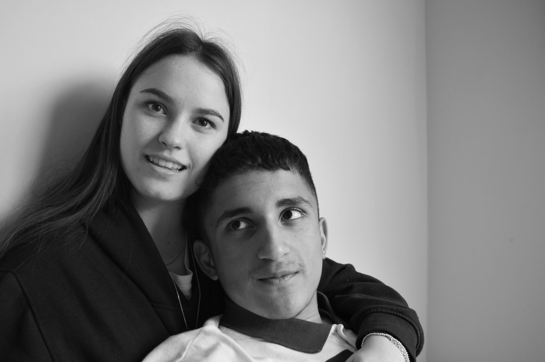
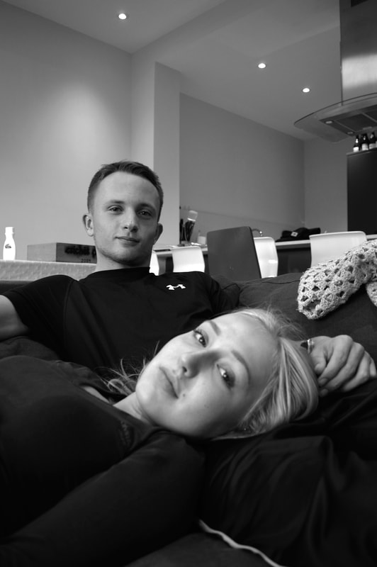
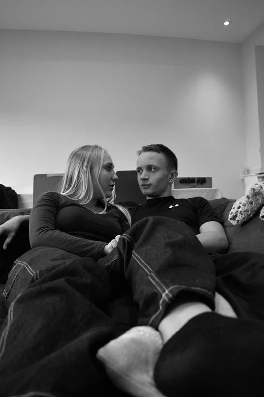
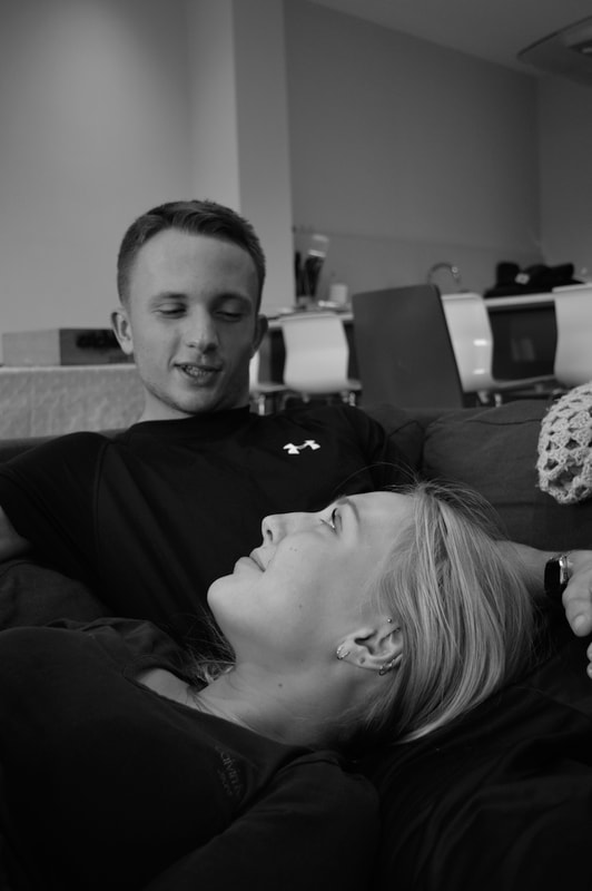
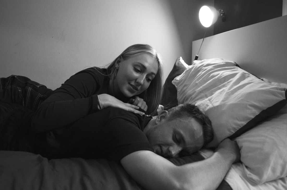
Young Love
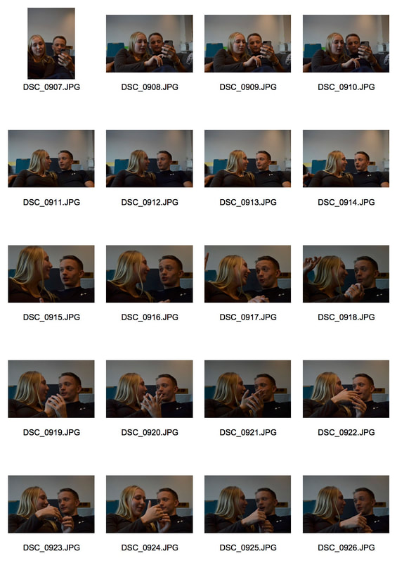
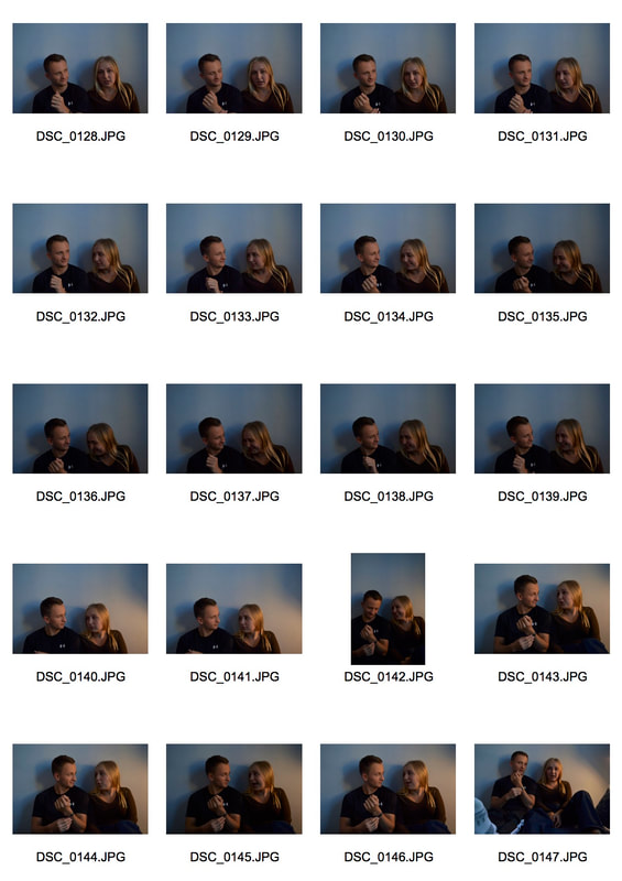
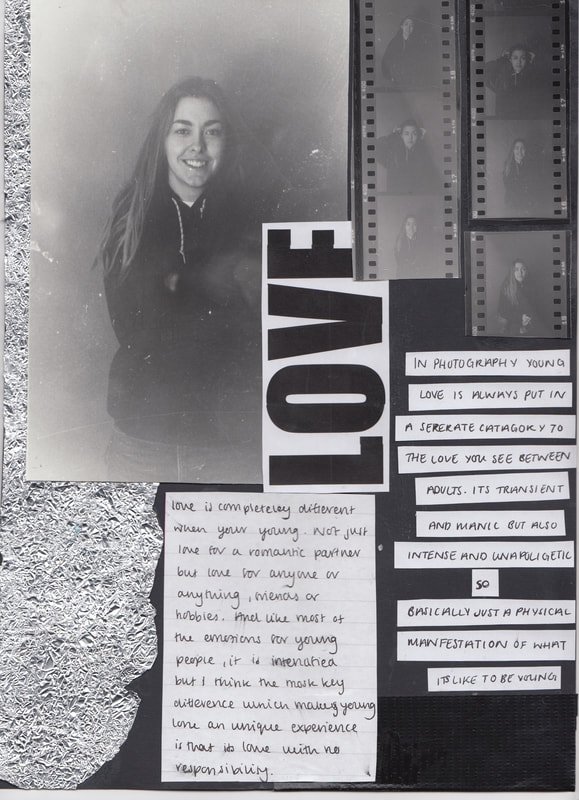
I felt as though my previous images were superficial, they didn't carry a message about youth or explore any part of youth apart from their appearance. The images I had taken previously were a good stepping stone in deciding that I would want to do clear portraiture style imagery and proceed to create images in black and white. I wanted to begin to explore clear aspects of youth such as relationships, young love, party culture, drug culture, friendships, politics and all the things that youths consume and are consumed by. Something that stood out for me was friendships, youth is the time where we make friends and form friendships that we will have for life, as a youth my friends are one of the biggest, if not they biggest parts of my life so this seemed like an obvious subject to focus on. However still wanting to avoid just taking pictures of youths interacting and missing the message of the image, I decided to focus on romantic relationships. In photography young love seems to categorised separately to love you might see between adults. It's portrayed as something intense and unapologetic but also transient and manic. I wanted to use photography to gain my own opinion about it, I haven't given it much thought previously because I hadn't needed to but I felt as a young person i had a unique opportunity to see it in a exclusive light. A photographer I felt I could really draw inspiration from was Ewen spencer, his project 'young love' I felt displayed a personal exploration and expose on what young love really means and gave the public an opportunity to find out what young love meant in the 21st century club culture of unapologetic saliva swapping.
MY WORK
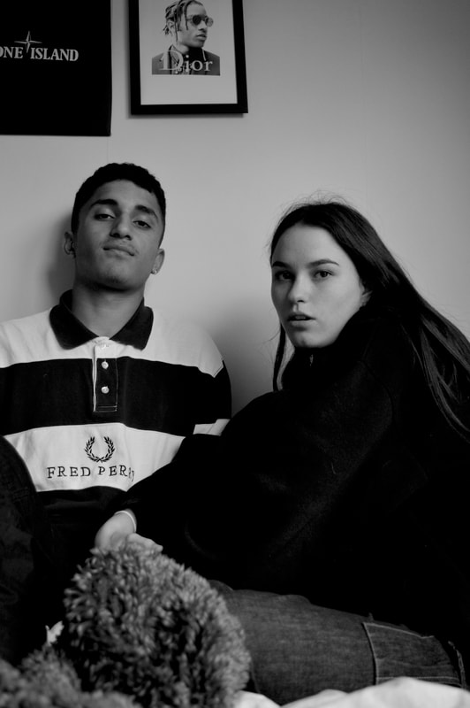
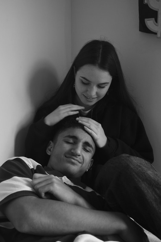
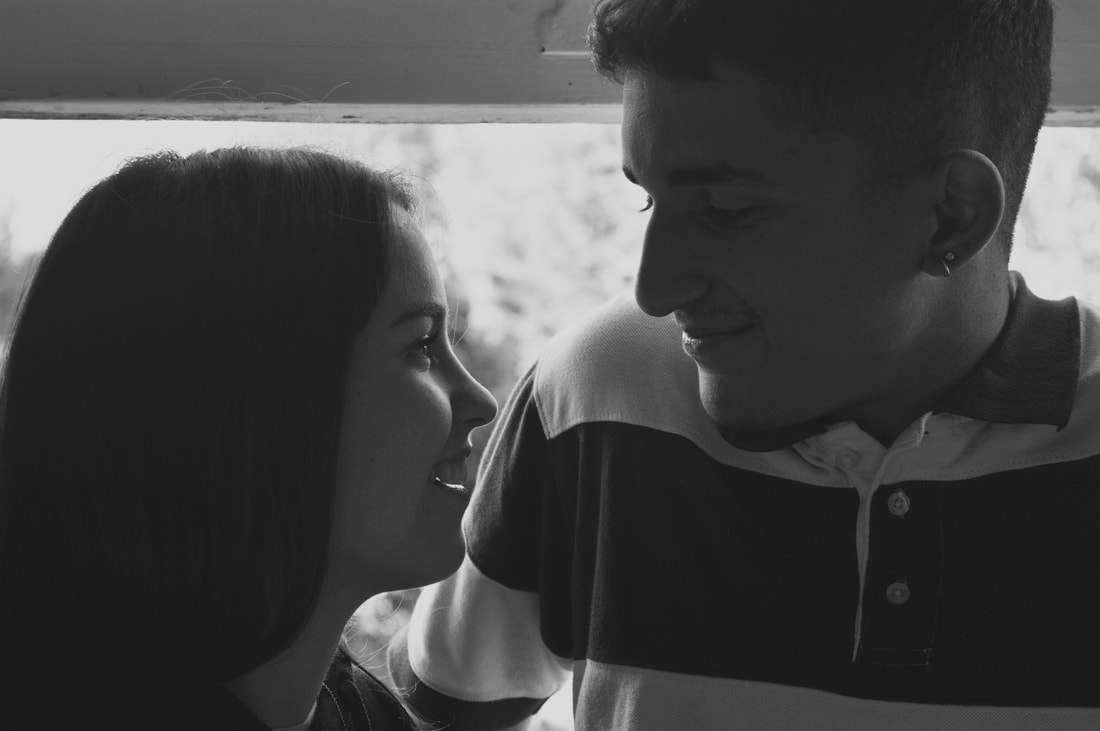
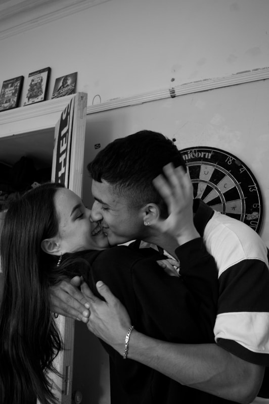
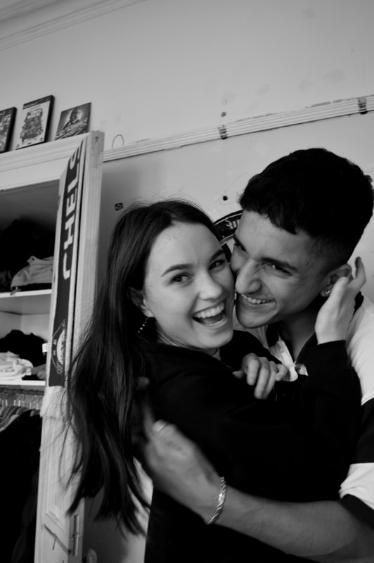
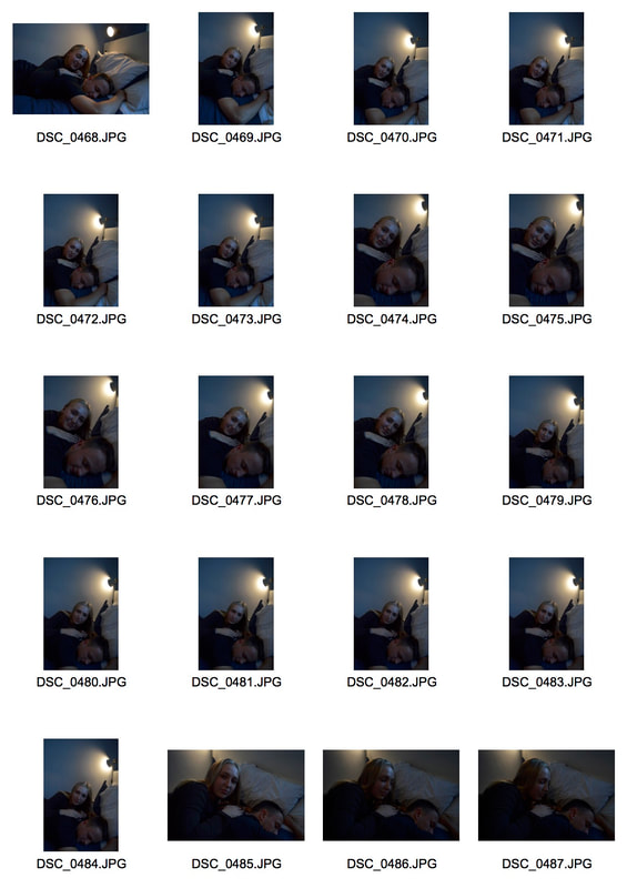
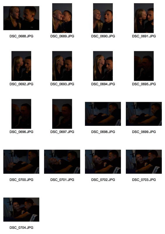
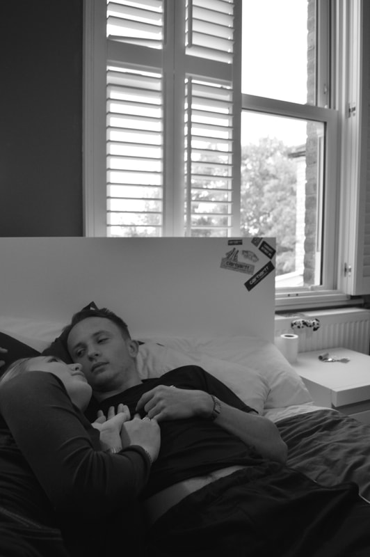
To take the images I used a digital camera but I also took pictures on film. I didn't develop these but I did display the contact sheet below, the images didn't come out well and this is the reason I used both digital and film so that i could make sure i had some usable pictures. I wanted the subjects to feel relaxed and interact the way they would if i wasn't there, I wanted to be more of a fly on the wall, this is hard when you have a big camera in your hand but I do think that the images came across as very natural which was the aim. In addition I also wanted to get the couple in a familiar environment to them and it seemed obvious that this would be their house or bedroom.
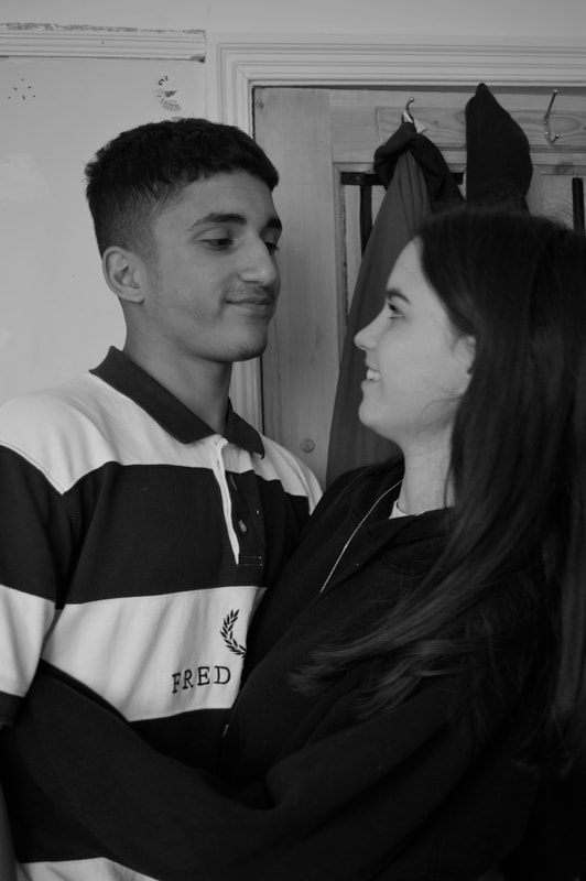
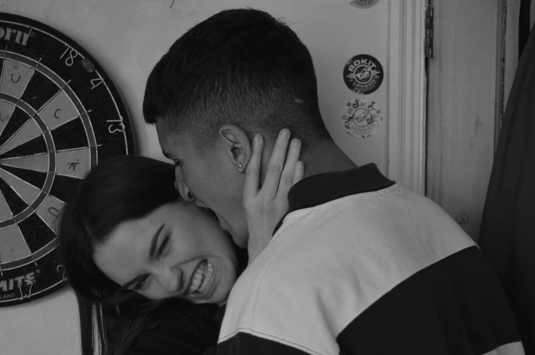
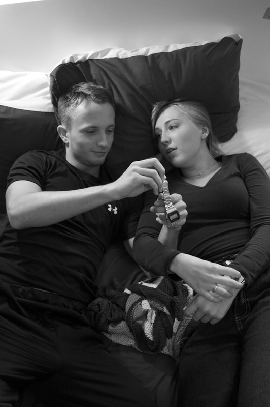
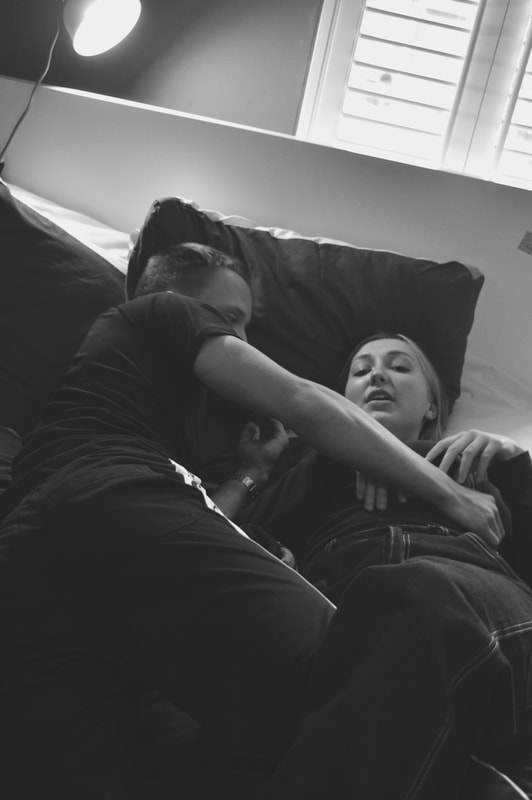
The first set of images have a more playful and carefree vibe, I think this representations of young love best emanates the image that people have of it in their minds. Its seems free and the couple are were relaxed in front of the camera and myself, this presents itself clearly in the images. They needed very little direction. furthermore the first location had much better lighting than the second one which obviously aided in them turning out better, they are brighter and clearer and this lighting is symbolic of the happy and joyful feelings which the image conveys and causes. I think for these reasons the first set of images are the best of the two sets.
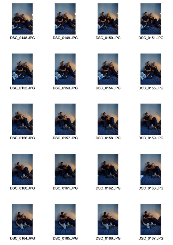
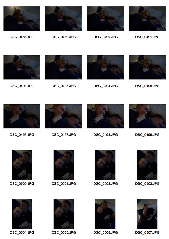
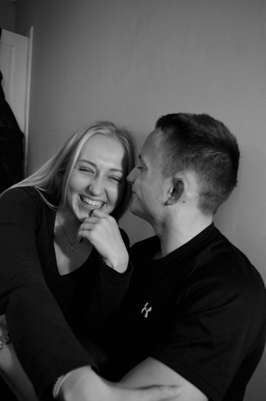
In the second set of images the couple felt more uncomfortable in front of the camera they wanted a lot of direction but after awhile they became more relaxed, I don't think that this discomfort is obvious in the the images but they are noticeably less playful and joyful than the first couple. However this does work to my advantage because it shows a clear range of relationship dynamics, it shows a different side to young love that isn't only playful but also more serious and intense. Also as I mentioned before the lighting was not great in the room and instead of using natural light (like we had in the first set) we had to heavily manipulate the artificial light in the room. This involved constantly changing the position and direction on the light depending on the angles of me and the subjects, for this reason there in a disparity in the lighting of these images compared to the first set which are very consistent and clear.
The first set of images have a more playful and carefree vibe, I think this representations of young love best emanates the image that people have of it in their minds. Its seems free and the couple are were relaxed in front of the camera and myself, this presents itself clearly in the images. They needed very little direction. furthermore the first location had much better lighting than the second one which obviously aided in them turning out better, they are brighter and clearer and this lighting is symbolic of the happy and joyful feelings which the image conveys and causes. I think for these reasons the first set of images are the best of the two sets.
In the second set of images the couple felt more uncomfortable in front of the camera they wanted a lot of direction but after awhile they became more relaxed, I don't think that this discomfort is obvious in the the images but they are noticeably less playful and joyful than the first couple. However this does work to my advantage because it shows a clear range of relationship dynamics, it shows a different side to young love that isn't only playful but also more serious and intense. Also as I mentioned before the lighting was not great in the room and instead of using natural light (like we had in the first set) we had to heavily manipulate the artificial light in the room. This involved constantly changing the position and direction on the light depending on the angles of me and the subjects, for this reason there in a disparity in the lighting of these images compared to the first set which are very consistent and clear.
|
|
|
|
|
|
|
|
|
|
|
|
|
|
|
|
|
|
|
|
|
|
|
|
|
|
|
|
|
|
|
|
|
|
|
|
|
|
|
|
|
|
|
|
|
|
|
|
Artist and Me- Ewen Spencer
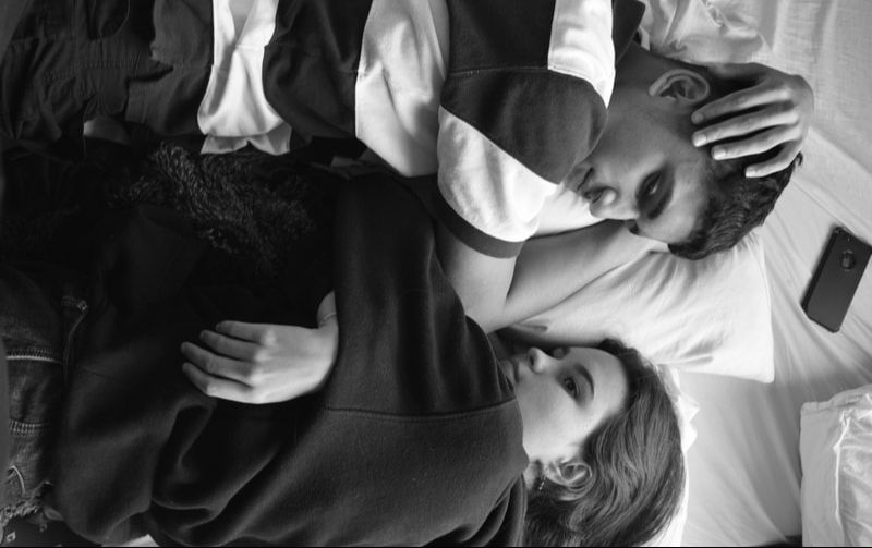
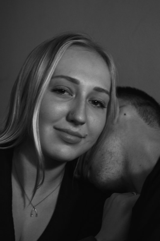
This image is taken from Ewen spencer's young love project. Spencer is a British photographer based in Brighton, his photography acts as a window into the worlds of young people all around the world and unexplored subcultures. Having previously explored the underbelly of uk grime in the uk this led him to explore youth within music culture generally. Naturally, documenting young love came with that. These images are compelling because they are familiar. He himself attributes the success of the project to the familiarity of the images, he believes most of us have had these personal moments of lust or love in similar surroundings and that is why people and so drawn to them. He has also described this work as somewhat autobiographical which tells us how immersed he was in this world and subculture.
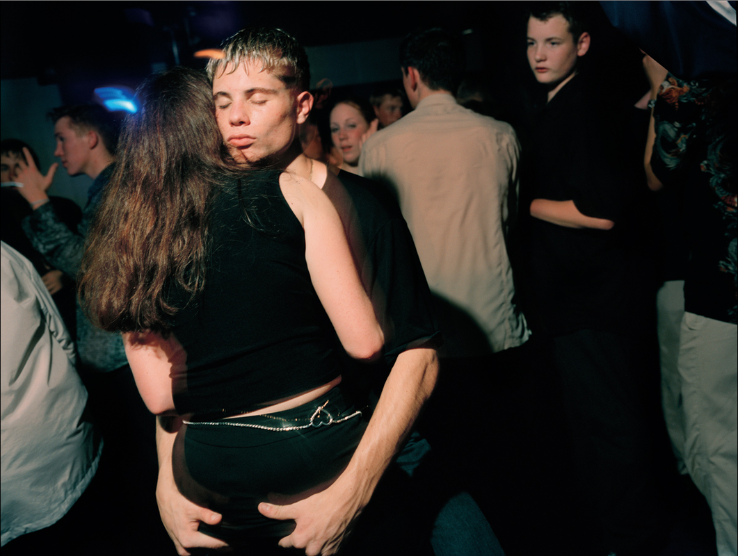
This is my work compared to Ewen Spencer's. I chose these images to compare because even though they are very different in aesthetic I think they have a similar sentiment. In Ewen Spencer's image it appears that the couple are calm and relaxed while being surrounded by excitement and mayhem. The boy in the image has his eyes closed which emphasises the idea that he is feeling calm and peaceful and is only focussing on the girl. The couple in my image also appear to calm and at peace with each other both looking off in the distance and not concentrating on their surroundings, although it is taken in a much calmer environment than that of spencer's work. For this reason the images have the same sentiment, they both emphasise the immersive nature of young love and how it can be consuming but peaceful at the same time and these emotions and qualities work harmoniously together.
|
|
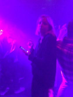
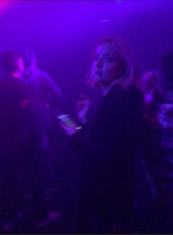
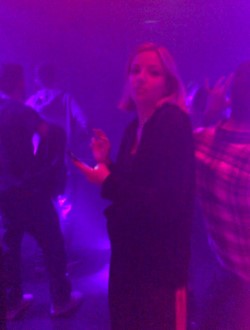
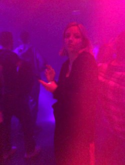
Party Culture
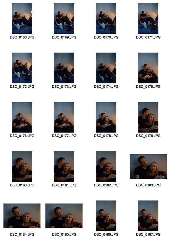
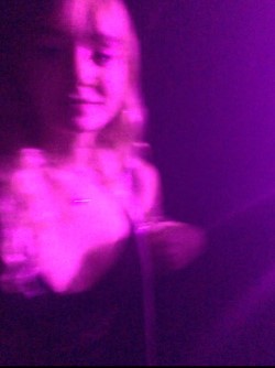
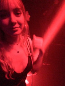
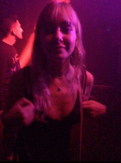
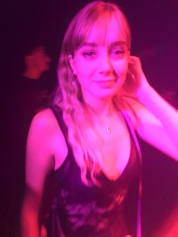
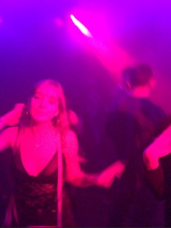
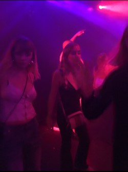
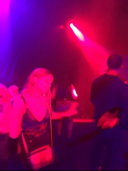
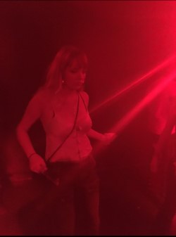
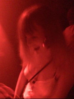
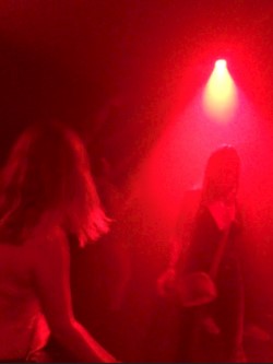
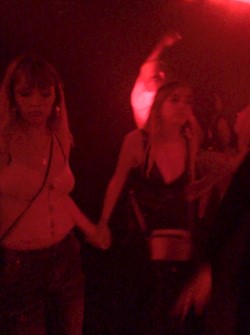
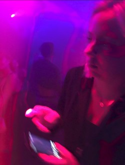
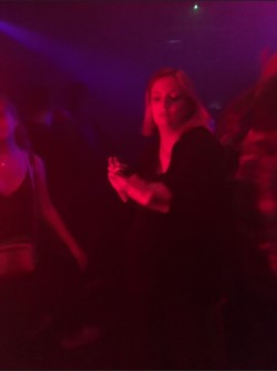
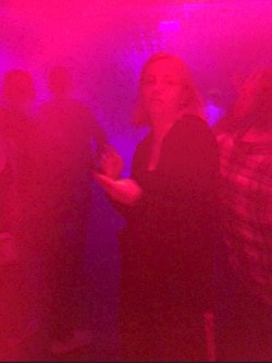
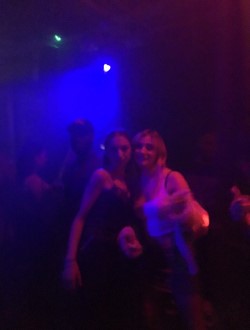
Having looked at romantic relationships I was still thinking of ways that I could capture friendships in a non superficial way. After looked at Ewen Spencer for inspiration before I had come across his work where he explored the 90s garage scene. Music is another central point in youth's lives and it is something that changes constantly. For this reason I decided that I wanted to explore party and club culture in current times, it is a youth dominated area and it's also for this reason I felt it would tie into the topic so well. I thought it would be a good way of capturing friendships and relationships simultaneously.
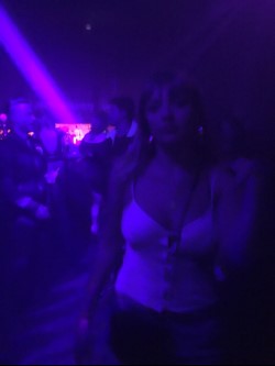
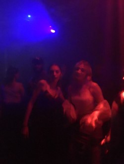
I took these photos on my phone, I felt as though taking them on a camera would of been too invasive and people would feel more relaxed in front of a phone camera. I think the coloured lights at the venue created an interesting effect, the use of the lights sparked some interesting ideas about using them to convey an emotion or feeling in an image, something I could explore in later developments. The photos are blurry and some are unclear but I think this enhances the effect of the image, it adds to the themes of unpredictability and hedonism similar to the themes explored in Spencer's work.
I took these photos on my phone, I felt as though taking them on a camera would of been too invasive and people would feel more relaxed in front of a phone camera. I think the coloured lights at the venue created an interesting effect, the use of the lights sparked some interesting ideas about using them to convey an emotion or feeling in an image, something I could explore in later developments. The photos are blurry and some are unclear but I think this enhances the effect of the image, it adds to the themes of unpredictability and hedonism similar to the themes explored in Spencer's work.
|
|
|
|
|
|
|
|
|
|
|
|
|
|
|
|
|
|
|
|
|
The images could be more refined and I think that they are slightly posed, I would like to look at some other areas which youth are concerned with before I would go on to refine this party and club idea any further. I think the idea of using colours to convey emotion is an interesting concept and is something I have previously explored in other projects, in addition i believe our youth is very emotional time in our lives and mental health is a a very current conversation which heavily concerns youth so maybe I could explore that as an aspect of young life using the effect of colours to reflect emotion.
Emotions with colours
|
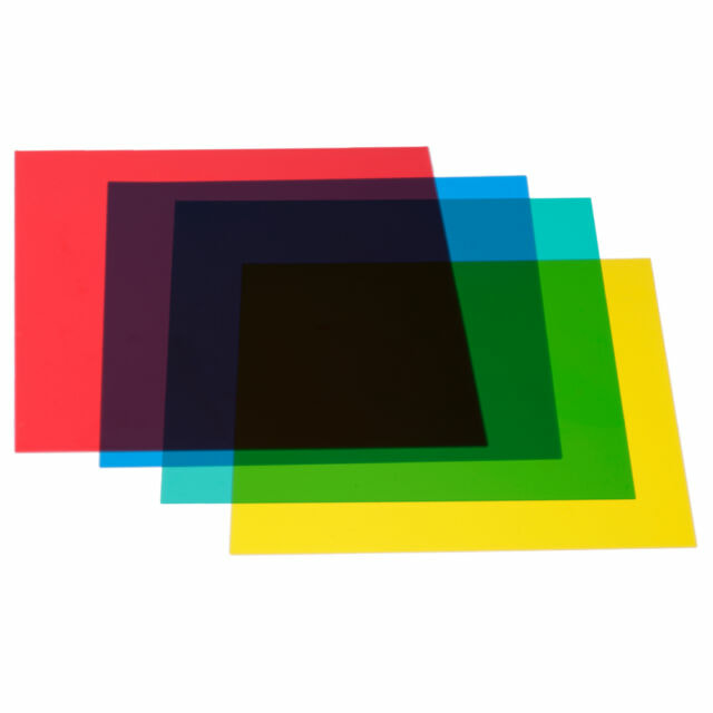
In this development I used colours to convey the emotions of the subject. I covered the lens of my camera with coloured gels, similar to the ones I have shown on the left. In some cases this created a hue over the images and in other it created and intense and strongly saturated image, it all depended on how the camera performed and where we were standing in relation to the light. The process was simple and I found that other less common feelings like jealousy or rage were harder for the subject to convey without the image seeming forced, for this reason the best images that came out of the shoot were the ones which conveyed simple and common emotions like sadness, happiness or love. this was the final product:
|
|
|
|
LOVE
|
|
SADNESS
|
|
HAPPINESS:
|
|
I think that the topic of mental health is important to touch on when looking at youth however I think the topic of emotion is too broad and strays from the title so I can't see myself carrying on in this direction. In addition the aesthetic of the images with the colours is too dissimilar to the style of documentary photography.
Mental Health
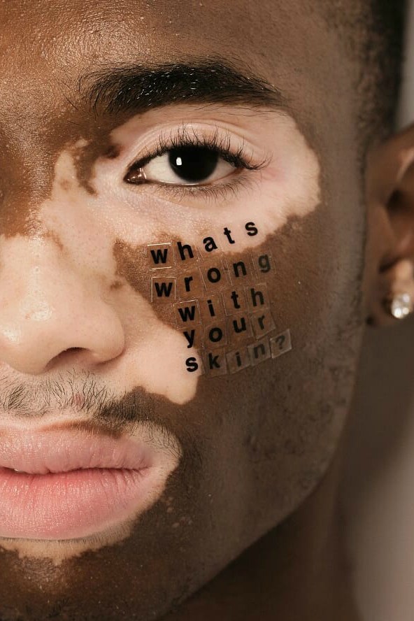
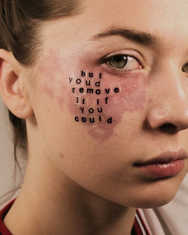
After deciding in the previous development that I would like to focus on mental health and the struggles that young people can have with their mental health I knew that my friend Mia would be a good subject for this development. She has struggled with bad mental health since we were young and is very open about this. The idea was very collaborative because I thought it would be more impactful and meaningful if she had helped in producing the idea on how we could present her and her mental health. After looking at more conceptual work around mental health I wasn't sure that this was a direction I would take it in mainly because it didn't focus on the individual and their unique struggle which was the point of asking somebody who had a personal story to tell. I had been following a photographer called Peter DeVito on instagram a few months and his work is something that inspired this project heavily. That work is displayed below.
|
|
ARTIST- Peter DeVito
Peter DiVito is a American photographer who showcases his work primarily on social media. He wants to change the conversation about body positivity, he doesn't want to just talk about it but wants to showcase people embracing themselves and their imperfections. He says "I was really inspired because a lot of people on social media started posting things about body positivity and self-acceptance". His work is very literal and to-the-point. This is something I wanted to carry over into my work. |
MY WORK
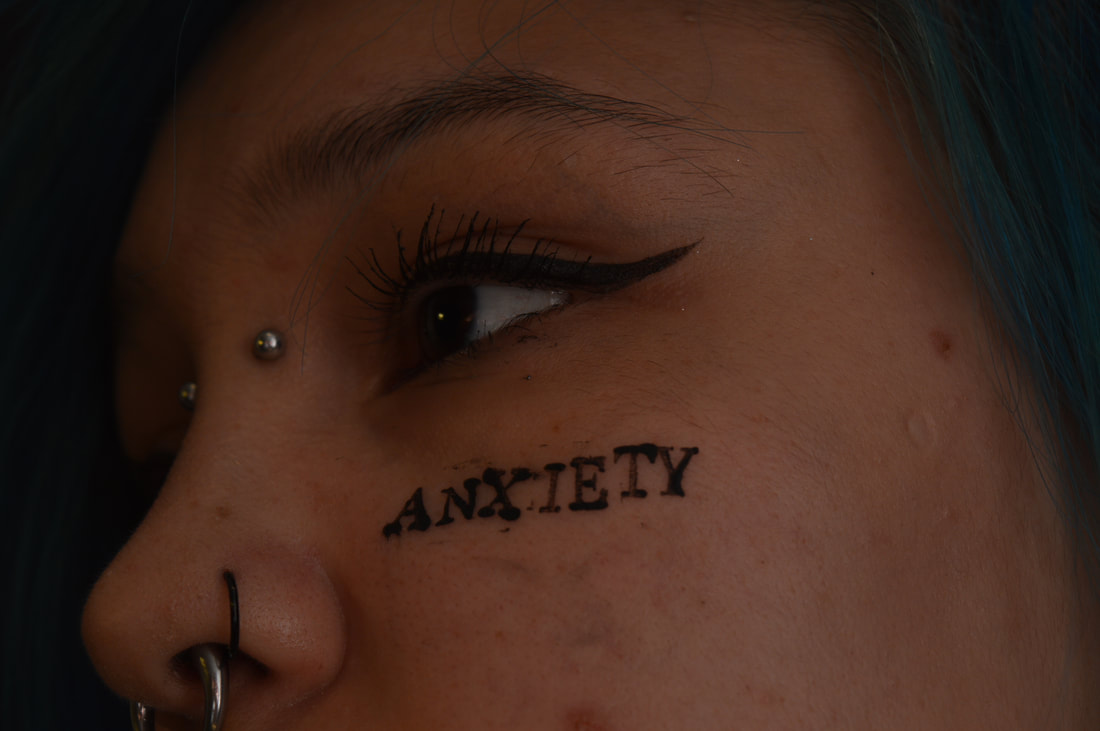
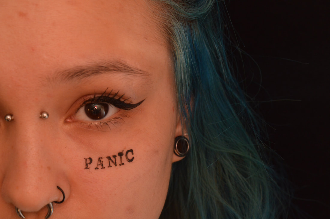
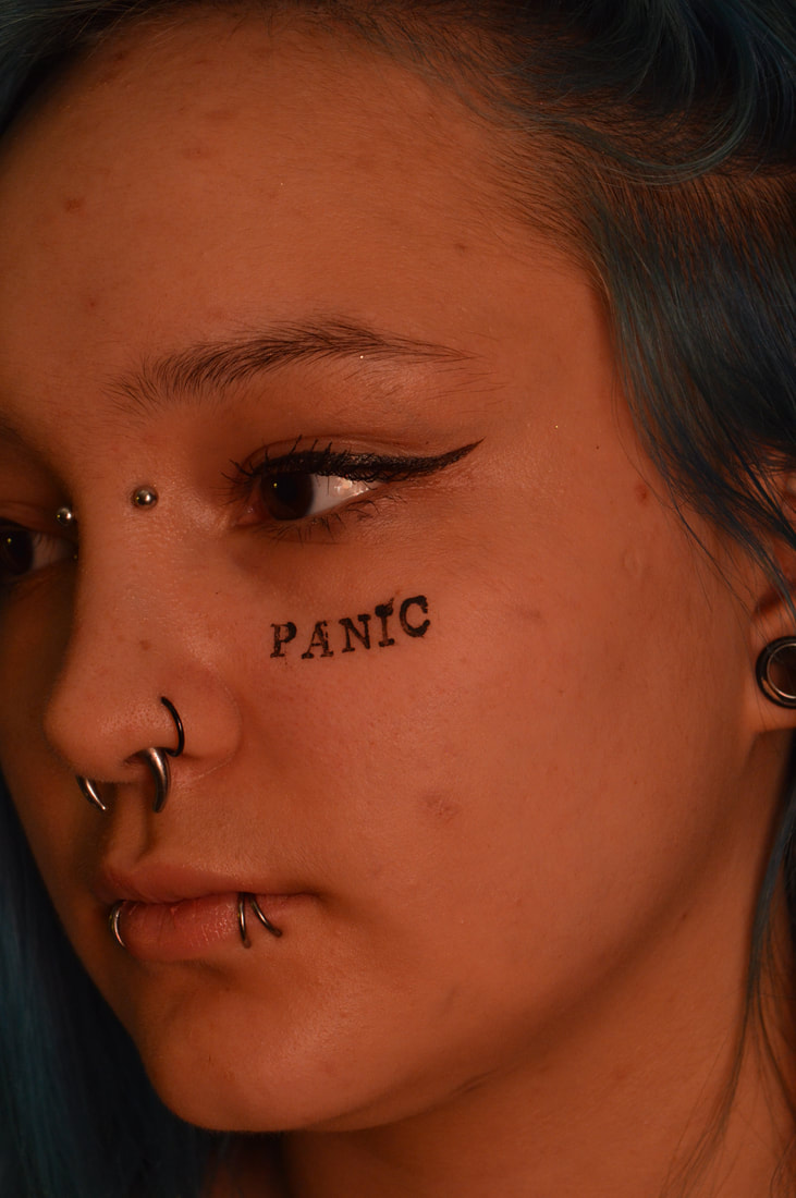
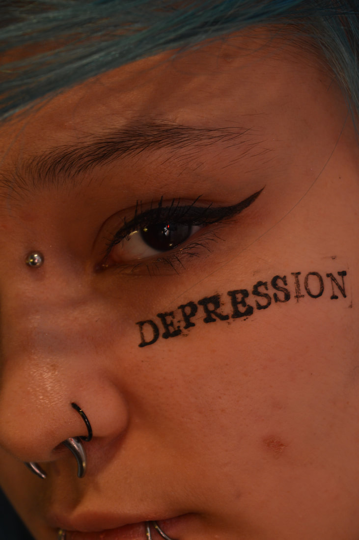
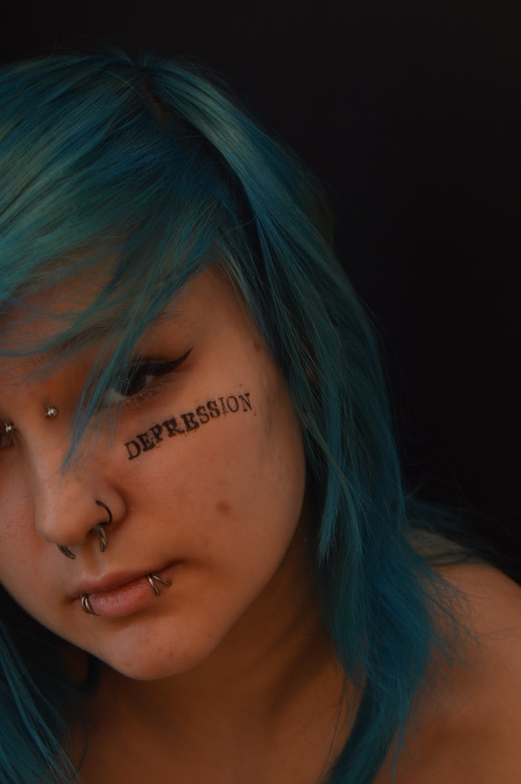
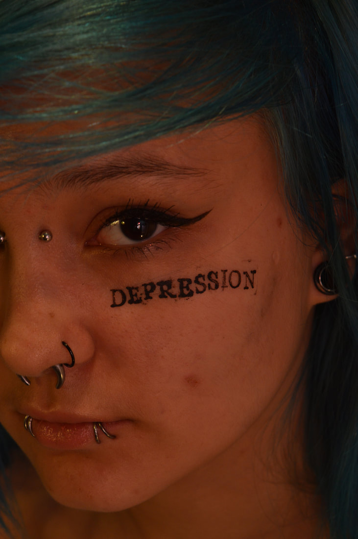
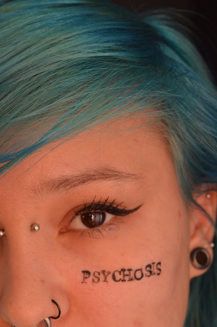
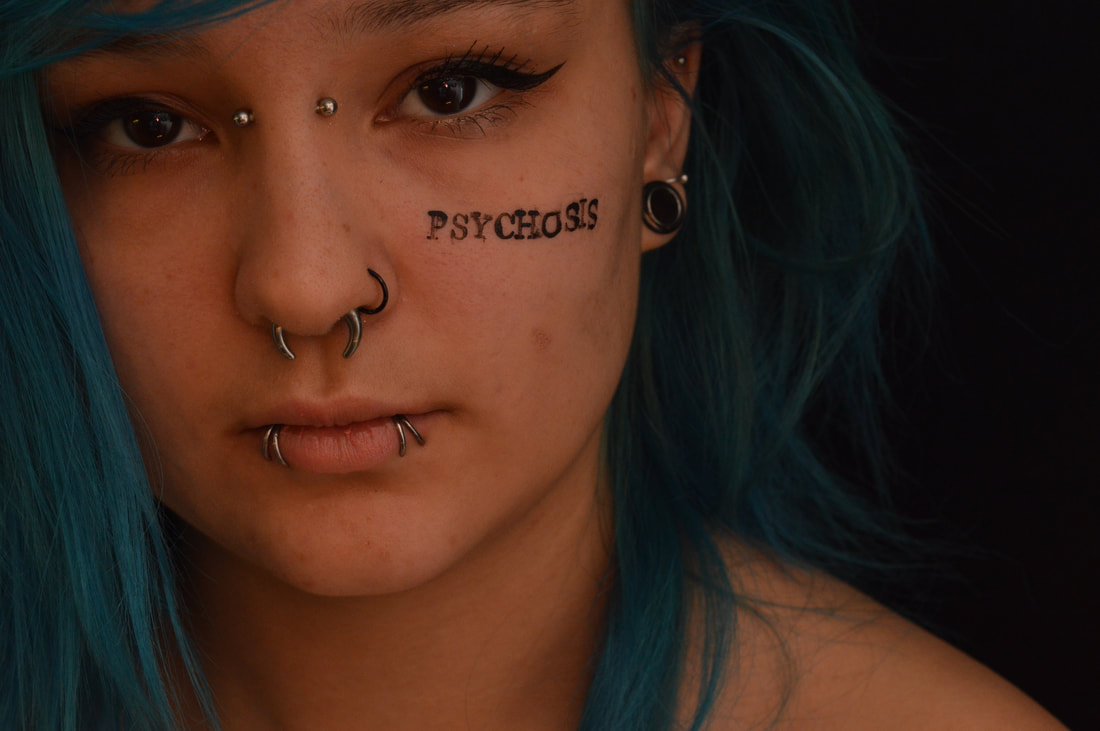
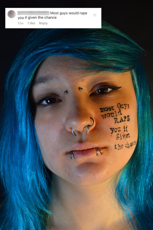
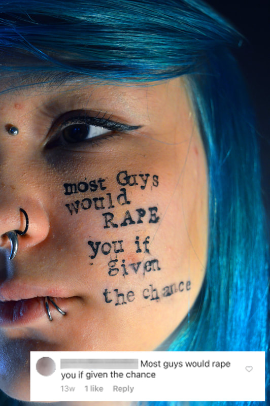
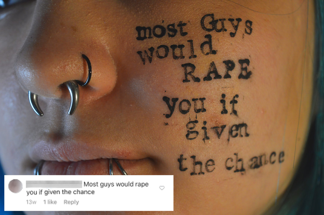
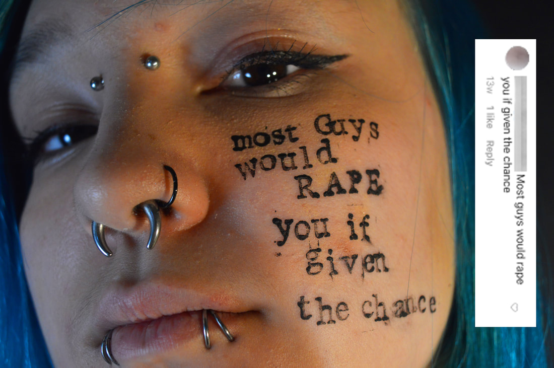
In the end after talking to Mia we decided that we would print on her face the issues that she has been diagnosed with in the past, some of these have changed and are no longer problems for her and some she was misdiagnosed with. From this we started discussing the importance we now give to labelling people and putting them into set boxes. So even though some of these diagnosis turned out to have been incorrect or misjudgements there seemed to of been a rush for people to put a label on Mia. This is something that is common in society today and probably the reason for some many people now self diagnosing themselves, all because they want to be able to identify what they think is wrong with them. This is something that heavily affects young people because that is how we are now being conditioned to treat ourselves and others, I hope that this physical representation of labelling will emphasise the negative effect of this problem and also draw attention to the mental health issues that do affect young people.
|
|
|
|
|
|
|
|
|
|
|
|
|
The sentiment behind the images has been conveyed successfully and they draw attention to the struggle of the individual as opposed to capturing mental health with a broad lens. However I think there should be more said directly by my subject as opposed to just her diagnosis being told to the audience. This could be in the form of a letter to accompany the images or maybe a video interview. In addition this discussion on mental health also got us discussing why bad mental health is such an issue amongst young people. We essentially came to the conclusion that the reason there is a a high amount of mental health problems among young people, although many of the cases are mild and not as severe as Mia's, is because of social media. Social media can be a positive place but it is also a place full of people trying to compete with each other and bring one another down. Mia herself has a large social media following and from this she has a very positive and supportive fan base, but with this comes hate messages. This is where the idea for my next development came from.
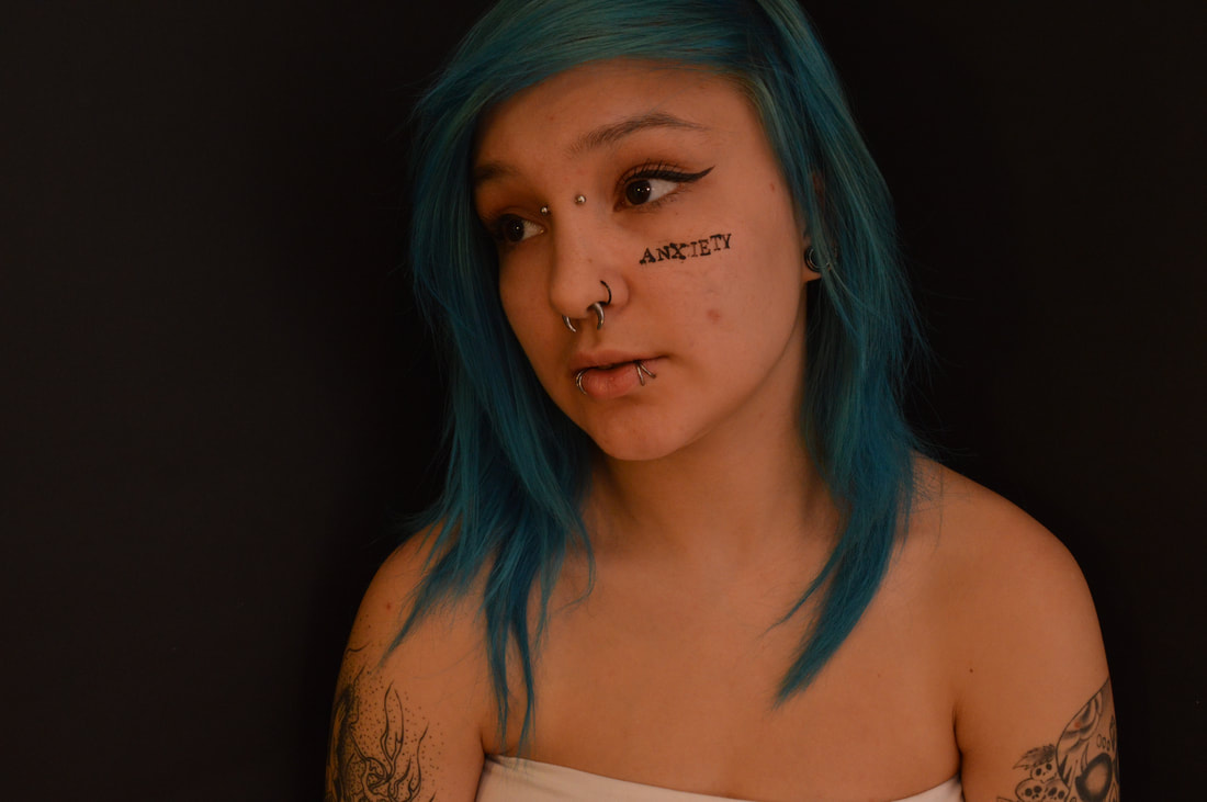
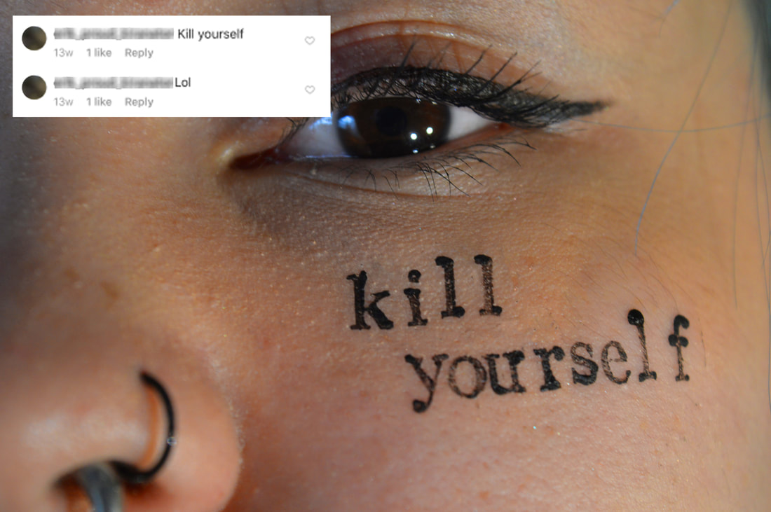
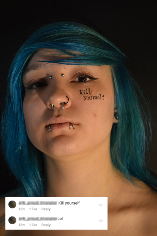
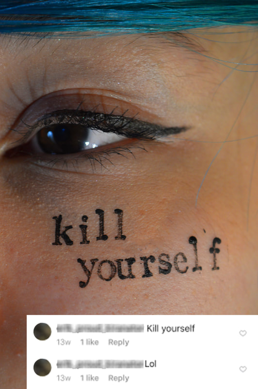
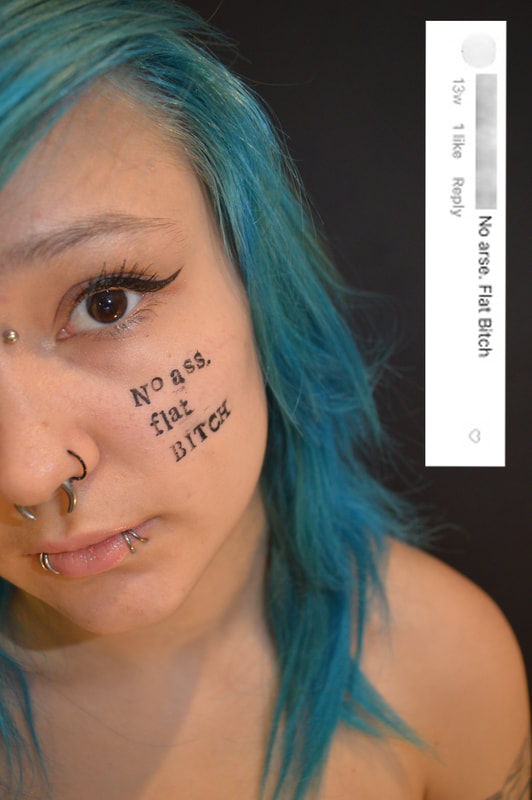
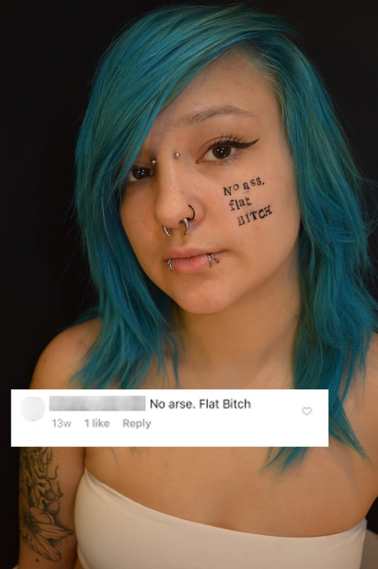
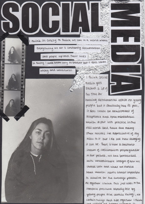
Social Media
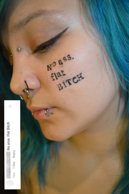
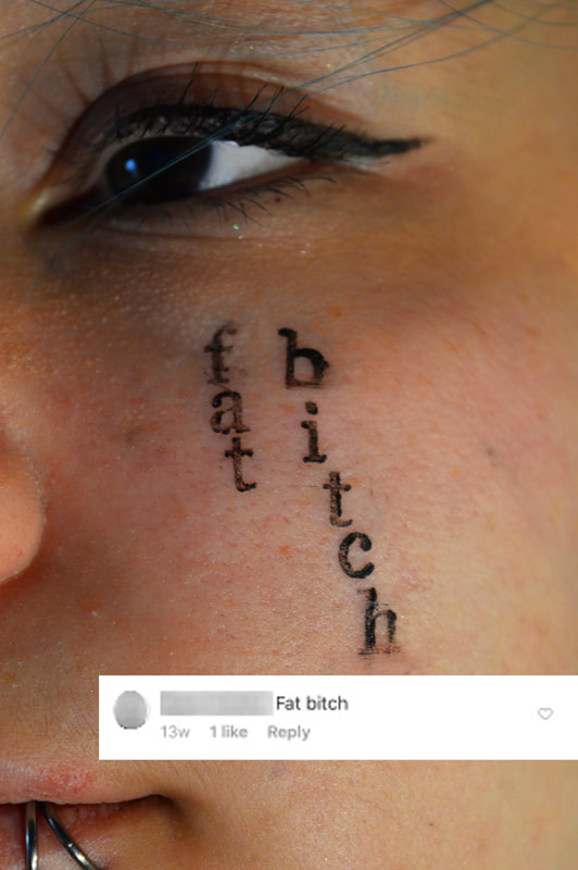
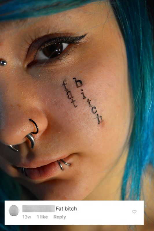
Seeing as social media plays such a huge role in our live now and is an youth dominated area I thought that exploring how this affects young people and the negative effects of it would be an interesting thing to focus on and explore. AsIi mentioned in the last development Mia has a big social media following which means that sometimes people say hateful things on her page. We collated some of the hate comments that she had received in the past and printed the on her face like we had with her diagnosis. Mia and I spoke about the detached nature of social media and how this means people don't understand the gravity of their words and don't associate an account with a real person, people tend to say things online that they would never say in to somebody in real life. By putting these things on Mia’s face we are physically attaching the person to the comment, putting a face to the account, hopefully creating a physical representation of what leaving a hate comment is really like and how these things can stick with people. Like I said these were real comments left on her page and I felt as though by attaching it the screenshot to the actual image it created a physical juxtaposition between what seems to be harmless words written online and the effect it can actually have on somebody.
|
|
|
|
|
|
|
|
|
|
|
I like this development because it draws attention to an important issue for young people. It is striking, the words are shocking and I think they are impactful which was the aim of this development, to leave an impact. However I think that i've only been looking at these topics of youth from the perspectives of young people. I want to broaden the perspective of the project and look at youth from a new viewpoint.
Personal Stories
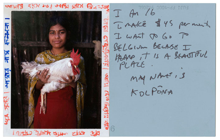
after thinking about how i could look at youth from a new perspective the obvious choice was adults, in addition i wanted them to be telling personal stories about their youths. i have across the work of Jim Goldberg many times before and his work is very well know for being a combination of images and writing, mixing mediums is something i do like to do in my work and would like to do in this project as well. i have displayed some of Jim Goldberg's work below.
ARTIST- Jim Goldberg
jim goldberg is an American artist and photographer his work focus on peopel in the margins of society. his work adreses topics such as neglect, poverty, abuse. these particular styles of work are of his most famous. the idea behind them is to get a clear message or story across to the audience directly from the subject. there always more to be said that from what an image can tell us and this is why i think the sentiment of goldbergs work is so stricking and impactful. Goldberg is part of the social aims movement in photography it combines improvisation with the use of the camera to unveil truth or highlight subjects hidden behind crude reality.
jim goldberg is an American artist and photographer his work focus on peopel in the margins of society. his work adreses topics such as neglect, poverty, abuse. these particular styles of work are of his most famous. the idea behind them is to get a clear message or story across to the audience directly from the subject. there always more to be said that from what an image can tell us and this is why i think the sentiment of goldbergs work is so stricking and impactful. Goldberg is part of the social aims movement in photography it combines improvisation with the use of the camera to unveil truth or highlight subjects hidden behind crude reality.
|
|
MY WORK
To create this work i got my nan to write down stories from her childhood and youth, i then matched these with old family photos, scanned all the components onto the computer and created the images on photoshop. i think this is an interesting way of adding a more in depth narrative to the images and of exploring new ways of presenting your subject's story. In addition the story written in the actual handwriting of the person makes the images even more personal and sentimental.
To create this work i got my nan to write down stories from her childhood and youth, i then matched these with old family photos, scanned all the components onto the computer and created the images on photoshop. i think this is an interesting way of adding a more in depth narrative to the images and of exploring new ways of presenting your subject's story. In addition the story written in the actual handwriting of the person makes the images even more personal and sentimental.
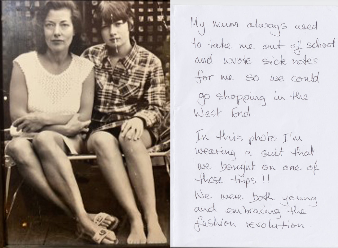
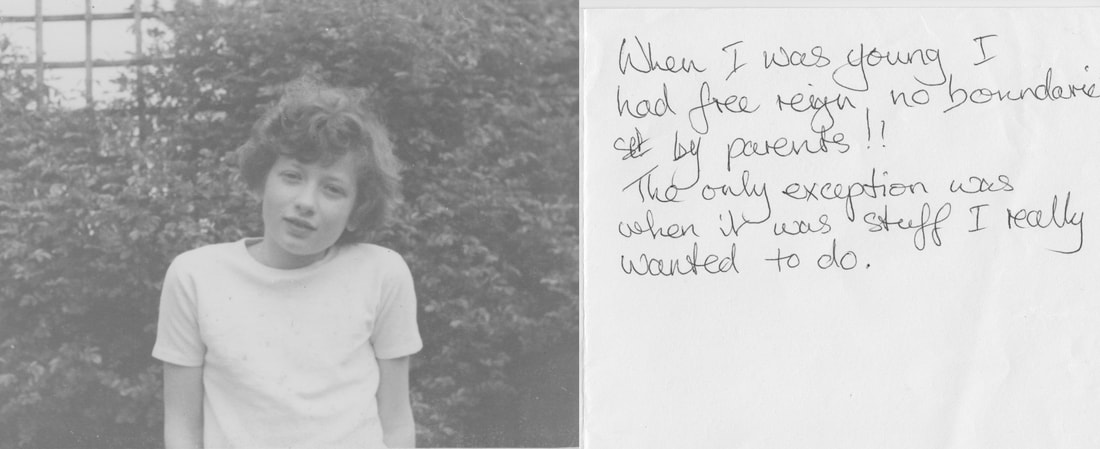
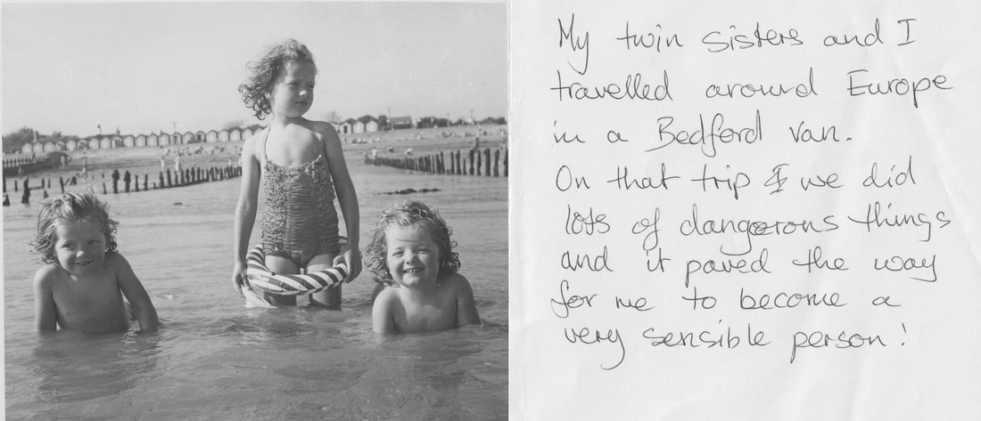
I really like the outcome of this development; I think the personal message directly from the subject coupled with it being written in their own handwriting emphasises the personal story the image tells. I think that this personal touch is what was missing from my development about mental health. I really like this feature. However the images are not mine so in future developments I think it is important that I include images that I have taken. In addition I do want to carry on exploring different mediums and perspectives as this is what has sparked my interest the most in the project so far and I hope to broaden my scope on youth.
'YOUTH' Documentary- past, present, future
My idea for this video came from the desire to look at youth from alternative perspectives and explore new mediums. The video is a compilation of 5 interviews that I did with 5 different people where they spoke about their own youths, how the experience of being young has changed and what they think about the youth of today and their futures. I think the development was successful in achieving my goal and bought up some important issues and areas which I had previously discussed in my project and some that were new. Throughout my project I have looked at different areas individually and experimented to find out which one I would want to take forward into a final piece but I think that the middle segment of the video where the subjects speak about relationships, friendships, school, politics, music and drugs has emphasised to me the intricacies of what it means to be young and that it would be better to look at these topics as a collective as opposed to as separate topics. The final video is below:
|
|
Editing of the video was a complicated process. First I watched through the footage and made notes on each answer that each person gave. After that it was the long process of compiling the footage and making is coherent. I have described how I did the main steps of this process below.
HOW TO CUT TOGETHER THE VIDEO:
HOW TO CROP INDIVIDUAL INTERVIEWS:
HOW TO LEVEL OUT THE AUDIO:
HOW TO MAKE THE VIDEO GREY:
I think that the documentary was successful and it produced a lot of new idea about youth and how I could move forward in my project. My Mum and Nan were both involved in the video and I felt like this was an interesting focal point when thinking about, youth and how youth has changed for different generations. This direct comparison is very apparent for me, my Mum and my Nan because we all grew up in the same area and we all went to the same primary and secondary schools, we also grew up with very similar socioeconomic backgrounds with all our mothers being teachers, so for these reasons we are very good example where not much has been different between us when we were young apart from the decade we grew up in. In addition to this I wanted to turn focus to myself and what youth means to me personally while also including the idea of looking at it in separate topics but all together in an accumulation.
self reflection
After deciding to look at myself specifically and explore what my own personal experience of being young was I looked at the idea of self portraiture and looked at work from artists like Vivian Maire. Her work is displayed below
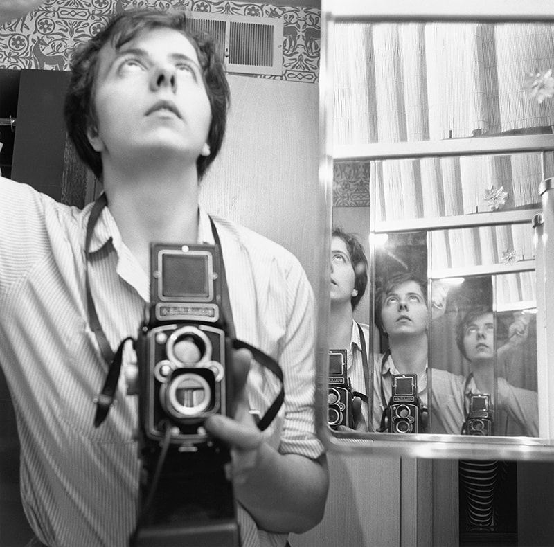
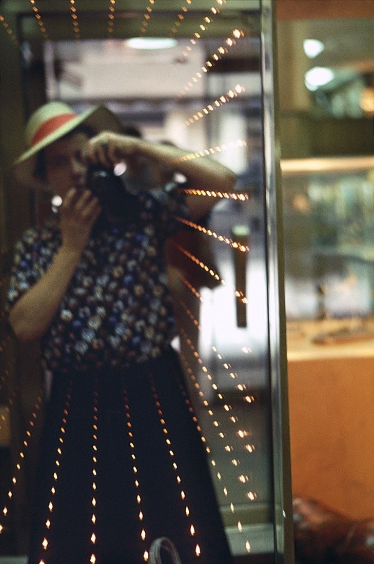
ARTIST- Viviane Maire
Viviane Maier was an American street photographer who worked for 40 years as a nanny only pursuing photography during her spare time. She took more than 150,000 photographs during her lifetime, primarily of the people and architecture of Chicago, New York City, and Los Angeles. During her lifetime Maier's photographs were unknown and unpublished, shortly after her death a collector posted some of Maier's work on the website Flikr and this sparked lots of interest. Since that post in 2009 (7 months after Maier's death) her photographs have been exhibited around the world. Her work with self-portraiture is what drew me to her work. She works a lot with mirrors and reflections making no secret of the fact she is taking the image herself, rarely is the camera not in the images she takes of herself. She is a mysterious character and I feel like her images convey mystery and ambiguity. I really like the style of these portraits and the story of how her work became so well known.
Viviane Maier was an American street photographer who worked for 40 years as a nanny only pursuing photography during her spare time. She took more than 150,000 photographs during her lifetime, primarily of the people and architecture of Chicago, New York City, and Los Angeles. During her lifetime Maier's photographs were unknown and unpublished, shortly after her death a collector posted some of Maier's work on the website Flikr and this sparked lots of interest. Since that post in 2009 (7 months after Maier's death) her photographs have been exhibited around the world. Her work with self-portraiture is what drew me to her work. She works a lot with mirrors and reflections making no secret of the fact she is taking the image herself, rarely is the camera not in the images she takes of herself. She is a mysterious character and I feel like her images convey mystery and ambiguity. I really like the style of these portraits and the story of how her work became so well known.
|
|
MY WORK
|
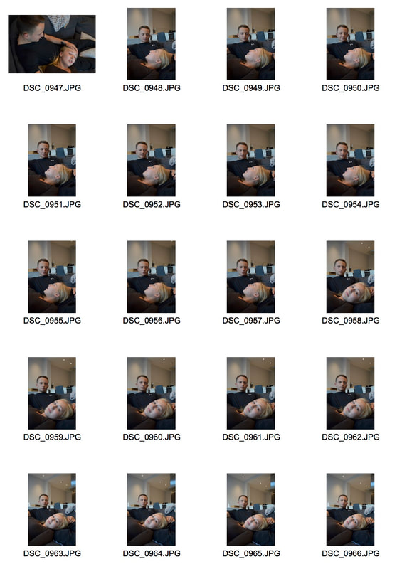
I started the development by taking portraits of myself, I used multiple mirror so that there would be multiple reflections of me in the image, similar to the effect that Viviane Maier uses in her work. I also experimented with my reflection in windows and in reflective surfaces, For a few of the image I used my reflection in tin foil. I then edited these images in Photoshop, I have shown how I've done this in a slide show below.
|
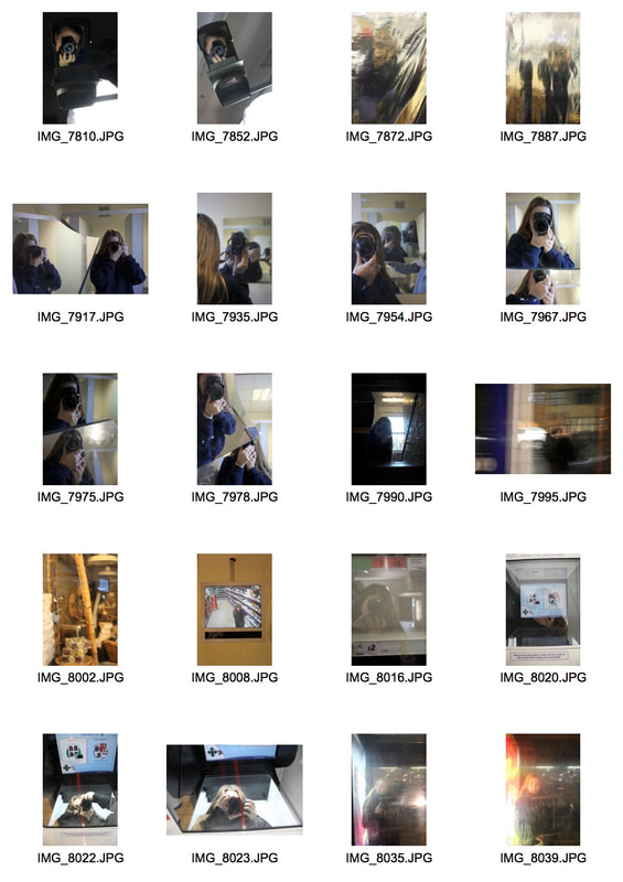
|
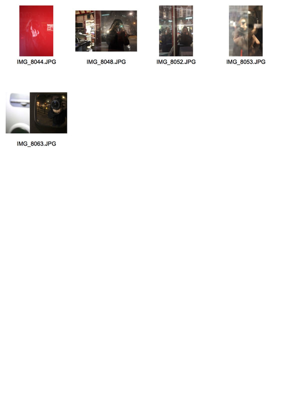
|
After printing out all the edited images I stuck them down onto poster board with glue and then added black duct tape, I think that this gave the collage more texture. I then added the writing. I was still trying to merge the discussion of the topics so I made the subject of each note ambiguous but they are all inspired by my thought on social media, politics, school, love or friendship. The final piece is shown below.
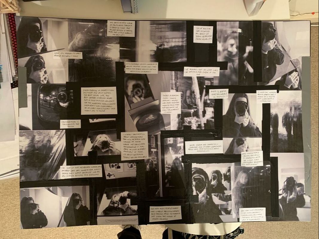
to get a closer look ive taken images of the 4 corners closer up:
i liked this development, i think using self portraits to symbolise self reflection worked well and creating a. project that combines the opioins and messages about all the topics I've looked at is much better that looking at them separately. i also like the formart of the collage with the black and white aesthetic. however i think not specifying which topic im talking about makes the writings a bit random and id want it to be more coherent in addition i think the camera overwhelmed the images.
topic collages
|
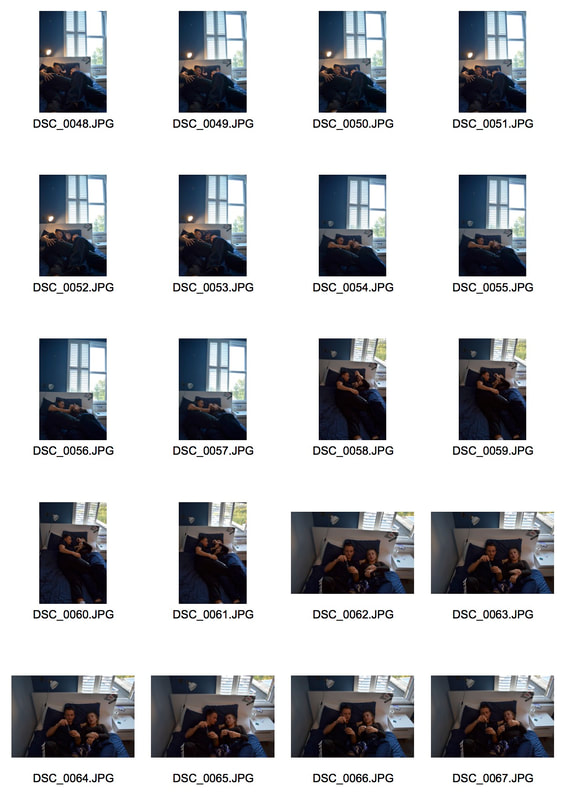
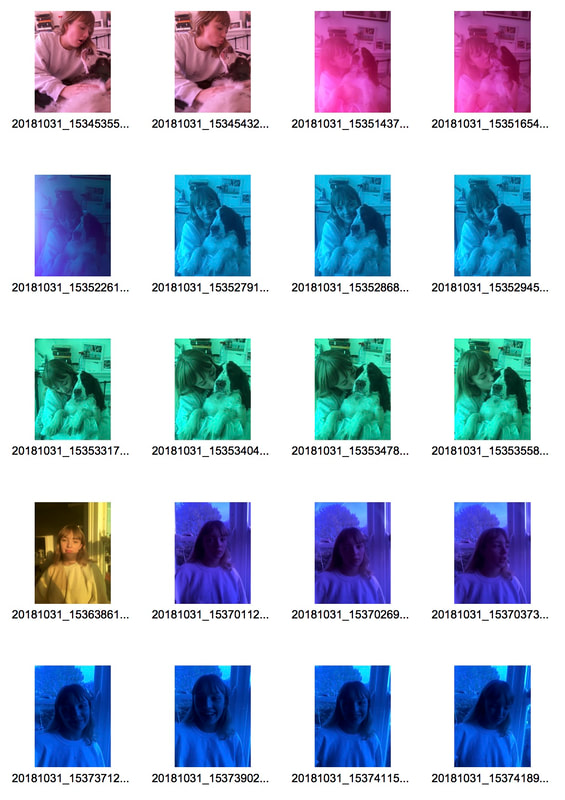
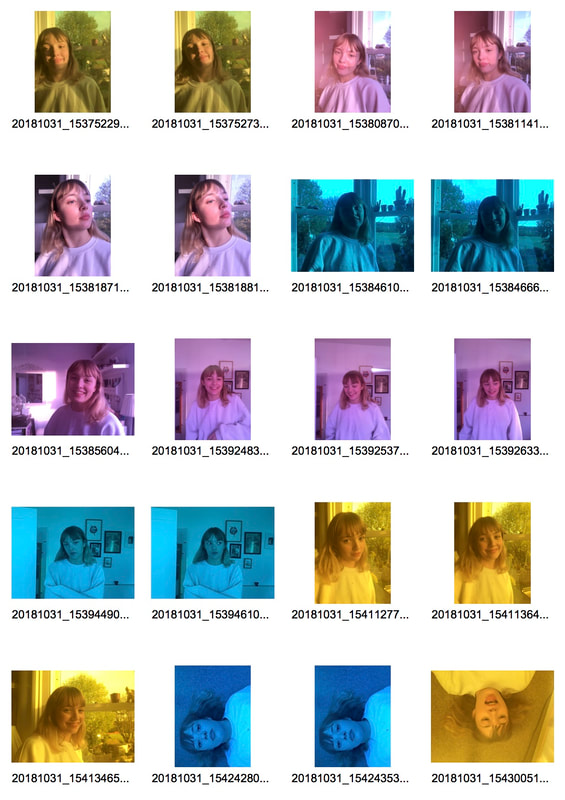
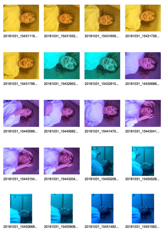
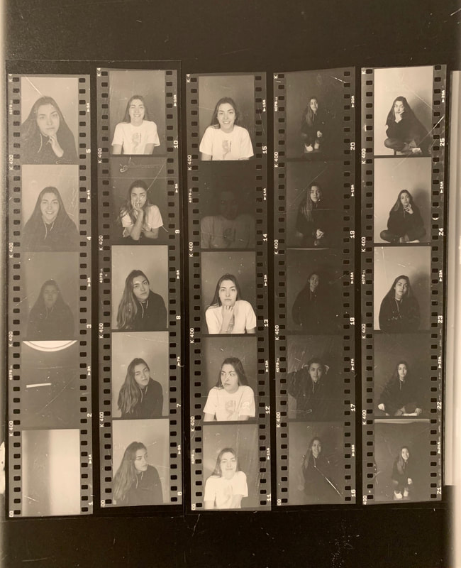
Moving forward into the next development I knew I would be using self-portraits so I took those on a film camera in the studio. I didn’t really know what I wanted from the images yet so tried to be natural and neutral in the images. The contact sheet from this shoot is on the left.
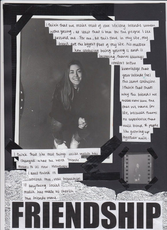
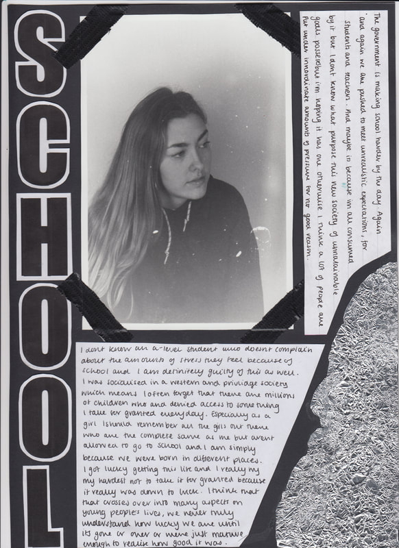
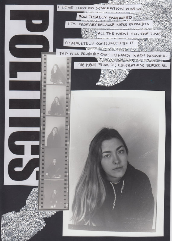
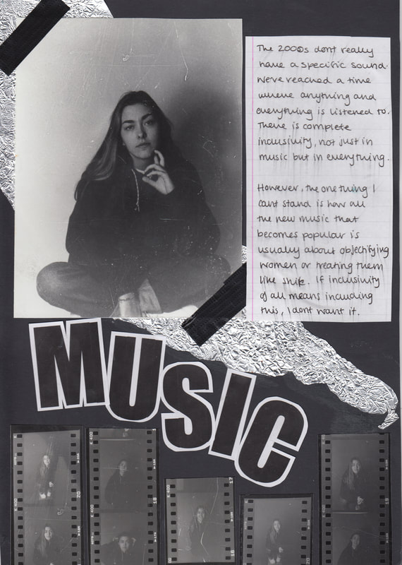
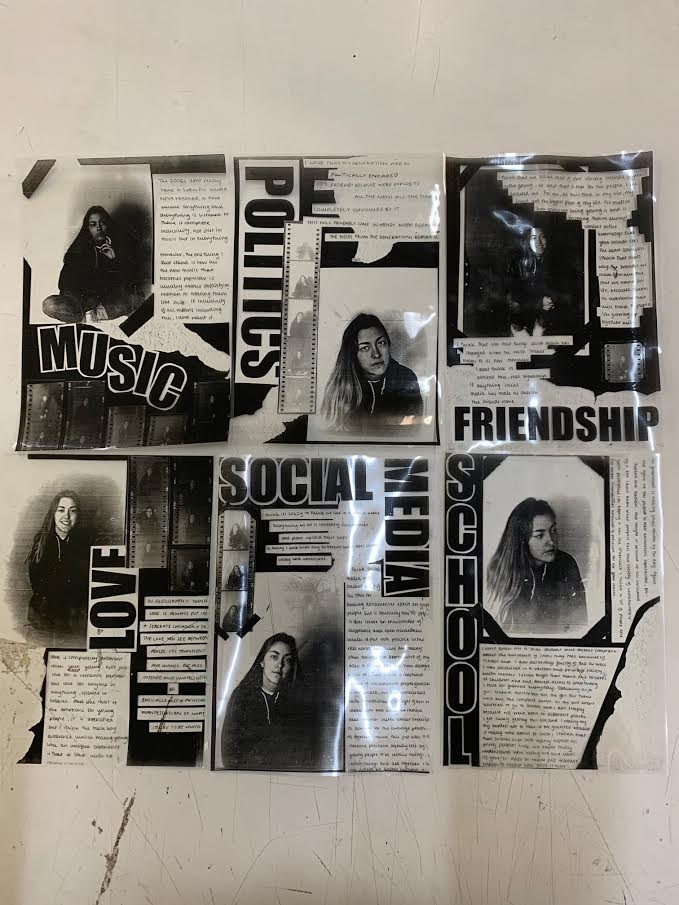
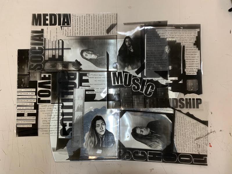
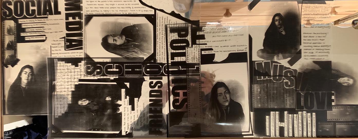
I knew that I wanted to make collages and I also wanted to combine the discussion of the topics without making them random and jumbled. So, it seemed obvious that I would make a set of collages that could be displayed together. So I chose 6 topics and developed 6 of the images I had taken in the dark room. These topics were school, love, politics, friendship, music and social media, although they aren't the exact topics that were spoken about in the video or in my previous development I did feel as though these were the one that I had the most to say about and the ones that affect my life and a young person the most. So after developing the images in the dark room i write down what I wanted to say about each topic and collated the collages. I felt as though they needed to have texture and layers so I added black tape like I had previously done in my last development. In addition to this I added tin foil, this idea was inspired by the portraits I took in the reflection of the tin foil, I wanted this to emphasise the aim of the collages he final product is shown bellow |
|
|
|
|
|
|
|
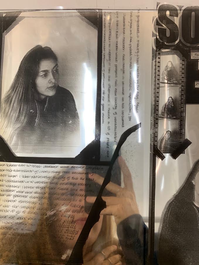
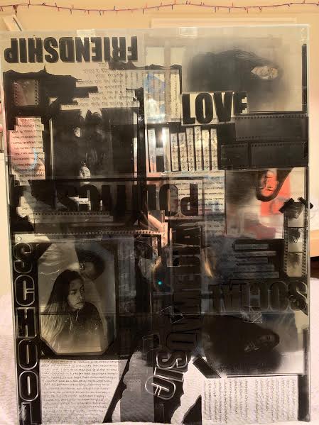
After making the collages I photocopied them and printed them onto acetate the product of this is displayed below. I then placed them on a mirror I have tried display the effect of this in the image on the right but the camera hasn't picked up the full effect. The effect of this was hopefully to emphasise the metaphor of self-reflection, which needs to be emphasised now the component of tin foil is not on the acetate photocopies.
|
|
I then experiment with the arrangement of the images on the mirror, This was just an example and as you can see this mirror is too small. I liked the aesthetic of the different orientations and the collage effect, I think it still emphasises the different topics being separate but at the same time presents it as a cohesive thought.
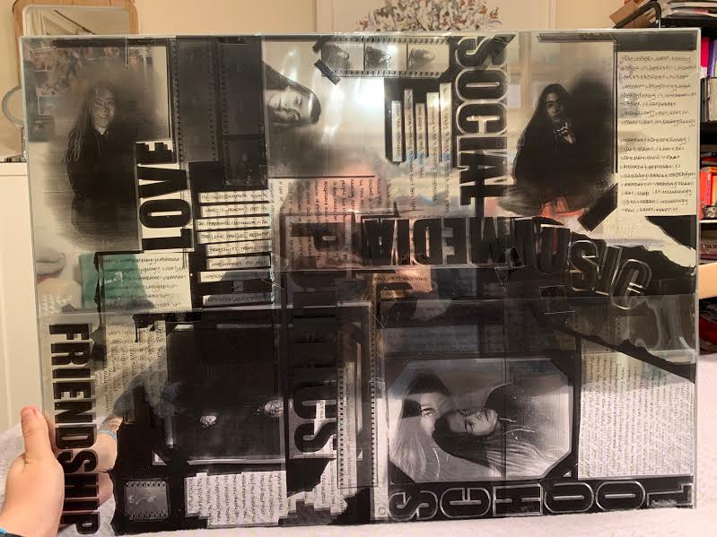
After getting a mirror that was the right size, this is what my final piece looked like, they will be accompanied by the original and separate collages.
|
|
