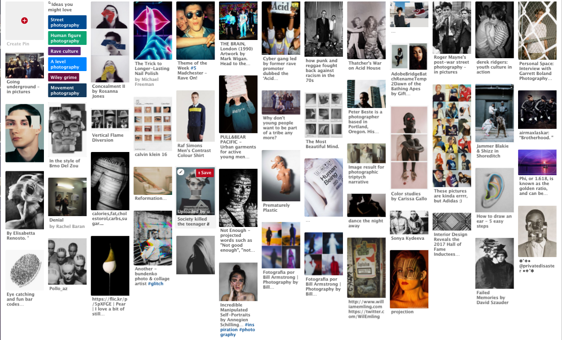
mood board
Artist
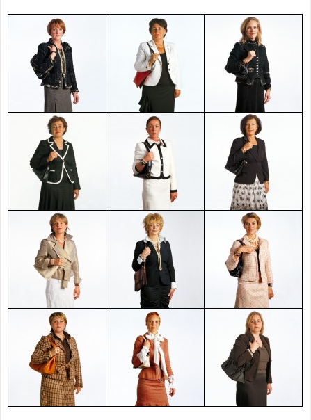
exactitudes- Photographer Ari Versluis and profiler Ellie Uyttenbroek
Ari Versluis and profiler Ellie Uyttenbroek create a thought provoking collection of images in their exactitudes project. They do this through showing fashion throughout the ages and the conventions which are seen in that time. I think that the photographers wanted us to consider the multitude of dress codes in which we all abide by in society. I think this because of the way the project presents itself. What I mean by this is that each collection of 12 images shows an individual style which is different to the other collections in the project but the layout of the collection shows that it’s not actually unique at all because so many people are dressed the same. I think it is in some way almost contradicting itself, because in one way its showing the differences between groups but the similarities between individuals. This is something that I find really compelling when exploring the conventions within fashion and the theme that this project explores.
I think that alongside the humorous aspect of this project there is a deeper meaning which addresses the wider issue of individuality and the obsession that society has with labelling and categorising people so that everybody fits into box and I think that exactitudes is really successful in conveying that lack of individuality due to society forcing it out of us. This is shown by the humorous layout the images which at a glance you may think are all the same person due to the matching clothes and poses, they look like clones of each other and I think that the decision to present the project in this way is one of the reasons that it is so successful in showing the theme and exploring ideas of individuality.
I think that alongside the humorous aspect of this project there is a deeper meaning which addresses the wider issue of individuality and the obsession that society has with labelling and categorising people so that everybody fits into box and I think that exactitudes is really successful in conveying that lack of individuality due to society forcing it out of us. This is shown by the humorous layout the images which at a glance you may think are all the same person due to the matching clothes and poses, they look like clones of each other and I think that the decision to present the project in this way is one of the reasons that it is so successful in showing the theme and exploring ideas of individuality.
|
|
|
Bill Armstrong
|
|
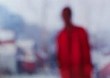
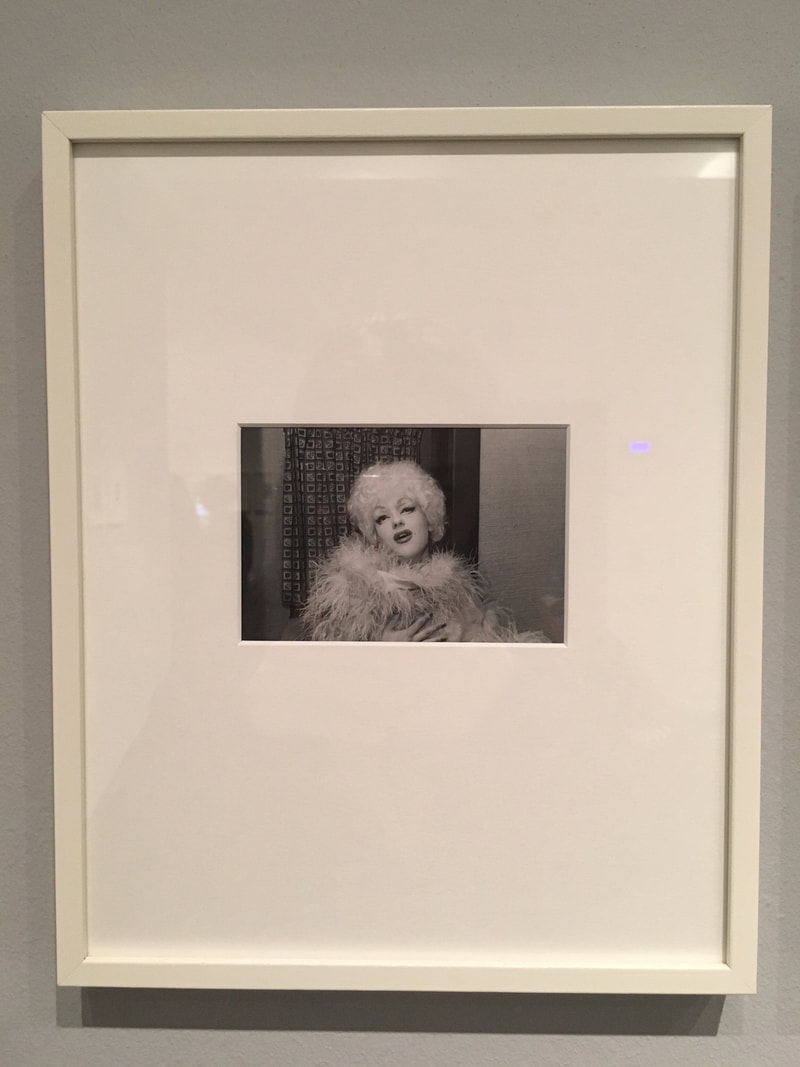
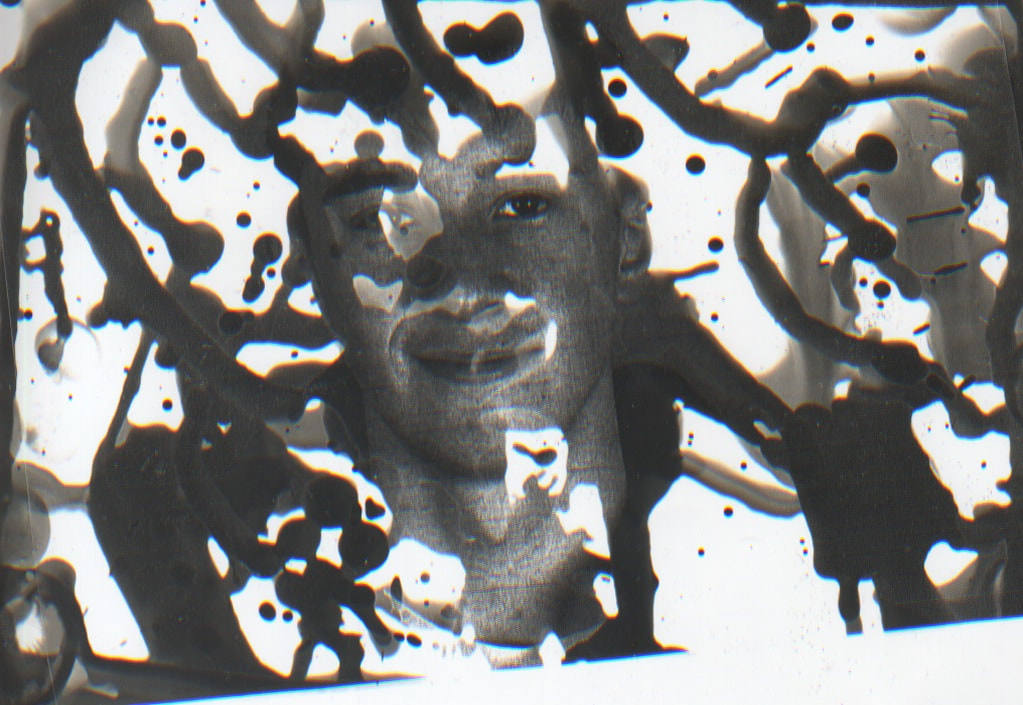
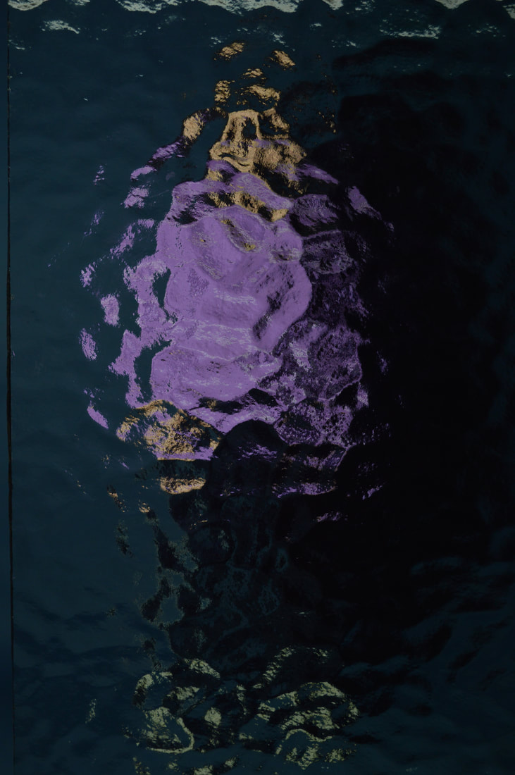
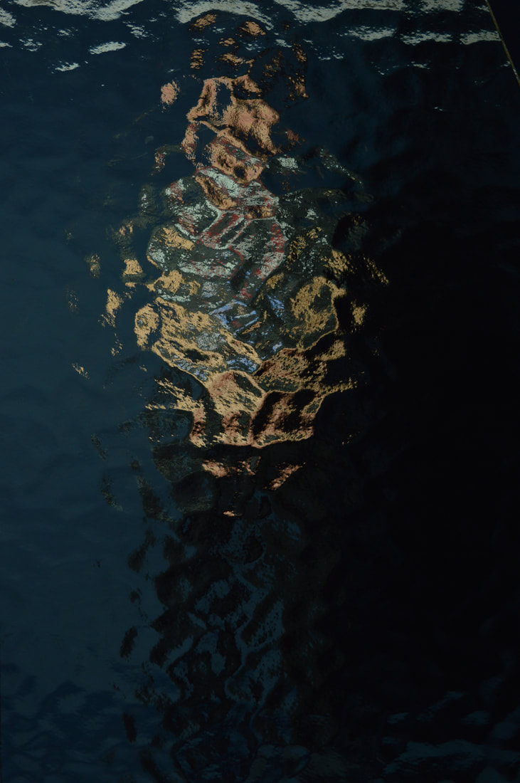
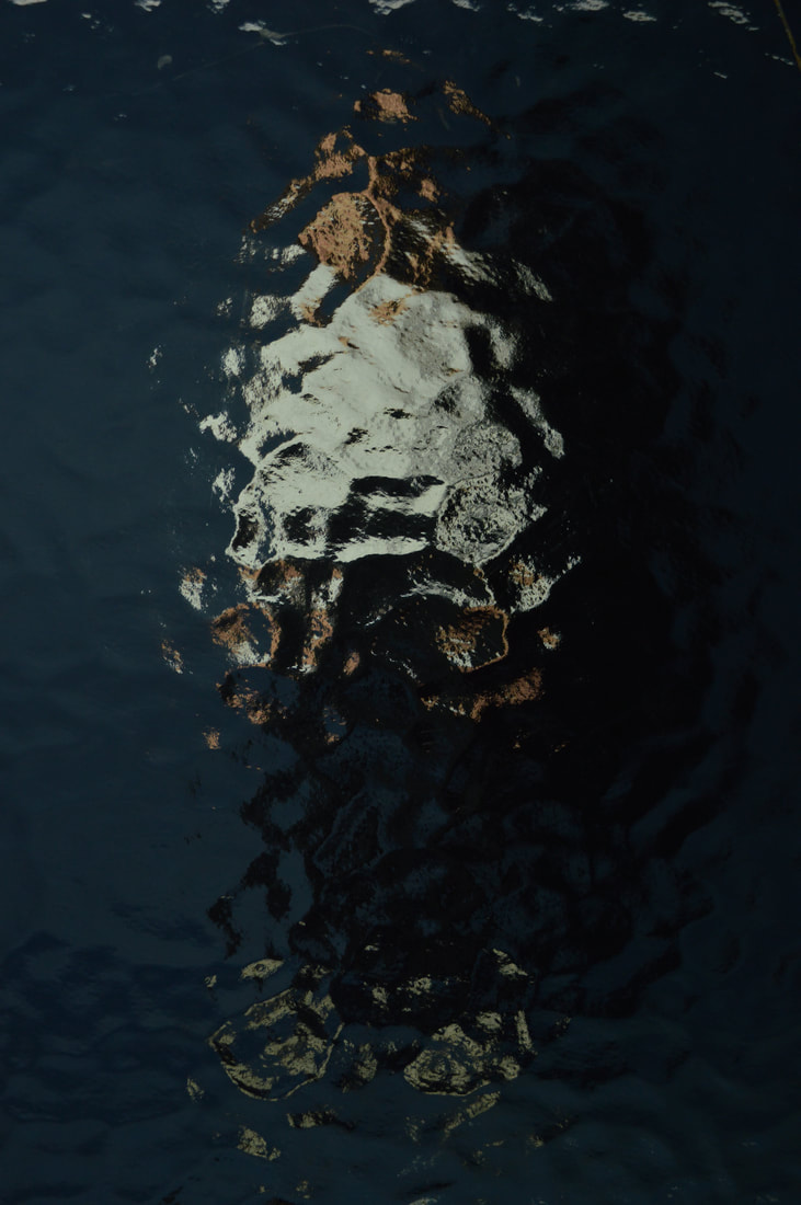
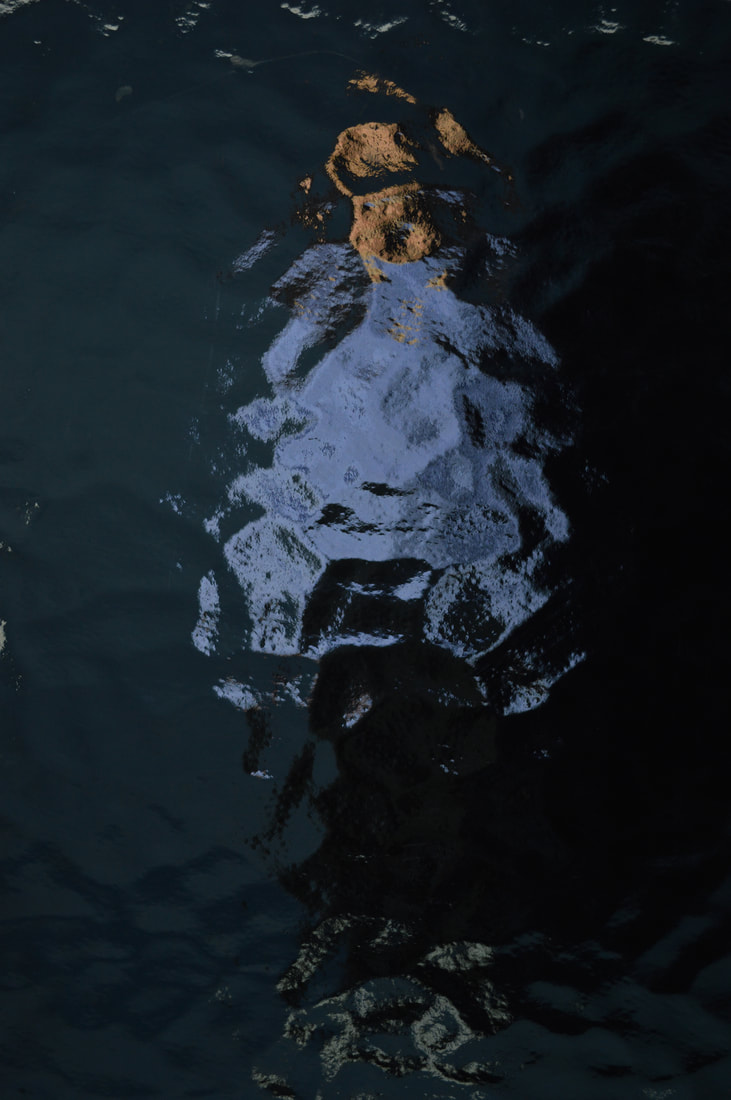
Having been born in Concord, Massachusetts, photographer Bill Armstrong now lives and works in New York.This fine Art photographer has exhibited in extensive collections across the world.These pieces are taken from ‘The infinity series’: a body of work Armstrong started in 1997.
I chose these images to represent secrets as I feel that Armstrong himself describes how he ‘conjure and world that hovers between the real and the fantastic’ (billarmstrongphotography.com) and i think this has strong links the the theme of secrets, mystery and the unknown. The artist has created this by blurring each subject in the photo, almost allowing them to disappear but Armstrong also describes ‘how the eye continually tries to resolve these images, but is unable to do so, and how that is unsettling’ and that I feel that this also represents the idea of not knowing something like a secret or being veiled behind something due to with holding a secret. Each image is created in vivid, colour, drawing the eye to the shapes within each image rather than just the subject. |
The Conversation
Paul Smith- Make My Night
|
|
|
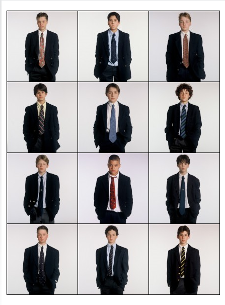
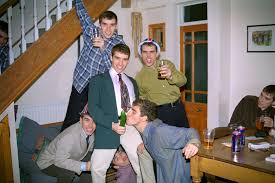
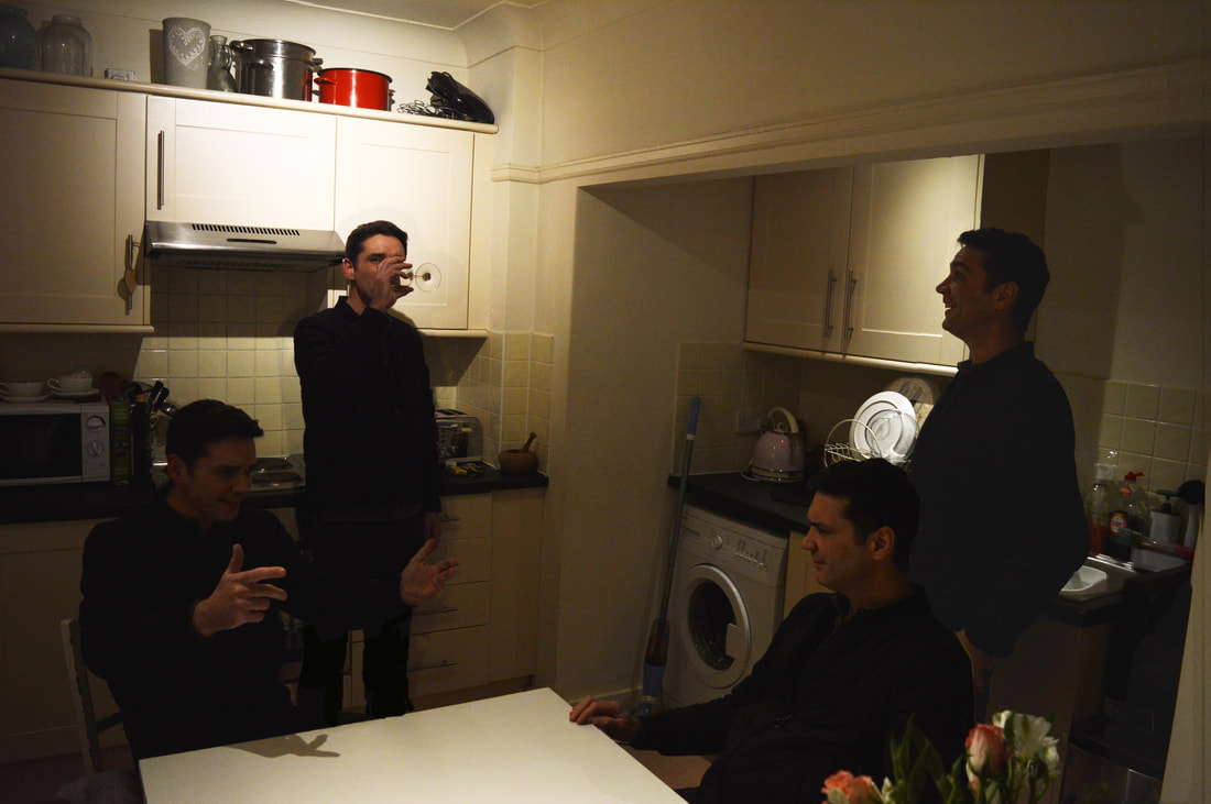
This work is called 'make my night' it was made by the photographer Paul Smith. This work shows a record of a very laddish night out to depict 'lad culture' in the noughties, the photographer's self-portraits are edited together to depict a scene from a classic night out with friends.
The images are very flat; I wouldn't say that there is much depth concerning what has been put in the foreground or background by the photographer. I think that this is a running theme in documentary photography which I is the category in which this project falls into. I like the style of the images I think that they look really natural like unprofessional images that boys might actually take on a night out, this is one of the things which makes this project so successful.
The composition of the image is very interesting because despite these images being very staged and thought out by the photographer, they are posed into a natural position and they look very candid until you look closer and realise that they are all the same person. The photographer has purposely done this so that it looks candid to express the theme of this project which is 'lad culture'.
I really like this project, not only is it very successful in conveying a theme but it also explores deeper ideas. I like the style of the candid photography which hasn't been taken on a professional or expensive camera, this photo quality adds to the effect of the imagery. As I mentioned earlier this project has deeper meaning, by looking at the idea of individuality but still being one individual, similarly to that of the exactitudes project. I think it has prompted me to think about the conformity within society where it can sometimes transpire that we are different people being the same, dressing the same and doing the same things. This idea is something interesting to explore when looking at conventions within society and codes of conduct which everybody complies with.
My Response
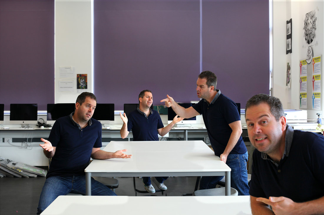
The intention of this task was to imitate the work of Paul Smith and explore the same themes that he looked at in his 'make my night' project. In order to do this we had to use a tripod and take multiple pictures of a model in different positions in the same frame.
PROCESS
|
|
I think that the outcome of this response was successful and it helped me develop my technique which would then aid me in creating amore refined piece if i were to develop this idea. however if i were to do it again i would make the model wear different clothes in each shot and make each image interact with each other in a more natural way, i think that this would aid in the communication of the concept behind the idea.
Gursky Exhibition
|
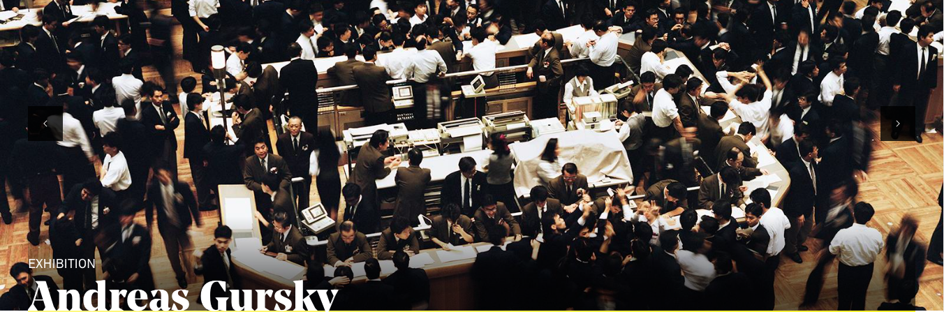
"In 2018, Hayward Gallery reopened with the first major UK retrospective of the work of acclaimed German photographer Andreas Gursky. Known for his large-scale, often spectacular pictures that portray emblematic sites and scenes of the global economy and contemporary life, he is widely regarded as one of the most significant photographers of our time."(https://www.southbankcentre.co.uk/whats-on/exhibitions/hayward-gallery-art/andreas-gursky)
|
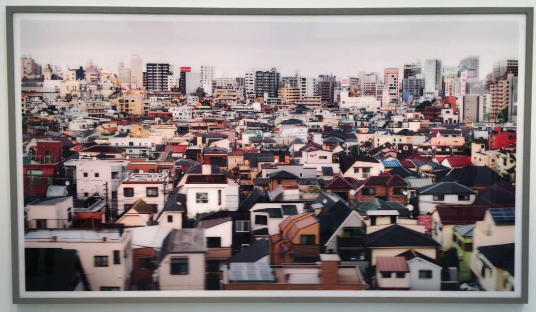
This image depicts a densely populated area in Tokyo. The image is slightly blurred which gives the effect that photographer might be on a train. Gursky depicts 'a world in high definition' in all his imagery and this is definitely prevalent in this particular image. The highly vibrant and saturated colours of the houses are eye-catching. Each house is different and this creates a collage effect which draws your eyes to the image. With lots of other pieces of work by Gursky I found it hard to look away because with every glance you seem to notice something new and interesting.
I think that the intention of this image is to depict through photography the fast growing society that we live in. The slight blur of the image makes it look as though the houses are moving rapidly which could be symbolic of population increase, globalisation and/ or urbanisation. I also believe that these are the wider issues that he is trying to express in most of his work and those three topics all fall under the umbrella of capitalism, which is a topic he has discussed when talking about the inspiration for his work.
As I mentioned before his image does seem to of been taken from a train of some sort of vehicle but I'm not sure if this is the case, this is because Gursky is very secretive about his processes, he believes when we concentrate to hard of the conditions in which an image was taken it takes away from the art of it.
hidden history
|
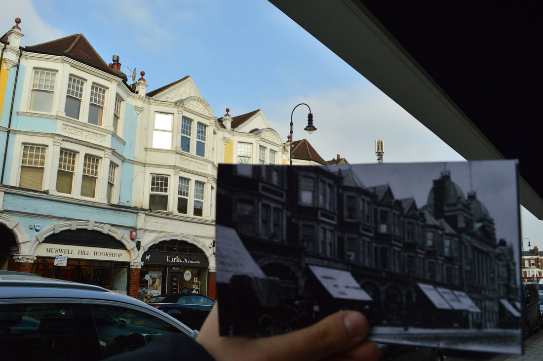
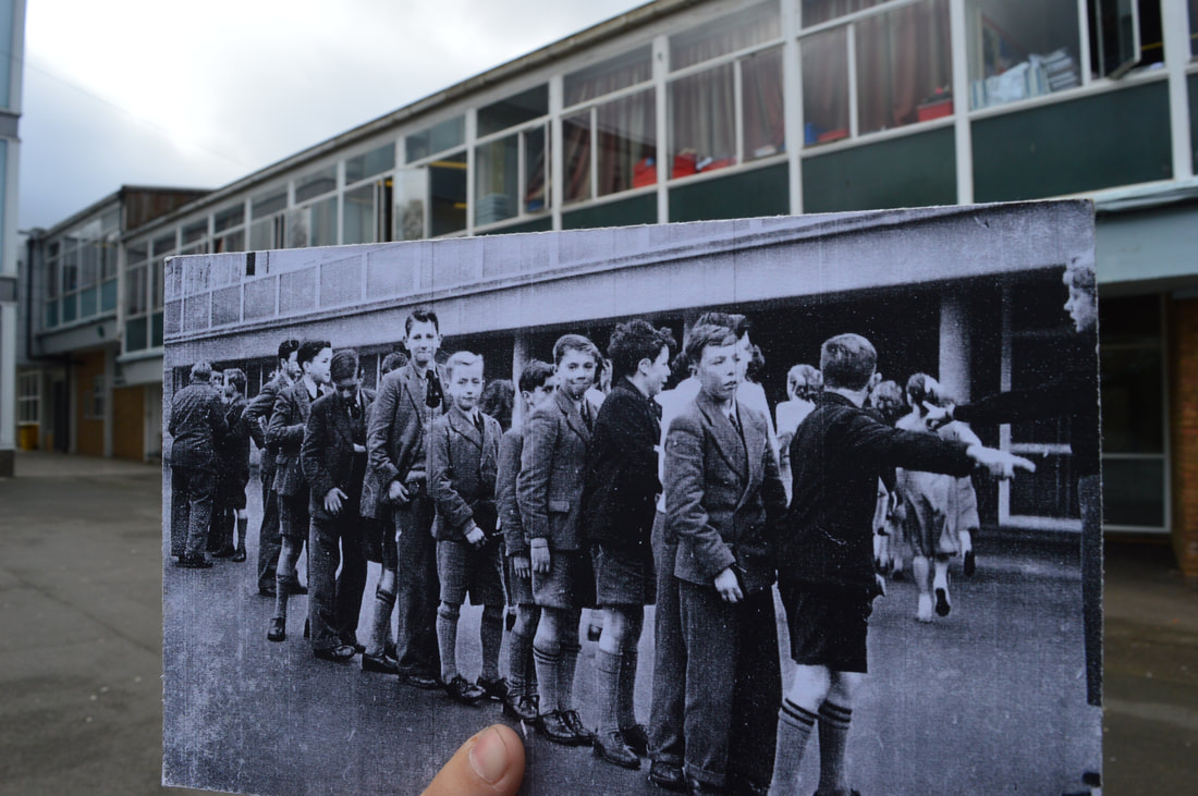
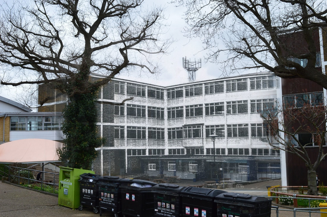
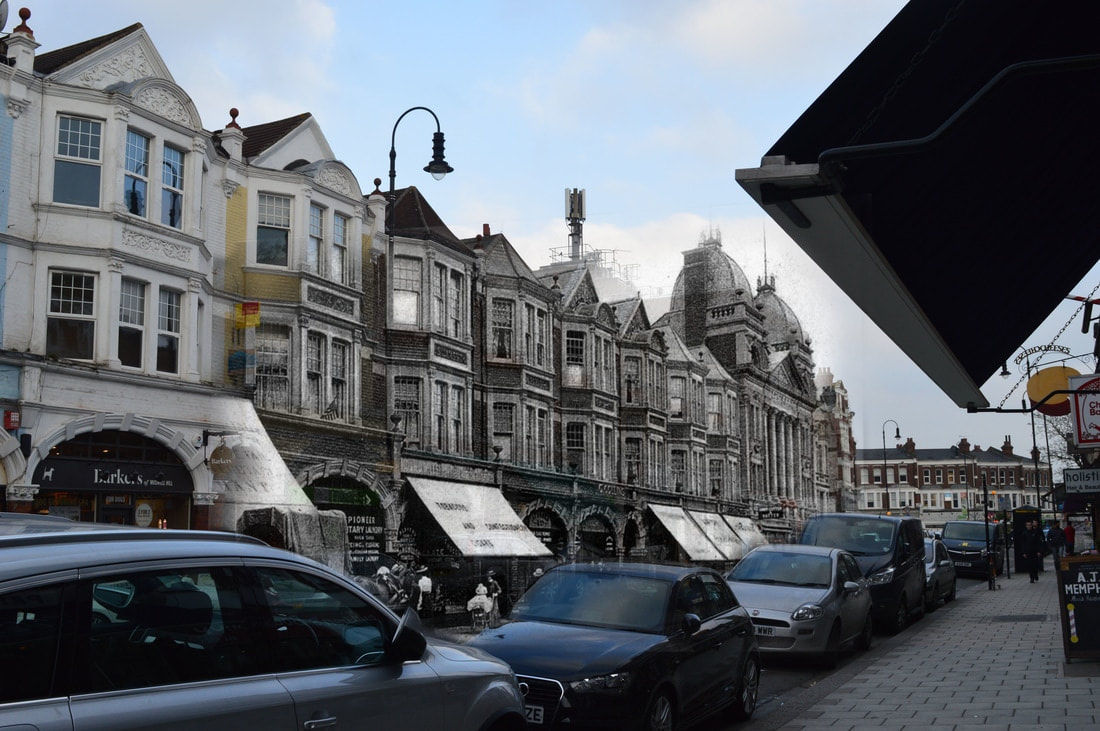
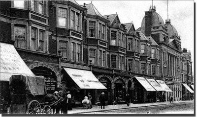
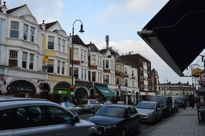
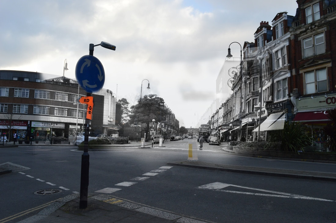
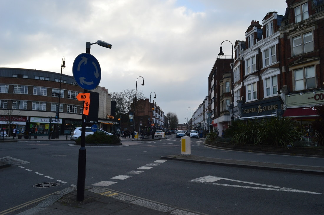
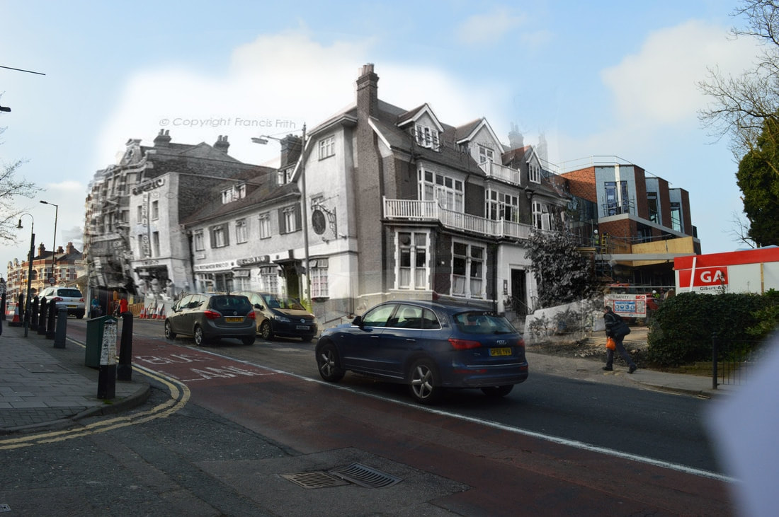
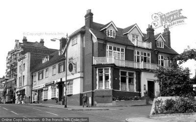
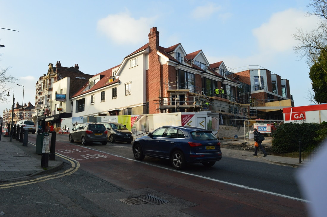
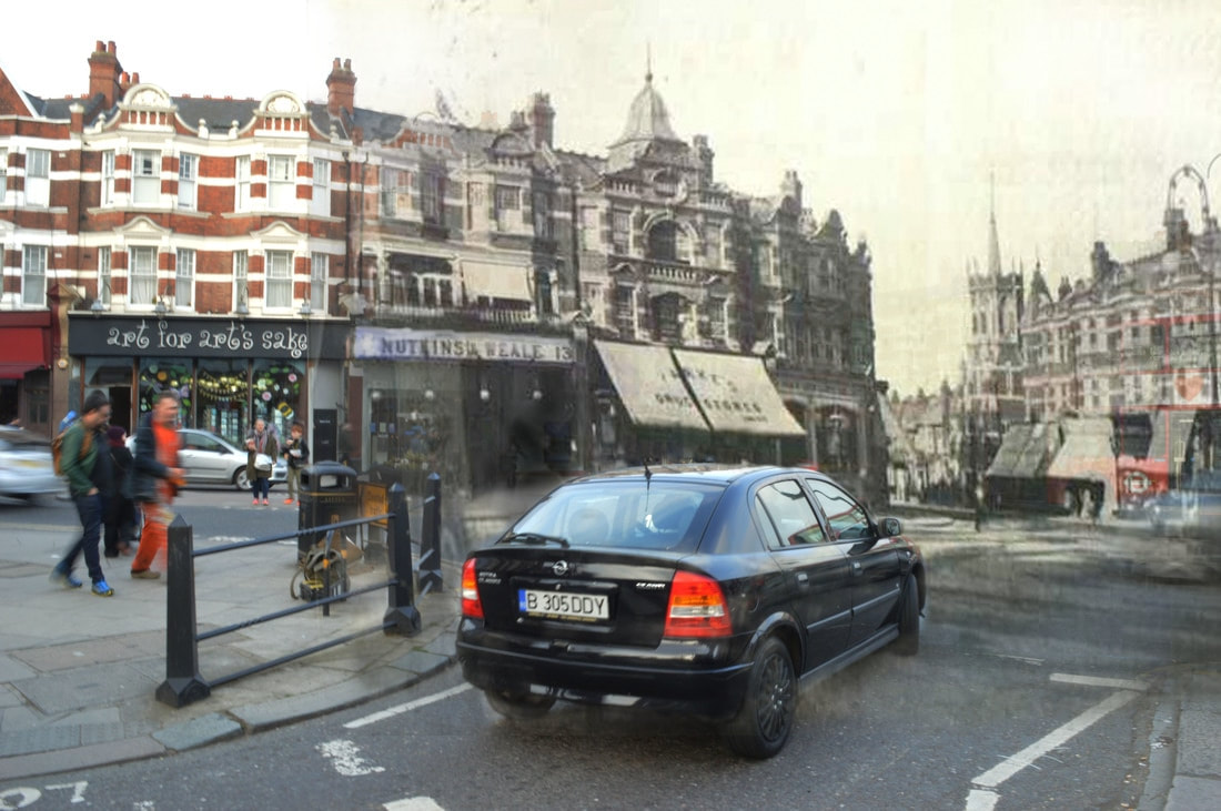
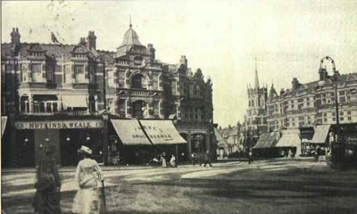
My intentions for this task were to show the history of the buildings in my school and local area. I think that this boded well with the topic title because it was an interesting insight into the secret past and history of my surroundings which I might have otherwise not known about.
In the beginning of this task I took a different approach to the other that I have displayed below. I decided to hold up the old images in front of the scene that I was photographing (see to the right). However this did not give me the desired effect that I was looking for and I decided that I would rather achieve my aim digitally on Photoshop. I decided to take another direction because I could line up the image and the background precisely and I could find a good balance between the lighting in the foreground and background. So once I had decided to change my approach I went out and took picture from the perspective of the old images. I then scanned in the old images and layered them over my own image. Next, changed the opacity of the image and lined them up. I wanted there to be a faded effect between the old and new image, I did this by gradually increasing the opacity of the rubber as I moved closer to the centre the image, rubbing out the sides and making the edges softer. My finished product is displayed below. |
|
SCHOOL
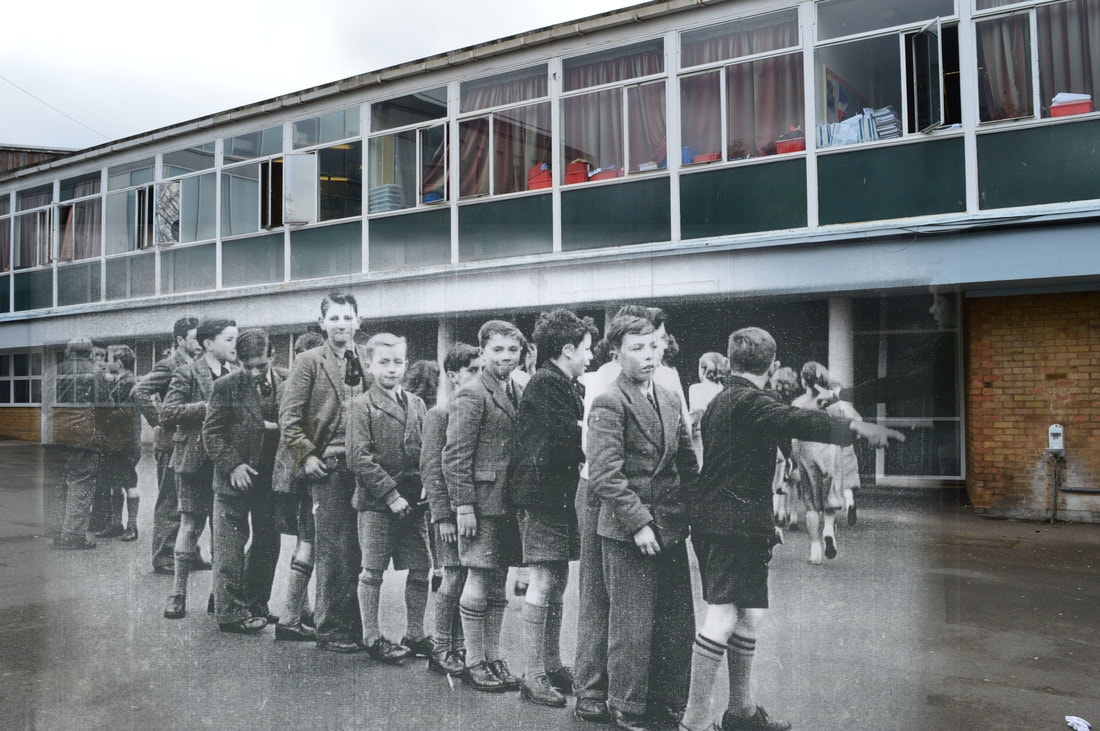
|
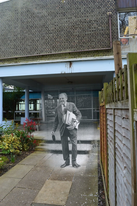
|
MUSWELL HILL
|
|
|
|

|
|
|
|
I thought my finished product was successful. The images were clearly comparing the old and the new but I liked the effect of the combination and I don't think that it immediately clear to observer what they were looking at and it causes people to look closer.
However if I were to do it again I would make the layering/ lining up even more precise, in addition to this I would be more accurate with where I positioned myself when taking the new image so that I wouldn't have to edit the image so much within Photoshop.
However if I were to do it again I would make the layering/ lining up even more precise, in addition to this I would be more accurate with where I positioned myself when taking the new image so that I wouldn't have to edit the image so much within Photoshop.
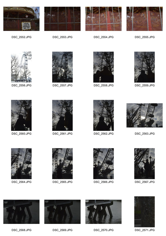
London
With this task I did not go out with a certain objective or goal but just with the exam title in mind. I think that this is visible as the images I took were ranged but encroached on most areas of the title.
|
|
|
|
|
|
|
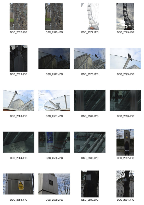
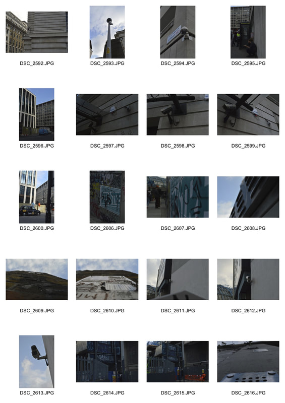
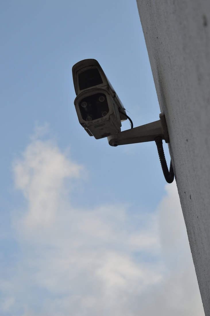
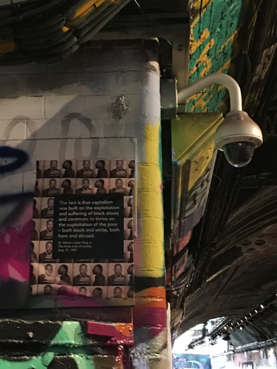
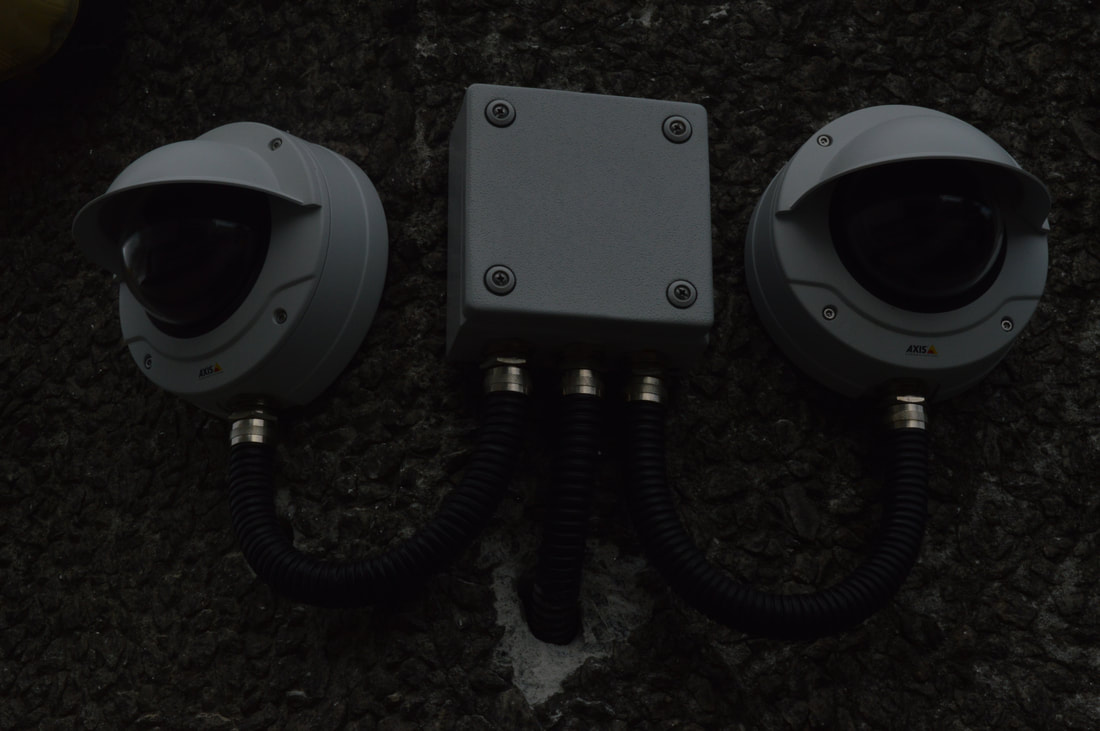
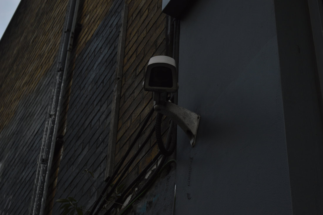
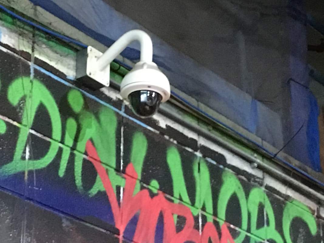
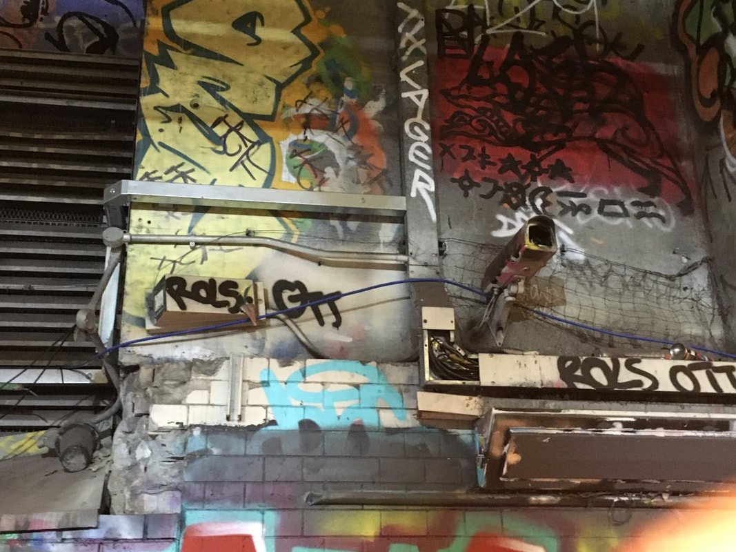
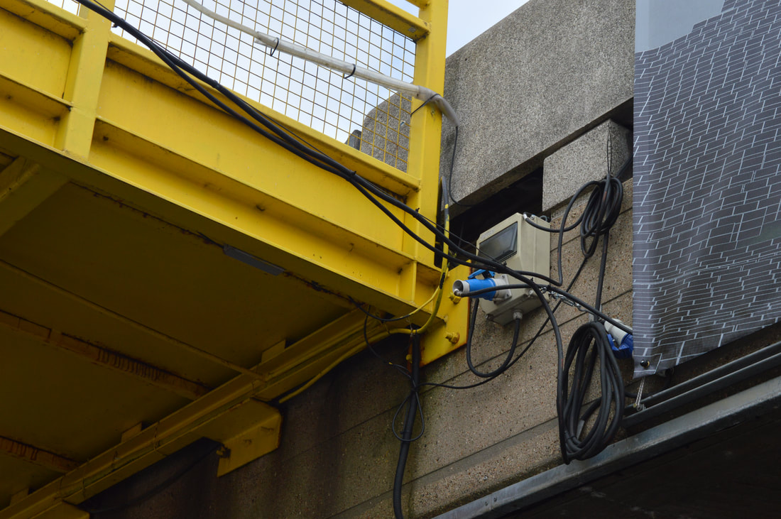
SECURITY CAMERAS
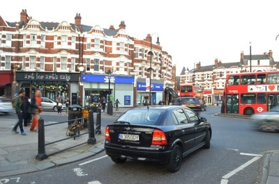
I was mindful of all the security cameras that you are surrounded by in London, especially in central London. I think the discreet manor of the security camera is something the ties it closely to the theme of secrets and I think that there is an element of mystery behind them, many questions come to mind when I see them (e.g.. whose are they? where is video of me going? who is using it?). I think that 'image 4' in this collection is the most powerful in my option and I find it quite striking because the camera is facing directly at the camera and if feels like its watching me through the image.
I was mindful of all the security cameras that you are surrounded by in London, especially in central London. I think the discreet manor of the security camera is something the ties it closely to the theme of secrets and I think that there is an element of mystery behind them, many questions come to mind when I see them (e.g.. whose are they? where is video of me going? who is using it?). I think that 'image 4' in this collection is the most powerful in my option and I find it quite striking because the camera is facing directly at the camera and if feels like its watching me through the image.
1
|
2
|
3
4
|
5
|
6
|
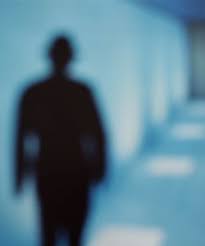
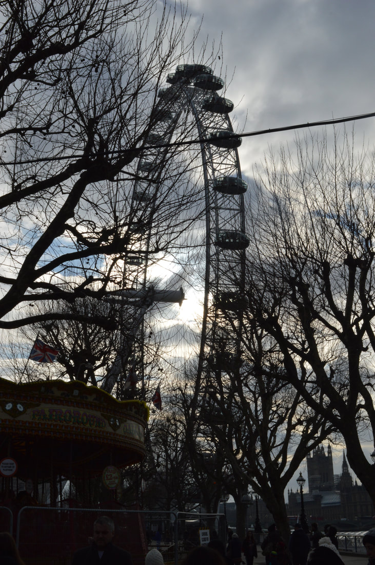
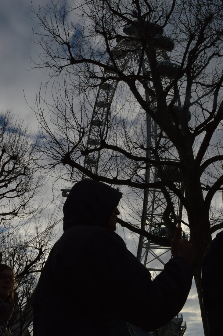
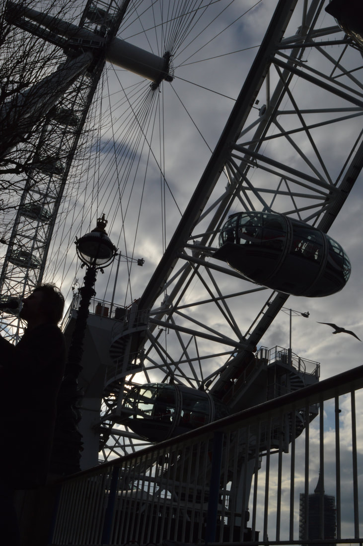
SILHOETTES
The silhouettes of the London eye are images that I have actually taken before, however I think that the addition of the silhouetted person adds something extra to the image that maybe can't see seen in the others. The silhouettes also lend themselves to the secrets theme and the element of the unknown. In addition the faceless person is very mysterious. I think that the angle in which the photos are taken are important because the composition makes the London eye seem more menacing and powerful.
The silhouettes of the London eye are images that I have actually taken before, however I think that the addition of the silhouetted person adds something extra to the image that maybe can't see seen in the others. The silhouettes also lend themselves to the secrets theme and the element of the unknown. In addition the faceless person is very mysterious. I think that the angle in which the photos are taken are important because the composition makes the London eye seem more menacing and powerful.
1
|
2
|
3
|
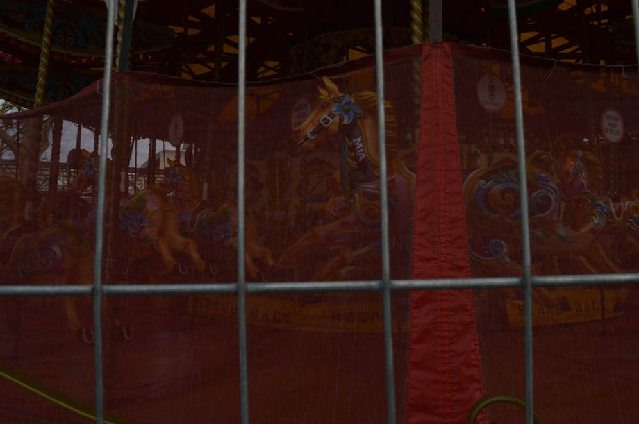
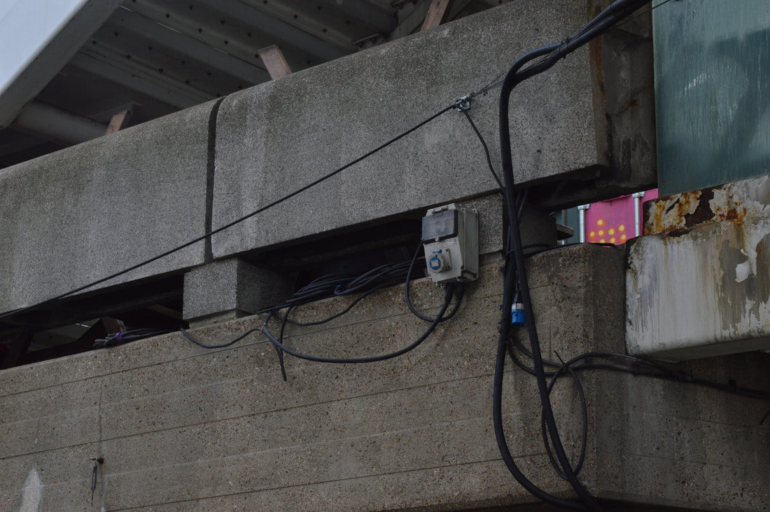
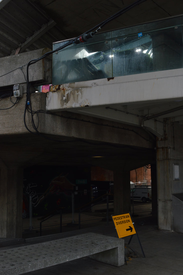
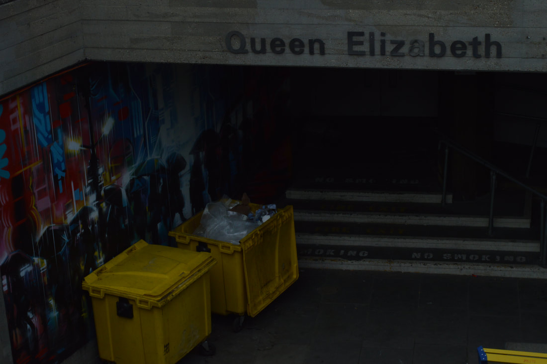
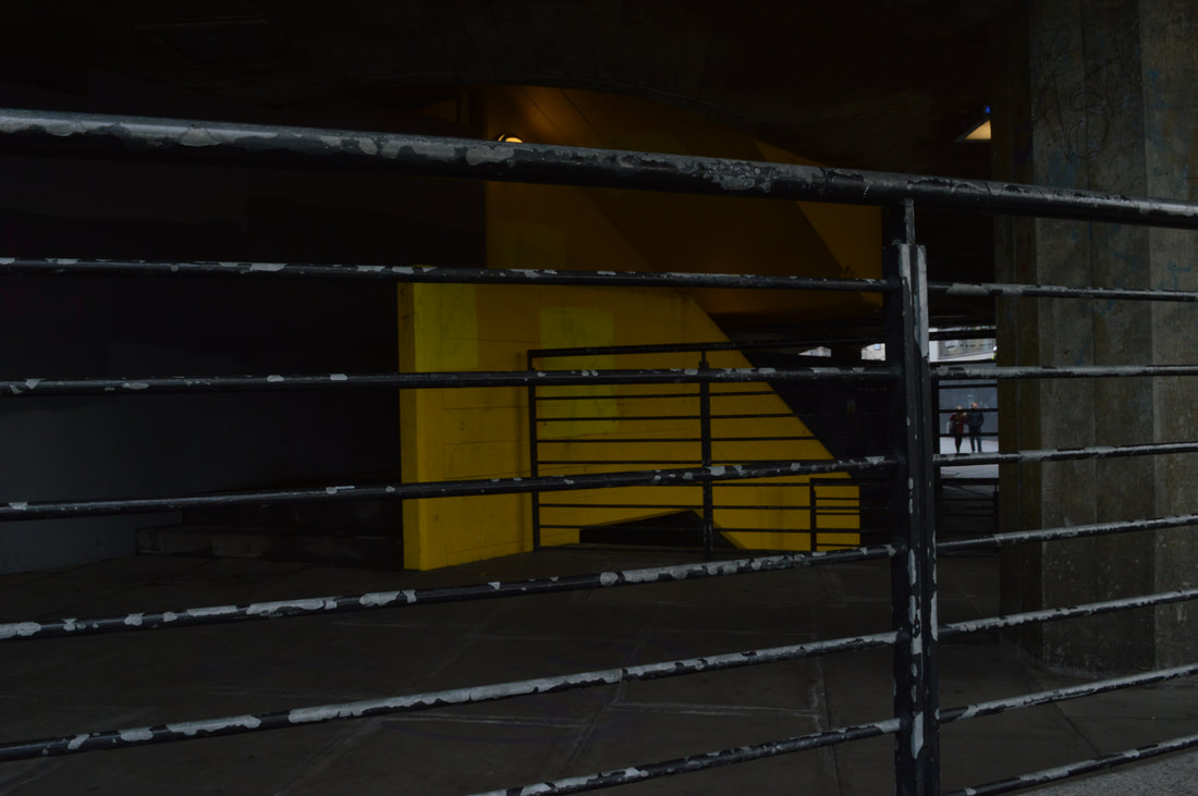
HIDDEN PLACES
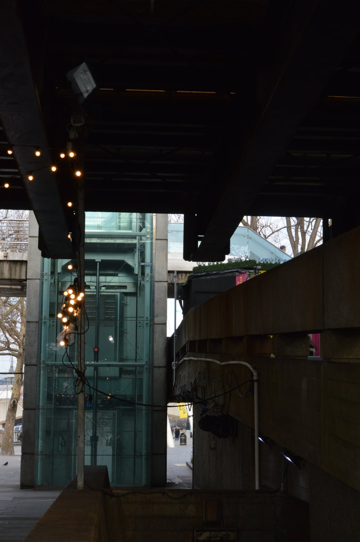
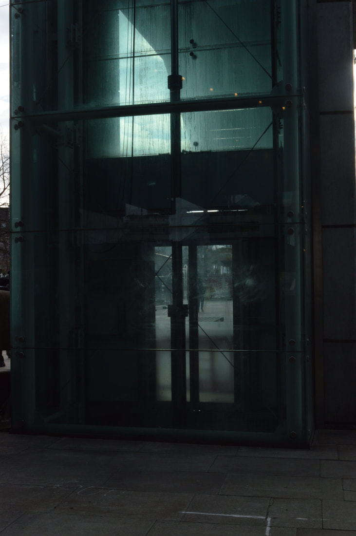
Another pattern which seemed to pop up in my array of images was hidden places, these seemed to be hard to find because central London is very open but there were some dark spaces which were interesting to photograph. My favourite image in this set is the elevator pictures with the blue glass, i think that the dark shadows and dirty glass contrast really nicely with the light shining through and this creates an interesting effect.
Another pattern which seemed to pop up in my array of images was hidden places, these seemed to be hard to find because central London is very open but there were some dark spaces which were interesting to photograph. My favourite image in this set is the elevator pictures with the blue glass, i think that the dark shadows and dirty glass contrast really nicely with the light shining through and this creates an interesting effect.
1
2
|
3
|
4
|
5
|
6
|
7
|
8
|
9
|

10
|
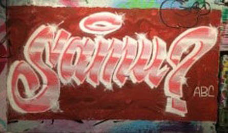
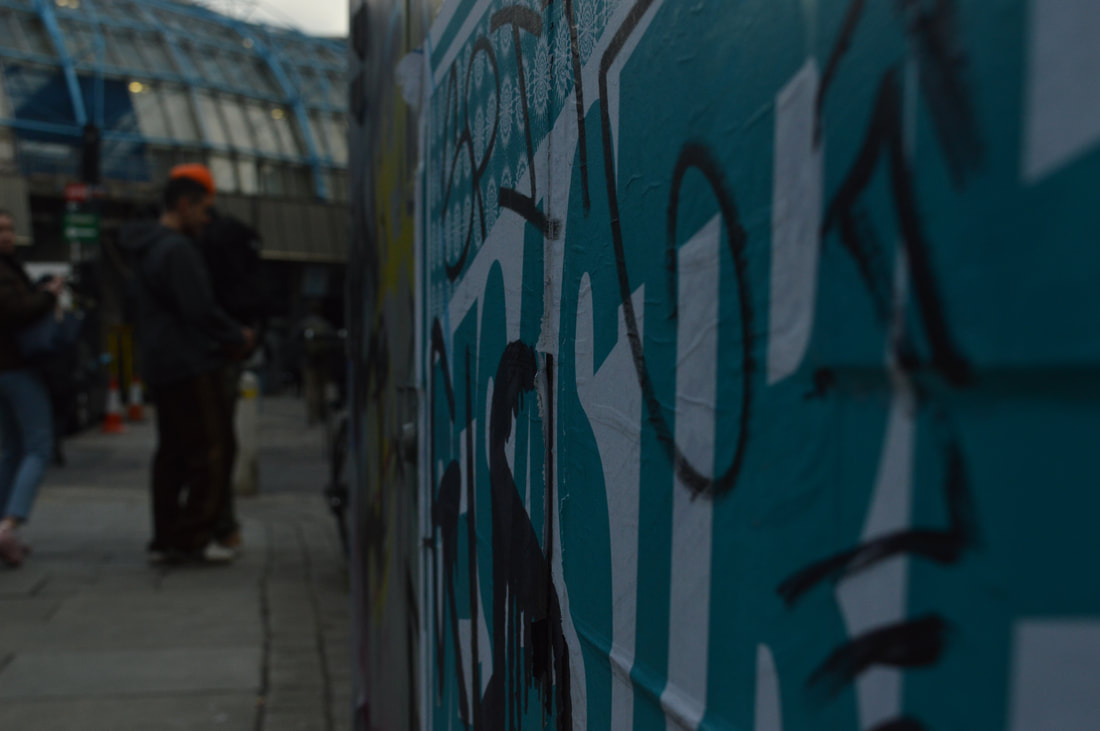
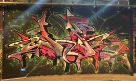
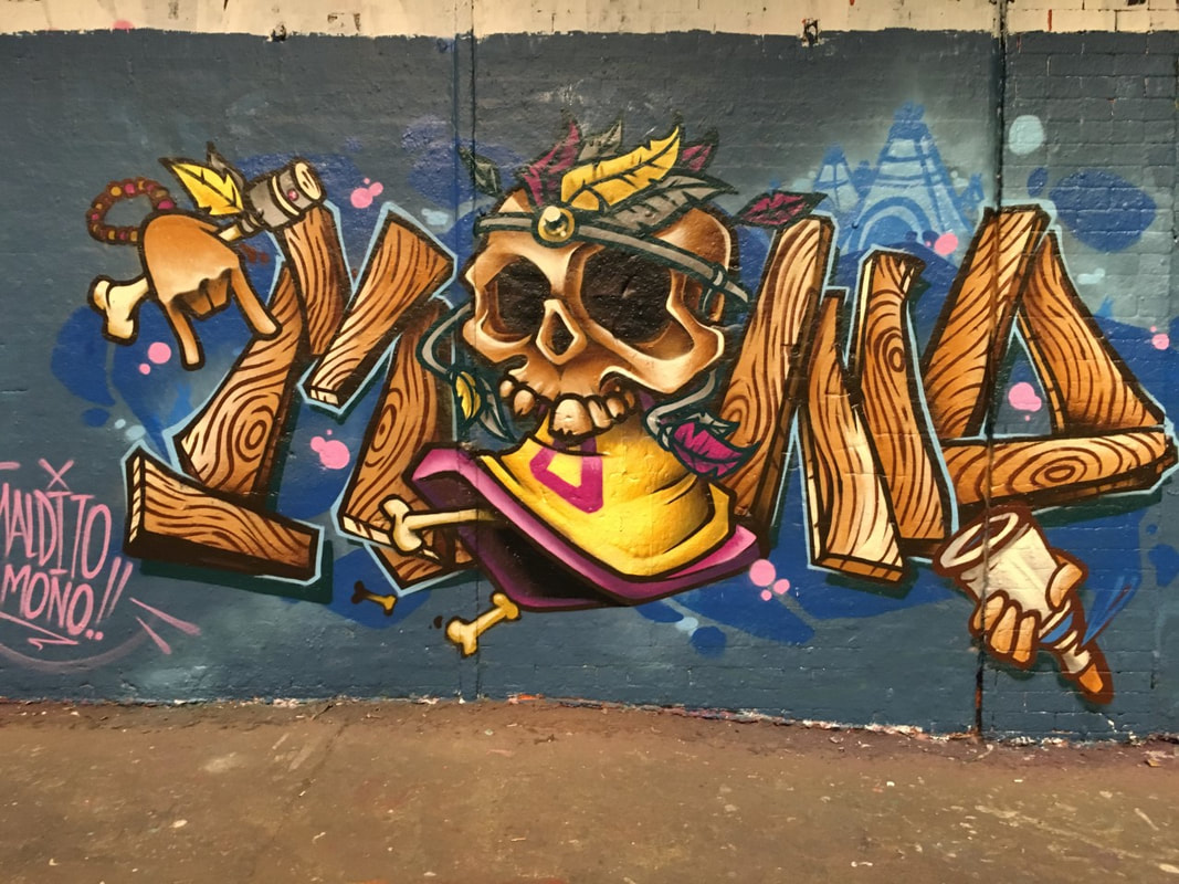
CODES
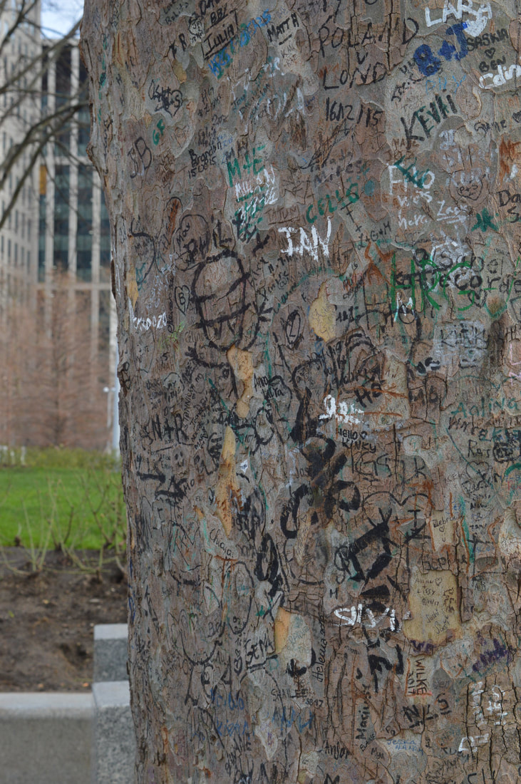
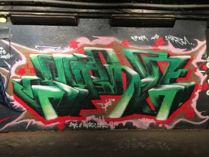
Here I was looking at writing round the city, graffiti was my main focus because of its artistic and abstract sale which sometimes makes it illegible I thought that looking at a graffiti as a code was an interesting perspective. This also led me to think of the exclusivity of graffiti art, only a select handful can do it well and only certain people can understand of read it. In addition there is a bit of black sheep in this collection which is the image of the tree, this was something I came across on the Southbank which i thought landed itself the theme of codes perfect. From far away you could necessarily tell that there was anything on the tree, as though the writing was hidden but then when you got up close you could see hundreds of messages engulfing the tree.
Here I was looking at writing round the city, graffiti was my main focus because of its artistic and abstract sale which sometimes makes it illegible I thought that looking at a graffiti as a code was an interesting perspective. This also led me to think of the exclusivity of graffiti art, only a select handful can do it well and only certain people can understand of read it. In addition there is a bit of black sheep in this collection which is the image of the tree, this was something I came across on the Southbank which i thought landed itself the theme of codes perfect. From far away you could necessarily tell that there was anything on the tree, as though the writing was hidden but then when you got up close you could see hundreds of messages engulfing the tree.
1
|
2
3
|
4
|
5
6
|
Secret Lives Of Cross Dressers Exhibit
|
This exhibit at the ‘photographer’s gallery’ has a compilation of work from various photographers from throughout the past 50 years which documented feminism, sexuality, gender and social constructs through time. It does this by displaying simple portraits of people being their true authentic selves, with small blurbs explaining the groups which are displayed in each section of the exhibit. I think that the photographers wanted to display the different lives that people led and shine a light on a new and somewhat mysterious (at the time they were taken) group in society. Overall I believe this is one of that main aims of art, to show and display new and I know cultures or concepts and this exhibit is a perfect embodiment of that.
In this particular image (displayed on the left) I think that the photographer and the model are trying to show the blurred lines between genders which is still a current and prevalent discussion being had in our current society. I think this because the image shows a very beautiful male, which are words that are not usually put into the same sentence when discussing old fashioned and tradition male gender stereotypes, which is something that many of pieces in the exhibition display. |
|
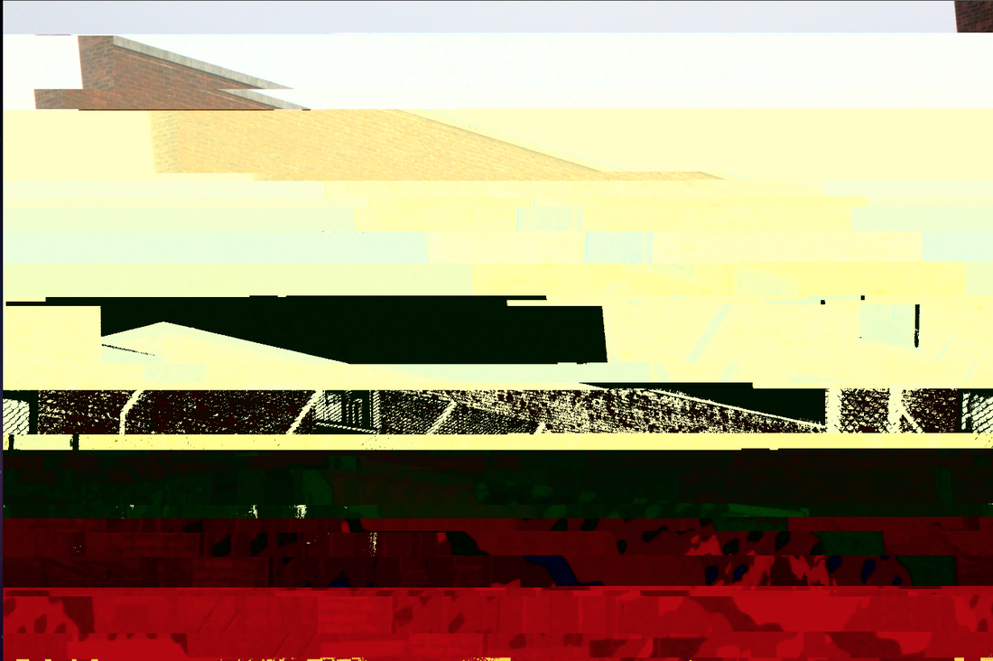
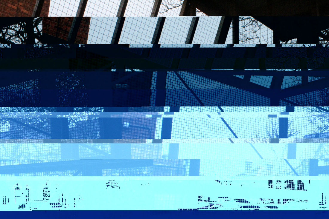
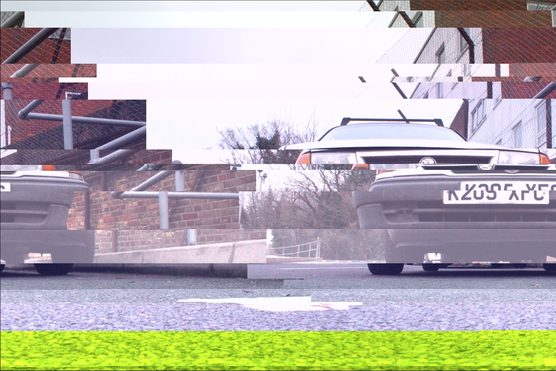
Glitching
Ataxia "Glitch" from bif on Vimeo.
Mathieu st Pierre
|
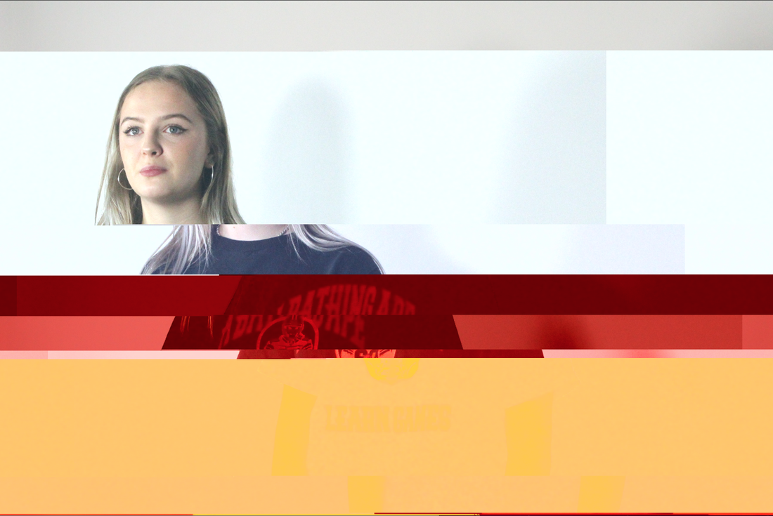
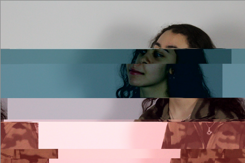
This work is called 'past-forward it was made in 2015 by Mathieu st Pierre. His images show a glitched portrait. This links in with the title because in order to create this affect you have to change the coding of the image and compromise the composition of it. This imagery is eye-catching and colourful. There is an inserting abstract element to them while still having clarity.
|
|
My response- computer
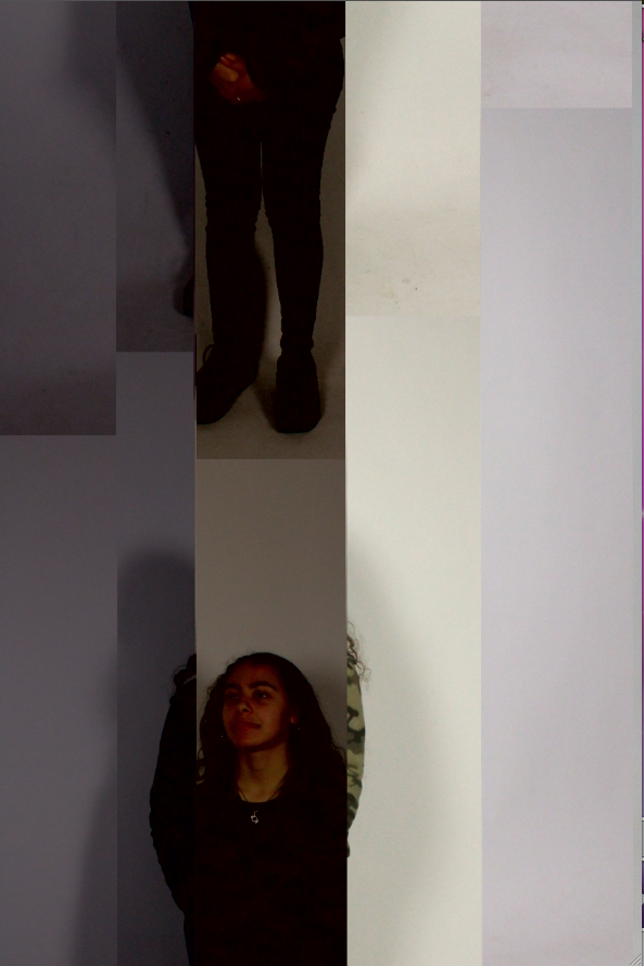
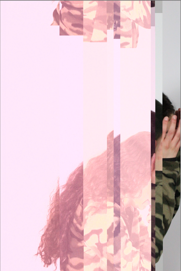
To create my own response to the work of Mathieu st Pierre I used 2 applications, ‘TextEdit’ and ‘audacity’. Firstly I used audacity which I had no previous experience with, I had a few technical difficulties and in the end it didn't give me the effect I wanted, I think that with more practice I would be able to learn how to manipulate the options in audacity to edit the image the way I want. However I was kind of winging it in this response and this is why a scrapped the work that I created in this application. So then I moved on to use ‘TextEdit’ which I have much more experience in using, even though it is more unpredictable that audacity I was able to use it in a way that I could get the desired look on my images. This process is the one which I display below.
This response is directly linked to the title because the process of creating the images involved comprising the coding of the image and in other words you incorporating the theme into the very making of image.
This response is directly linked to the title because the process of creating the images involved comprising the coding of the image and in other words you incorporating the theme into the very making of image.
TextEdit PROCESS
|
|
|
|
|
|
|
|
|
I think that the final outcomes were cool and can out successfully. If I were to develop this then perhaps I would explore other ways to compromise images out go Photoshop.
Darkroom Glitch
This is the second response to the theme of 'glitching'. However I'm aware that this darkroom work does not really count at glitching because I did not compromise the coding of the image because i did compromise it and the way that it should come out. Each image was created by a different process and using different technique.
To create this effect I enlarged the image onto the paper as I would normally but then dripped the developer onto the paper so that only certain part would start to merger and develop. I did this strategically so that the face would fully develop and the background would be patchy.
|
This one was created by squashing up the associate underneath the enlarger; this is why you can see my hands in the image. Apart from this it was developed as normal.
|
After developing the image as normal I then used wire brush to scratch in lines.
|
This image was created by moving around the associate while under the lager to create the blur effect and then developed normally.
|
I think that this response was successful in compromising the image and i think that it helped develop my skill in the darkroom about how to manipulate images which the chemicals as well as physically compromising them. if I were to further develop this darkroom glitch then prep i would experiment with different materials, maybe adding bleach, using different paper or exposing the paper to light.
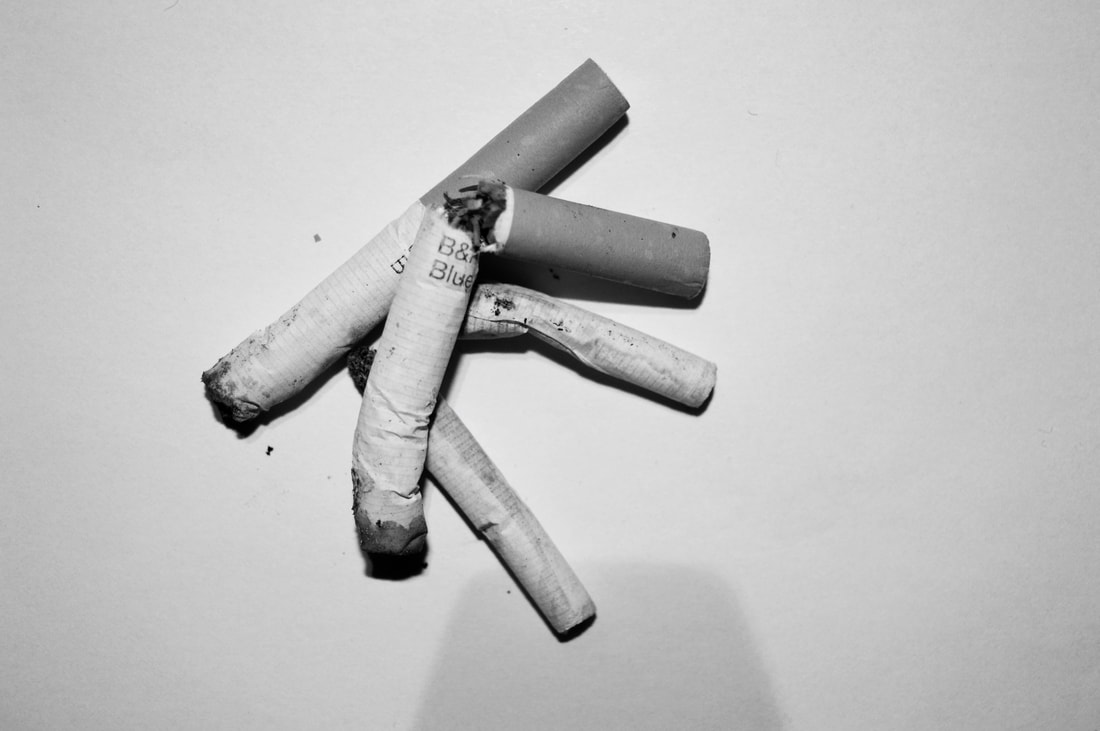
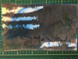
Hidden beauty- Beauty in the imperfect
Irving Penn
|
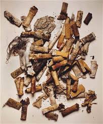
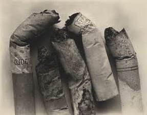
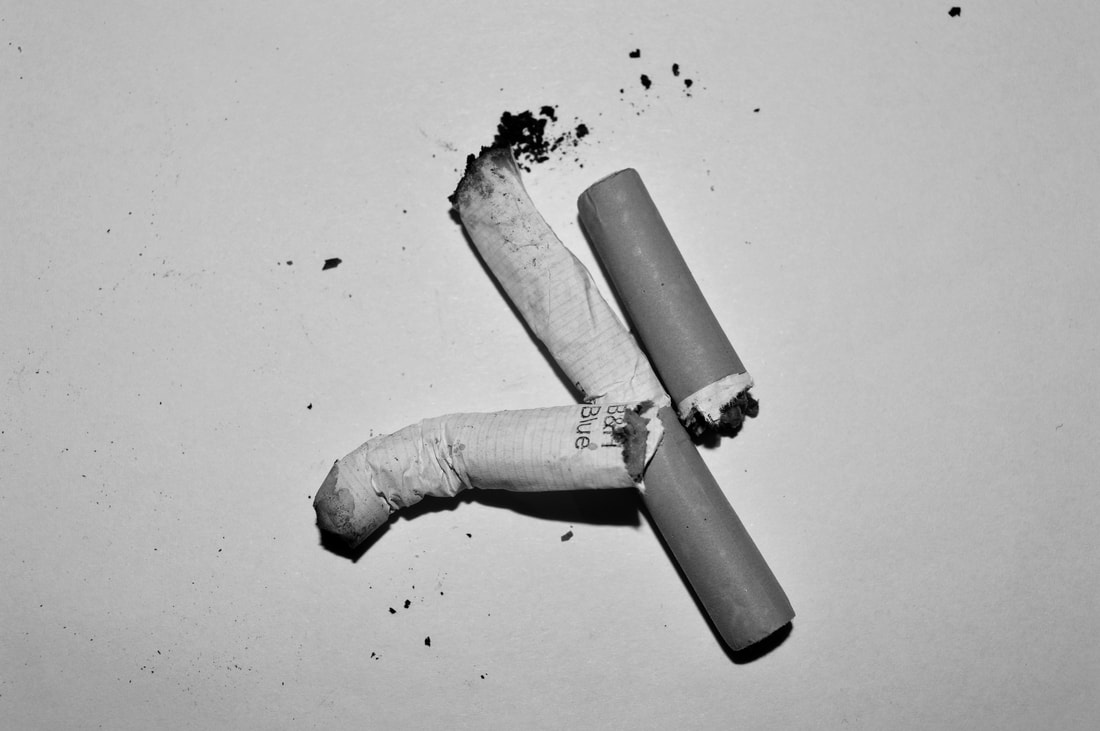
Irving penn creates beautiful images from things thing that are associated with being ugly. he does this by collecting them and displaying them in an exhibit like way, putting them on a clean and crisp background and adding flattering filters and effects to them. i think that he wants us to consider the beauty and art that we can find in everyday things or things that we think are ugly and useless.
Irving Penn could perhaps be addressing bigger issue which could be the rise of smoking which is a fatal habit but he manages to find beauty in it, which could elude to the idea that there are more that one option of certain thing and and more than one view point, this project helps shine a light on both if this views. this concept can be a applied to any area of life. |
|
|
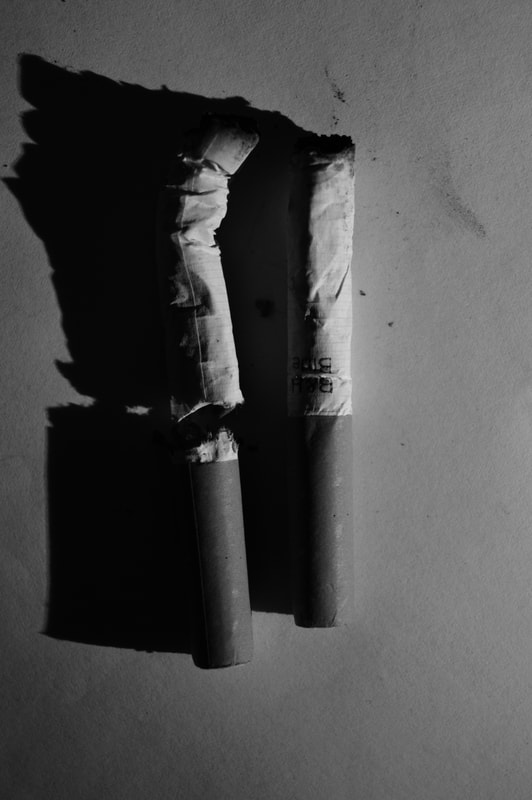
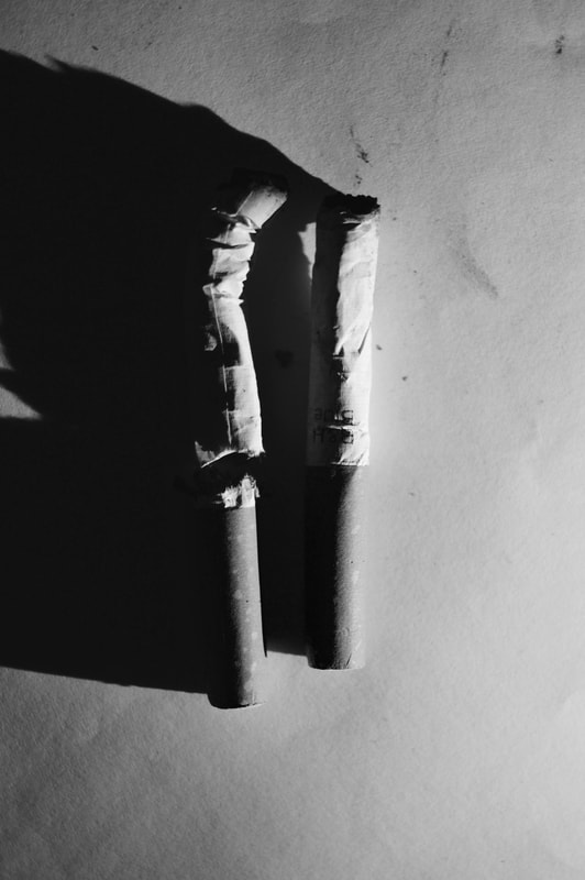
My Response
|
|
|
|
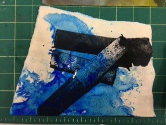
Compromises
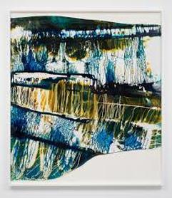
Mariah Robertson.
|
mariah robertson creates stunning images using long roles of photo paper. she does this by putting chemicals and dyes on the images. she is one of the members of this new abstract photography movement, i think through her work she wants us to take a new perspective on photography and view as more an art than a practical process. i think she wants us to reconsider the boundaries of photography and how they can be broken out of and broken.
the photographer uses her darkroom and rolls of chromogenic paper to create her series of hand processed colour. she creates the effects on the images through altering and tampering with traditional developing processes. this helps the photographer achieve her aim of breaking out of the confines of "photography culture" which tells to you to 'frame this way' and 'work this way'. this is something mariah robertson wants to stay clear from , this is the reasoning for her un =regular shaped images and her giant and also incredible installations. i think that this unconventional approach to "photography culture" is what this makes this work and its artist unconventional. |
|
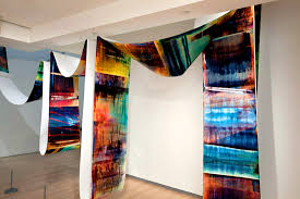
this is a image of one of Roberts large intimations where she showcases one of her incredible long rolls of developed chromogenic paper which she displays as one long sheet. they are so long that they need to be strung up in order for you to see all of it
|
|
My Response
Here is my response to the unconventional work of Mariah robertson, i used the images that i had taken in the hidden beauty work that i have done above.
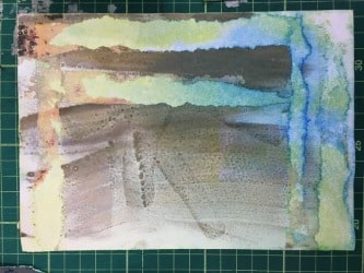
in this image the picture that i had originally enlarged onto the paper didn't show up clearly, i think this is because i used old photo paper and on this particular sheet the emulsion had been painted on and this is where the brushstrokes behind the stripes and ink stains come from. to create the effect of the striped i put masking tape on the image while i enlarged and developed it and only took it off the image when it was still wet, then i put yellow and blue ink all over it in a random way.
|
this image that i have taken of this final product does not show very clearly the faint imagery of the cigarettes in the background which i enlarged onto it, for this image i used old photo paper as well but one which hadn't had emotion painted onto it. i also used masking tape to create the stripes on this picture but waited until the image was dry until i took them off.
|
to create this picture i enlarged 2 images onto the paper and then exposed it to light after putting it in the developer. then after i had put it into the stop and fix i let it sit in a trap of yellow dye. then after that i creates puddle go blue dye onto on the picture and let it sit there
|
before i put this picture in the fix i took it into the light so that it would form a punk hue, this did happen but its not very visible in the picture. then after finishing the development process i strategically formed a puddle of blue dye on top of the image and let in stain the picture. this was the outcome of that process.
|
STRAND 1-
Identity
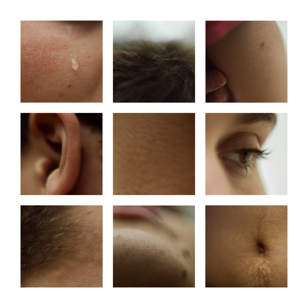
After looking at projects such as 'exactitudes' and 'make my night' which focuses of showing the similarities between people, I was inspired to create a strand which highlighted the differences between people and what perhaps makes them unconventional. As you can see below my Pinterest bored was big inspiration when deciding which way to approach this strand. a pattern started to occur and I had looked at lots of pictures in grid form, similarly to the images in the exactitude project. This is how I came across the works of Lauren Marek (showed and spoken about below the Pinterest board)
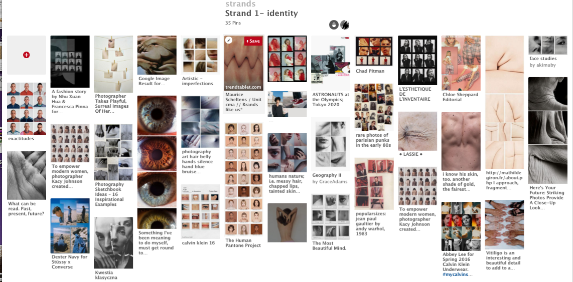
My pintrest inspertion board
|
Lauren Marek
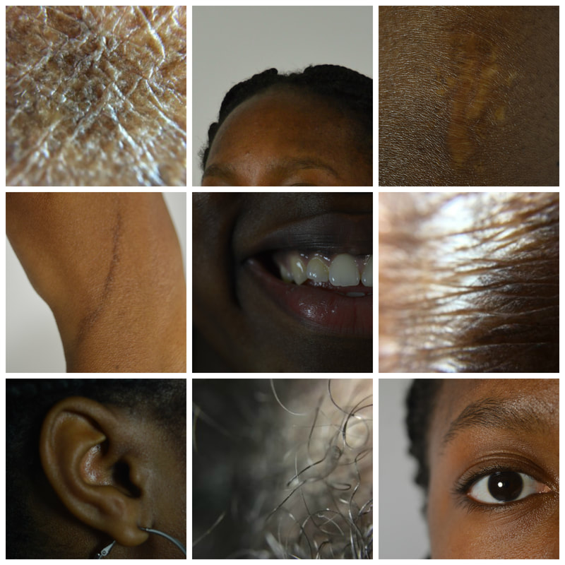
Lauren Marek creates objective imagery of people and the feature that make them unique and different e.g. scars birthmarks, eye colour, fingerprints or hair. The photographs show the details of a person although doesn't show the persons whole body or face. She presents her smaller images in a grid form which makes up a larger image; this is symbolic of the features accumulating to make up a person's identity. She wanted us to consider key pieces that make the person an individual. The viewer is able to gather a sense of the individual’s identity through key details and characteristics. |
|
|
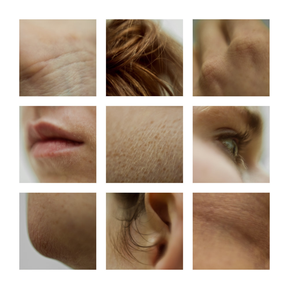
My response this this work is displayed below:
My response this this work is displayed below:
FINN:
MEGAN:
GABY:
I liked the outcome of this strand but I think that it definitely has aspects which could be improved, however I like the fact that each set looks different and unique which is what I was trying to outline with this strand. if I were to develop this further i would have the images more ambiguous because i don't this that I’m achieving the effect of not beaching able to piece together the portrait, perhaps this could be done by taking closer shoed with a macro lens.
STRAND 2-
Covering/ Distorting The Human Form
For this strand I was inspired by the page in the exam booklet which looked at tapestries. I started to research the topic and learned about the secrets that certain cultures would entail in their tapestries. Some of the things that I came across are displayed below. This sparked some interest and I wanted to find a way to incorporate this concert into my photography.
|
|
|
 Anton Bendenko's work
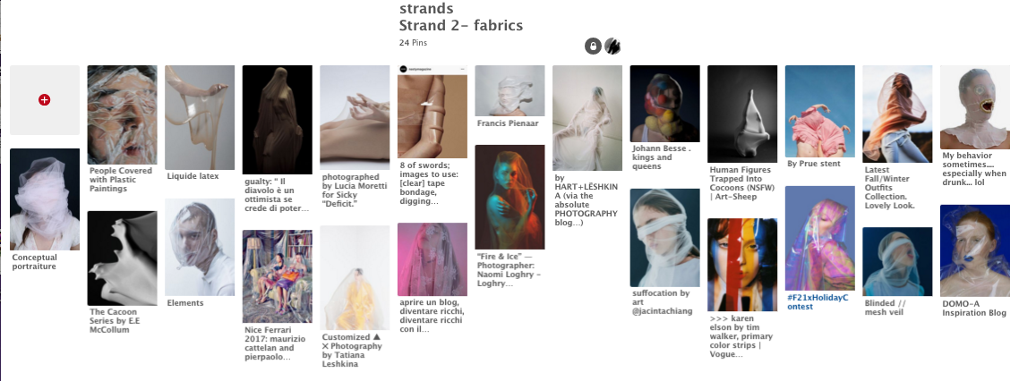
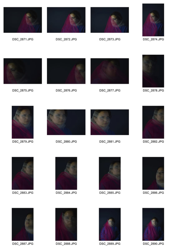
Originally I was researching fabrics and tapestries on Pinterest and started to accumulate images from photographers who have covered their models in fabric and draped it over them. This is how I came across the works of Anton Bundenko (whose work is shown on the right).
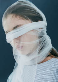
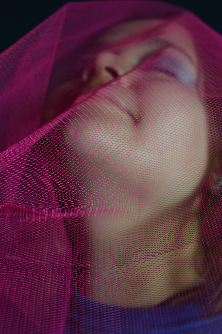
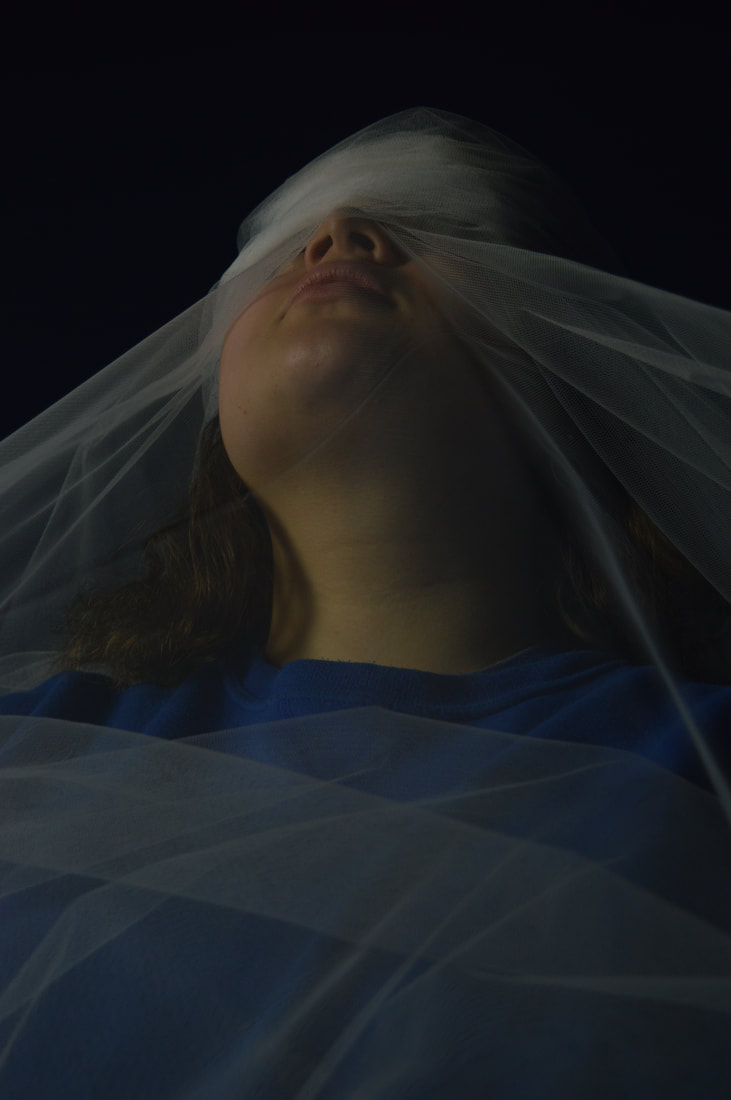
Anton Bundenko
Anton Bundenko creates artistic photography. This particular work shows a girl with mesh wrapped around her face, and her eyes are completely covered. I'm not sure if Bundenko want us consider anything specific when looking at his work but I personally find it very thought provoking, it sparks a lot of question within me when I look at it. the girl looks sad and upset in the image which immediately makes me wonder 'why?' and the fabric adds another more mystical element not only is the anonymity of the girl intriguing because she has her eyes covered but the reason for the fabric being there and what it could symbolise, is also something that i think when looking at his work.
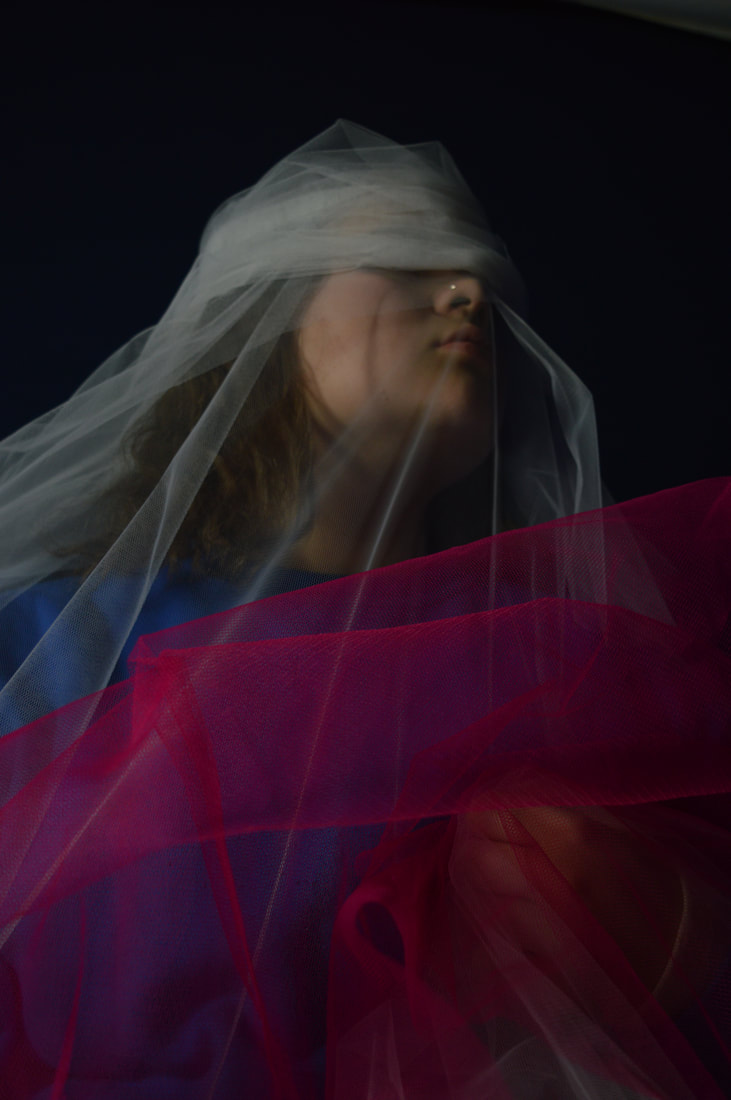
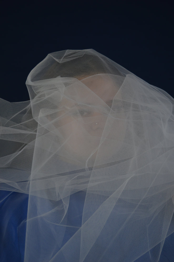
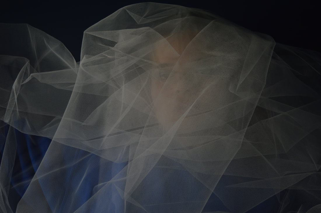
I wanted to try my own response to this, originally I wanted the fabric to be symbolic of veiling a secret that the model might have and after being inside my Bundenko's work I wanted to research similar project which other photographer had done, this research is displayed below in the form of a pint rest board. This research time led me down many different path ways and showed me many ways that I could take this project forward. However it also made me stray from the title of the strand which had originally been fabric and tapestries. His is because I began to see lots of very interesting photography where the human body had been disrupted in some way either with mediums such as tape, cling film, plastic or tights. This is the work that really inspired this strand and this is what would of motivated my development of this strand. This is how I came to the idea on covering/ distorting the human form.
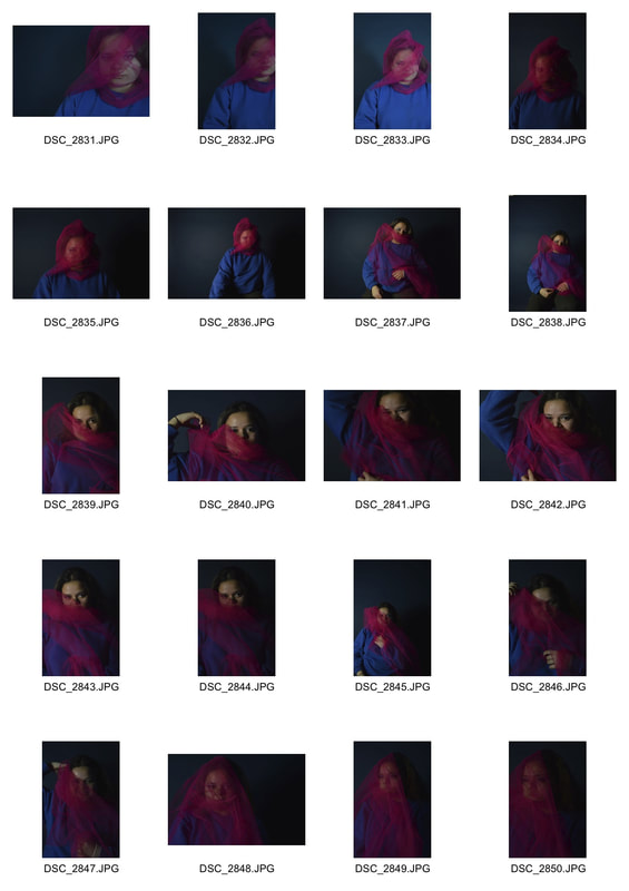
I stayed on my original path and was still being inspired by the work of Anton Bundeko as you cans see in the images that I took but i knew that if I were to take this strand further I would of strayed from this a gone more toward my new muse which was the images on my pint rest board which displayed covering/ distorting the human form.
Anton Bundenko
Anton Bundenko creates artistic photography. This particular work shows a girl with mesh wrapped around her face, and her eyes are completely covered. I'm not sure if Bundenko want us consider anything specific when looking at his work but I personally find it very thought provoking, it sparks a lot of question within me when I look at it. the girl looks sad and upset in the image which immediately makes me wonder 'why?' and the fabric adds another more mystical element not only is the anonymity of the girl intriguing because she has her eyes covered but the reason for the fabric being there and what it could symbolise, is also something that i think when looking at his work.
I wanted to try my own response to this, originally I wanted the fabric to be symbolic of veiling a secret that the model might have and after being inside my Bundenko's work I wanted to research similar project which other photographer had done, this research is displayed below in the form of a pint rest board. This research time led me down many different path ways and showed me many ways that I could take this project forward. However it also made me stray from the title of the strand which had originally been fabric and tapestries. His is because I began to see lots of very interesting photography where the human body had been disrupted in some way either with mediums such as tape, cling film, plastic or tights. This is the work that really inspired this strand and this is what would of motivated my development of this strand. This is how I came to the idea on covering/ distorting the human form.
I stayed on my original path and was still being inspired by the work of Anton Bundeko as you cans see in the images that I took but i knew that if I were to take this strand further I would of strayed from this a gone more toward my new muse which was the images on my pint rest board which displayed covering/ distorting the human form.
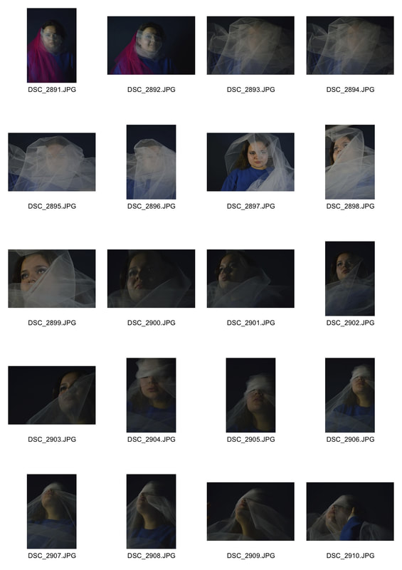
MY RESPONSE:
|
|
|
|
|
|
|
|
|
|
|
|
|
|
|
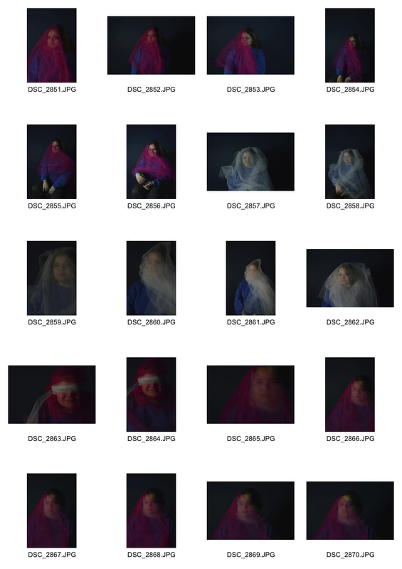
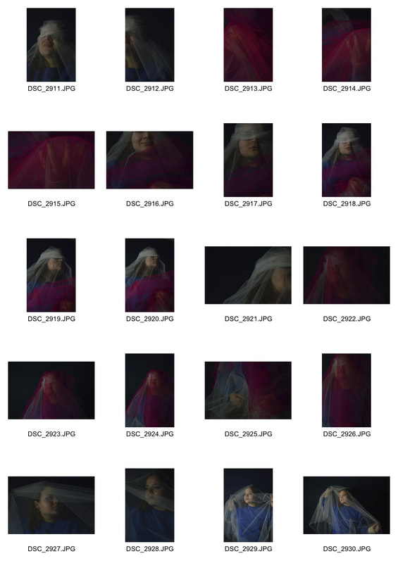
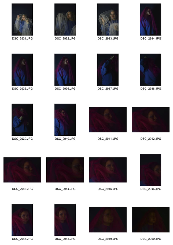
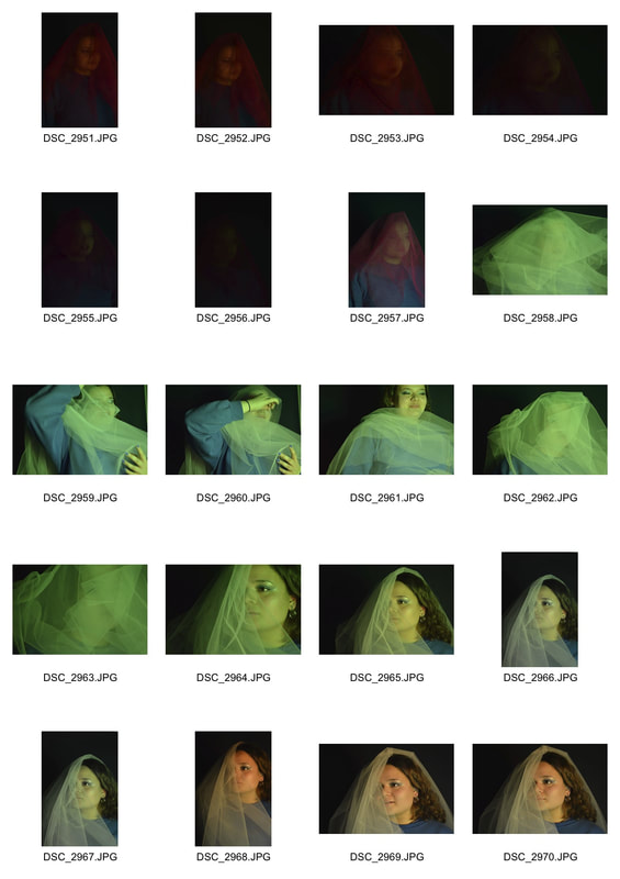
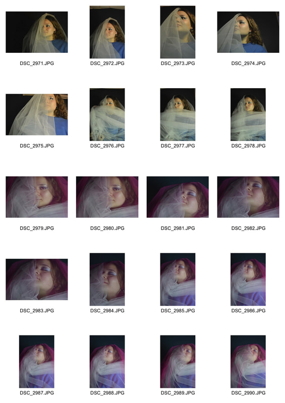
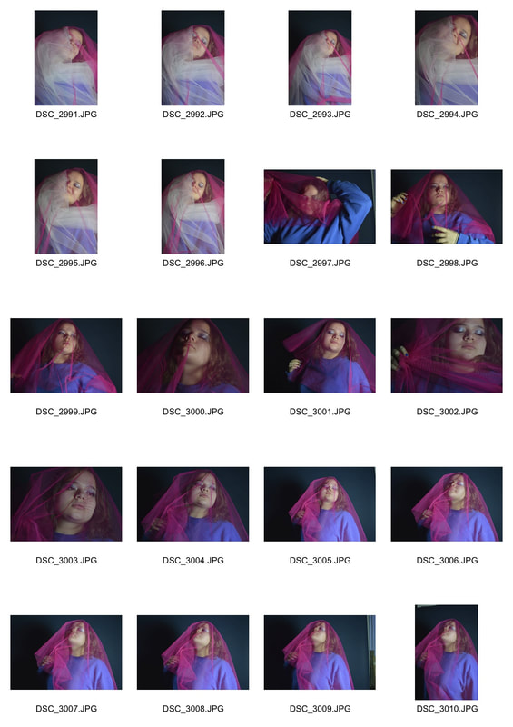
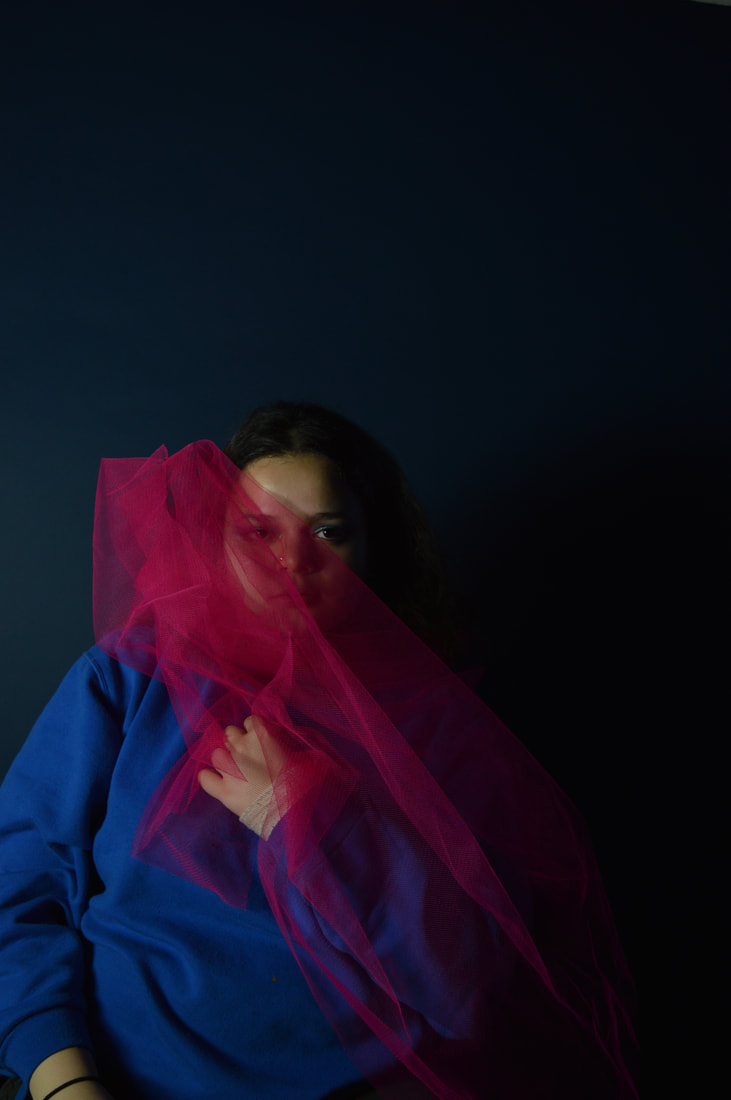
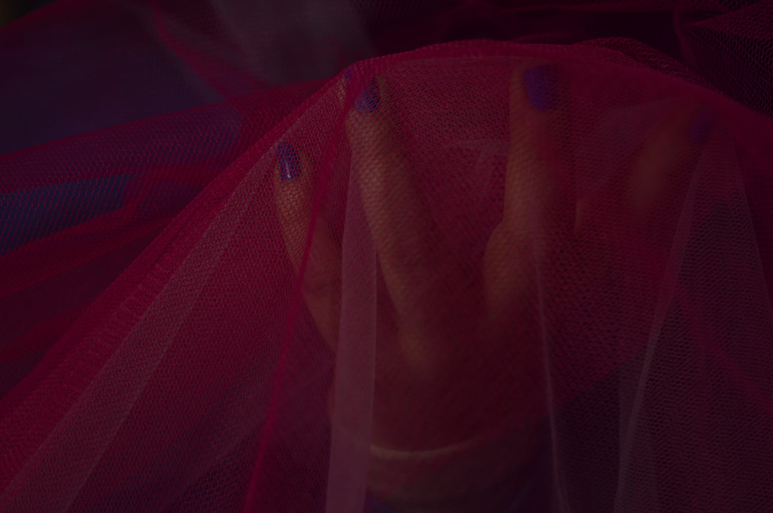
With developing and moving forward in mind, at the end of this shoot as a quick experiment I decided to place some gels over the lights with the aim of white mesh taking on the colour that I had chosen and catching the light. This was the results:
|
|
I really loved how these images came out and I think the element of mystery and secret came through. If I were to develop on this particular shoot I would try and expand on the work with the coloured light that I gave a glimpse off at the bottom of my chosen images. However I think that on the theme of distorting the human form, this particular idea of distorting and covering with fabrics is not something that I would take further as an idea under this topic. If I were to develop this strand I would explore other routes, the tape and cling film doctoring is something that appealed to me when researching.
STRAND 3-
Unconventional Portraits
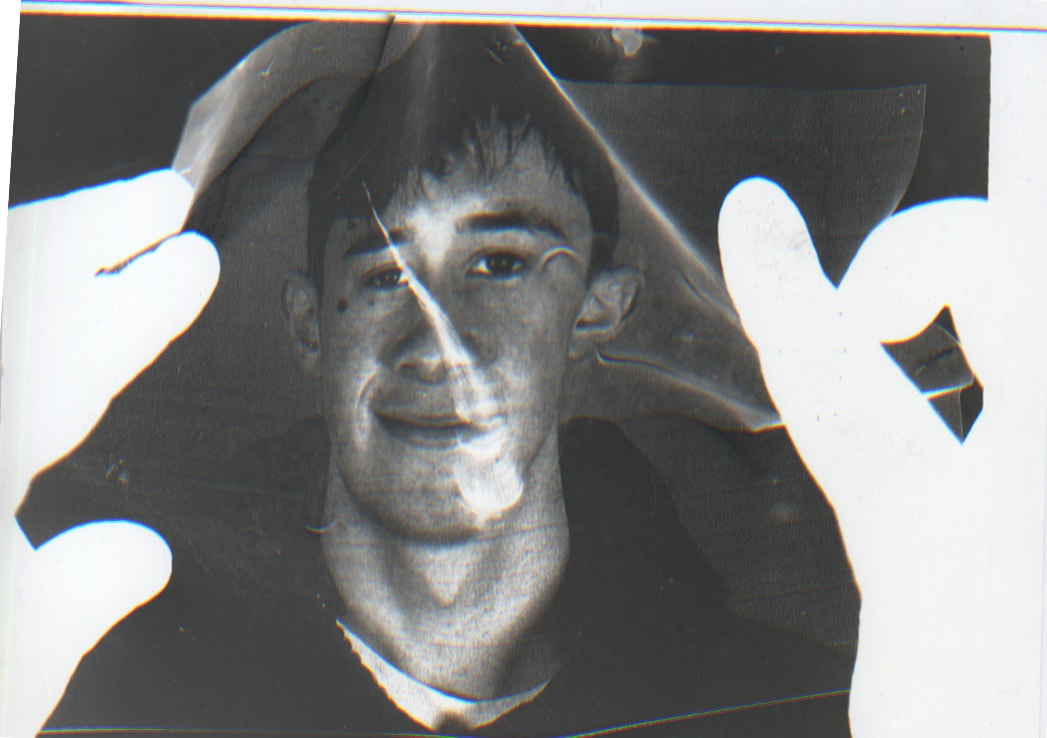
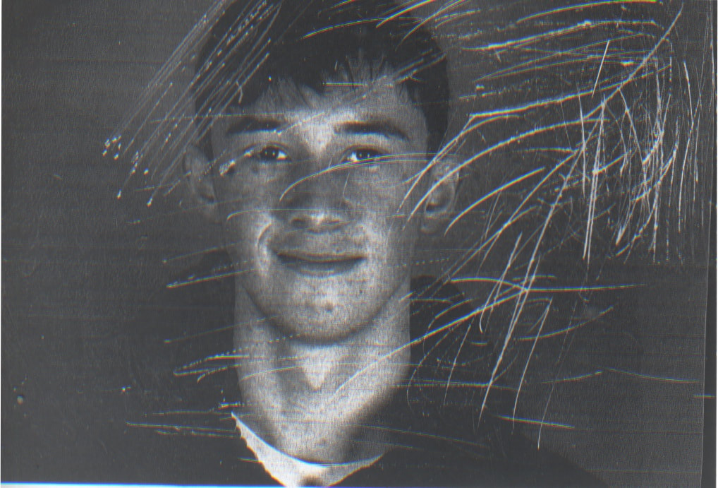
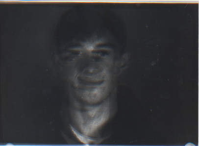
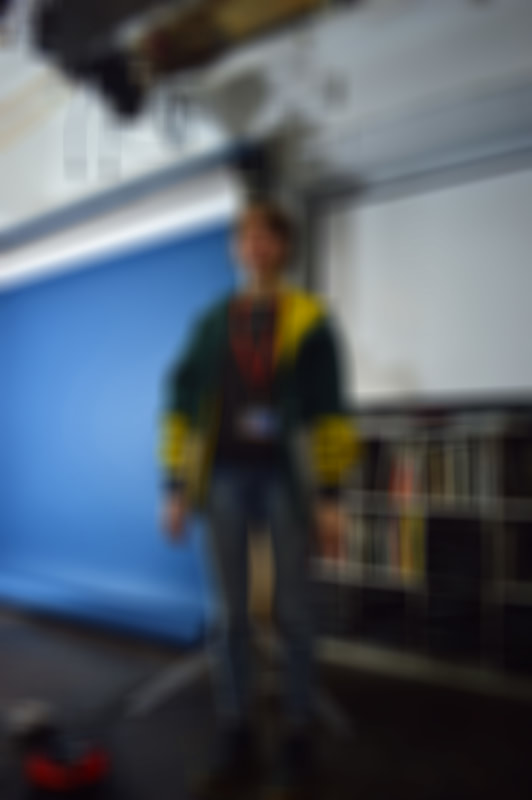
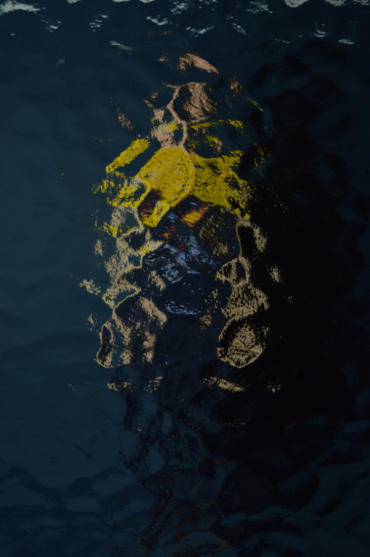
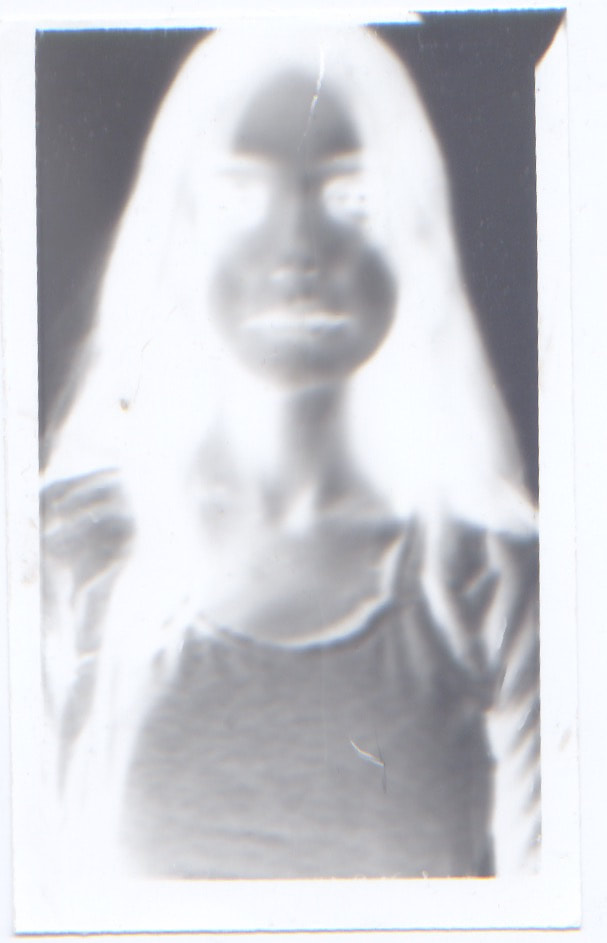
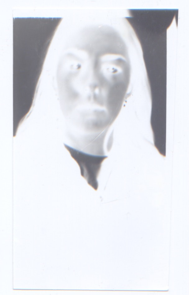
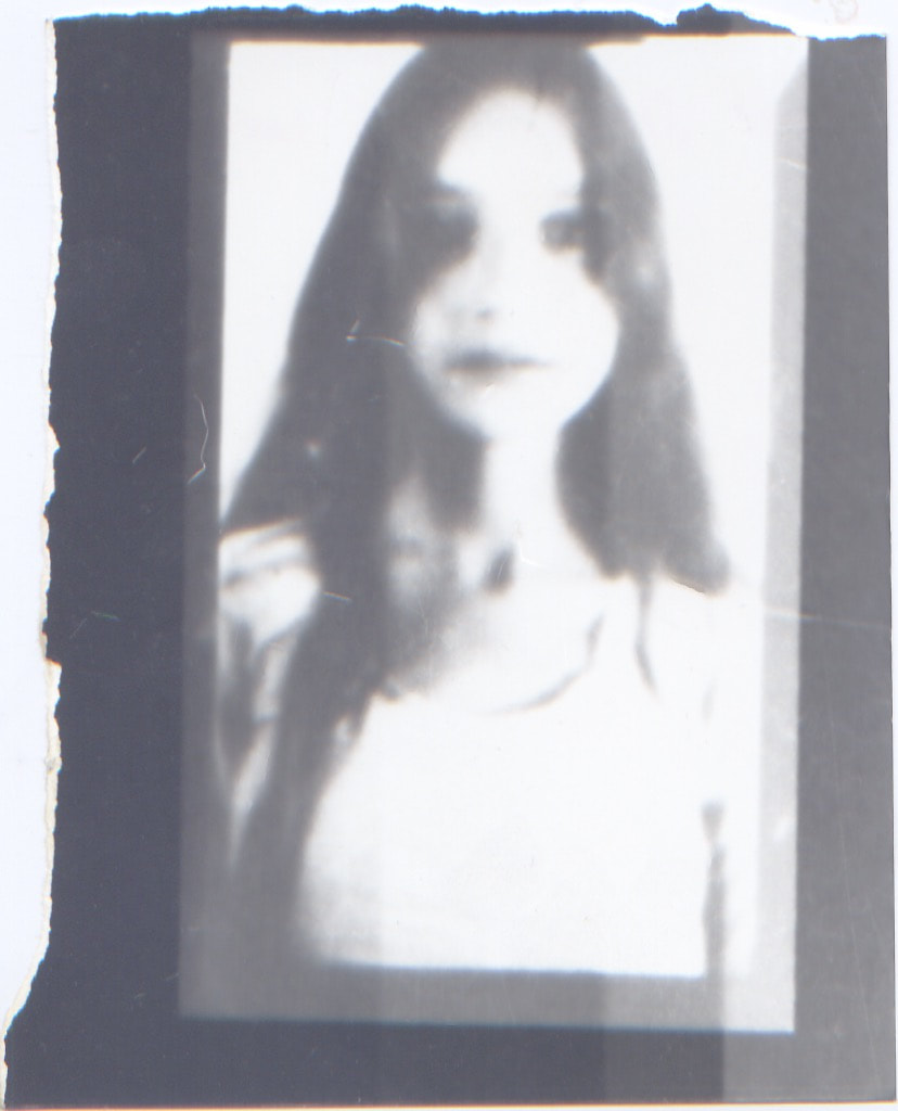
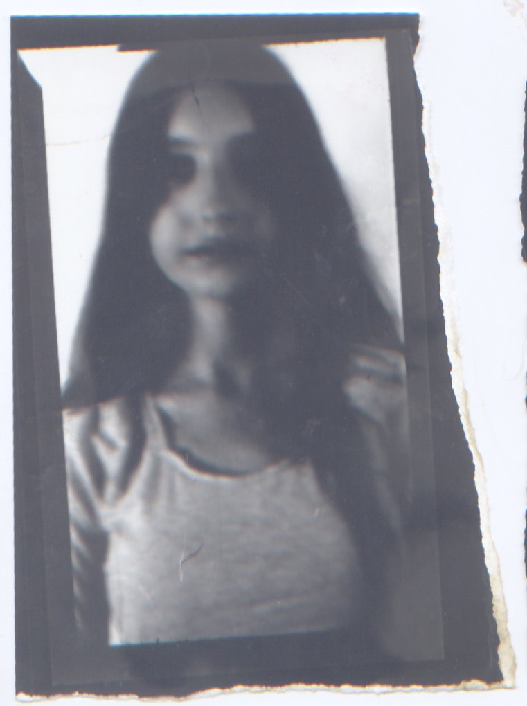
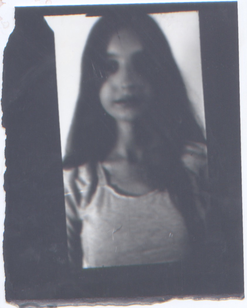
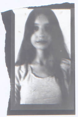
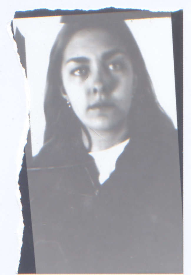
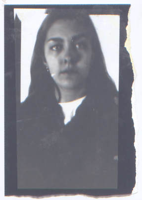
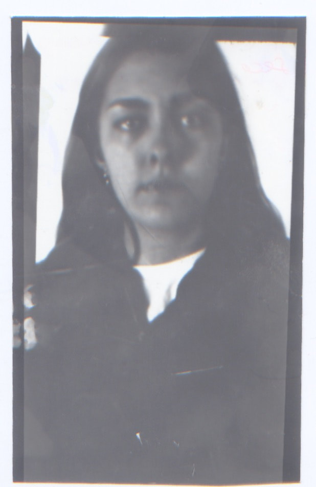
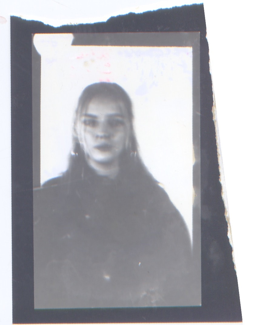
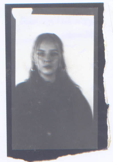
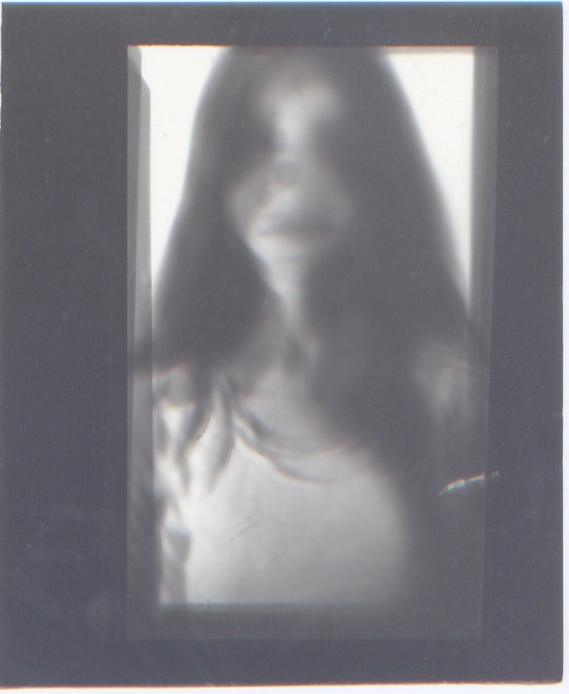
I was intrigued by the work of Bill Armstrong (his work is displayed at the top of my exam unit page), I thought that it explored the topic title from different angles which is something that I wanted to do in my third stand. firstly I think the most obvious impact of his work is caused by the ambiguity of his subjects because they make me think of secrets and mysteries straight away and this sparks questions in me such as ‘who are they? Where are they? What’s going on in the picture?’ His work is interesting because you can make out the key features of the figures and build a picture on your mind with the vast colour information that you are given but the images are still abstract and mysterious. This leads on to some less obvious questions which is something that went onto inspire my strand, this was the intrigue I had concerning the information we get from portraits and photographs as a whole. What I mean by this is how much information do we need from a picture so that we can interpret it and understand what’s going on? For example, the colour information we are given in Armstrong’s portraits is very last and they are very eye catching images because of this however the shape information we are given is not to in depth and the images really do look more like swirls of paint than actual people. However this doesn’t stop us from knowing what we are looking at. I think that this links to another angle in which we can view his work, which is that they are unconventional portraits, what I mean by this is that they don’t show is a clear face or subject but we still classify them as portrait and I think that this makes them unconventional because they are blurring the rules/ lines of photography. I wanted to find my own style within this concept but I began by creating my own response to bill Armstrong’s work and this is how I began my developments.
|
|

|
|
|
|
|
|
|
I like this response, however if I were to refine it I would take more of the images outside as I think that the 1/6 that’s I did take outside was the best one. However as you can see my work is very similar to the work of the artist and I want to take this idea and the concepts that I had discussed perilously, in a more unique direction and incorporate my own ideas into it. This will be one of my objectives in the next development. Additionally in my experimentation of this strand I would like to explore distortion within Photoshop, in camera and out of camera, I hope to display in my next developments.
DEVELOPMENT 1
With experimentation with distortion digitally and practically in mind, I came across the idea of using frosted/ patterned glass. To create these images I held a piece of frosted glass in front of the camera and took pictures of subject. I tried to make sure that they were wearing clothes which would stand out enough so that you could make them out but at the same time still keeping them ambiguous, I also lit them very brightly for the same reasons.
I think that this still explores the concepts regarding colour information which I have previously discussed and thought about. In addition It further explored the shape information which I have also briefly discussed however here we are actually creating new shapes instead of distorting the ones which are already
I think that this still explores the concepts regarding colour information which I have previously discussed and thought about. In addition It further explored the shape information which I have also briefly discussed however here we are actually creating new shapes instead of distorting the ones which are already
|
|
|
|
|
|
|
In this development I think I achieve my main objectives which were to put my own individual spin in the idea and play around with distortion out of camera. However I’m not sure how I’d take this further, perhaps looking at black and white images white would take away the colour information completely and only focus on shape.
DEVELOPMENT 2
1
|
2
|
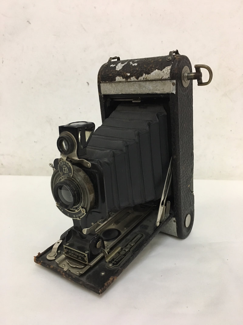
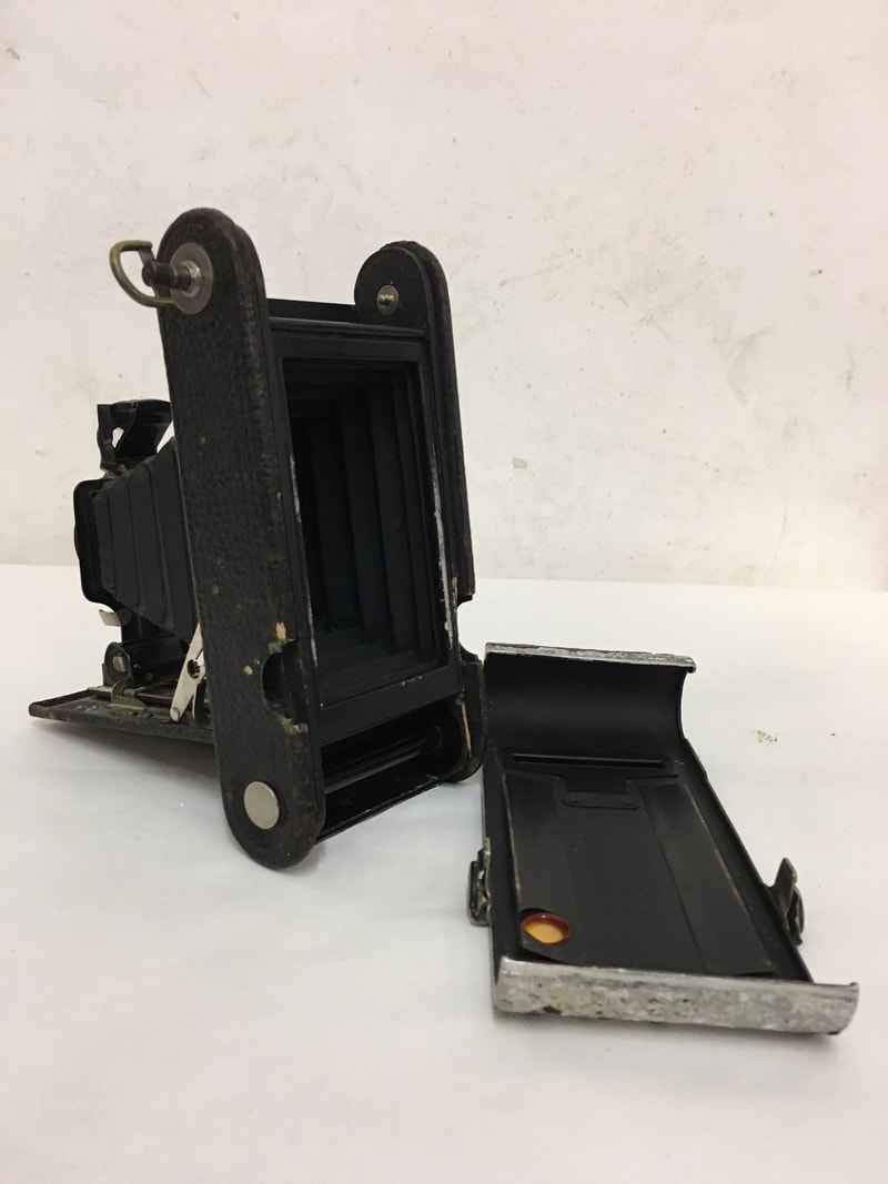
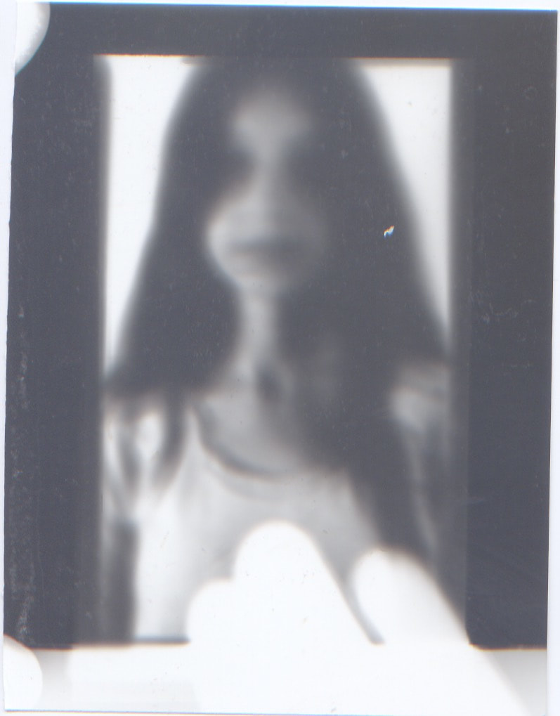
In this response I was completely inspired by the tools I had around me and the desire to work more in the darkroom and develop my film skills, I also thought that my development idea would be a good way to approach the black and white photography that I mentioned in my last strand's development ideas. To create this response I used an very old camera (shown in image '1') where you place the film paper into the back (shown in image '2'). I used a digital camera to gage how I long I would need to open the shutter in the old camera for (because this has to be done manually). I had seen other images that were also created this way and obviously due to the camera, they came out blurry and messy so it thought that his would be an interesting extension to the other blurred images I had created.
My development process in explained in more depth below: |
NEGATIVES
These are the negatives which I took in the camera and then went on to develop in the darkroom. Each one was exposed for about 6 seconds but on reflection I think that the one on the left could of been exposed for more time and the one in the middle could of been exposed for less time.
These are the negatives which I took in the camera and then went on to develop in the darkroom. Each one was exposed for about 6 seconds but on reflection I think that the one on the left could of been exposed for more time and the one in the middle could of been exposed for less time.
|
|
|
|
TEST STRIP
Here is the test strip that I made, however it was somewhat unsuccessful because there wasn't a district difference between the strips, so I just went with the a the longest which was around 8 seconds. I have displayed this attempt below. |
|
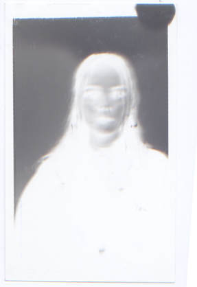
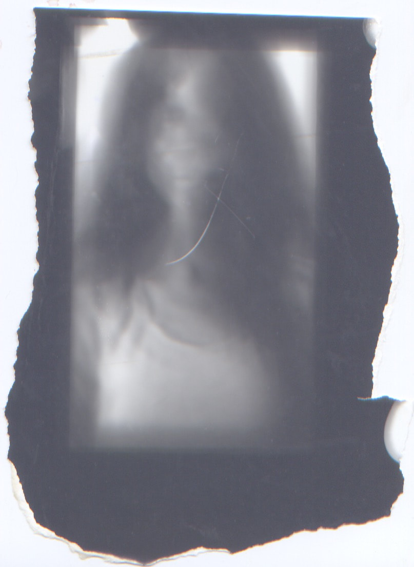
DEVELOPED IMAGES
|
3) The obvious choice now was to expose it for 6 seconds and this is how I got my desired effect where you could see the person but it was still blurred and had a level of ambiguity to it.
|
These images didn't really have the desired blurred effect, I think this is because I stayed very still and could steady myself by holding the camera as I took the selfie. I developed them anyway but this is something I tried to rectify with my next model.
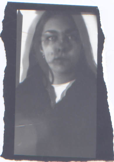
1) exposed for 3 seconds
|
2) exposed for 5 seconds
|
3) exposed for 4 seconds
|
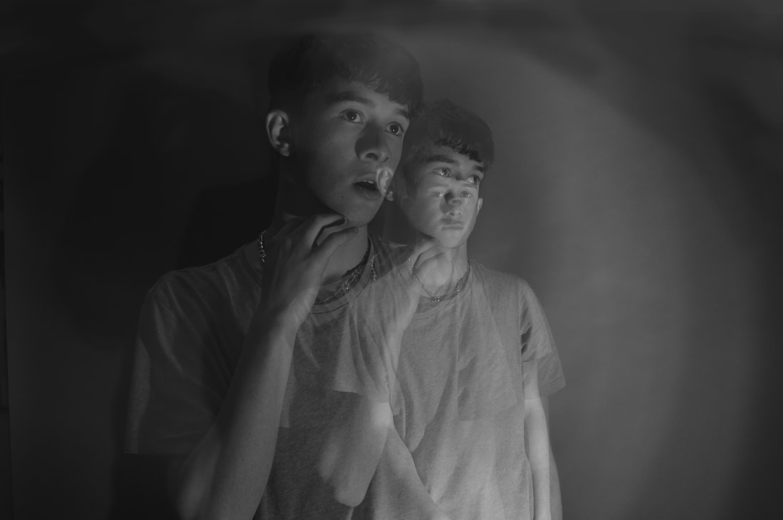
In the next portrait I got the model to make very small and subtle movements while I was taking the picture. I think this is where I really discovered for to get the effect I wanted and really show the blur and distortion.
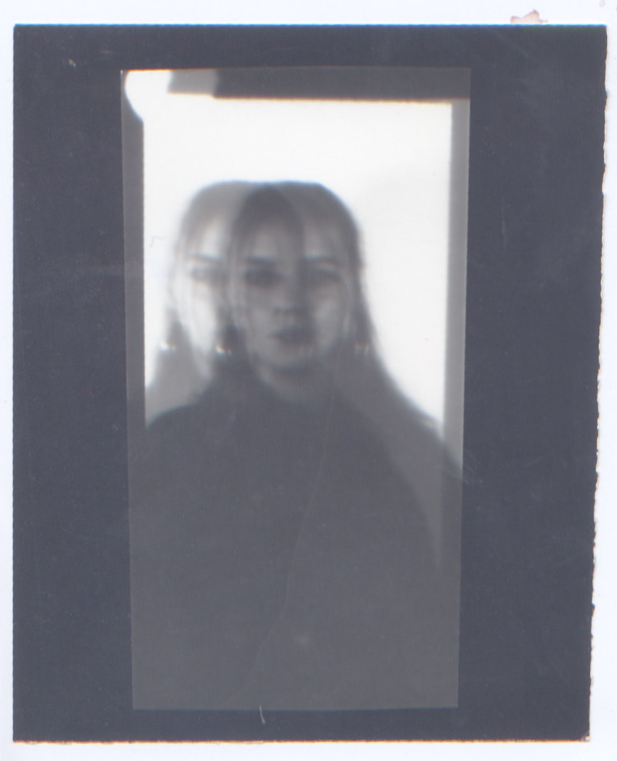
1) This image was exposed for 2 seconds under the enlarger which was a sufficient time and I like the picture but I wanted the faces to be a bit darker and a bit more mysterious
|
2) This is why I exposed this image for 3 seconds and this was the final outcome.
|
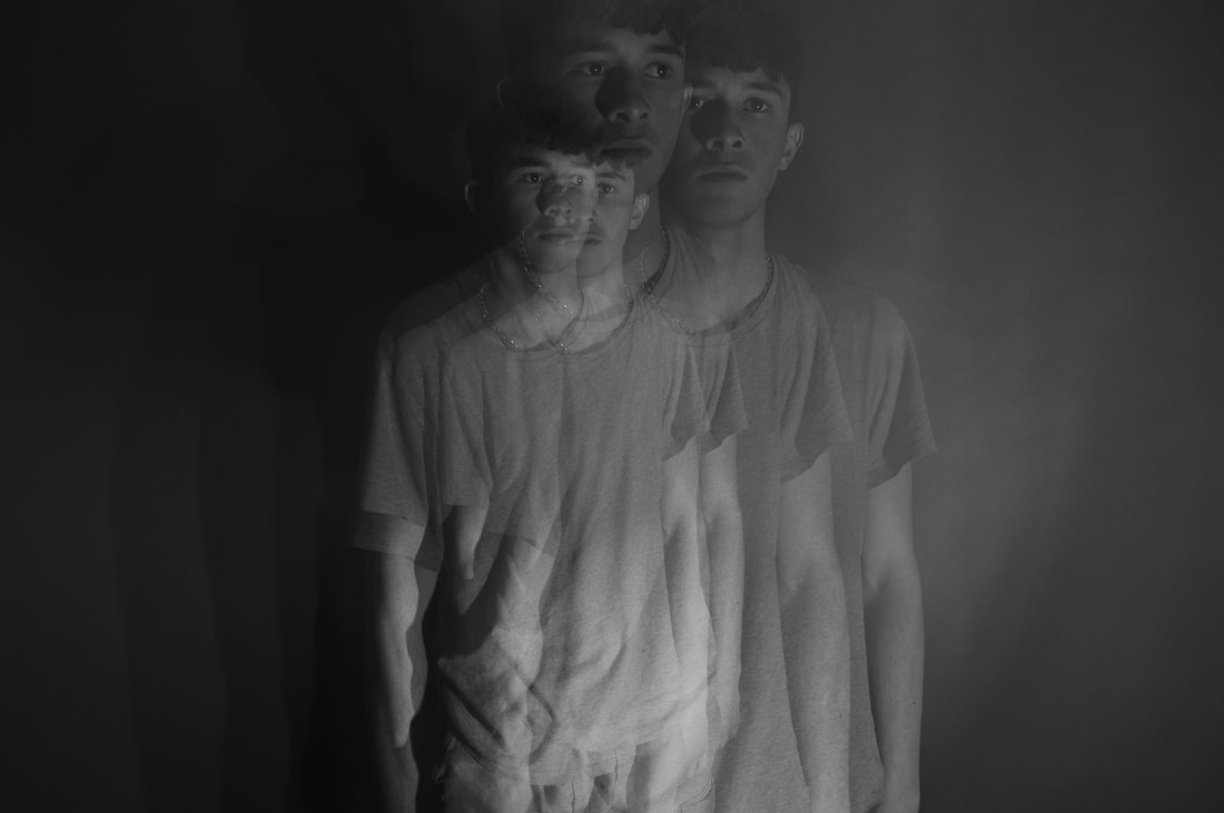
BLURRED IMAGES
I then started to blur the images by moving them around under the enlarger. this was the outcome:
As you can see as we look though images 1-3 they get progressively more blurred, this because I moved them around under the enlarger more vigorously each time. However I didn’t want to go back to but making more pictures which looked like the work of bill Armstrong’s and that is how I developed onto creating images like 4 and 5 (down below)
1
|
2
|
3
|
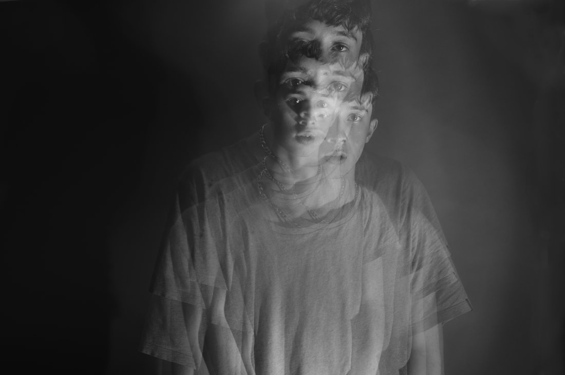
instead of moving the image continuously while the enlarger light was on, in this development i would turn the enlarger off and then more the negative and the turn it back on again.
4
This image was exposed for too long overall with each burst of light making the original positioning darker and darker and this actually cancelled out the effect and didn't make it clear in the image. In addition there is not much negative space and a lot of black from the jumper that I'm wearing so it hard for us to see the other figures. I tried to rectify this in my next attempt
|
5
This image was much better suited to apply this technique to because there is more negative space in the image for me to position the negative so that you can see the figure. In addition to this I exposed the original figure for less time s that it had other attempts to darker with other exposures. I really like this image and the effect that it had, I think after a lot of refining this was a successful end product.
|
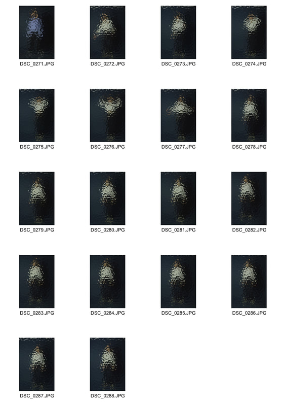
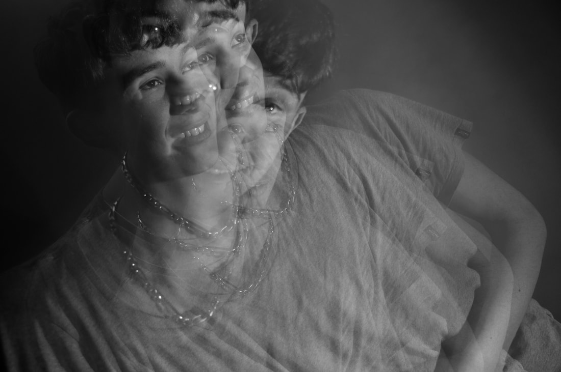
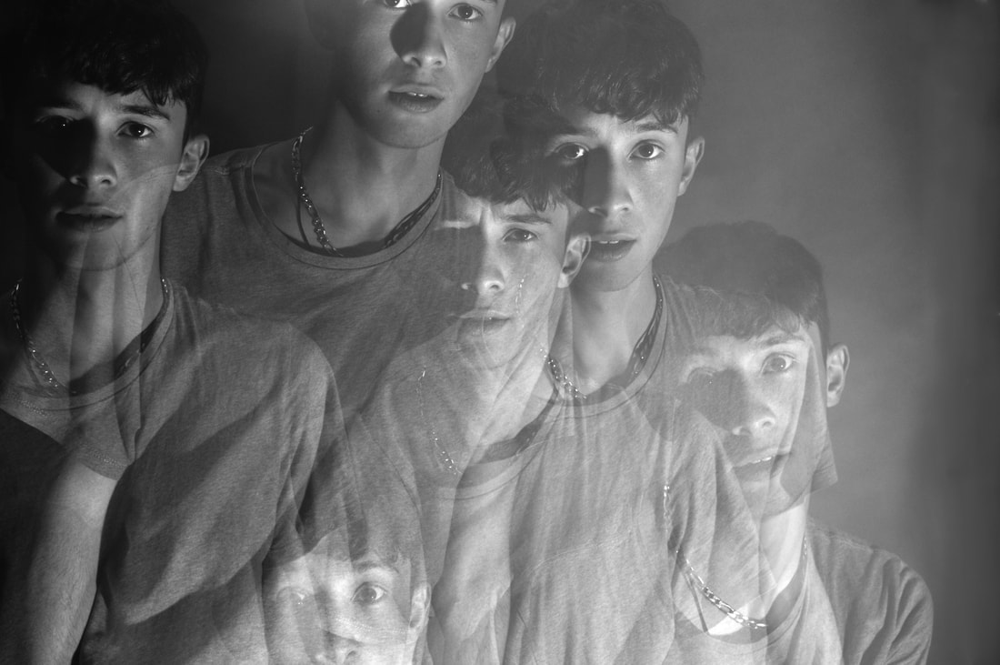
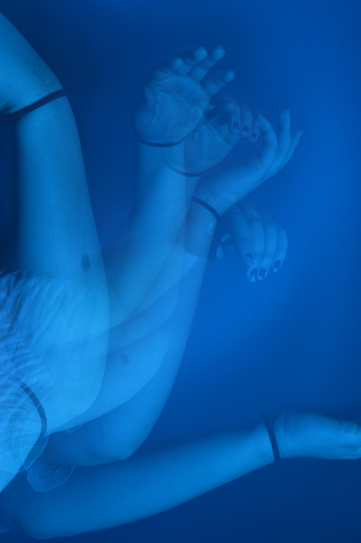
This development was interesting successful in achieving aim that I had set myself for this strand however I don't like how it came out because I think it looked messy and unprofessional, I think this could be rectified now that I have more experience and know the steps that I would be taking however i was successful in inspiring my next development. the last image reminded me of some double exposure images created with the strobe, which I had previously experimented done in other topics and this is what I wanted to do in next strand.
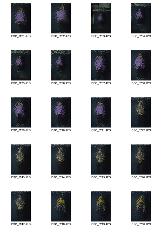
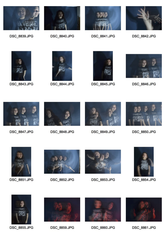
DEVELOPMENT 3
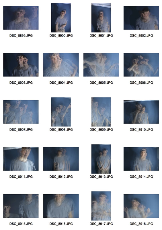
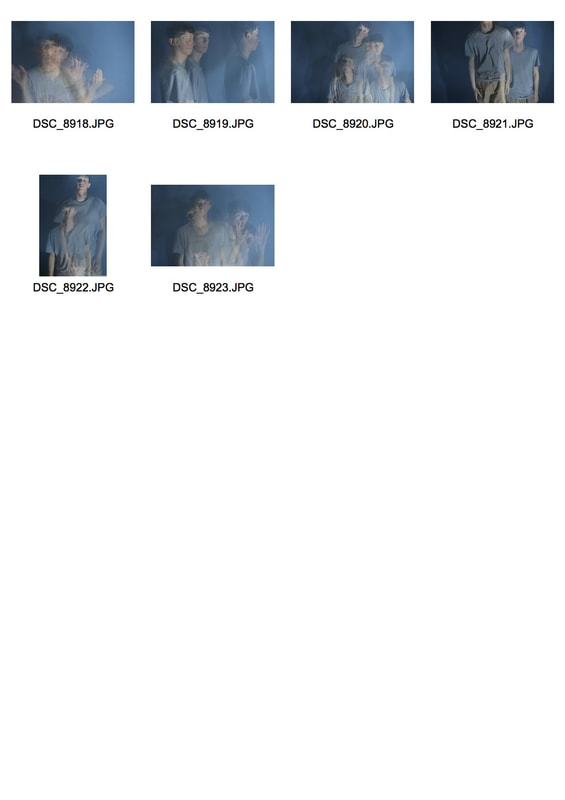
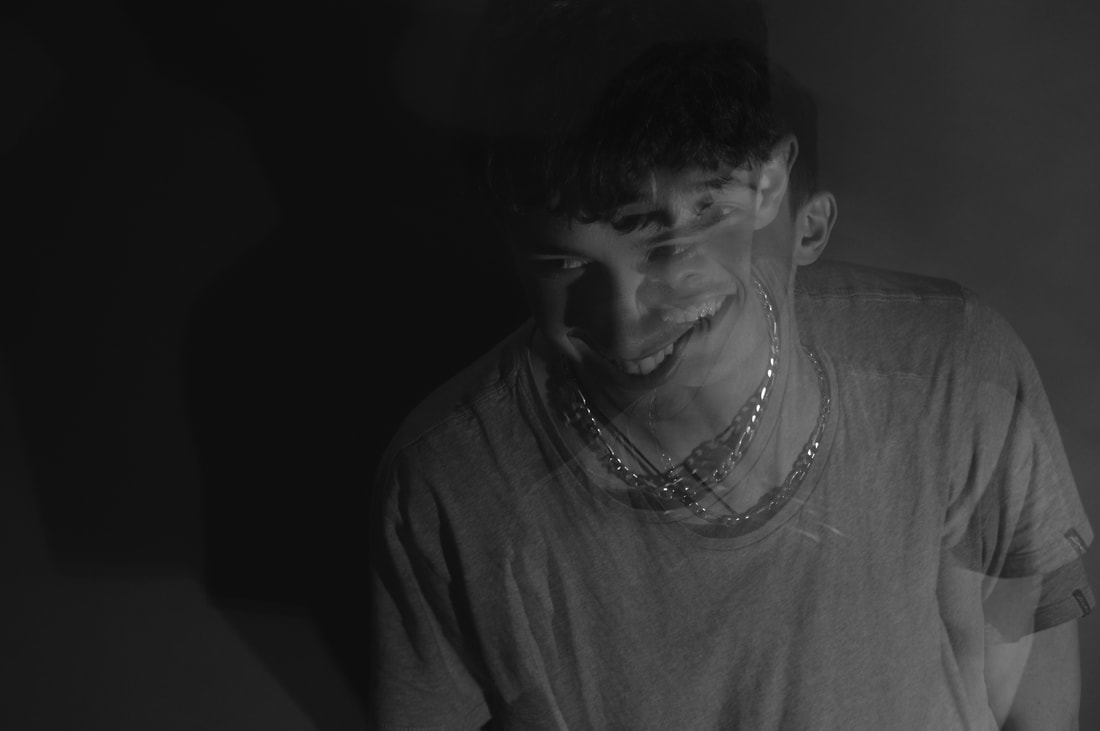
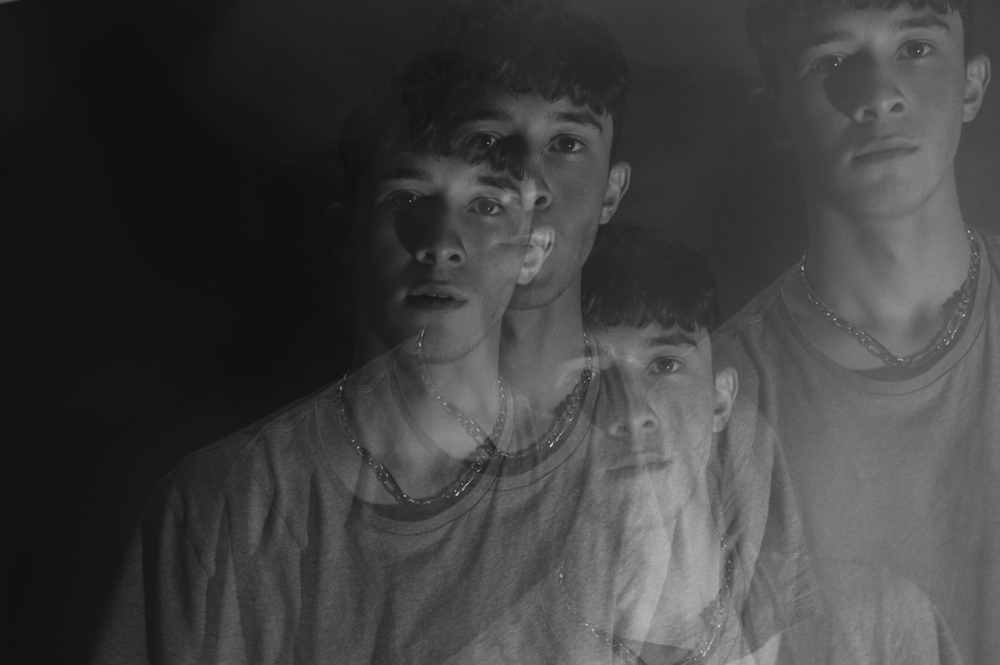
As I mentioned previously this strand was created with the strobe. How this is done: i put my camera on the 'bulb' setting which allows me to open the shutter for as long as my finger is on the button and then I turn the strobe on. This allows only the position of the person when the light flashes to be captured in the image. If I didn't have the strobe and just had normal studio lighting then this would of come out as one continuous blur of movement which I did consider but decided against because i still wanted to see the person with some clarity, in addition to this I wanted it to be a development from me previous response in the darkroom.
|
|
|
|
|
|
|
Even though this was my favourite response of the ones that I had done I still felt that there was room for improvement. If I were to refine this exact response and make it my final piece then I would have made sure the room was darker so that each figure was more sticking. However on reflection I wanted to bring back the element of colour into the images and I was planning on doing this by putting gels over the lights in my next development.
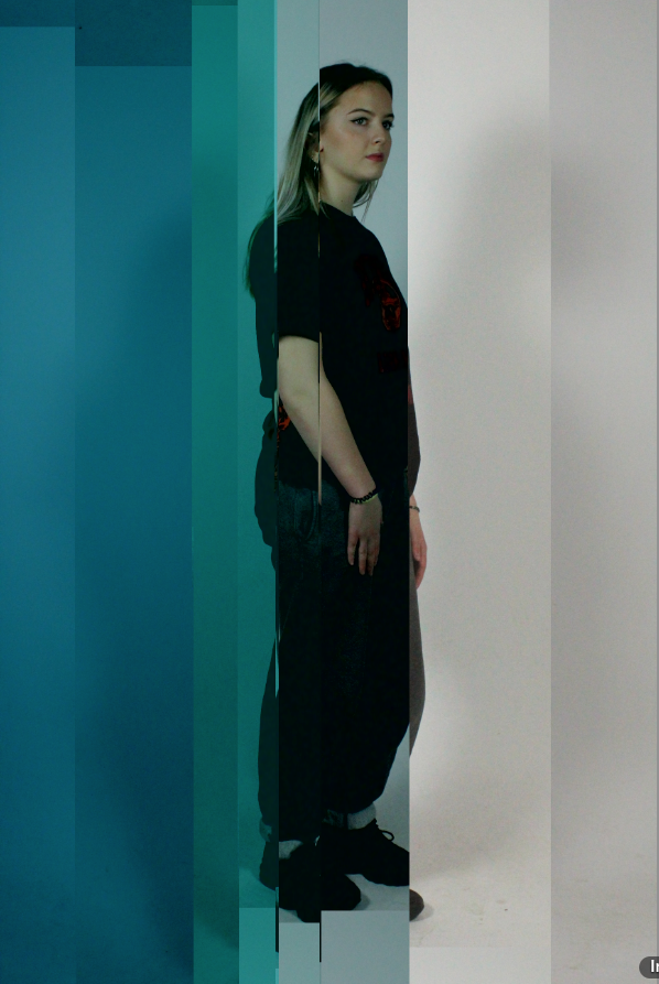
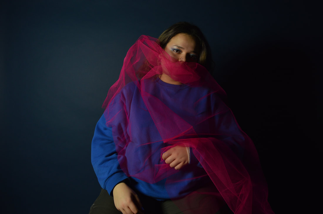
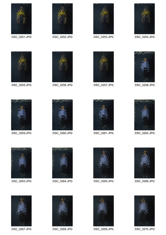
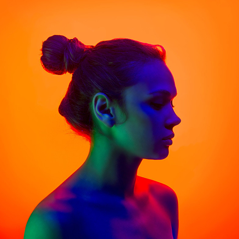
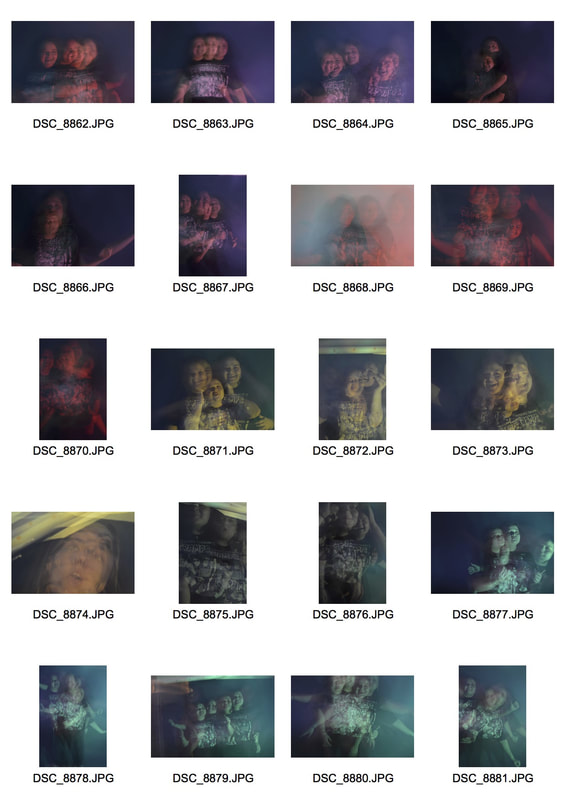
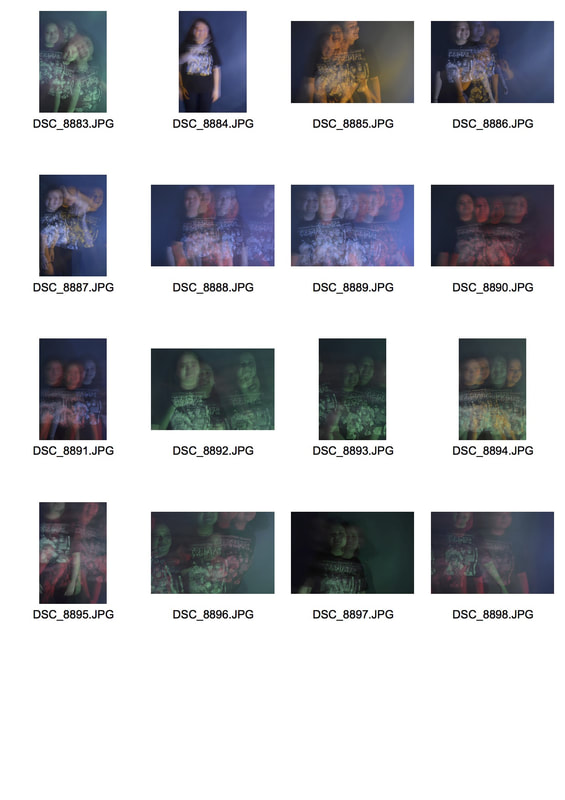
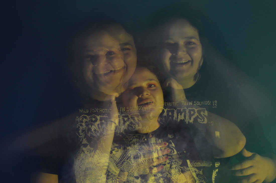
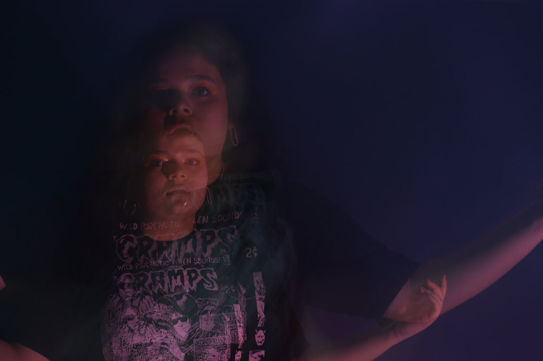
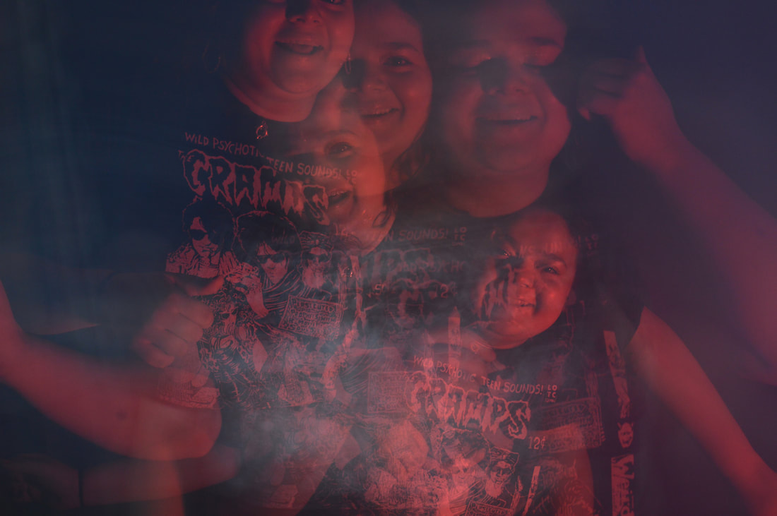
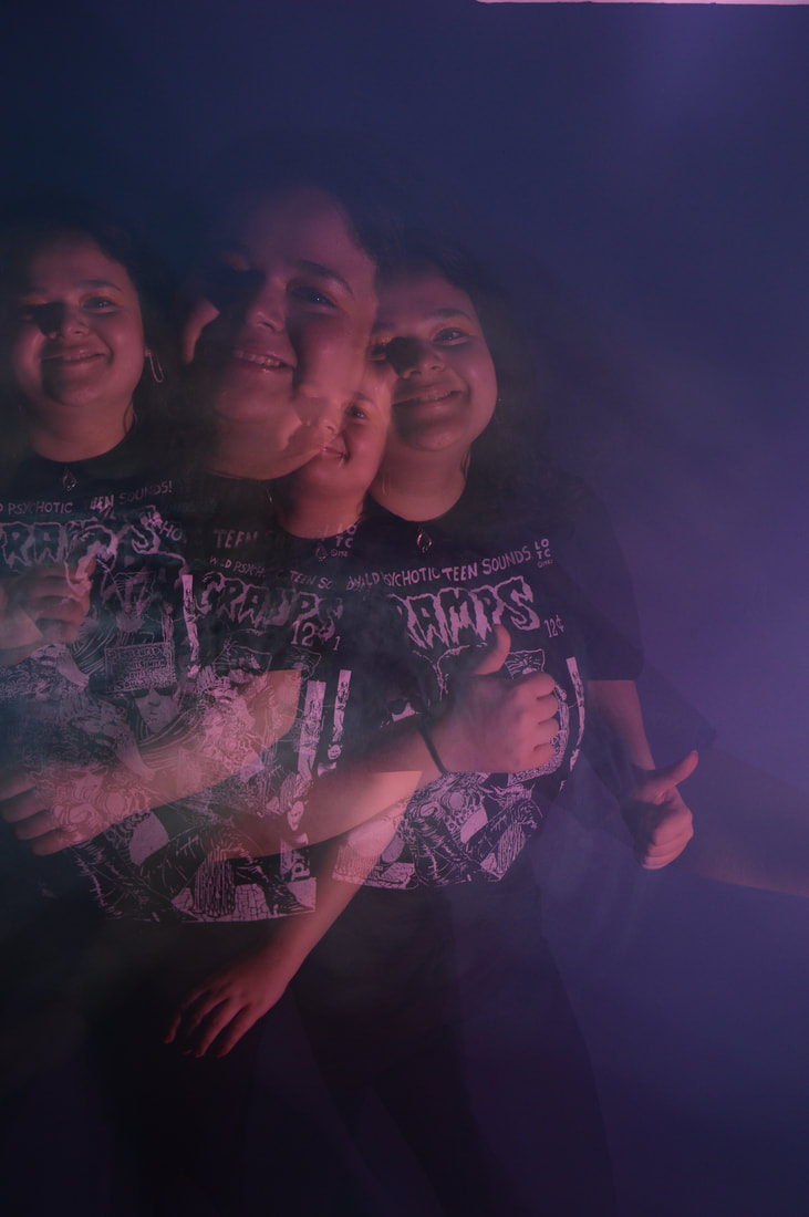
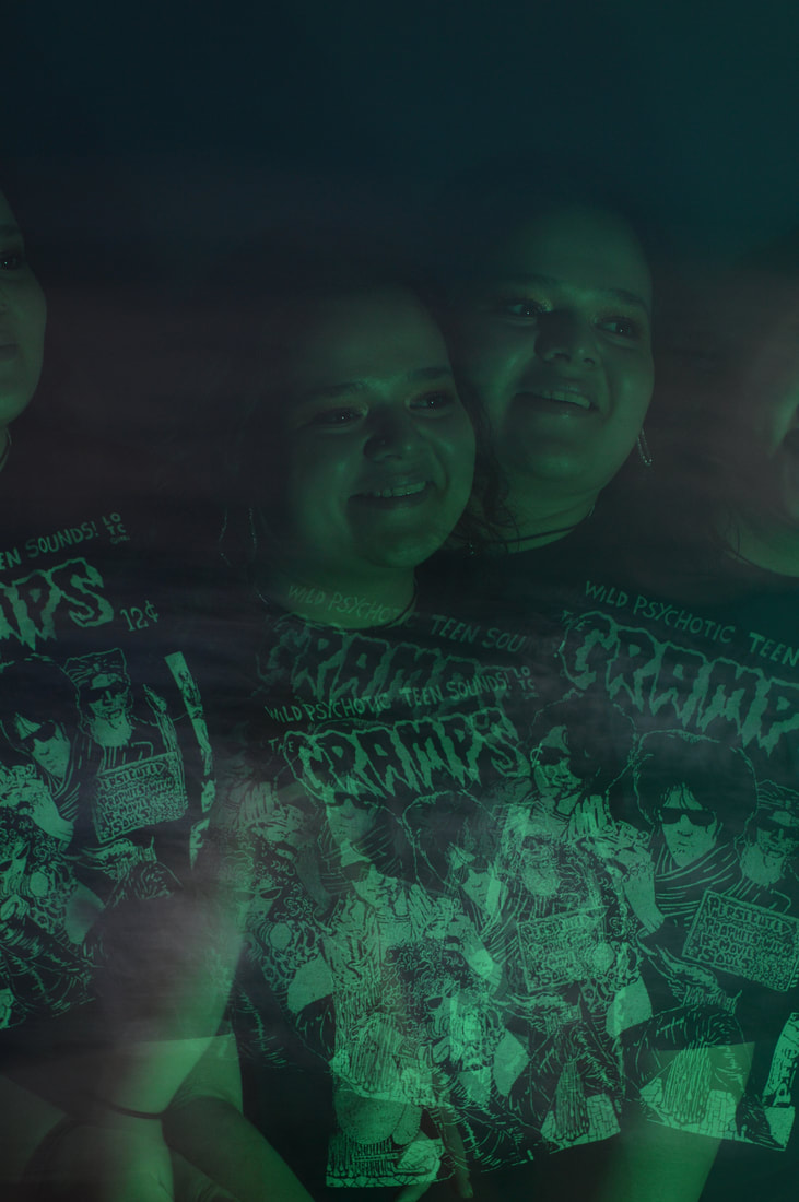
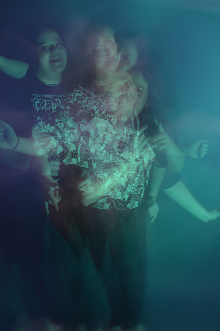
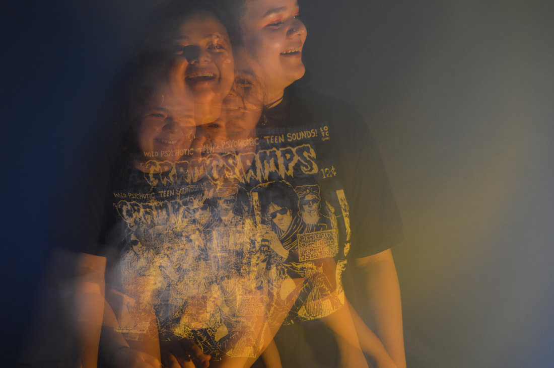
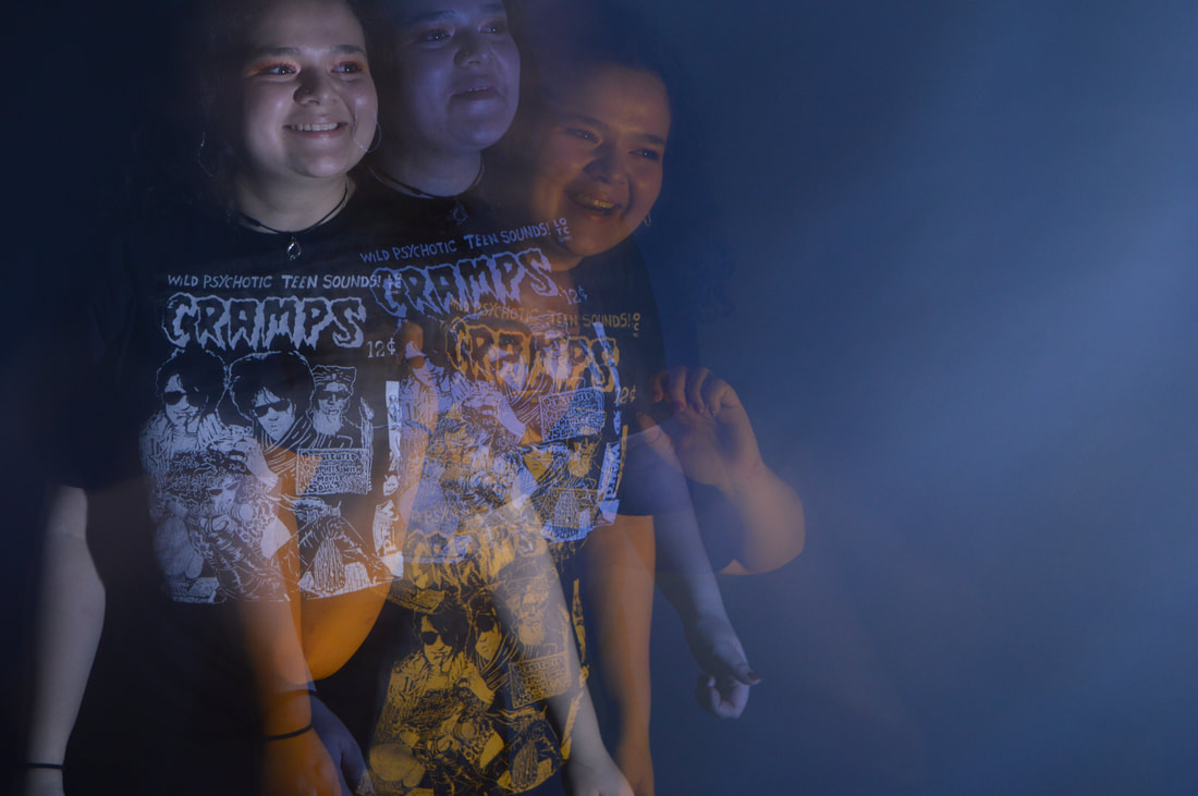
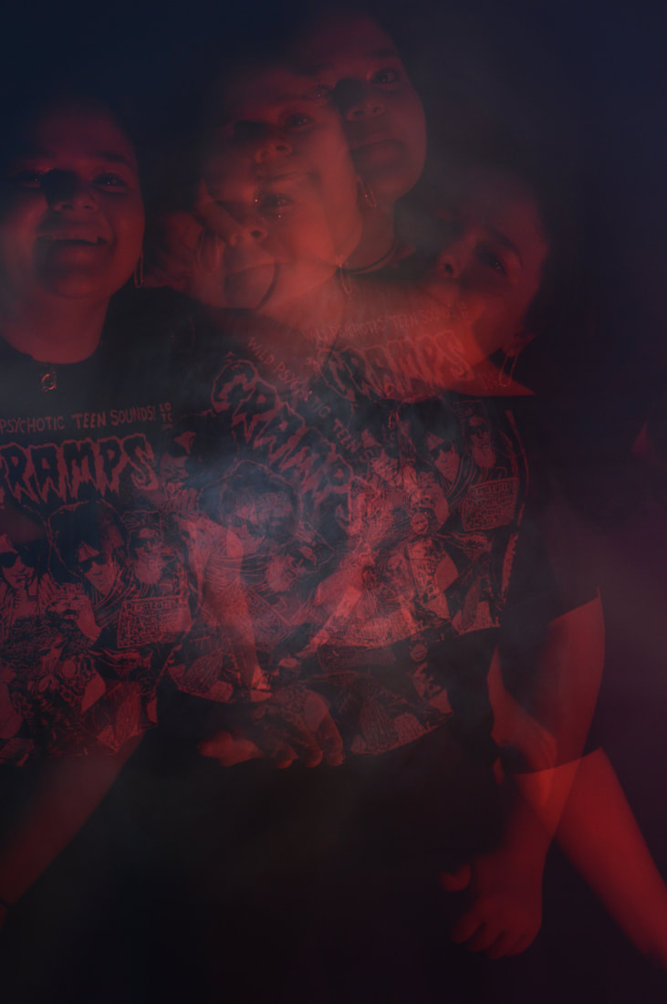
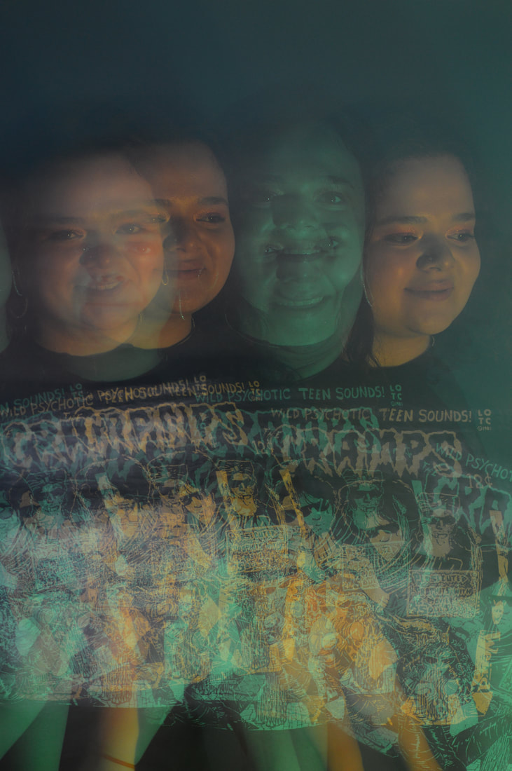
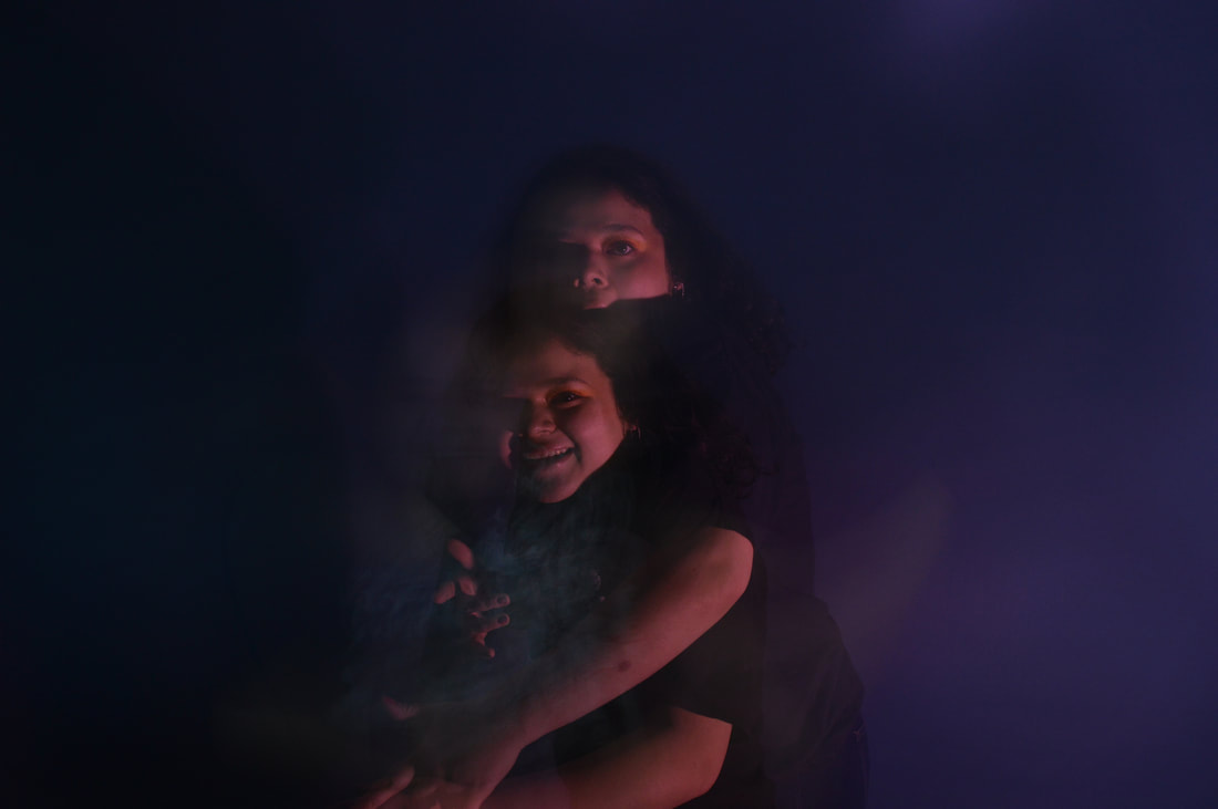
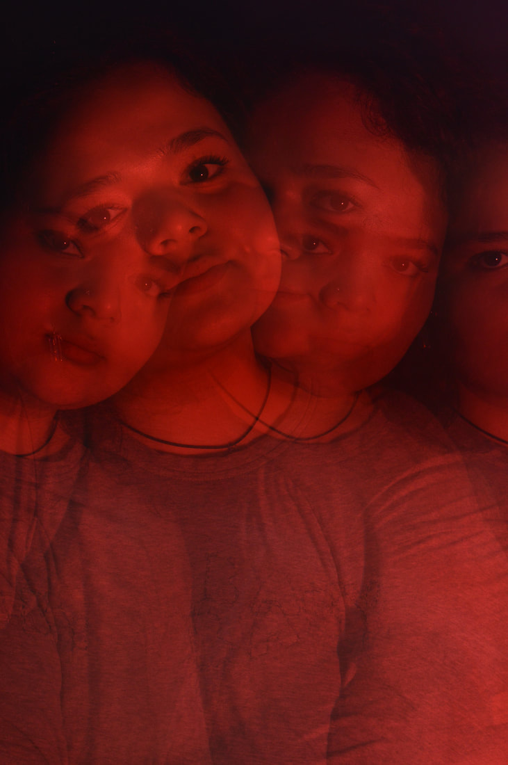
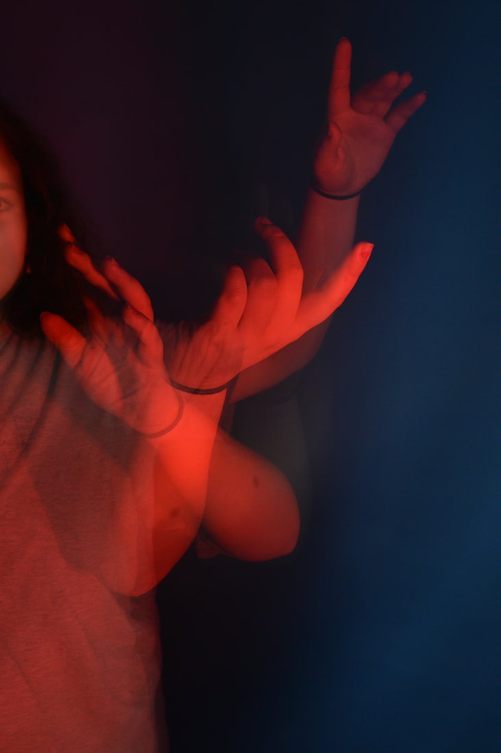
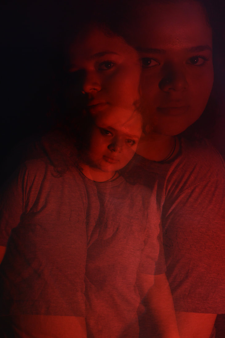
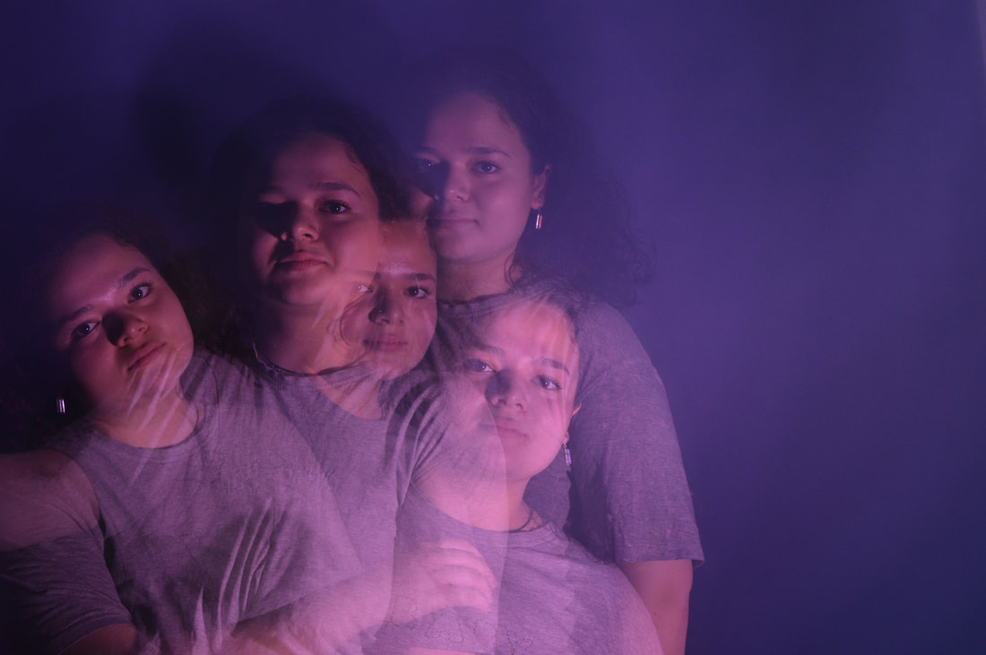
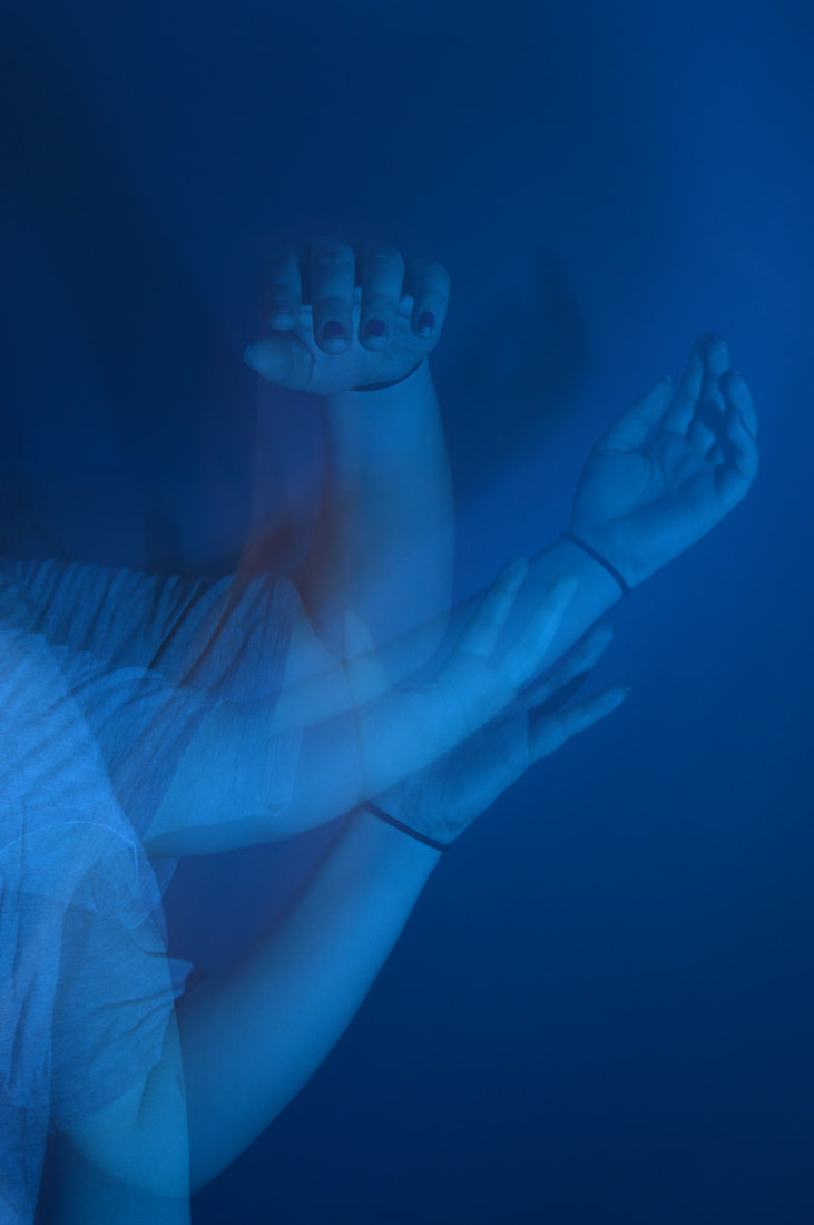
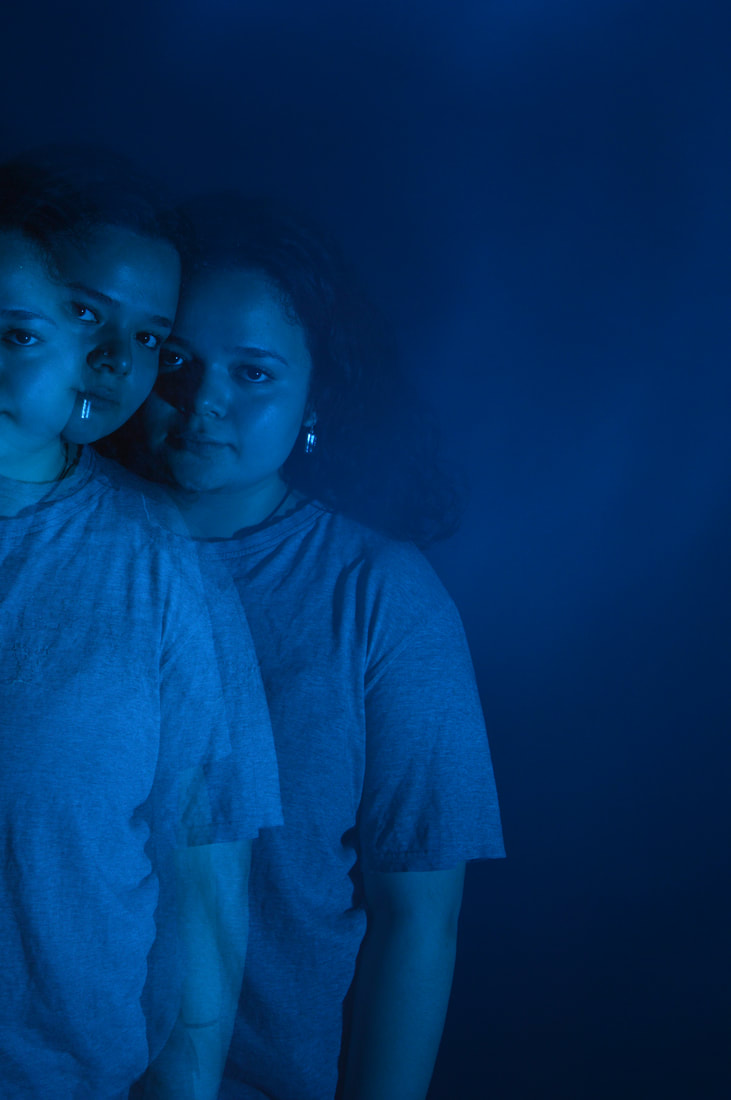
DEVELOPMENT 4
In this development i used the same technique from the last development but kept them in colour and put gels over the lights. The artist which inspired the idea of incorporating coloured lights was Slava Thisset
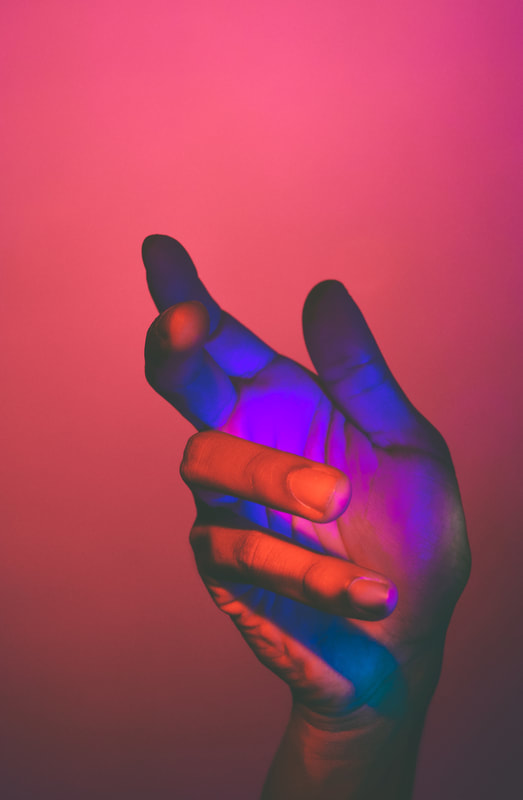
Slava Thisset
Slava Thisset creates fantastical and dreamlike images. She does this by adding light and effect to the images. In image 2 (shown below) different parts of the hand take on different colours. This is an beautiful and ethereal aesthetic. Image number 1 is entitled 'supersaturation sadness', this title is not explain but my interpretation of this title is that the artist wants us to see a sight of beauty and eye-catching digital art with the juxtaposing negative vibes that the subject is given off. The artist has used coloured gel light and her talent for digital art in creating this work. This creates the euphoric effect.
1
|
2
|
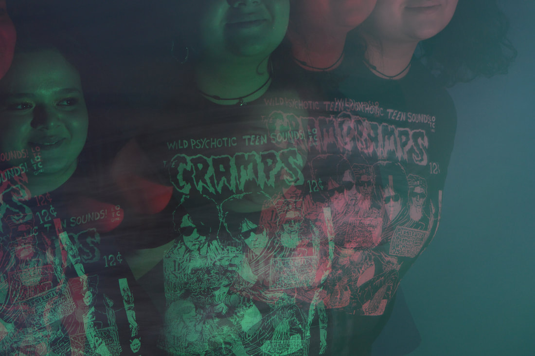
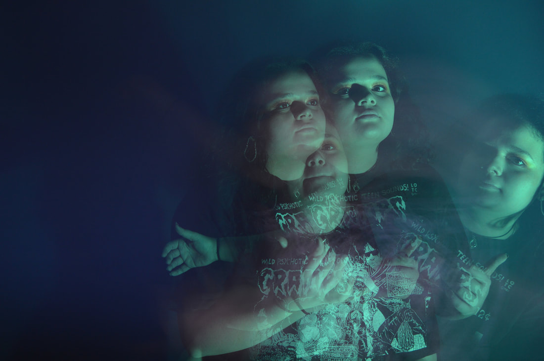
MY WORK
|
|
|
|
|
|
|
|
|
|
|
|
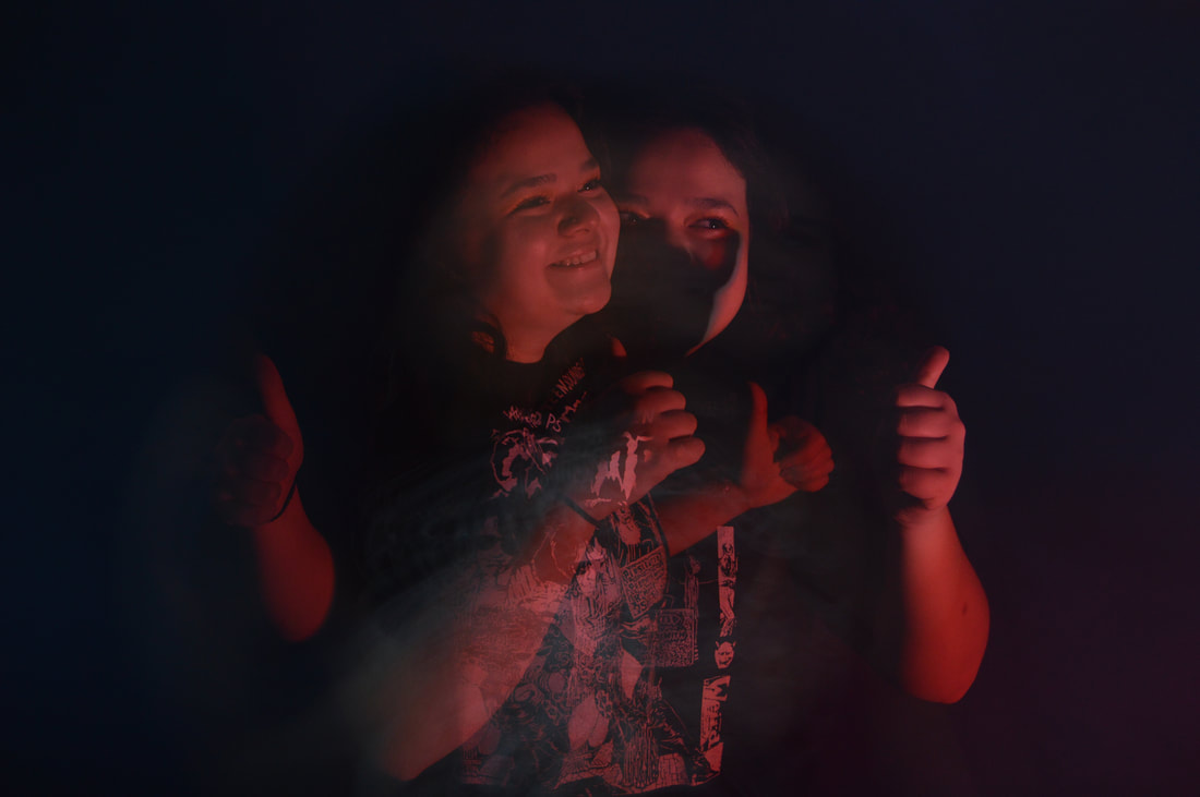
I really like this development and I would like to use a more refined version of this for my final piece. I think that the colours which cancel out her natural colouring links with the original idea for changing the colour information and the shape information is also distress through the use of the strobe double exposure. However I have 3 issues with this response. Firstly, I don't think that the colours are bold and overwhelming enough whereby they completely consume any other colours in the images, to rectify this I would layer the coloured gels to get more intense colours and make the room darker. secondly, I think that the whit on her t-shirt captures the colours well, a bit too well and I think that think means that the gaze is instantly drawn to that and the bright coloured writing is very distracting, in my final piece I would want the model to wear more plain clothing. Lastly her expression in the images is very different to my other response and i would like to keep the expressions of the models consistent throughout my responses, so in my find pieces I would ask the model to have a more serious expression on her face.
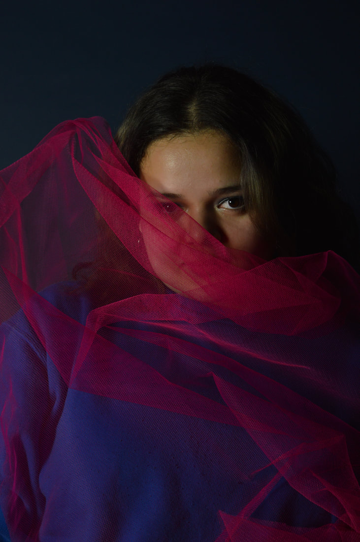
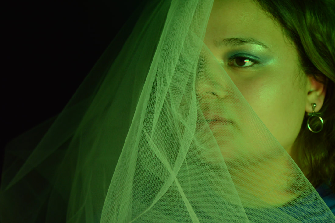
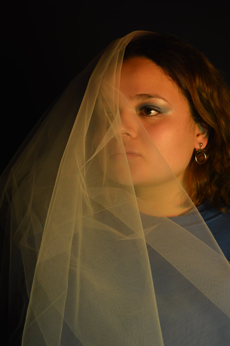
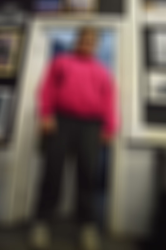
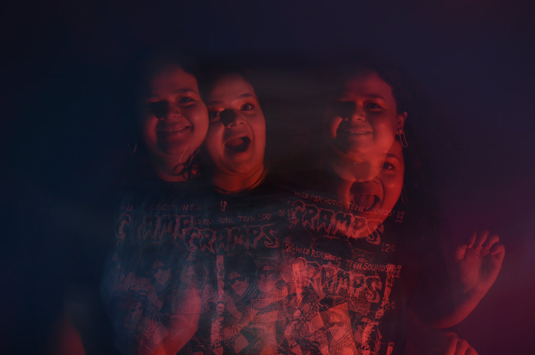
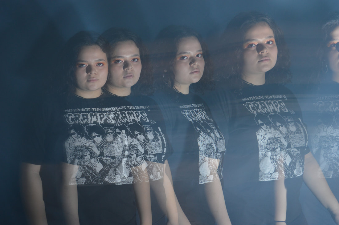
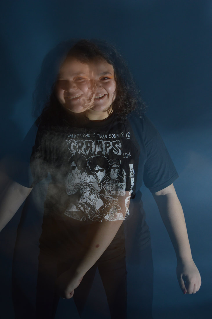
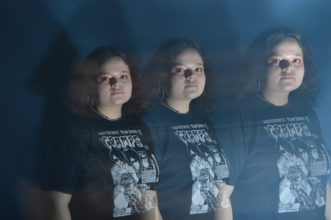
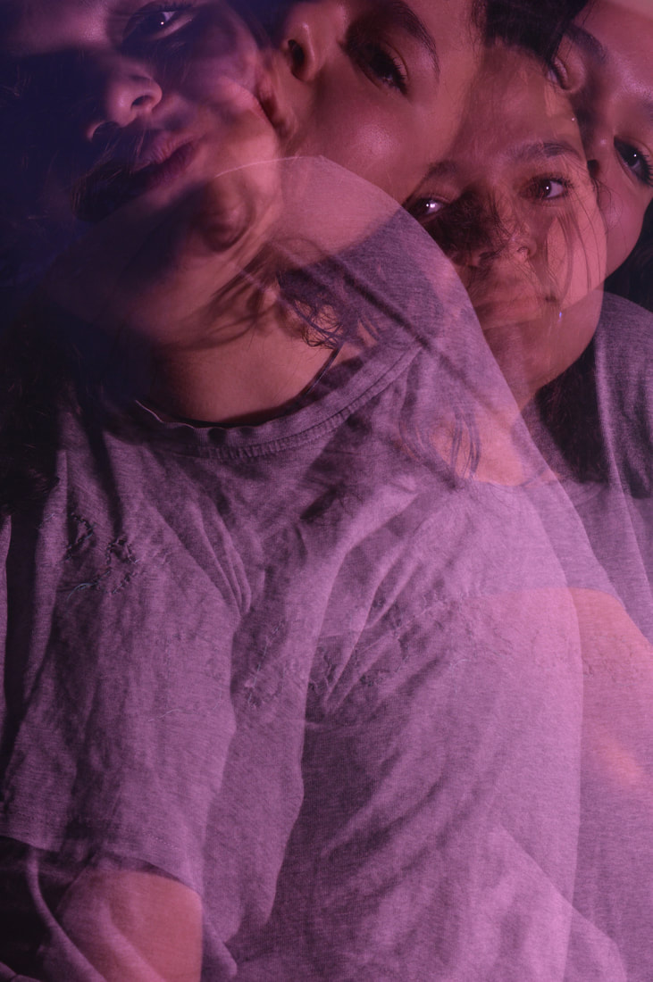
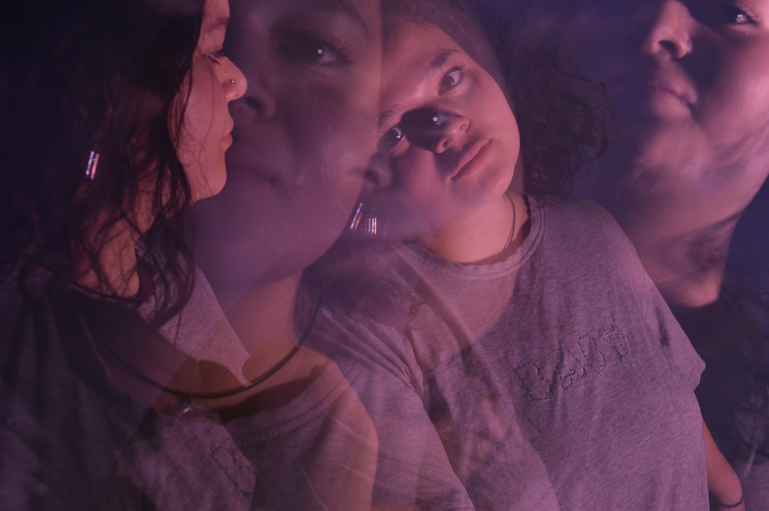
FINAL PIECE
As you can see in my final pieces I have taken all my criticisms of the last response on board and tried to make these as refined and perfect as possible. I have enhanced the light without the use of Photoshop which is something that I wanted to ensure i did because I wanted this effect to be completely practical. This way I get to show my camera skill and I think they look more natural. I find that sometime I can over edit images on Photoshop just because the option is there for me to do so. In addition to this I made sure her clothing was a more neutral and less distracting and she has a more solemn expression her face.
|
|
|
|
|
|
|
|
|
|
|
|
